Society of Visual Storytelling

    SVSLearn Forums

    • Register
    • Login
    • Search
    • Recent
    • Tags
    • Popular
    • Users
    • Groups
    • Search

    Cover design feedback pls: Update!

    Artwork
    kidlit colorscheme swing children artwork
    10
    11
    2208
    Loading More Posts
    • Oldest to Newest
    • Newest to Oldest
    • Most Votes
    Reply
    • Reply as topic
    Log in to reply
    This topic has been deleted. Only users with topic management privileges can see it.
    • Leontine
      Leontine last edited by Leontine

      Thank you so much for all your kind comments, hereby the reworked piece with text design (translation: through thick and thin) (it's going to be published in The Netherlands)

      0_1524641565598_Buddy Books door dik en dun.jpg

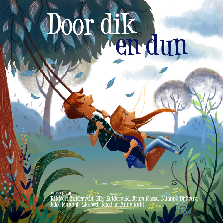
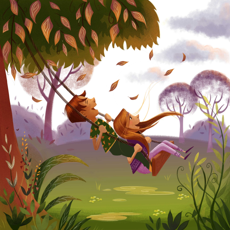
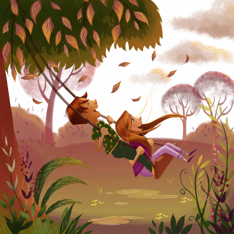
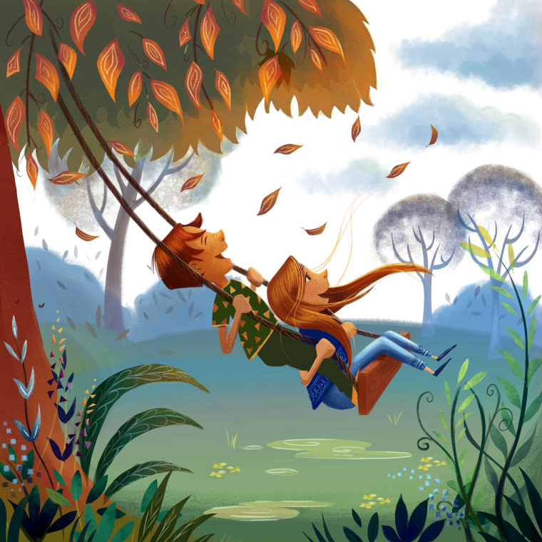
      I've made a cover design for a new childrens-book in three different color schemes. Of course there is room for the title and other info. Feedback is very much appreciated!
      0_1524478429766_Leontine gaasenbeek coverd design 3.jpg

      0_1524478854720_Leontine gaasenbeek cover design 1.jpg

      0_1524479121444_Leontine gaasenbeek cover design 2.jpg

      Leontine
      "A picture is worth a thousand words."

      https://leontineillustrator.com
      https://www.instagram.com/leontine.illustrator/
      http://www.facebook.com/leontineillustration

      Chip Valecek 1 Reply Last reply Reply Quote 6
      • AirenHall
        AirenHall last edited by

        @Leontine One of the first things that jumped out for me was that each of these color schemes seems to evoke a different season. #1: summer, #2: autumn, #3 spring. Was that intentional? Does the book take place during a specific season or is that kind of vague?

        https://www.instagram.com/withoutaladder/

        https://twitter.com/withoutaladder

        Leontine 1 Reply Last reply Reply Quote 1
        • RHirsch
          RHirsch last edited by

          I really like the color contrast in the third one, but I agree with @AirenHall that they look very seasonal. So if the story calls for a specific season that might decide it. Lovely work.

          www.rhirschillustration.com
          https://www.facebook.com/rhirschillus
          Instagram: rhirschillus

          1 Reply Last reply Reply Quote 1
          • Chip Valecek
            Chip Valecek SVS Team SVS OG @Leontine last edited by

            @leontine I like the first one the best.


            https://www.instagram.com/chipvalecek/
            https://www.facebook.com/cvalecek
            http://www.cshellmedia.com/

            1 Reply Last reply Reply Quote 1
            • smceccarelli
              smceccarelli Pro SVS OG last edited by

              They are all lovely, but my favorite is the third one!

              1 Reply Last reply Reply Quote 1
              • Leontine
                Leontine @AirenHall last edited by

                @airenhall @smceccarelli @RHirsch Thank you, thats really helpful.The book will be released in autumn, however, its probably not sold out in half a year, so thats the difficult part. Id like to give it a feeling of 'happy', more than 'seasonal'. Perhaps I have to work on the blue version and give it a punch.

                Leontine
                "A picture is worth a thousand words."

                https://leontineillustrator.com
                https://www.instagram.com/leontine.illustrator/
                http://www.facebook.com/leontineillustration

                Kevin Longueil 1 Reply Last reply Reply Quote 0
                • Kevin Longueil
                  Kevin Longueil SVS OG @Leontine last edited by

                  @leontine These all look very nice! I would say that number three is the one that jumps out the most though - great work!

                  Portfolio: kevinlongueil.com
                  https://www.instagram.com/kevinlongueil/

                  1 Reply Last reply Reply Quote 1
                  • djlambson
                    djlambson last edited by

                    What a great mood..I love it. For me the orange and blue color combo really popped, that's the one I'd choose!

                    https://www.instagram.com/deborahlambson_art/
                    https://deborahlambson.com/folio

                    1 Reply Last reply Reply Quote 1
                    • Eli
                      Eli last edited by

                      Love them all, but ditto number 3!

                      1 Reply Last reply Reply Quote 1
                      • Miriam
                        Miriam last edited by Miriam

                        The 3rd one is my favorite. I think the characters stand out against the background more in this one & it has a little more depth between the foreground and the background.

                        1 Reply Last reply Reply Quote 1
                        • Sofie Schollaert
                          Sofie Schollaert last edited by

                          Like them a lot, great movement and joy that comes from this picture! I like the 3rd one the most because the children jump out more. Really love it!

                          • Life is cuter when you draw it! -

                          instagram: https://www.instagram.com/sofie.schollaert/
                          website: https://studiomosa.be/

                          1 Reply Last reply Reply Quote 1
                          • First post
                            Last post