Society of Visual Storytelling

    SVSLearn Forums

    • Register
    • Login
    • Search
    • Recent
    • Tags
    • Popular
    • Users
    • Groups
    • Search

    Help choosing a cover design for Children's book

    Artwork
    5
    6
    784
    Loading More Posts
    • Oldest to Newest
    • Newest to Oldest
    • Most Votes
    Reply
    • Reply as topic
    Log in to reply
    This topic has been deleted. Only users with topic management privileges can see it.
    • tazzyartist
      tazzyartist last edited by

      Hello!

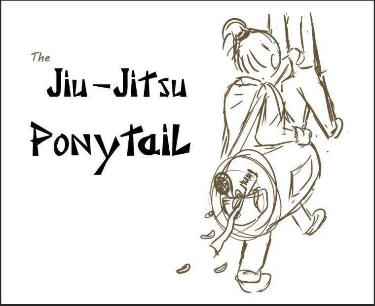
      So I am at the stage in illustrating a book where we are coming up with cover ideas and designs. So we have come up with 5 designs total and I would like your feedback on which one has the most appeal--basically which you might be most inclined to pick up. They are just quick sketches for now but of course will be in full cover in the final version for whichever we choose. And any other feedback or suggestions would also be appreciated.

      Some info-
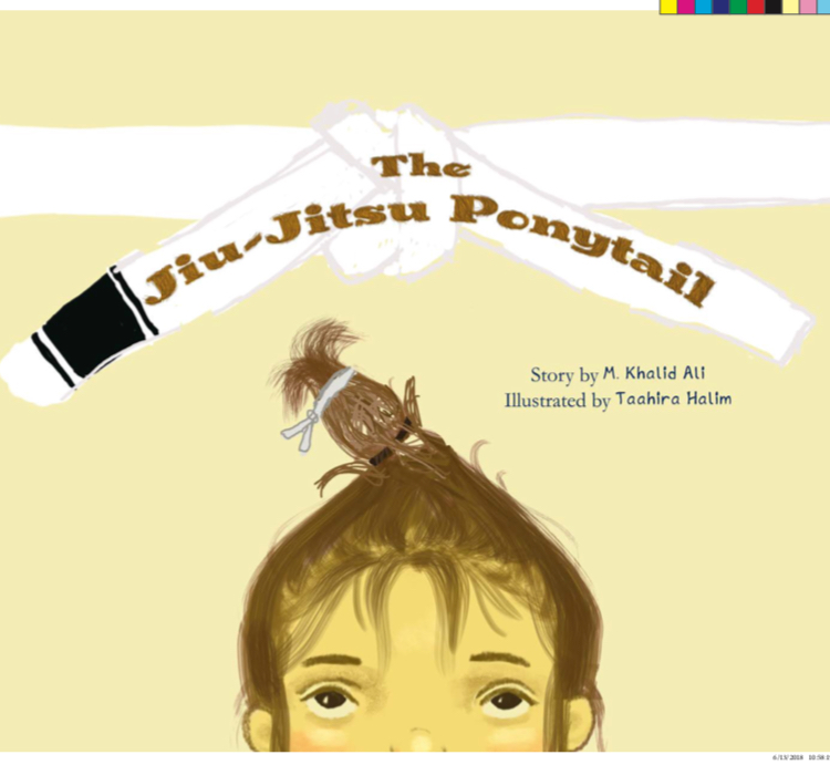
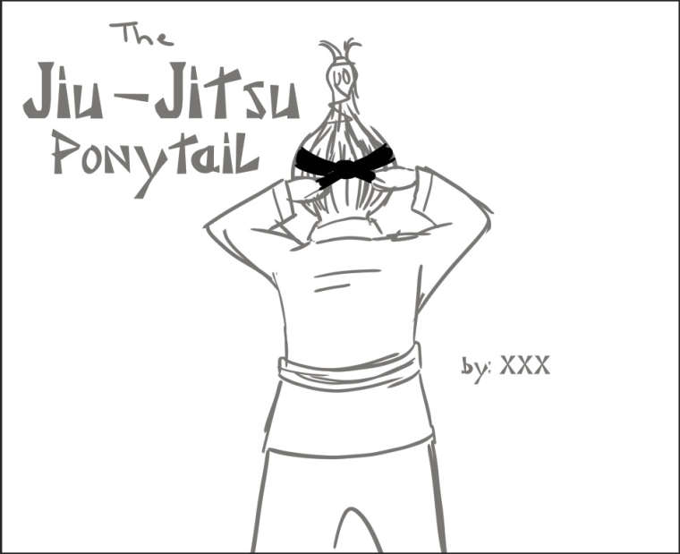
      Title: The Jiu-Jitsu Ponytail
      Target Audience: Girls and boys ages 6-10

      1. 0_1532707538655_image1 (1).jpeg
      2. 0_1532707575997_coveridea1.jpg
      3. 0_1532707602501_coveridea3.jpg
      4. 0_1532707625240_coveridea4.jpg
      5. 0_1532707643123_coveridea5.jpg

      www.instagram.com/tazzyartist
      thalimart.daportfolio.com

      1 Reply Last reply Reply Quote 0
      • rcartwright
        rcartwright last edited by

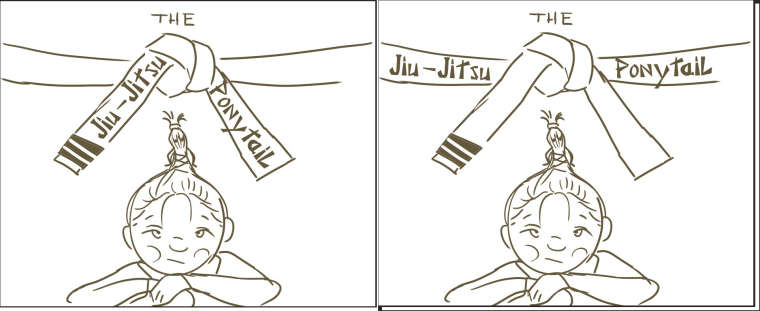
        In 4 there are a couple of tangents with the illustration coming very close or touching the text but I like this design

        https://www.scbwi.org/members/richard-cartwright/
        https://www.instagram.com/richardwcartwright/
        https://www.pinterest.ca/richcartwright3/art-of-richard-cartwright/
        https://www.richardwcartwright.ca/

        tazzyartist 1 Reply Last reply Reply Quote 1
        • Flordevitaz
          Flordevitaz last edited by

          I like number 4 because of the perspective and the way that the ponytail is more important. My only suggestion is about the title, I feel that there is not enough space between the character and the title.

          www.flordevitaz.com
          www.instagram.com/flordevitaaz

          1 Reply Last reply Reply Quote 2
          • ?
            A Former User last edited by

            I like #4, I agree with the others the character is a little too close to the title but I love the perspective and how it gives the attention to the pony tail. I see that #1 has a lot of votes too, maybe work up #4 similarly for a better comparison between the 2.

            1 Reply Last reply Reply Quote 1
            • tazzyartist
              tazzyartist @rcartwright last edited by

              @rcartwright @Flordevitaz @shiggins180 Thank you all! Sounds like you are all saying similar things, that you like the design of 4 but the title placement needs some reworking. Or perhaps I could make the character a bit smaller? Not sure but I can definitely play around with it. According to votes, number 1 is in the lead now but your suggestion is a good one @shiggins180 that maybe I should add some color and more details to 4 to see if that helps.

              www.instagram.com/tazzyartist
              thalimart.daportfolio.com

              1 Reply Last reply Reply Quote 1
              • burvantill
                burvantill Moderator last edited by

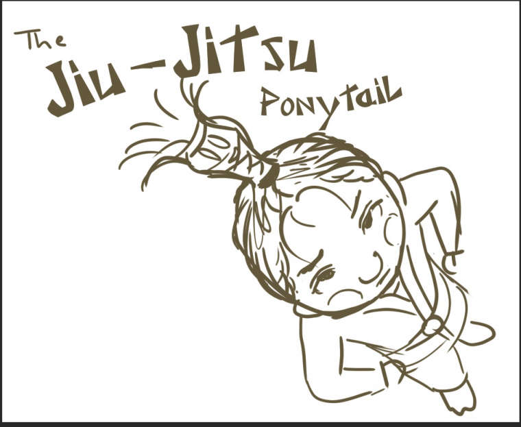
                I like one and four. One, because of the great exasperated expression on her face and, four, because of the perspective and design. If you could put the emotion from one into four that would be perfect. 👍

                Lisa Burvant
                www.lisaburvant.com
                Instagram & Twitter & SVS: @burvantill

                1 Reply Last reply Reply Quote 1
                • First post
                  Last post