WIP Music
-
 Whoops! Sorry about that!
 -
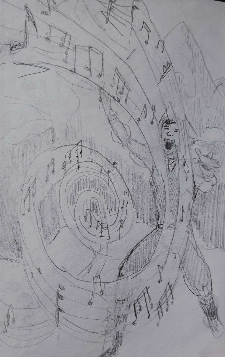
A music based magic system? Sweet! My question would be- have you played with any other compositions in small thumbnail form? While I think this composition could definitely work, I'm kind of wanting to see a couple of different ideas. If the setting is a mountain and he's searching for children, perhaps a more zoomed out view would add impact? It would show the immensity of the situation and perhaps give more weight to the magic. You might not even have to zoom out too much. What about a view slightly from above? That might also show the immensity of the situation while still showing of the magic and keep strong focus on Mikael. It's hard to know for certain without trying it out. But maybe you've already done this and definitely want to stick with this comp?
Website: www.tessawrathall.com
Instagram: www.instagram.com/tessawrathall_art/
-
@chrisaakins Is he controlling the magic coming from somewhere else or is he creating the music magic? Right now it seems as if its coming from somewhere else, and he is manipulating it.
Lisa Burvant
www.lisaburvant.com
Instagram & Twitter & SVS: @burvantill -
@tessaw I was actually trying to get a more aerial effect. I will try a few more things and post them later.
-
@burvantill Both, really. He is singing to the mountains and they are responding back. Not sure how to represent that without making it look like he's vomiting:)
-
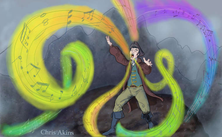
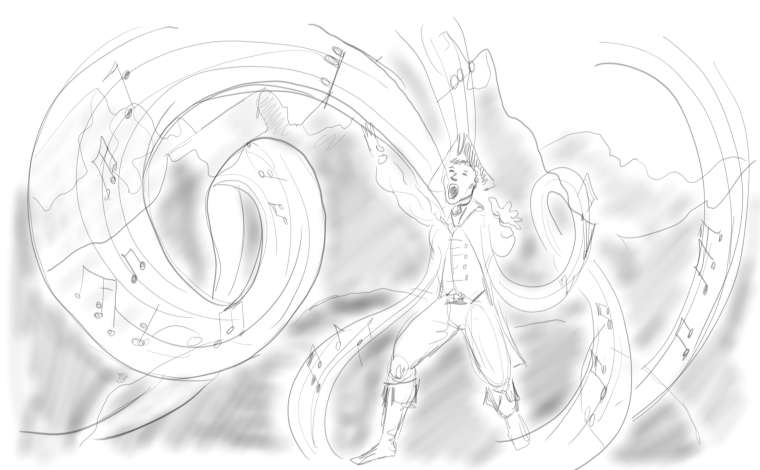 How about this? I took your advice @burvantill and tried to make it look more like the music is coming from him. @TessaW I zoomed out a little and made it more landscape, adding more mountains. Also, this is my first attempt using my surface book. Trying the all-digital platform! Word! I love being able to do layers. And the pen works great.
 -
@chrisaakins YES! good change

-
Here is the idea so far. This is my first time attempting digital art with layers. I would love some validation, but also some critique on technique and composition. I will say it is not finished by any means.
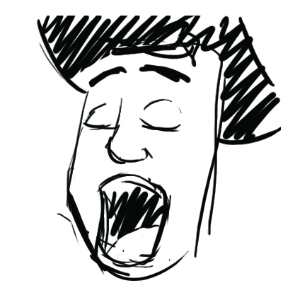
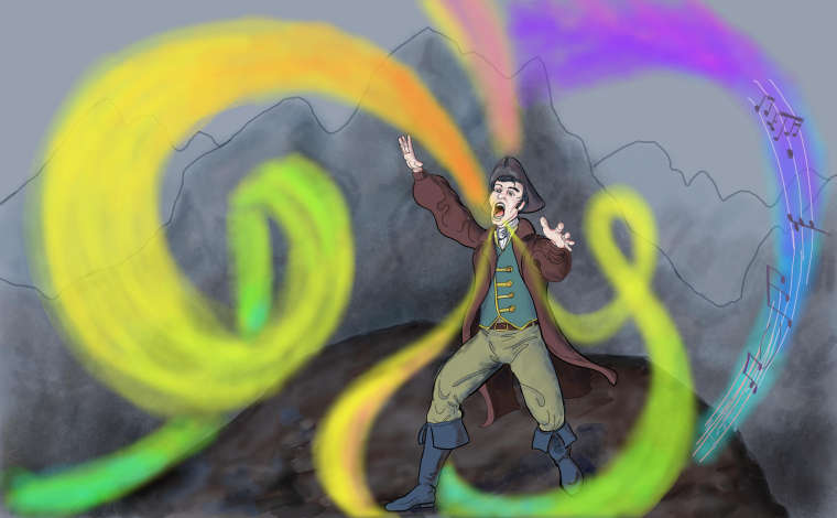 How do you like the music effect? I personally really like the colors. NOt sure if I should mute the musical notes more(I will be adding them everywhere there is a magical color band.) My son says the face is weird and he looks cartoony. I wanted a comic book feel. What do you guys think?
 -
Hi Chris. I love the changes you've made. I would suggest changing his stance a little. In my opinion, he looks a little unbalanced. Maybe something like this:
Sorry, I kind of butchered your character, but hopefully you can tell what I mean about the stance.
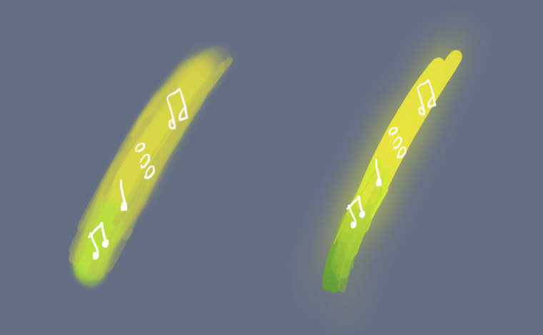
I think you're off to a good start with the rendering. I think you could possibly add some semi-transparent streaks on the magic "ribbons" or perhaps just on the underside to get a sense of more depth. While I like the colors, I think adding some transparent streaks would tone it down just a tad. When you add more music notes, I think you could mute some sections of them, that way they will have a shimmery or metallic look to them that might be cool.
Other than that, I think you could maybe change his eyes so he's gazing upward more, or perhaps shut his eyes. I think it would let us flow through the composition a bit better.
As a side note, I'd like to compliment you on the hands. They are very expressive, something that I think is sometimes forgotten. Hands can enhance the mood so much in an illustration and I think you've nailed that.
This is shaping up really nicely. It makes me very curious about the story! Hope you're having fun with those layers! They can be tricky sometimes.
Website: www.tessawrathall.com
Instagram: www.instagram.com/tessawrathall_art/
-
@tessaw Thank you so much for the input. I was debating about the intensity of the magic. I think your suggestion is a good one. After seeing your sketch of the legs I am inclined to agree with your assessment. Your leg placement looks much more natural. Thank you for the comment about the hands! That is really good to hear. And the eyes....ugh! I have struggled with them from the beginning. Everything I have tried so far looks bad. I will keep plugging away.
-
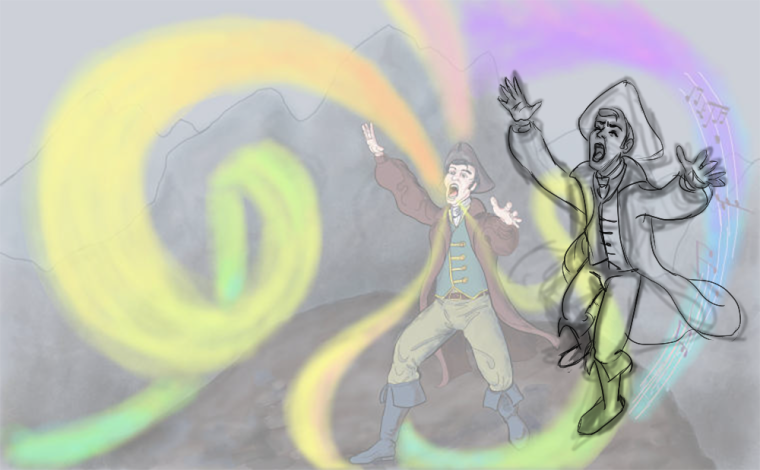
@TessaW Soooo I played around with the legs and I still like the action that the wider stance portrays but I did shadow the one leg to increase the illusion that it is underneath him and that he is walking forward. I took your advice about the eyes and the music. I think they work much better. Thank you so much for the advice. @rcartwright I would be interested in your opinion of the background. Too little? Need more texture? Less?
Anyone and everyone else, is the composition too simplistic or do you feel like it makes you want to read my story more? Does it draw you in? I picture it as a kind of supplemental illustration to a Young adult novel. @Teju-Abiola I would love your input! (Am I being too brazen?)
-
Ha. I think that some of the changes I made on the lessening of the music did not show through. I may repost later. Oh well.
-
@chrisaakins Hi, Chris! I think having the saturated colors in the foreground against the desaturated background is great. It helps put emphasis on the magic and show how it's a force affecting the world. I don't think the background requires a lot of detail especially if you want the focus on the foreground and middle ground. I would make sure we can tell what he's standing on though and the plane of the ground. Extend the image lower or move him up higher because he is butting up against the frame and that is dragging my eyes from your focal point. I'd also watch out for the sharp angle and straight line that you've made with the greenish swirl on the right. It's distracting from your focal point and halting the smooth flow of that curve. It's also unfortunately located on a third, which draws it even more attention.
I agree with @TessaW about the character's pose being unbalanced. I feel like the music notes in the swirls are either too unsaturated or too light and need more emphasis. Maybe even trying making them white or a light color could work. I think the magic could feel more 'magical'. It's what one of my teacher's calls a 'phenomenon'. It needs to feel otherworldly and like a special effect almost. Try messing with the transparency and saturation in some parts to demonstrate depth and the way light is interacting with the magic.
I like the colors that you have going on, and I think you could add some more blue and purple.
I'm sorry if that is a lot! Don't think you have to try and change everything I suggested; it's just my opinion and do what you think is best. I really like this concept and am excited to see how you finish it out
") !!!
!!! -
@chrisaakins Personally I feel like there shouldn't be a background. I would keep it neutral. I would also consider making it a spot illustration with an ova shape and even cropping out most of the guys body, editing out things that are not relevant to the message is always a good way to go.
-
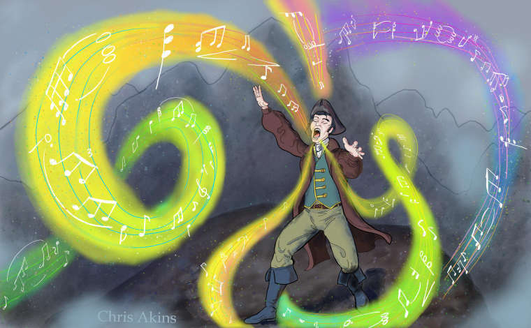
@Teju-Abiola @TessaW I fixed the magic. How do you like it? More magical now? I have an idea to fix the legs. I am thinking of having him sit cross-legged on a pile of boulders. Hopefully that will fix the leg and composition troubles. Thanks for all the input. @rcartwright The background is relevant due to the fact that he is singing to the mountains and they are answering back.
-
@chrisaakins I like it. I love the costume design. one suggestion is that eyebrows are extremely expressive, you may want to pivot them up in the middle to give him a more joyful expression.
keep up the good work. -
Hi Chris. I like the change you made to his eyes, and I think that making the notes white was also a great idea.
I have a couple of nit-picky ideas, which you may feel free to disregard!
-
Think about making his pants just a tad darker. It is framed in a wide open space, and I feel it's stealing attention away from the magic. I don't think you need to go overboard, just push it a little more toward a mid-range value.
-
I think that the music ribbons look a little mushy, instead of glowing. Perhaps if you made the edges firmer, and then went on another layer, used a very soft airbrush to overlay a very saturated color, then lowered the opacity, it might give a nice glowing effect. Not sure if that's what you're after though! Just a suggestion.
-
-
@TessaW I agree with the mushiness and I think I am okay with it. In the immortal words of @Jake-Parker I just need to finish it. I will not make it perfect. That being said, I am very pleased with the seated arrangement I put in the finished work. I am posting it tonight. Feel free to go and take a look.
Thanks to all who gave me input! I really learned a ton going through this process. You made this more of a team effort and I am encouraged to keep on going. Maybe actually finish writing the second book and maybe even make it a graphic novel.