Society of Visual Storytelling

    SVSLearn Forums

    • Register
    • Login
    • Search
    • Recent
    • Tags
    • Popular
    • Users
    • Groups
    • Search

    Music Wip- Update- Color Help

    Artwork
    29
    73
    6890
    Loading More Posts
    • Oldest to Newest
    • Newest to Oldest
    • Most Votes
    Reply
    • Reply as topic
    Log in to reply
    This topic has been deleted. Only users with topic management privileges can see it.
    • TessaW
      TessaW last edited by

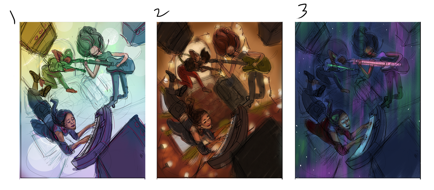
      I've come up with 3 color comps. Wish I could do more, but I'm running out of time. These are basic color rough-ins and the value structure is not completely worked out. Does anyone have an opinion on which one I should go with?
      0_1535223707670_Music Color Comps.png

      Website: www.tessawrathall.com

      Instagram: www.instagram.com/tessawrathall_art/

      Jabbernewt rcartwright 2 Replies Last reply Reply Quote 2
      • Jabbernewt
        Jabbernewt @TessaW last edited by Jabbernewt

        @tessaw Hiya Tessa!

        I can sense three distinct moods here between the color roughs, with the first and third being much more fantastical than the second. Yet even though the first and third are the more fantastic of the three, there's a relatability to the second which, for a young adult such as me, feels more real; more easily identified with. I think one reason I feel this way is just that you've already established the situation as fantastic with the general composition and the gestures of your characters. By that I mean to say that the contrast between the more realistic tone, what with the Christmas lights and colors/space which is more familiar to a young adult, (which is to say that young adults spend a lot of their time living and sharing small spaces, thereby making the small space here more familiar) and the floaty gestures/equipment is refreshing, and seems to denote the power music has to change the ordinary in a more concrete fashion. The other two are certainly excellent takes on that same statement, but I feel you will have more people who identify with the middle comp than the other two.

        ...though I will admit that I am a sucker for warm color palettes.

        Pax

        TessaW 1 Reply Last reply Reply Quote 1
        • rcartwright
          rcartwright last edited by

          I choose 1

          https://www.scbwi.org/members/richard-cartwright/
          https://www.instagram.com/richardwcartwright/
          https://www.pinterest.ca/richcartwright3/art-of-richard-cartwright/
          https://www.richardwcartwright.ca/

          1 Reply Last reply Reply Quote 1
          • rcartwright
            rcartwright @TessaW last edited by

            @tessaw My choice of 1 may have more to do with value than color 1 reads instantly where the other two made my brain work more to understand what was happening

            https://www.scbwi.org/members/richard-cartwright/
            https://www.instagram.com/richardwcartwright/
            https://www.pinterest.ca/richcartwright3/art-of-richard-cartwright/
            https://www.richardwcartwright.ca/

            1 Reply Last reply Reply Quote 2
            • TessaW
              TessaW @Jabbernewt last edited by TessaW

              @jabbernewt Interesting point. Thanks for the analysis!

              @rcartwright Good point. I have to remember that others can't see the potential I'm seeing in my head. I should be more careful that my roughs are reading well to others. I was more focused on establishing a color palette and overall mood, but it would have been better to sort it out more fully for presenting it here.

              Website: www.tessawrathall.com

              Instagram: www.instagram.com/tessawrathall_art/

              1 Reply Last reply Reply Quote 1
              • Jason Bowen
                Jason Bowen SVS OG last edited by

                I really like the etheral feel of number 3. Looks great.

                https://www.instagram.com/jasonbowenoils/

                TessaW 1 Reply Last reply Reply Quote 1
                • Jabbernewt
                  Jabbernewt last edited by

                  Very conclusive results so far šŸ˜‰

                  Pax

                  1 Reply Last reply Reply Quote 1
                  • TessaW
                    TessaW @Jason Bowen last edited by TessaW

                    @jason-bowen Thank you!

                    @Jabbernewt lol, I know.

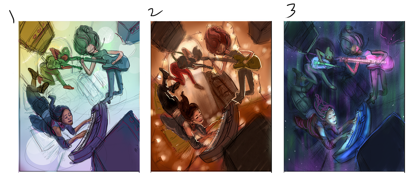
                    I tried to make 2 and 3 a little more clear to read. Don't know if it's better. It's hard for me to get it to read well without putting in a lot of time, so hopefully you can see a general idea of where they might go.
                    0_1535231002158_Music Color Comps 2.png

                    Website: www.tessawrathall.com

                    Instagram: www.instagram.com/tessawrathall_art/

                    nasvikdraws burvantill 2 Replies Last reply Reply Quote 5
                    • kaitlinmakes
                      kaitlinmakes last edited by

                      I agree with @Jabbernewt about number 2

                      https://www.instagram.com/kaitlin.kahn.art
                      Https://www.kaitlinkahn.com

                      1 Reply Last reply Reply Quote 2
                      • Eli
                        Eli last edited by

                        I like 2 also.

                        1 Reply Last reply Reply Quote 1
                        • Davidingalls
                          Davidingalls last edited by

                          I’m on team 2 but like 1 a lot also.

                          1 Reply Last reply Reply Quote 1
                          • SarahLuAnn
                            SarahLuAnn last edited by

                            2 is my favorite, 1 is also nice. 3 just doesn't have great silhouettes.

                            sarahluann.com

                            1 Reply Last reply Reply Quote 1
                            • nasvikdraws
                              nasvikdraws @TessaW last edited by

                              @tessaw Can't wait to see where this one goes. You can feel the energy. The perspective, the characters are very dynamic.
                              I see everybody is leaning towards the second one and I see that that one has the most specific mood and atmosphere. However, to me there is a slight disconnection between the warm colors, the cozy Christmas lights and the energy in the characters. I would further emphasize the characters' imagination with lighting and colors. I would merge somehow the cozy room interior with harsh lighting and futuristic colors of a grandiose concert.
                              I am rooting for this one šŸ™‚

                              www.instagram.com/nasvikdraws
                              www.facebook.com/nasvikdraws

                              1 Reply Last reply Reply Quote 2
                              • braden H
                                braden H last edited by

                                I like #2 the best. I can see how #1 would be a lot easier to pull off, though.

                                Either way, it's gonna look awesome!

                                Jabbernewt 1 Reply Last reply Reply Quote 2
                                • Jabbernewt
                                  Jabbernewt @braden H last edited by

                                  @art-of-b said in Music Wip- Update- Color Help:

                                  I like #2 the best. I can see how #1 would be a lot easier to pull off, though.

                                  Either way, it's gonna look awesome!

                                  Agreed!

                                  Pax

                                  1 Reply Last reply Reply Quote 1
                                  • burvantill
                                    burvantill Moderator @TessaW last edited by

                                    @tessaw 2! I liked it before and now I like it more. 😃

                                    Lisa Burvant
                                    www.lisaburvant.com
                                    Instagram & Twitter & SVS: @burvantill

                                    1 Reply Last reply Reply Quote 1
                                    • Chip Valecek
                                      Chip Valecek SVS Team SVS OG last edited by

                                      @TessaW I like #2 and #3. #3 feels more like a dream to me where #2 feels more real.


                                      https://www.instagram.com/chipvalecek/
                                      https://www.facebook.com/cvalecek
                                      http://www.cshellmedia.com/

                                      1 Reply Last reply Reply Quote 1
                                      • Mandy Forte
                                        Mandy Forte last edited by

                                        I like #1. It has more of a surreal feeling. Which helps sell the floating. When I look at #2 I find myself trying to figure out if they are jumping or how they are laying on the floor or what is going on in general, just because the colors feel more real.

                                        1 Reply Last reply Reply Quote 1
                                        • TessaW
                                          TessaW last edited by TessaW

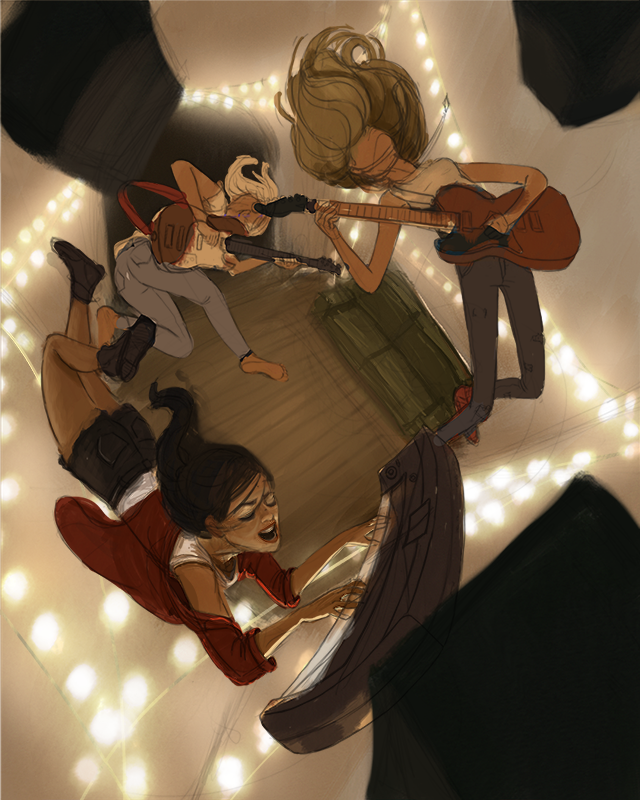
                                          Guys, thanks so much for the feedback. It's really pushing me to get this done. I've decided to go with #2 and I am also going to attempt to bring in a hint of concert lighting at the very end, to see if I can get a little bit of a combo of #2 and #3 going on. If it doesn't work out, I can always just delete the layers. This made me realize I didn't even look at concert photos when I was trying to figure out the lighting of this piece. Duh.

                                          Here's a work in progress. Still a lot to be done. My main focus right now is figuring out the local colors of things and building up the light and shadow and cleaning up the forms. Then I'll probably add the wires to the amps/instruments (which I'm hoping will sell the idea that they are floating better), and figure out the hair a bit more. Last will be playing with hints of concert lighting.
                                          0_1535297921355_Music 2018 Color Final First Pass WIP.png

                                          Website: www.tessawrathall.com

                                          Instagram: www.instagram.com/tessawrathall_art/

                                          Kevin Longueil Nyrryl  Cadiz 2 Replies Last reply Reply Quote 9
                                          • chrisaakins
                                            chrisaakins last edited by

                                            Wow. @TessaW this is looking great. I really like the lights in the background. This is so creative.

                                            Chris Akins
                                            www.chrisakinsart.com
                                            www.instagram.com/chrisakinsart/

                                            1 Reply Last reply Reply Quote 1
                                            • First post
                                              Last post