Music Wip- Update- Color Help
-
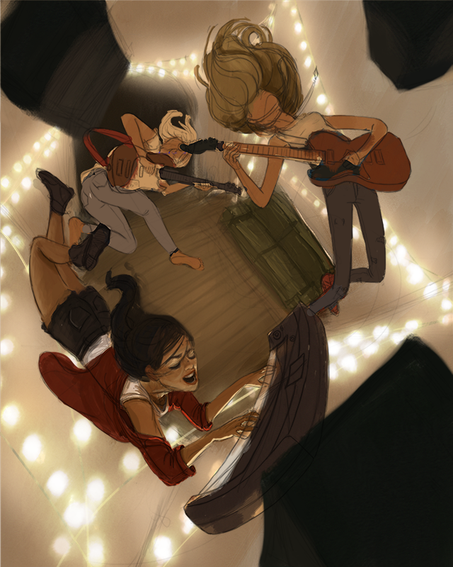
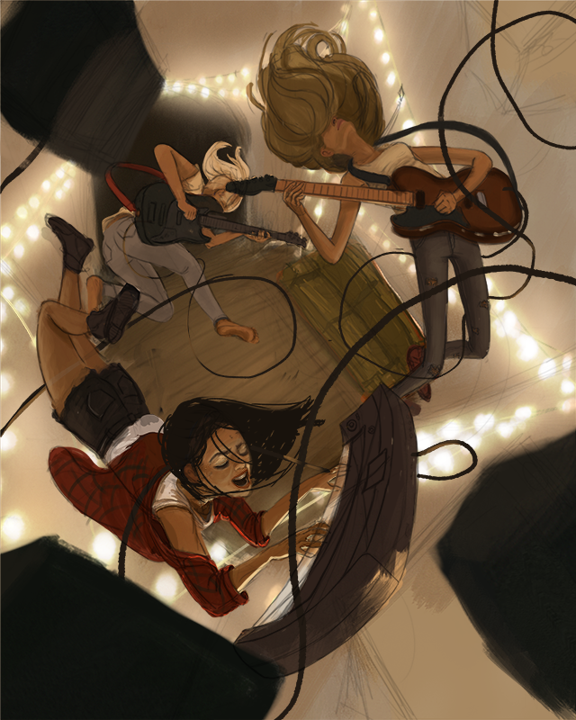
2 is my favorite, 1 is also nice. 3 just doesn't have great silhouettes.
-
@tessaw Can't wait to see where this one goes. You can feel the energy. The perspective, the characters are very dynamic.
I see everybody is leaning towards the second one and I see that that one has the most specific mood and atmosphere. However, to me there is a slight disconnection between the warm colors, the cozy Christmas lights and the energy in the characters. I would further emphasize the characters' imagination with lighting and colors. I would merge somehow the cozy room interior with harsh lighting and futuristic colors of a grandiose concert.
I am rooting for this one
-
I like #2 the best. I can see how #1 would be a lot easier to pull off, though.
Either way, it's gonna look awesome!
-
@art-of-b said in Music Wip- Update- Color Help:
I like #2 the best. I can see how #1 would be a lot easier to pull off, though.
Either way, it's gonna look awesome!
Agreed!
-
@tessaw 2! I liked it before and now I like it more.

-
@TessaW I like #2 and #3. #3 feels more like a dream to me where #2 feels more real.
-
I like #1. It has more of a surreal feeling. Which helps sell the floating. When I look at #2 I find myself trying to figure out if they are jumping or how they are laying on the floor or what is going on in general, just because the colors feel more real.
-
Guys, thanks so much for the feedback. It's really pushing me to get this done. I've decided to go with #2 and I am also going to attempt to bring in a hint of concert lighting at the very end, to see if I can get a little bit of a combo of #2 and #3 going on. If it doesn't work out, I can always just delete the layers. This made me realize I didn't even look at concert photos when I was trying to figure out the lighting of this piece. Duh.
Here's a work in progress. Still a lot to be done. My main focus right now is figuring out the local colors of things and building up the light and shadow and cleaning up the forms. Then I'll probably add the wires to the amps/instruments (which I'm hoping will sell the idea that they are floating better), and figure out the hair a bit more. Last will be playing with hints of concert lighting.

-
Wow. @TessaW this is looking great. I really like the lights in the background. This is so creative.
-
@tessaw really nice!!
-
Exciting Tessa! you rock!

-
Thanks guys! I bit more progress. I'm trying to figure out the design of the cords. Not sure if I can get this done in time.

-
@tessaw I love watching your progress. Its going to be a great piece when you are done. One thing I would watch out for is the cord going around the neck of the keyboard player. Maybe move it lower of her back so its not going to choke her. Also the cord at the top right leads my eye of the page, maybe bring that around to the left side to keep the viewers eye moving around the piece.
-
@tessaw Keep going this is looking awesome!
-
Oh my gosh - this piece is awesome!
-
Looks great, the lighting is amazing!
-
@tessaw oh my gosh! This is Gorgeous! AMAZING!!!!! I love you color! I love your composition! I love it all!!!
-
Thank you!
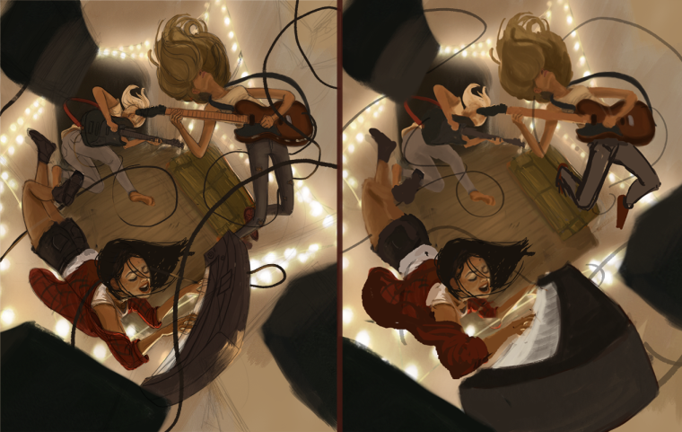
I had a bit of a set back. Someone on my online sketchbook suggested pushing the perspective a bit more, so I've spent some time figuring out how that would work. Thoughts? Left side is the original direction, right side is a rough lay-in of tweaked perspective.

-
It's awesome that you're up for experimenting with new ideas throughout the process of making this piece. I learn so much from people who take suggestions to heart. Personally, I think your original image looks more cohesive. The perspective in the piece is already very dynamic, to my eye, because of the environment. Having the musicians as a separate middle ground seems to let my mind settle in and enjoy the piece. With the keyboard becoming more of a foreground element, I think it draws the eyes to the other foreground objects (speakers) which actually aren't as important. Some thoughts to consider.

-
@tessaw I think it will be great whichever way you go but i do like the original of the two - forced perspective is a cool thing for sure - i think though that it becomes an extra element in a way which invites scrutiny beyond the composition itself - i find myself looking at the scale of a thing in the foreground and comparing it to the background...the edge of the keyboard closest to us is about four time as long as its' other edge...to me it seems like a dramatic change over a short distance but nothing else is quite following this rule - it is probably just me over thinking it though but the first one did not make me wonder about consistency of perspective and it looks really awesome - super nice piece!!