Society of Visual Storytelling

    SVSLearn Forums

    • Register
    • Login
    • Search
    • Recent
    • Tags
    • Popular
    • Users
    • Groups
    • Search

    Business Start up: Which logo?

    Artwork
    16
    19
    1669
    Loading More Posts
    • Oldest to Newest
    • Newest to Oldest
    • Most Votes
    Reply
    • Reply as topic
    Log in to reply
    This topic has been deleted. Only users with topic management privileges can see it.
    • Elizabeth Rose
      Elizabeth Rose last edited by

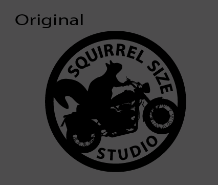
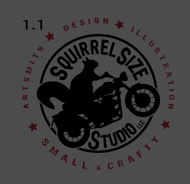
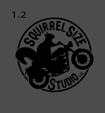
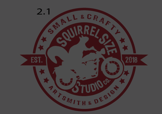
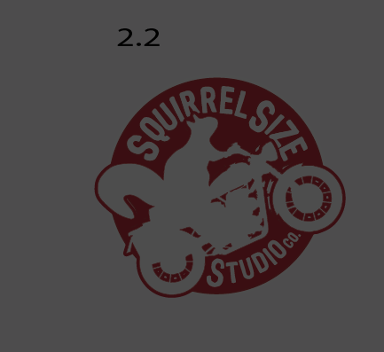
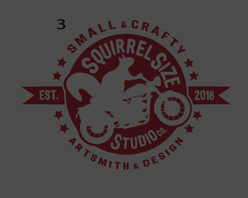
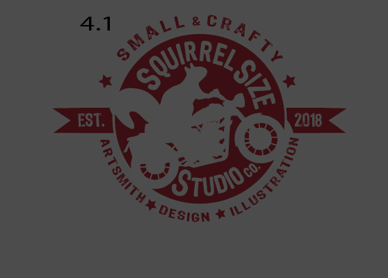
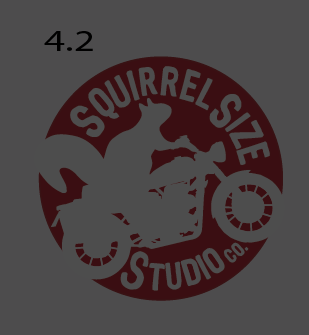
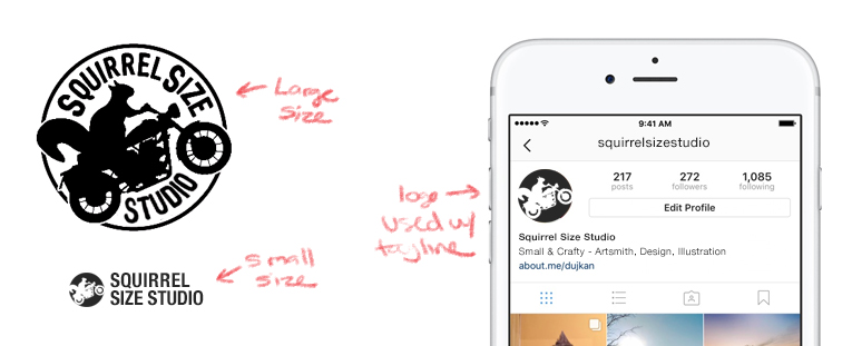
      Next year I plan to start my own Design/Illustration/Art Contracting business. I've been playing around with my logo some, and I've come up with a few different variations. Some are several months old and don't include the word "illustration". But I'm wanting some input on the design compositions over all. The 1.2, 2.2 and the 4.2 are secondary logos which just means they don't include the extra words. Any crits, thoughts, or suggestions? (Also, please ignore the color various, they are irrelevant at this point)

      0_1539090944817_Screen Shot 2018-10-09 at 8.09.50 AM.png 0_1539090948846_Screen Shot 2018-10-09 at 8.09.58 AM.png 0_1539090952725_Screen Shot 2018-10-09 at 8.10.03 AM.png 0_1539090963628_Screen Shot 2018-10-09 at 8.10.12 AM.png 0_1539090967117_Screen Shot 2018-10-09 at 8.10.55 AM.png 0_1539090980067_Screen Shot 2018-10-09 at 8.10.37 AM.png 0_1539091005513_Screen Shot 2018-10-09 at 8.10.43 AM.png 0_1539091009878_Screen Shot 2018-10-09 at 8.11.10 AM.png

      https://elizabethrosehoffman.com/
      https://www.instagram.com/elizabethrosehoffmanart/
      https://linktr.ee/elizabethrosehoffman

      Chip Valecek Sas M 3 Replies Last reply Reply Quote 2
      • chrisaakins
        chrisaakins last edited by

        I think 4.2 and 1.2 are best.

        Chris Akins
        www.chrisakinsart.com
        www.instagram.com/chrisakinsart/

        1 Reply Last reply Reply Quote 2
        • NessIllustration
          NessIllustration Pro last edited by

          I really quite like 2.1, 3 and 4.1! That vintage feel is really cool πŸ™‚ However it maybe has a bit more text. I like the text on the outside, so one suggestion could be to put Squirrel Size and Studio co. on the outside, top and bottom. That would also give the squirrel a bit more space to breathe πŸ™‚

          vanessastoilova.com
          instagram.com/vanessa.stoilova/

          Check out my Youtube channel for tips on how to start your career in illustration! www.youtube.com/c/ArtBusinesswithNess

          1 Reply Last reply Reply Quote 2
          • Chip Valecek
            Chip Valecek SVS Team SVS OG @Elizabeth Rose last edited by

            @squirrelsize I like 1.1 and 2.1


            https://www.instagram.com/chipvalecek/
            https://www.facebook.com/cvalecek
            http://www.cshellmedia.com/

            1 Reply Last reply Reply Quote 1
            • StudioLooong
              StudioLooong last edited by StudioLooong

              I agree with @chrisaakins , you don't need the extra text around the edges. Remember that your logo needs to work at really small sizes. That small text around the edges becomes illegible very quickly. You may want to stick with it just saying "squirrel size studios" at larger sizes and have your variation for smaller sizes just be the icon or the icon with the text outside the circle. Additionally, you don't need to include LLC or CO unless that is something that helps brand recognition ( for example if your handles on social media are "@squirrelsizestudioco" ). Small & Crafty is a really cool tagline, I would definitely keep it and use it but not in your logo lockup. Maybe consider something like this:

              0_1539096704280_sss.jpg

              Taylor Woolley
              (Formerly Taylor Ackerman / StudioLooong)


              Website: www.woolleystories.com
              Instagram: https://www.instagram.com/woolleystories/

              1 Reply Last reply Reply Quote 5
              • Jason Bowen
                Jason Bowen SVS OG last edited by

                1.2 with a white background I assume looks good to me.

                https://www.instagram.com/jasonbowenoils/

                1 Reply Last reply Reply Quote 1
                • rcartwright
                  rcartwright last edited by

                  If I may here are a couple things to think on

                  Drop the word size. I understand why it is there but if you say it out loud it sounds a bit clunky.

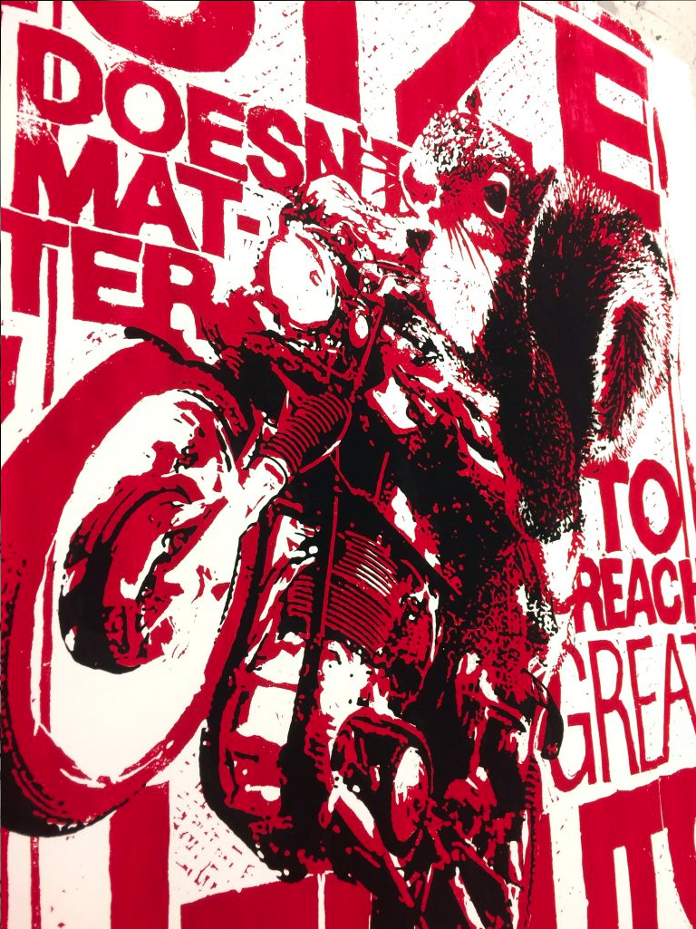
                  Why a motor bike? if I saw this on a shirt or sign I would think it was for some sort of motor cross thing or bike shop especially with the vintage feeling versions.

                  Just my thoughts based on my initial impression

                  https://www.scbwi.org/members/richard-cartwright/
                  https://www.instagram.com/richardwcartwright/
                  https://www.pinterest.ca/richcartwright3/art-of-richard-cartwright/
                  https://www.richardwcartwright.ca/

                  1 Reply Last reply Reply Quote 1
                  • Elizabeth Rose
                    Elizabeth Rose last edited by Elizabeth Rose

                    You all are the best! So many good tips!

                    @chrisaakins @NessIllustration @Chip-Valecek @Jason-Bowen Hey, thanks you all a ton for your input on which ones are your favs. It helps a lot!

                    Thanks @StudioLooong, You make some really good points. I love the small icon idea! I'll have to change my SVS profile pic to that instead. Also great suggestions about leaving the LLC/Co off on Social media.

                    @rcartwright I agree the word "Size" does make it read aloud clunky. Sadly someone already has the name " Squirrel Studio"
                    The "Squirrel Size" name is actually from an inside joke me and my colleagues have, but I'm open to any suggestions on the name. And the Bike is from a kids book series I've been working on. But I do see where you are coming from with the motor bike.

                    https://elizabethrosehoffman.com/
                    https://www.instagram.com/elizabethrosehoffmanart/
                    https://linktr.ee/elizabethrosehoffman

                    1 Reply Last reply Reply Quote 0
                    • Ailantan
                      Ailantan last edited by

                      I like 2.1, but i would use dark inside.

                      https://www.instagram.com/ailantanart/

                      1 Reply Last reply Reply Quote 1
                      • Sas
                        Sas @Elizabeth Rose last edited by

                        @squirrelsize I really like 1.1 and 4.1. Nice logos!

                        https://www.instagram.com/sasmakkinje/

                        1 Reply Last reply Reply Quote 1
                        • burvantill
                          burvantill Moderator last edited by

                          I like the simplicity of the original design, I was questioning the motorcycle as well. After reading everyone’s comments I had a little idea about maybe removing the bike and making the dark circle around the squirrel be a bike tire? Maybe? Just a thought. Good start. Remember to keep it as simple and straightforward as possible. I like logo images that are just an image without text. The text can be support later, as in business cards or website kinda thing. Look at @smceccarelli or even the SVS logos. Recognizable unique images. πŸ™‚

                          Lisa Burvant
                          www.lisaburvant.com
                          Instagram & Twitter & SVS: @burvantill

                          1 Reply Last reply Reply Quote 1
                          • Elizabeth Rose
                            Elizabeth Rose last edited by

                            Thanks you all for your votes! @Ailantan @Sas

                            @burvantill Thanks for the advice. You have some really good pointers. Yeah, I might try to play around with the bike, maybe take it out.
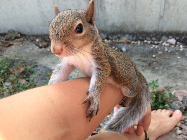
                            The back story of the squirrel on the bike started with a screen print I made in college. I raised a baby squirrel during a semester, and one day decided to photoshopped him onto a bike with the words "Size doesn't matter to reach great heights"

                            From that I've started working on a kids book series about a small squirrel overcoming big obstacles.

                            But as an image that represents my whole business I can see it could be stretching it

                            P.S. The baby squirrels name is Ivan πŸ™‚

                            0_1539263136225_Screen Shot 2018-10-11 at 8.05.17 AM.png
                            0_1539263055459_Screen Shot 2018-10-11 at 8.03.57 AM.png

                            https://elizabethrosehoffman.com/
                            https://www.instagram.com/elizabethrosehoffmanart/
                            https://linktr.ee/elizabethrosehoffman

                            Eli 1 Reply Last reply Reply Quote 3
                            • Eli
                              Eli @Elizabeth Rose last edited by

                              @squirrelsize I actually love the name Squirrelsize...Now even more with the backstory

                              1 Reply Last reply Reply Quote 1
                              • Martha Sue
                                Martha Sue last edited by Martha Sue

                                I love the vibe of the biker squirrel, and 'small and crafty' is a great tagline! It all depends on your values/key attributes and how it fits into your story. Maybe you are super fast and dynamic. I like 4.2 best. πŸ™‚ I feel like it could be worth playing more with the type, and negative space in general. Might be possible to simplify the shape of the bike to read better small. Also wonder if it has to have the 'co'? The S in Studio seems much bigger in relation to the rest of the word than in the other two words. Last thought- maybe all those elements like 'small & crafty' could be used in other parts of your brand system. I don't know that your primary logo has to fit in everything. I took an awesome Coursera class on brand creation recently and it was great: https://www.coursera.org/learn/brand-new-brand

                                1 Reply Last reply Reply Quote 2
                                • jaepereira
                                  jaepereira SVS OG last edited by

                                  2.1 minus the established ribbon or 4.2. Cool logo

                                  jaepereira.com
                                  instagram.com/jaepereiraart

                                  1 Reply Last reply Reply Quote 1
                                  • Buddy Skelton
                                    Buddy Skelton last edited by

                                    Version 1.2 is the best I feel.

                                    Instagram: @StepOne_DrawCircle

                                    1 Reply Last reply Reply Quote 1
                                    • Elizabeth Rose
                                      Elizabeth Rose last edited by

                                      @jaepereira @Buddy-Skelton Hey you all, thanks for your input, its a lot of help πŸ™‚

                                      Thanks @Martha-Sue Wow, Yes! I agree, simplifying the bike so it could be viewed small is a smart idea. I see what you mean about the "S" in Studio now too, I'll mess around with it. Good advice about the tagline 'Small & Crafty'. I had some branding classes in college, but I think I still need to do some more research on branding. Thanks again for your comment πŸ™‚

                                      https://elizabethrosehoffman.com/
                                      https://www.instagram.com/elizabethrosehoffmanart/
                                      https://linktr.ee/elizabethrosehoffman

                                      1 Reply Last reply Reply Quote 0
                                      • M
                                        Mara Price @Elizabeth Rose last edited by

                                        @Elizabeth-Rose I like 2.1 and 3

                                        1 Reply Last reply Reply Quote 0
                                        • aska
                                          aska last edited by

                                          2.1! love it

                                          Aska
                                          www.mugaska.com
                                          https://www.instagram.com/mugaska/
                                          https://www.etsy.com/uk/shop/mugaska

                                          1 Reply Last reply Reply Quote 0
                                          • First post
                                            Last post