Society of Visual Storytelling

    SVSLearn Forums

    • Register
    • Login
    • Search
    • Recent
    • Tags
    • Popular
    • Users
    • Groups
    • Search

    Halloween illustration WIP

    Projects
    digital sketch illustration halloween
    15
    67
    37870
    Loading More Posts
    • Oldest to Newest
    • Newest to Oldest
    • Most Votes
    Reply
    • Reply as topic
    Log in to reply
    This topic has been deleted. Only users with topic management privileges can see it.
    • NoWayMe
      NoWayMe last edited by

      Hello again!!

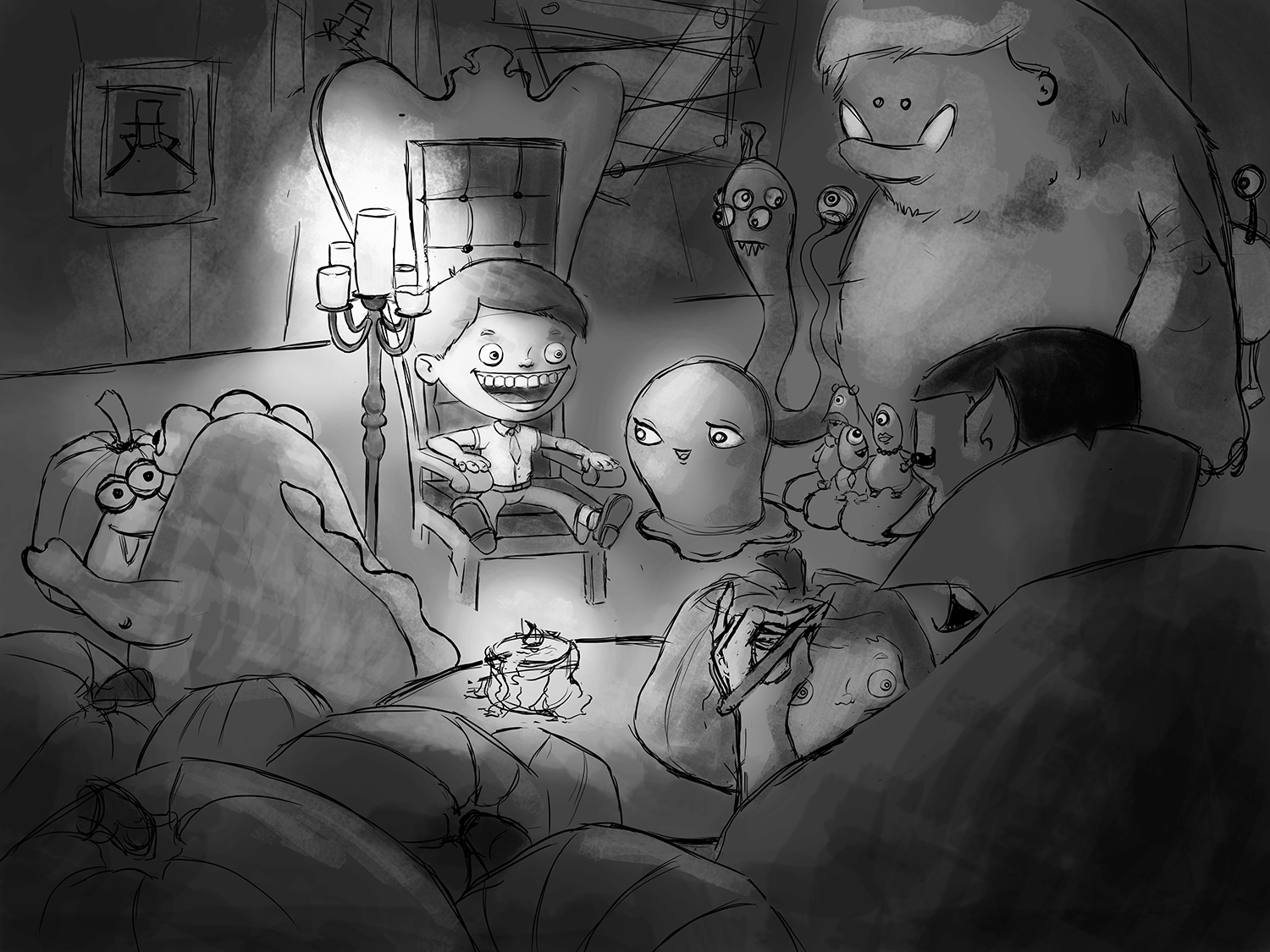
      So Halloween is over, but I am still working on my illustration! (I would like to put it in my portfolio when it's done)
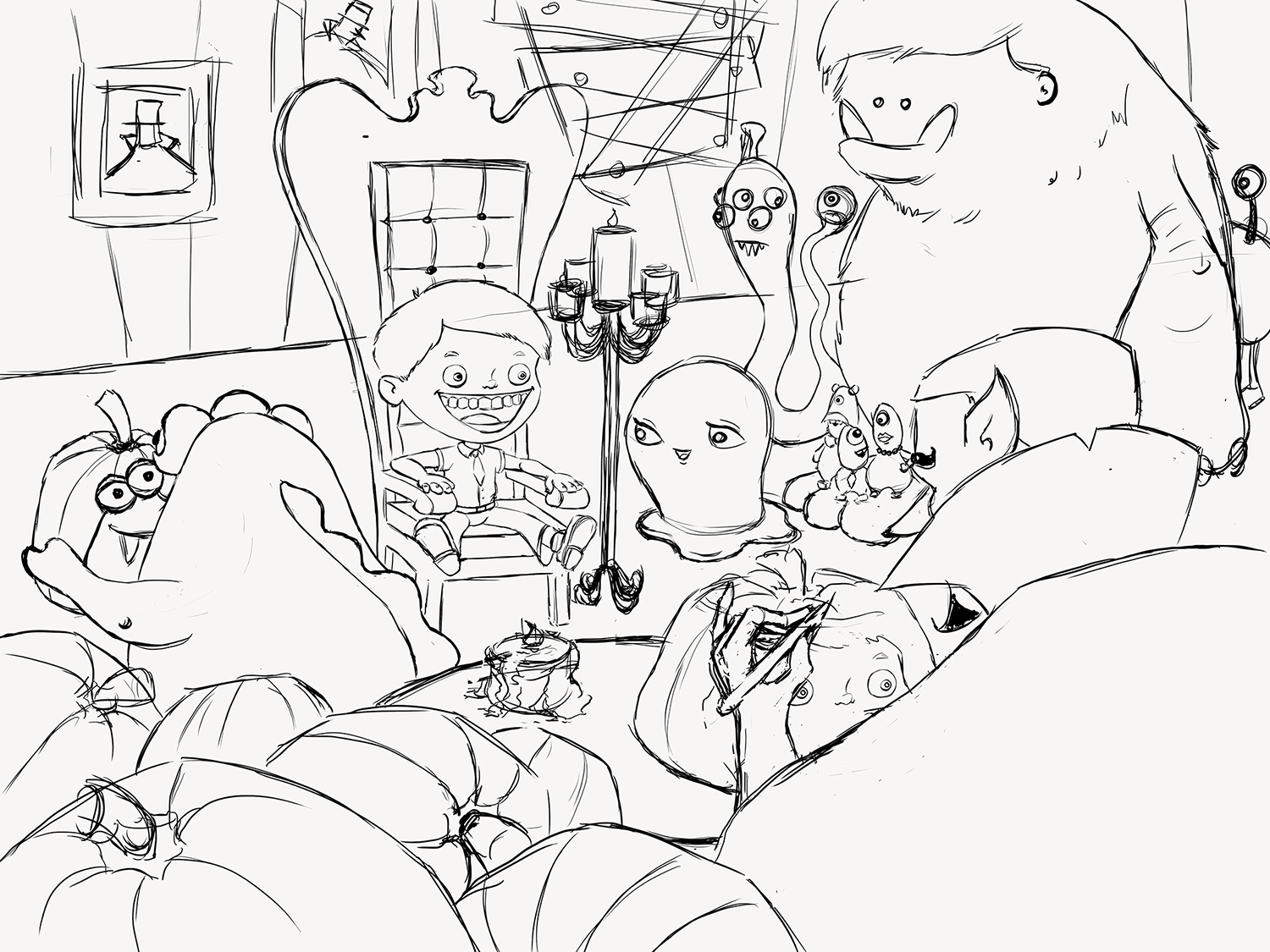
      With all your help, I came up with this (almost) final version for the sketch! Anything I should modify before starting colors ? The background is still very rough, I will probably change it a little.

      Hope everyone had a great Halloween!

      Count Pumpkin 4.jpg

      noemiegionetlandry.squarespace.com
      noemie_illustration on Instagram

      Thrace 1 Reply Last reply Reply Quote 2
      • Naroth Kean
        Naroth Kean last edited by

        I really like it! this is very cute XD because he is carving his the boy face out of the pumpkin. I think the new composition is great. It's going to be awesome!

        http://narothkean.com
        https://twitter.com/narothkean
        https://www.instagram.com/narothkean

        1 Reply Last reply Reply Quote 0
        • Thrace
          Thrace @NoWayMe last edited by

          @NoWayMe it looks awesome! One little thing though, I like the old mouth on the boy much better than the new one. The new one just doesn't look right to me. Just my opinion wait and see what others think. Can't wait for you to paint it!!

          1 Reply Last reply Reply Quote 0
          • Leontine
            Leontine last edited by

            Its a really nice piece! Cant wait to see the colors appearing! I agree With @Thrace-Shirley-Mears about the mouth.

            Leontine
            "A picture is worth a thousand words."

            https://leontineillustrator.com
            https://www.instagram.com/leontine.illustrator/
            http://www.facebook.com/leontineillustration

            1 Reply Last reply Reply Quote 0
            • NoWayMe
              NoWayMe last edited by

              Thank you all for the comments! I'll re-modify the mouth, I think it's the tongue... anyway it's true it looked better before!

              noemiegionetlandry.squarespace.com
              noemie_illustration on Instagram

              1 Reply Last reply Reply Quote 1
              • Naroth Kean
                Naroth Kean last edited by Naroth Kean

                one thing I have to point out, it's the candle that shit right in mid of the illustration. I would move it back a bit so it sits behind and between the boy and the monster to the right. Now It divides the page and stops the flow of the composition. Again lovely piece!

                http://narothkean.com
                https://twitter.com/narothkean
                https://www.instagram.com/narothkean

                shinjifujioka 1 Reply Last reply Reply Quote 0
                • shinjifujioka
                  shinjifujioka SVS OG @Naroth Kean last edited by

                  @Naroth-Kean Uh...what exactly is that candle doing?? Not sure it's "stopping the flow", if you know what I mean. Hahahahaha, sorry. I'm still 12 years old.

                  shinjifujioka.com
                  https://www.facebook.com/shinjifujiokaart
                  IG: @shinjifujiokastudio

                  Naroth Kean 1 Reply Last reply Reply Quote 2
                  • Naroth Kean
                    Naroth Kean last edited by Naroth Kean

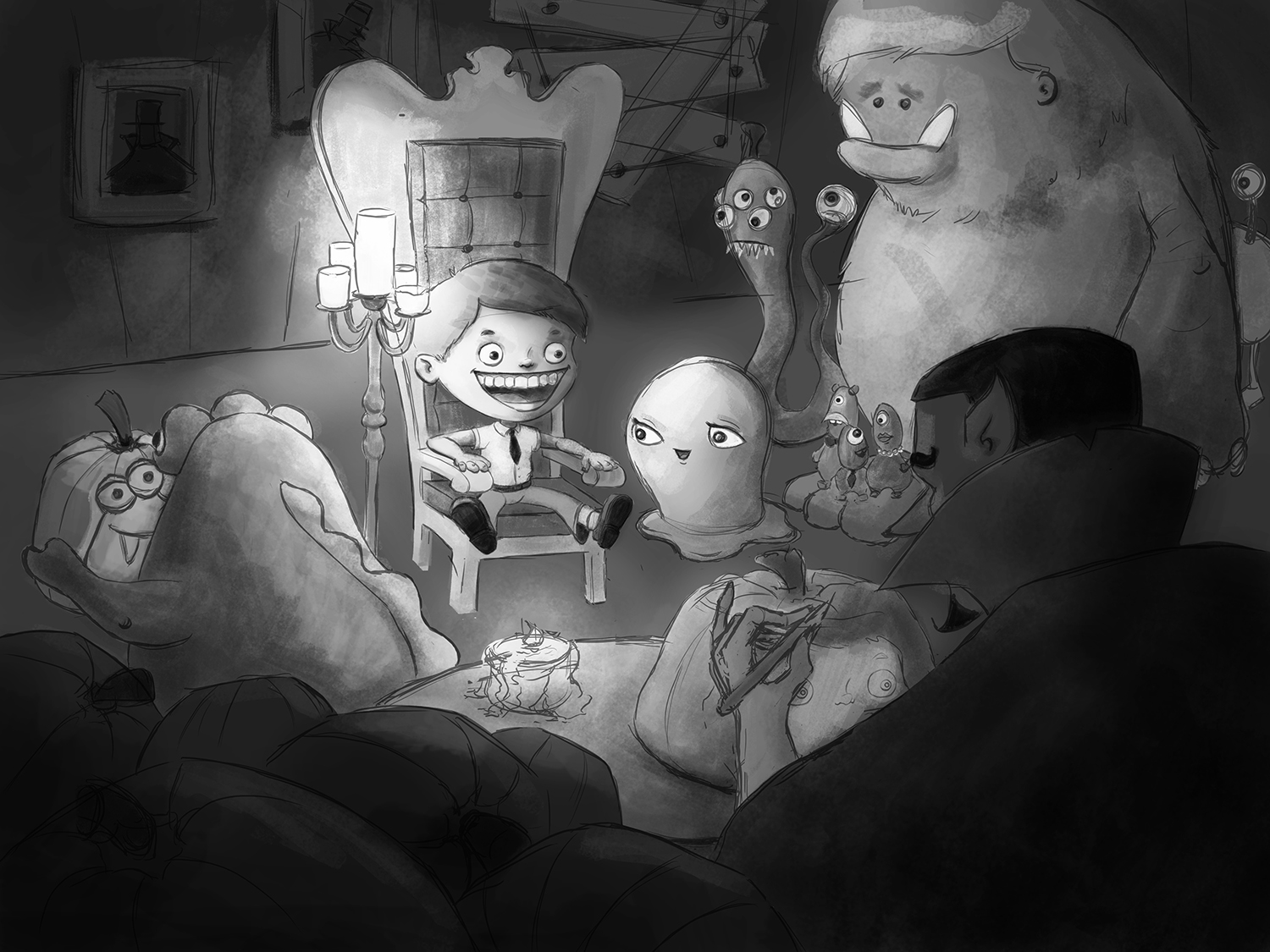
                    @shinjifujioka Shinji I'm only 5 :D. I think Will did that by moving it to the back a bit but I think it's better without the candles since you already have one light source from the table. I'm worried that the candles will looks very hot on the boy hair. Here I removed it, just a thought1446434117274-count-pumpkin-4.jpg

                    http://narothkean.com
                    https://twitter.com/narothkean
                    https://www.instagram.com/narothkean

                    1 Reply Last reply Reply Quote 0
                    • Thrace
                      Thrace last edited by

                      You could move candle to the other side of the chair and then it wouldn't interfere.

                      NoWayMe 1 Reply Last reply Reply Quote 0
                      • Naroth Kean
                        Naroth Kean @shinjifujioka last edited by Naroth Kean

                        @shinjifujioka yeah i flipped to my own mistake LOLOLOLOLOLOLOLOLOL "shit" i'm sorry I mean "sit"

                        http://narothkean.com
                        https://twitter.com/narothkean
                        https://www.instagram.com/narothkean

                        1 Reply Last reply Reply Quote 0
                        • NoWayMe
                          NoWayMe @Thrace last edited by

                          @Thrace-Shirley-Mears Yes! I will definitely do that! Now that @Naroth Kean pointed that out, it's the only thing I am seeing when looking at my drawing!! It couldn't be more "in the middle"! However, I really want to keep it in the illustration because I want it to be my primary light source (since the boy is my focal point).

                          noemiegionetlandry.squarespace.com
                          noemie_illustration on Instagram

                          1 Reply Last reply Reply Quote 0
                          • NoWayMe
                            NoWayMe last edited by

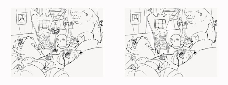
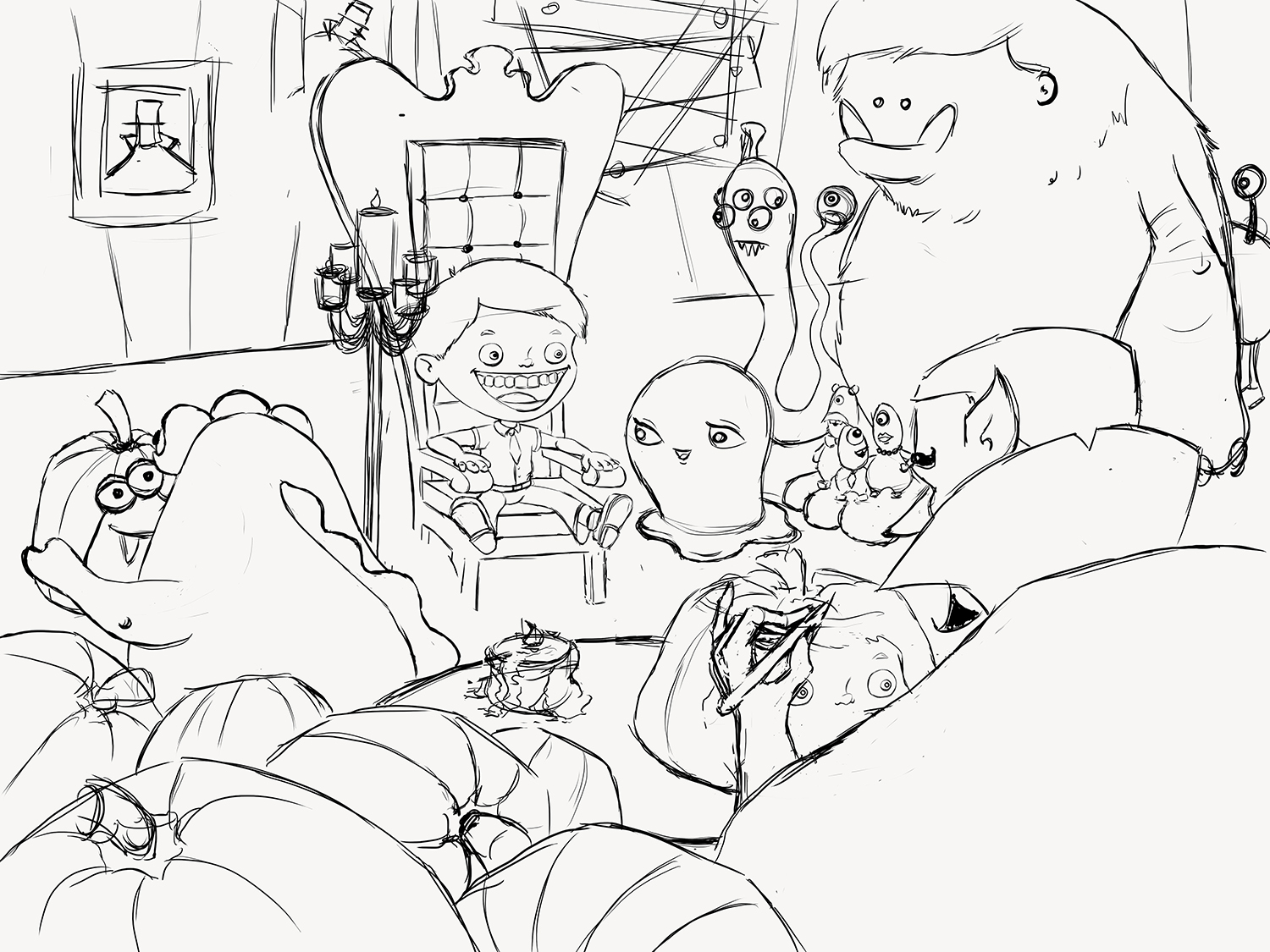
                            I think this is better!

                            Count Pumpkin 5.jpg

                            noemiegionetlandry.squarespace.com
                            noemie_illustration on Instagram

                            Ace Connell 1 Reply Last reply Reply Quote 2
                            • Ace Connell
                              Ace Connell @NoWayMe last edited by

                              @NoWayMe Yup - tons better! I'm looking forward to seeing this finished... even if it is too late for Halloween haha.

                              Ace

                              NoWayMe 1 Reply Last reply Reply Quote 0
                              • NoWayMe
                                NoWayMe @Ace Connell last edited by

                                @Ace-Connell Hahaha! It will probably be done it time for Christmas...

                                noemiegionetlandry.squarespace.com
                                noemie_illustration on Instagram

                                Ace Connell 1 Reply Last reply Reply Quote 0
                                • Ace Connell
                                  Ace Connell @NoWayMe last edited by

                                  @NoWayMe There's always next Halloween 🙂

                                  1 Reply Last reply Reply Quote 0
                                  • NoWayMe
                                    NoWayMe last edited by

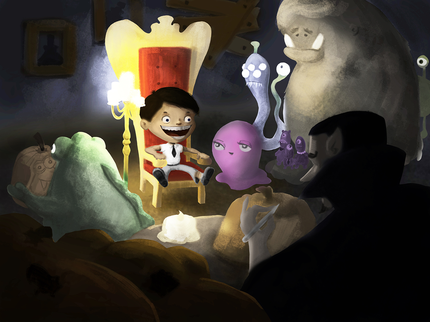
                                    I started the painting phase of my illustration with a value study. I tried to clearly have the boy in focus, and then the carving vampire as a secondary focal point.

                                    I have to disclose that I have never done a fully rendered illustration on photoshop before! I usually work traditionally (mostly in soft pastels) so I'm walking in the dark a little bit here! Hope it is going to turn out good! Critiques are of course more than welcome!

                                    Count Pumpkin - Value study.jpg

                                    noemiegionetlandry.squarespace.com
                                    noemie_illustration on Instagram

                                    1 Reply Last reply Reply Quote 0
                                    • Ace Connell
                                      Ace Connell last edited by

                                      Personally, I'd try and work in more contrast between the foreground of the dude with the awesome beard carving the pumpkin and the rest of the scene so you get that real sense of dimension.

                                      Hope that helps a little 🙂
                                      Ace

                                      1 Reply Last reply Reply Quote 2
                                      • NoWayMe
                                        NoWayMe last edited by

                                        Still working values, and slowly adding details!

                                        Count Pumpkin - Value.jpg

                                        noemiegionetlandry.squarespace.com
                                        noemie_illustration on Instagram

                                        1 Reply Last reply Reply Quote 2
                                        • NoWayMe
                                          NoWayMe last edited by NoWayMe

                                          Hello again!

                                          I am starting to add colors to this illustration and I would really appreciate any feedback you guys can give me! Of course it is still very rough, but I would rather have feedback at this early stage, when it is still relatively easy to modify things!

                                          Thanks in advance!

                                          Count Pumpkin 7.jpg

                                          noemiegionetlandry.squarespace.com
                                          noemie_illustration on Instagram

                                          mattramsey 1 Reply Last reply Reply Quote 1
                                          • Kevin Longueil
                                            Kevin Longueil SVS OG last edited by

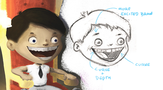
                                            This is such an excellent piece! Love it!....there is something about the original drawing of the boy's face that i like so i thought i would try to figure out what it is - i think it is the eyebrow mostly and then the curve of the mouth in two places .....possibly the larger tongue and smaller pupils in the first one too but I'm not sure about those - lastly the teeth recede i size on the original but not yet in the painting (on our left) it is such a subtle difference but i think the boys expression in the original drawing has a bit more magic to it - what do you think? Untitled-1.jpg

                                            Portfolio: kevinlongueil.com
                                            https://www.instagram.com/kevinlongueil/

                                            NoWayMe 1 Reply Last reply Reply Quote 3
                                            • First post
                                              Last post