2ND TAKE- Misunderstood Monster WIP
-
Hello, friend! Your work, as always, is amazing. I admire you for tackling the process of coming to a strong piece once again for this month. I promised myself that I'd focus on another project instead of the prompt this month, but my idea was similar to this theme, and I love that you have executed the concept so well here. I think children are misunderstood so often!
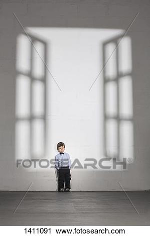
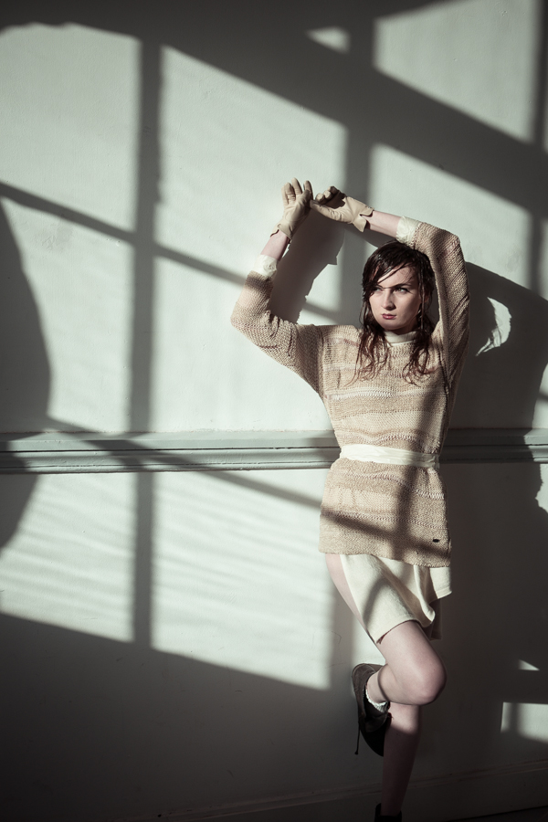
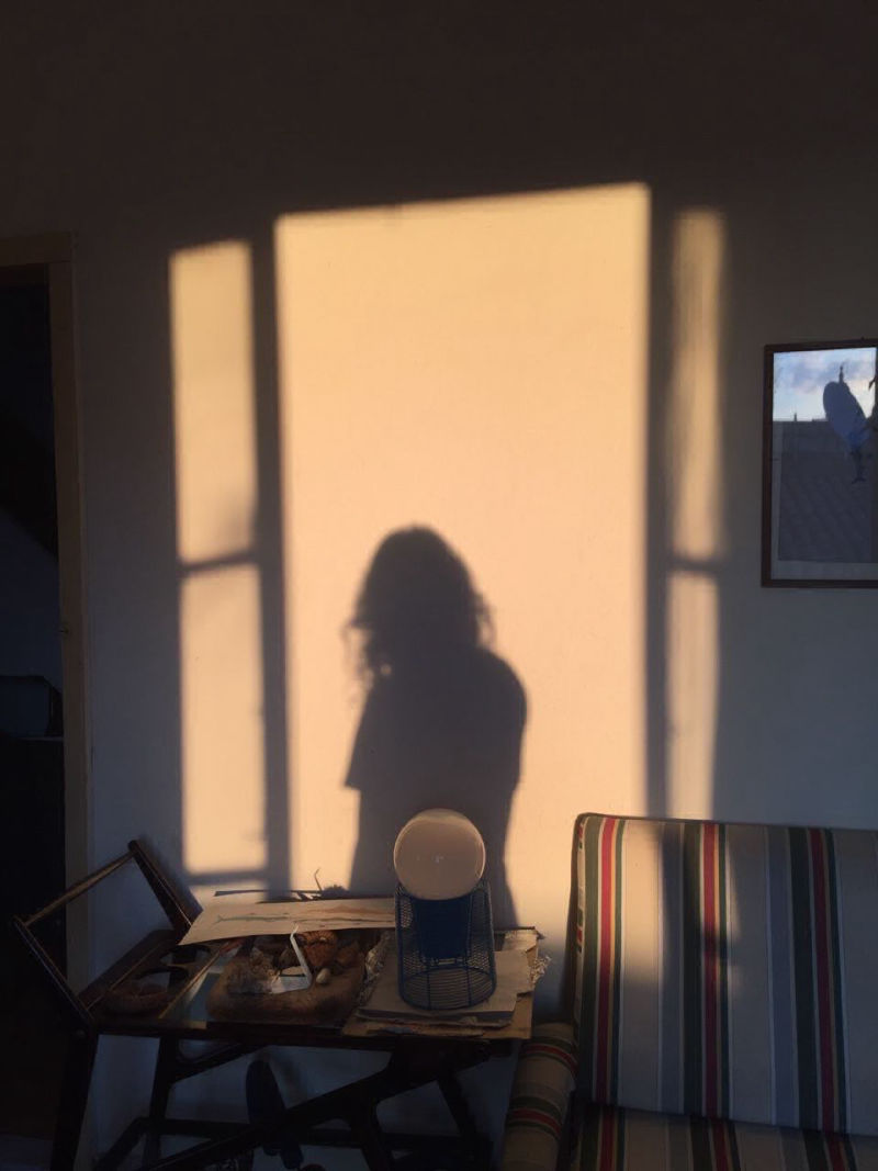
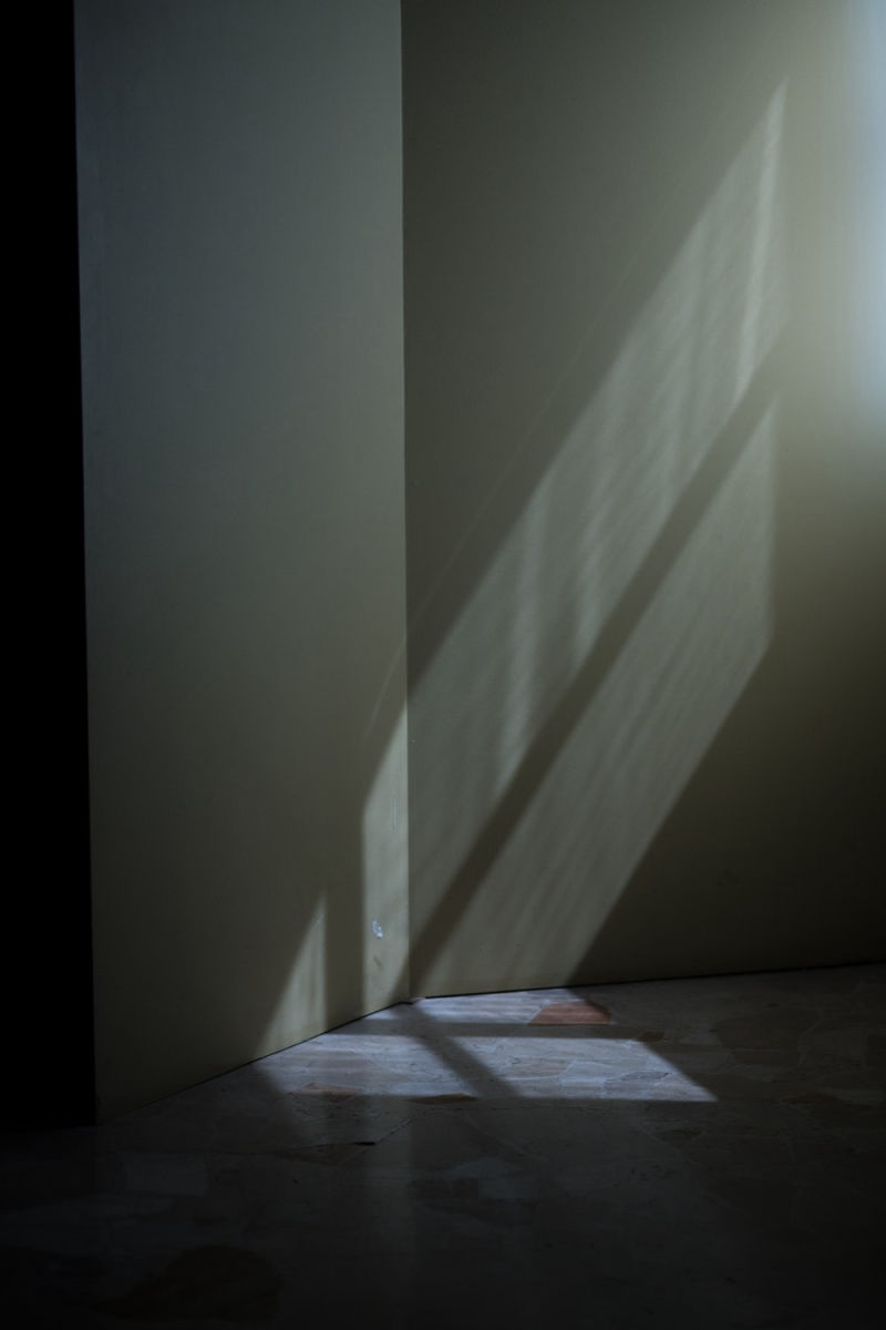
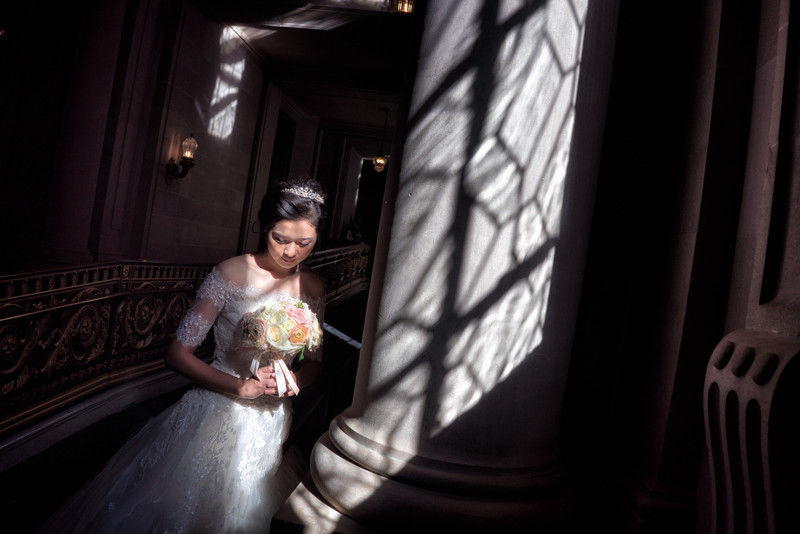
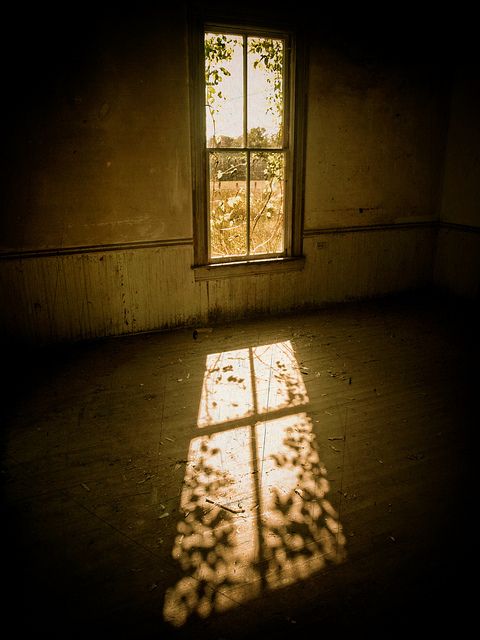
To me, your first color option looks most believable. I was curious about how light works in this setup so I looked up a few reference photos. Here they are in case they come in handy for you...
Thanks for sharing your work with everyone!
-
@kathrynadebayo hi, Katheryn! Yikes! You caught me! yeah, my window lighting is really out of whack, however, it’s actually an artistic liberty that i made inorder to further emphasize the feeling of disarray our character feels. I want to make the audience feel a sense of uneasiness with the situation. I’m not sure if it’s getting though. lol!...Anyway, thank you so much for the photo references. They’re very helpful. And it’s very thoughtful of you. I might consider changing my lighting in the future if it just doesn’t work. Again, thank you so much!
-
Just to clarify, I think your lighting is working well.
 It was genuinely out of curiosity and a desire to learn that I looked up those photos. However you interpret the scene will be excellent, I'm sure. We can get so caught up in achieving a certain realism... I know I do. However, I don't think that's right for everyone's style. Show the world your thing, while being constantly open to learning, and I don't think you can go wrong.
 -
I was totally sold on #1 when I first saw it. But the more I think about it, and the more I look at #3, it makes more sense story-wise. I think the window lighting is such a cool idea and it looks great. But it's also taking away from the story and for me, it that's cute little kids sad face not understanding why his parents are upset at something he worked so hard on for them. So for me right now, the window lighting is making me focus on the drawing he did. Which in a way, is fine, but I think more focus on the kids face the better. With no distractions in the background.
With the window outline, the drawing, the parents scolding him.. there's too much going on for me. So that's why I think #3 is working better for the story.
Also, emphasize the dragon/dino outfit more. I didn't notice it until someone else mentioned it. And with misunderstood monster being the topic, it's so perfect.
-
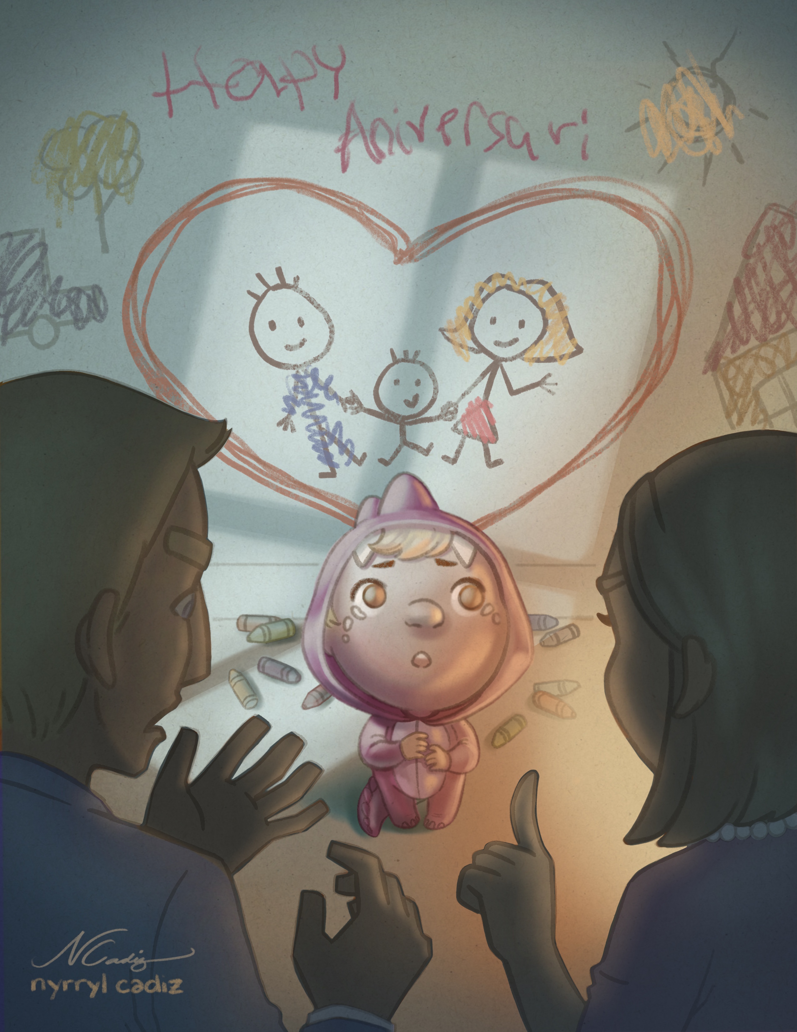
@Branden-Brushett Oh, dear... i’m really sorry, Braden. I was really busy working on the piece that i wasn’t able to read your comment. I’ve already painted the illustration using lighting #1 and i’m really satisfied with it. I’ve attached the illustration below. I hope the kid’s expression still reads through. Thank you so much for your input. Please don’t think I’m completely disregarding what you guys think. I may not execute your comments now but i’ll surely remember and re-enforce them in the future.
-
Hi, everybody! Here’s the almost-final illustration. Please let me know if there are some things that i need to work on more. Thank you very much. I hope you like it.
-
@kathrynadebayo hi! Thank you so much for your support. Yeah, sometimes i also get so technical with how things look that i get so nit-picky and frustrated. It’s nice to bend reality a bit sometimes and experiment with whacky ideas. I wish you the best with your work as well!
-
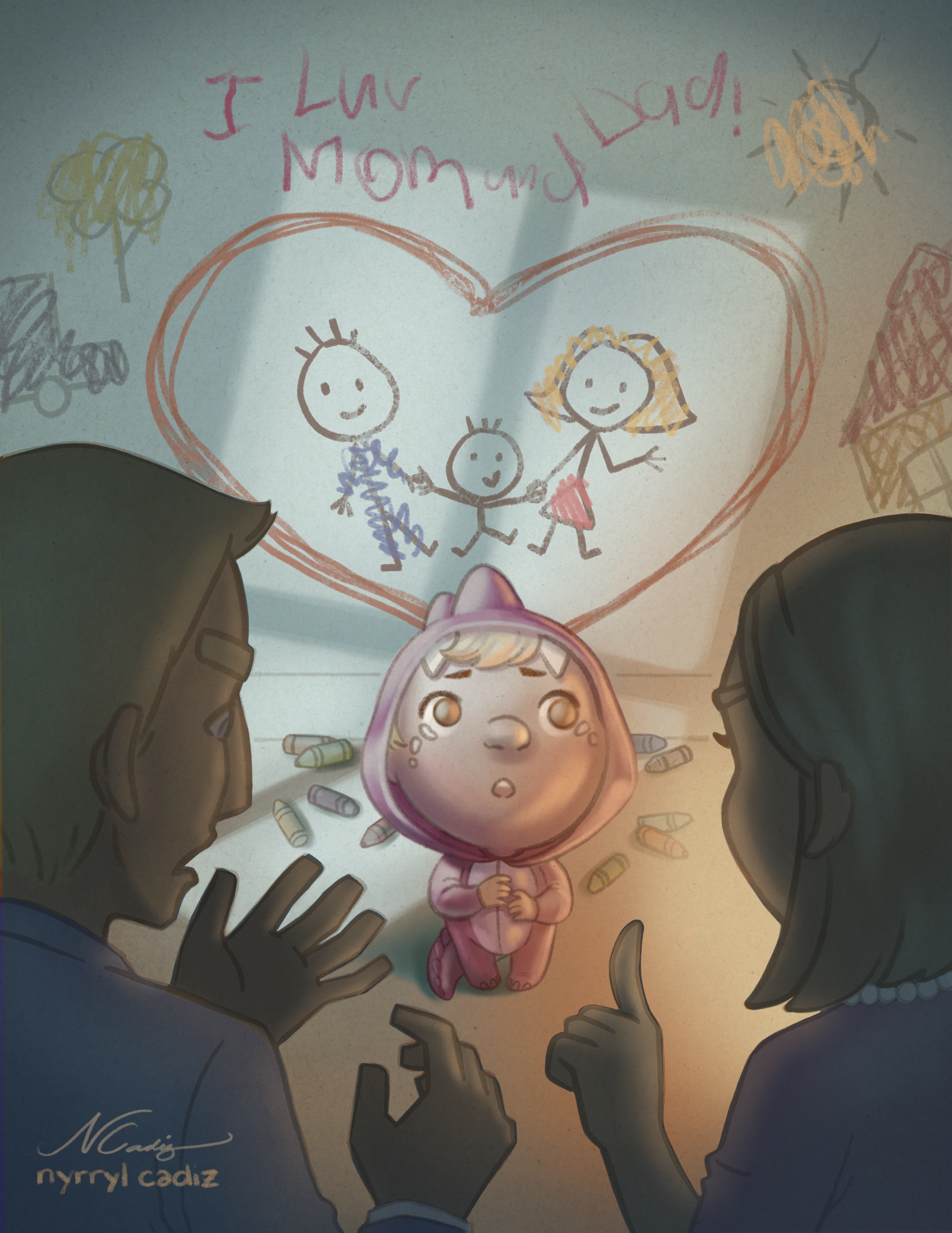
Here’s another version of the illustration where instead of the writing on the wall saying ‘Happy Anniversary’, it’s ‘I love Mom and Dad’. I think it works better.
-
@nyrrylcadiz I love this final version. It looks amazing and kind of breaks my heart a little! So well done. I think it works well without any words at all--I like the storytelling of just the picture of the happy family juxtaposed with the scolding, shadowy parents and confused, sad kid...
-
@eli hi, Eli! I’m really glad you like it! I’ve been doubting my skills lately and to have someone appreciate my work really makes me feel a bit better inside.Thank you.
-
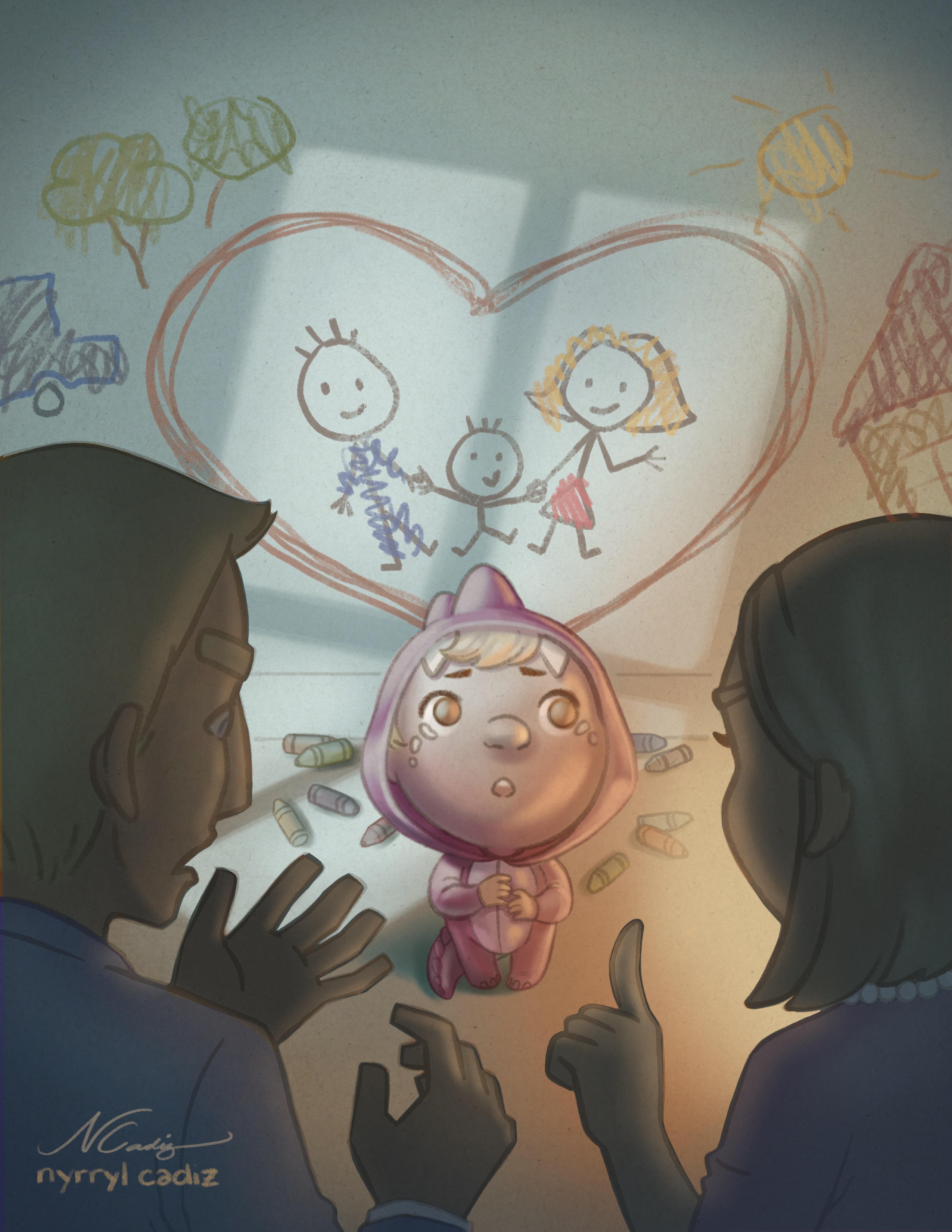
One small thing to consider would be changing the color of the gray/brown outlines on the crayon drawings. Right now if I were to see the car, tree, sun, or house out of context I would tell you that they looked like they were colored-in by a kid, but not necessarily drawn by one. They're kind of giving off a coloring book vibe. If you change the outline to the same colors as the scribbles and maybe make the outlines a little messier I think it will look more like a kid that size drew them. Here's a cool article on kid's art at different stages of development: http://www.artjunction.org/young_in_art.pdf
-
@studiolooong hi! Yes, i see what you mean. I’l definitely work on that. Thank you so much!
-
I did a quick edit on the piece. Here it is. I removed the brown outlines on the wall sribbles and got rid of the words. I hope you guys like it. Please let me know what you guys think. Thanks.
-
Amazing!!!!
-
@kathrynadebayo Thanks, Katheryn!
-
@nyrrylcadiz It looks SO GOOD
-
Great work @nyrrylcadiz ! That kid is super cute. I do think that the text above the heart works better but both are great

-
@eli Thank you so much! I’m very happy you like it.
-
@gary-wilkinson Thank you! It means a lot coming from you.
-
I love your picture, its splendid!
