Society of Visual Storytelling

    SVSLearn Forums

    • Register
    • Login
    • Search
    • Recent
    • Tags
    • Popular
    • Users
    • Groups
    • Search

    Points of views

    Artwork
    3
    6
    544
    Loading More Posts
    • Oldest to Newest
    • Newest to Oldest
    • Most Votes
    Reply
    • Reply as topic
    Log in to reply
    This topic has been deleted. Only users with topic management privileges can see it.
    • Deniseprado
      Deniseprado last edited by

      Hi. I have been working in this children’s book and I really need points of view about the composition. Please send me suggestions and feedback. 0_1540562832913_6F75DEEE-62AA-4399-9D0C-1DB9DBC3EF3A.jpeg

      1 Reply Last reply Reply Quote 0
      • StudioLooong
        StudioLooong last edited by

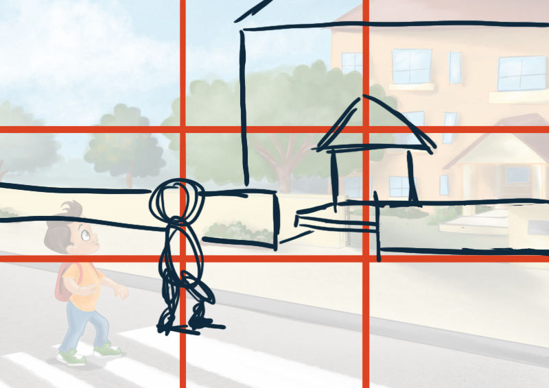
        I feel like there is a void in the middle of the composition that my eye keep getting sucked into, you may benefit from tweaking the composition to follow the rule of thirds. If you bring the boy up and over a little and bring the house more into frame it will make the image a bit more dynamic.

        0_1540565758510_1540562882892-6f75deee-62aa-4399-9d0c-1db9dbc3ef3a-resized.jpg

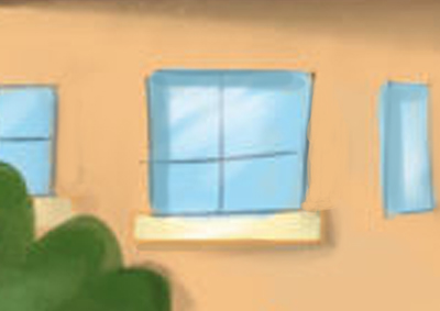
        Another thing to consider is the way you've shaded the windows. I think the way the lighter window sills are shaded is great but the shading on the right side of the glass panes is making it look like the window is popping off the house. The glass of the window would be inset into the wall so the shadow would actually fall on the left inside of the blue area, something like this:

        0_1540566559777_1540562882892-6f75deee-62aa-4399-9d0c-1db9dbc3ef3a-resized.jpg

        Hope this helps!

        Taylor Woolley
        (Formerly Taylor Ackerman / StudioLooong)


        Website: www.woolleystories.com
        Instagram: https://www.instagram.com/woolleystories/

        Deniseprado 1 Reply Last reply Reply Quote 1
        • Deniseprado
          Deniseprado @StudioLooong last edited by

          @studiolooong totally help!!! I will make your suggestions. Thanks!

          1 Reply Last reply Reply Quote 0
          • burvantill
            burvantill Moderator last edited by

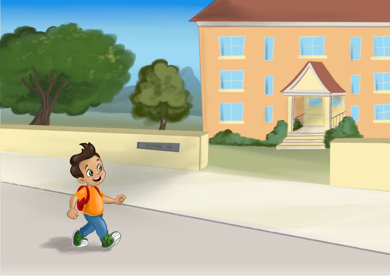
            Welcome! The shadows on the house are indicating that the light is behind the boy, yet his shadow is directly below him. Figure out where your light source would be and try to keep it consistent for every object. The boy seems a little flat as well. Perhaps add some shading to his body as well. Looking forward to seeing this progress. 👍

            Lisa Burvant
            www.lisaburvant.com
            Instagram & Twitter & SVS: @burvantill

            Deniseprado 1 Reply Last reply Reply Quote 0
            • Deniseprado
              Deniseprado @burvantill last edited by

              @burvantill thanks! Good point!

              1 Reply Last reply Reply Quote 0
              • Deniseprado
                Deniseprado last edited by

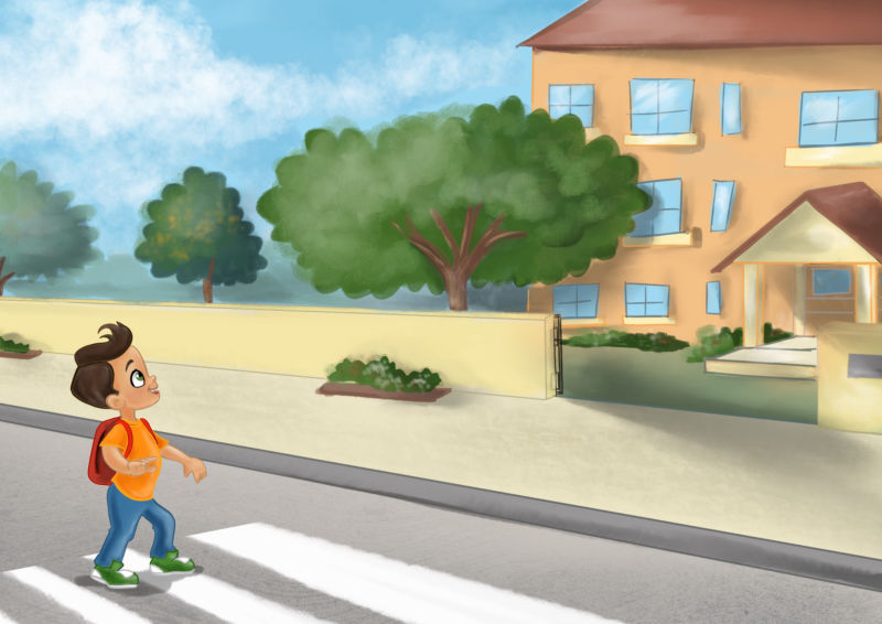
                I’m thankful for all suggestions. I did all changes. What about now?
                0_1540688284131_8E28B502-1BF2-43A0-AD5C-5563A97BE33B.jpeg

                1 Reply Last reply Reply Quote 2
                • First post
                  Last post