Thumbnails for a personal project. PLEASE VOTE! :)
-
I suggest taking the children's book class. There is a lot of info there but it goes over thumbnails. I found them very helpful..
-
Specifically talking the second video called the book dummy. Truthfully I have not take the entire class...so that is all I can add as a suggestion. Perhaps someone more seasoned can add further advice..
-
Thanks Reid. Yes I took that class. Very good stuff. In that class Jake's thumbnail layouts are very basic and give him an ideal of placement and most of the characters are almost "stick figure like" and with no indication of lighting or direction of light or value. Perhaps its just a personal thing for basic thumbnail sketches? I guess? lol.
-
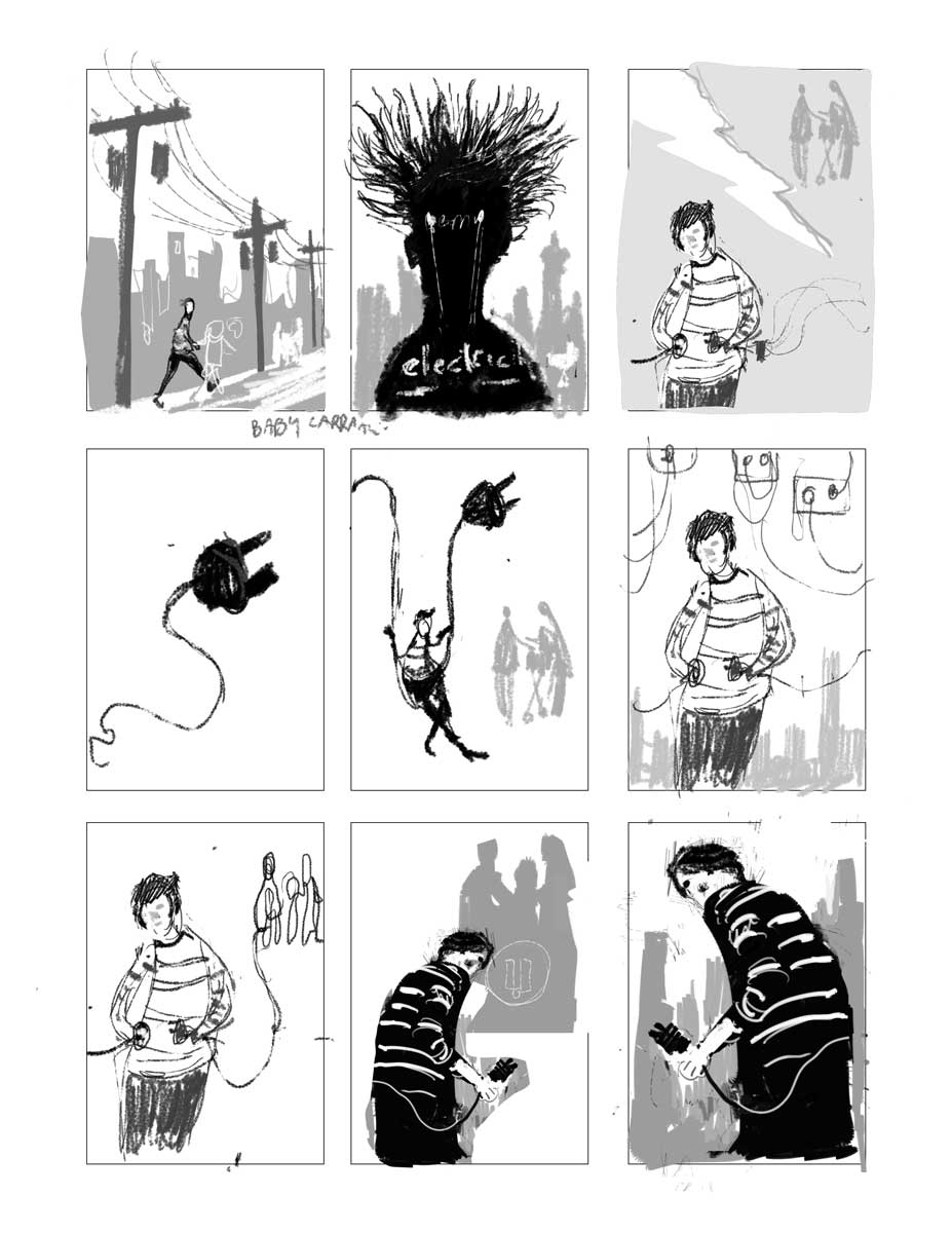
Kris, I typically start with a VERY rough sketch and get the composition worked out. I like to do a lot of them so I don't focus too much on quality at the first stage at all. I do like to use the 5 value system though. It helps keep them more orderly than if I just sketch in pencil. I just focus on camera angle and placement of objects.
Here's how that first stage might look. These were for a book cover I did last year titled "Electricity". (I've included more info below this image so keep scrolling for more):
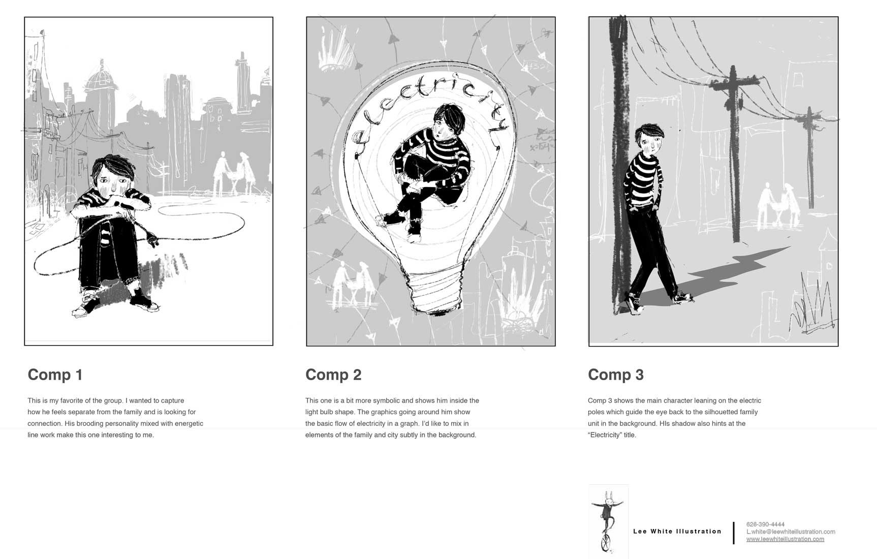
Then, once I figure out which ones I actually like I clean them up to present to the client. I ALWAYS do a little write up to let the client know what I am thinking. Here's that stage (more below that):
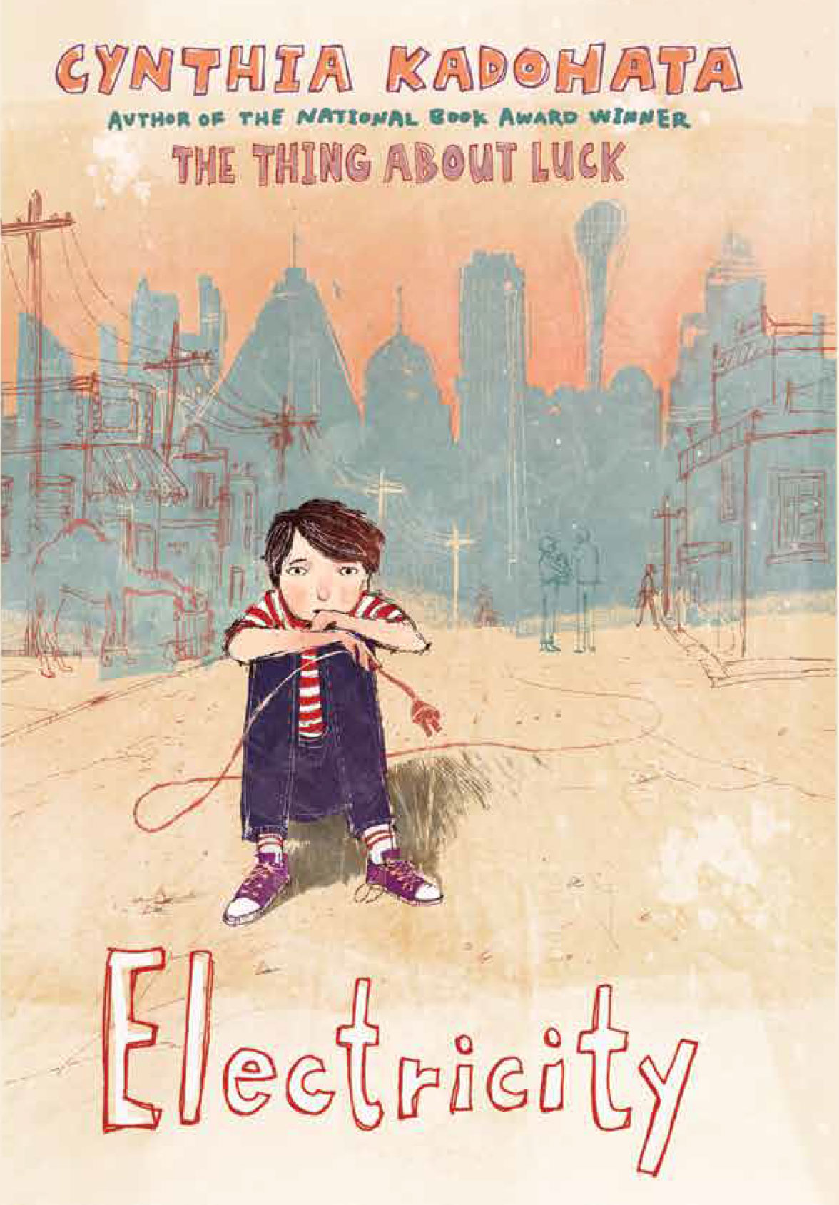
Then once I talk to the client a bit, I submit a final painting and they add type. Here's the finished cover:
-
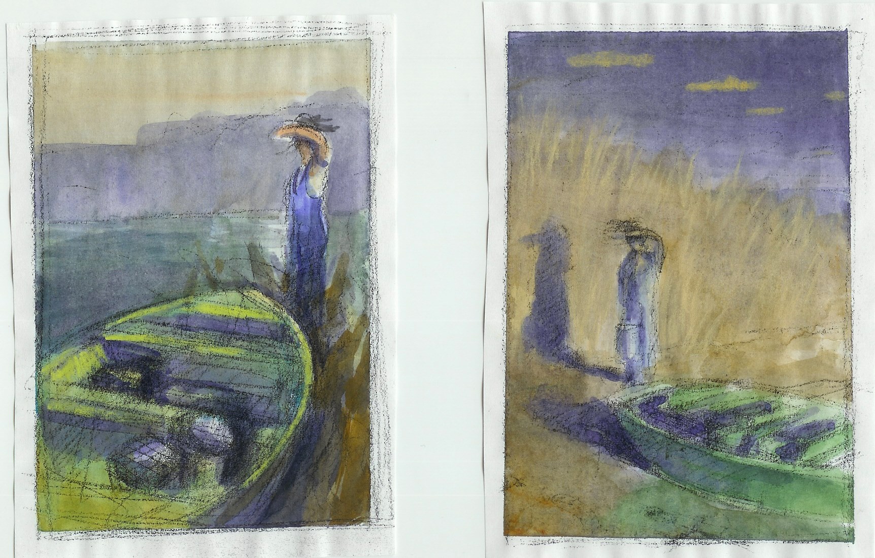
Here's another sample by the awesome Chris Sheban (who is going to do a video with us!!!!!! YAY!!!). It shows how he works from the rough all the way to the finish. So he does the value and color in one step. Of course, he is a total pro and knows what he is doing. I would suggest the greyscale route first, and then go to color. Note: I do these color studies AFTER I do the greycale studies. So it's just figuring out what works best for you.
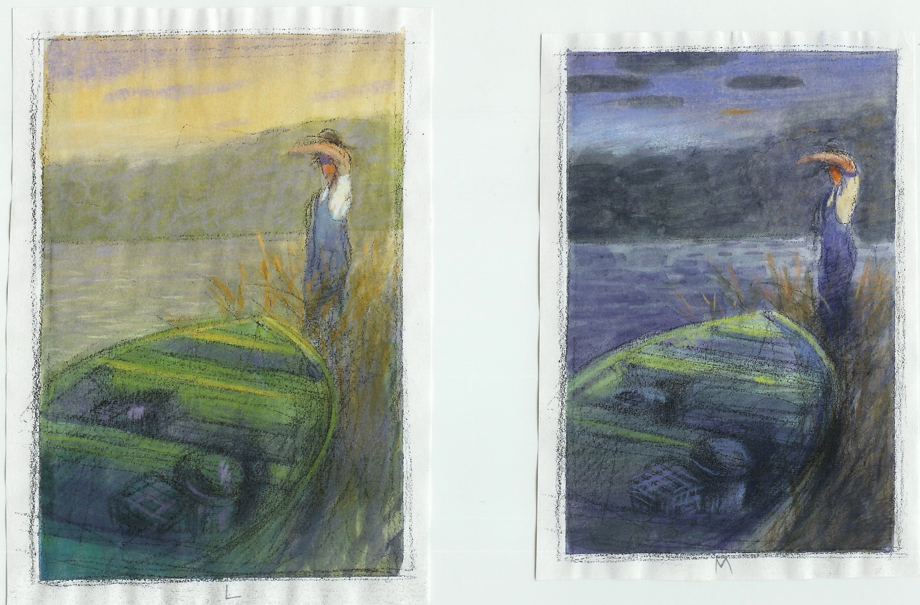
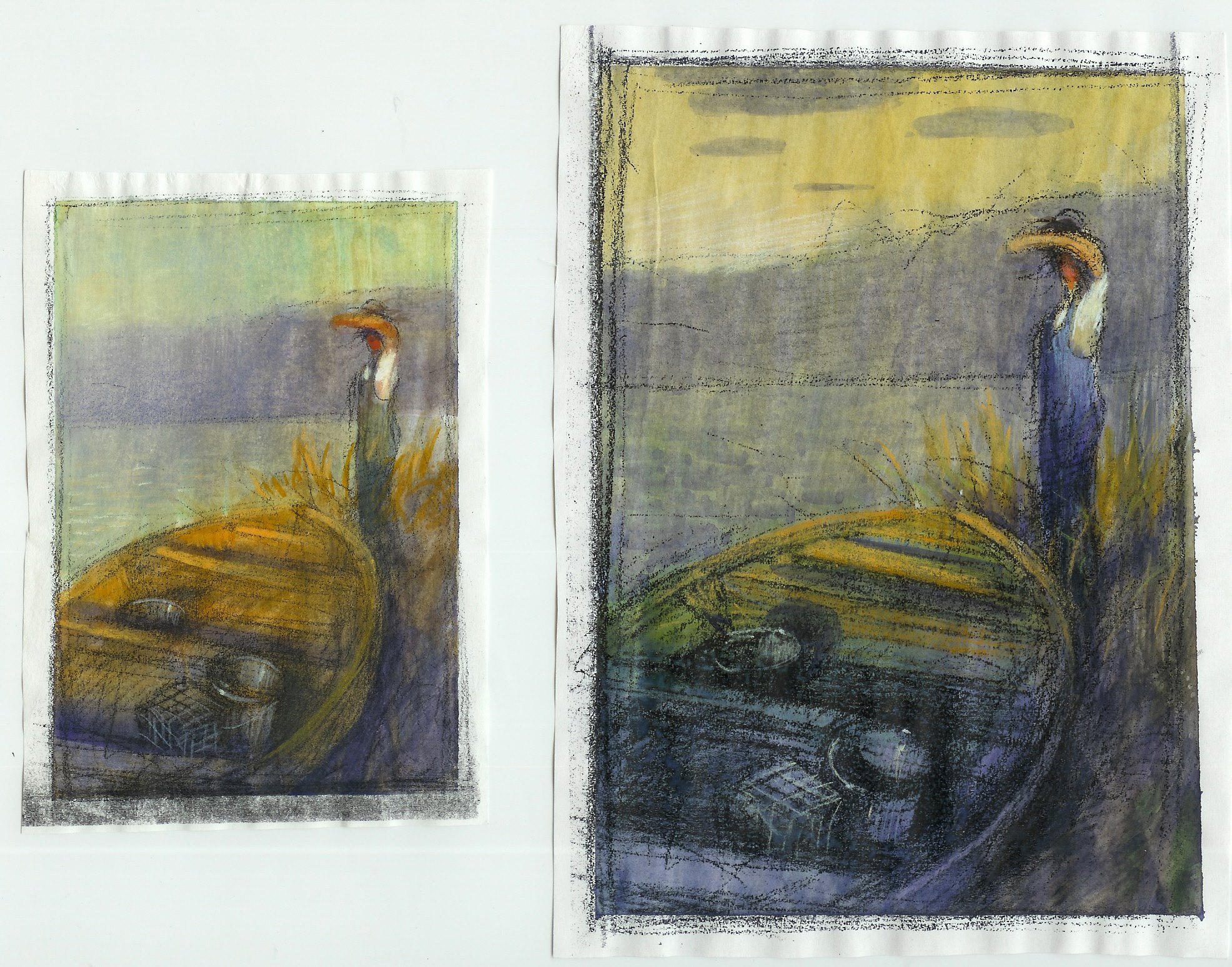
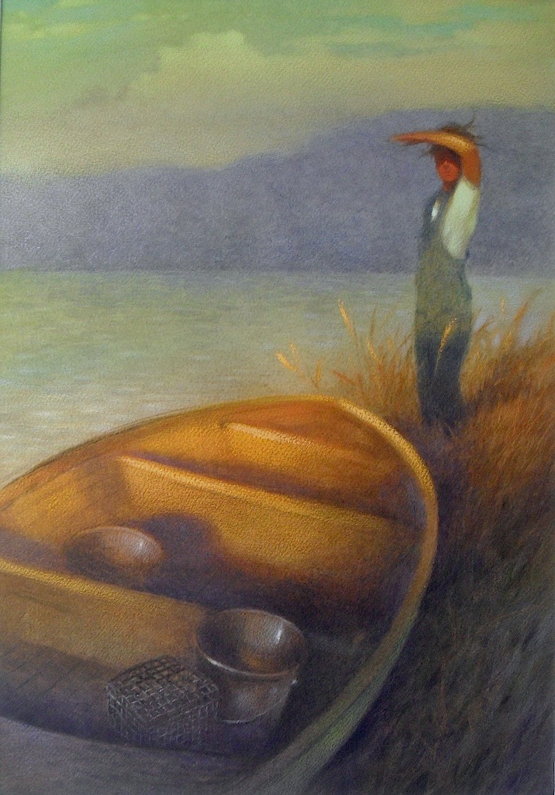
-
Excellent. I really appreciate you taking the time to do that. The thumbnails I posted were simply my first step for creating the "idea" of an image. So then I see from your stuff my next step would be solidify the value, then a color study, then rendering. Very nice and very appreciated. Thanks Lee :).
... and thank you to everyone who took the time to write
-
I love number 5 and 8! Great Job!!!
-
Without regard to storytelling, just based on visual appeal as a composition, I like #5.
-
@Olivia-Hope-Shelley
Thanks Olivia
-
@Patty-Burke
Thanks Patty.
I think I remember you in one of the classes. I can't remember which one (Might have been Composition), but I think it was a sledding/winter scene with the cute little dogs Anyway. thanks for letting me borrow your eyes :). thanks
 -
@Kris-Knight I was immediately drawn to 5 and 8, although on a second look, I'm really liking #7. This looks like a really fun project. I can't wait to see your next steps.
Maile
-
I vote 5 and 8, leaning more towards 8 for adventure appeal and being curious where he is going. Lee's thumbnails are fantastic, loved seeing the progression and the other artist's samples.