Society of Visual Storytelling

    SVSLearn Forums

    • Register
    • Login
    • Search
    • Recent
    • Tags
    • Popular
    • Users
    • Groups
    • Search

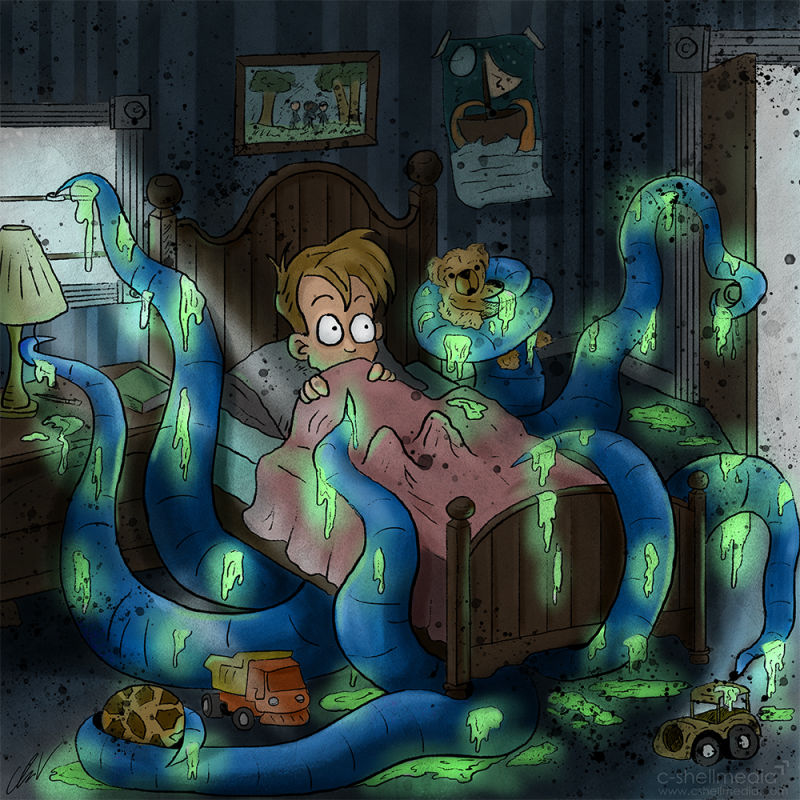
    Misunderstood Monster (vote)

    Illustration
    12
    13
    2061
    Loading More Posts
    • Oldest to Newest
    • Newest to Oldest
    • Most Votes
    Reply
    • Reply as topic
    Log in to reply
    This topic has been deleted. Only users with topic management privileges can see it.
    • J
      JennyJones @Chip Valecek last edited by JennyJones

      @chip-valecek I vote B. I like the look of your piece here. I think the glowing slime glows better without the white outlines. Fun concept too.

      1 Reply Last reply Reply Quote 0
      • juliepeelart
        juliepeelart SVS OG last edited by

        B, Cool idea! A looks a little like a cut out to me.

        www.juliepeelart.com
        www.instagram.com/juliepeelart/
        www.facebook.com/juliepeelart/
        www.facebook.com/Wundersplat/
        www.wundersplat.com

        1 Reply Last reply Reply Quote 0
        • Jon Anderson
          Jon Anderson SVS OG last edited by

          I like B best, too. The white line just adds a little confusion for me.

          instagram.com/jonandersonillu

          1 Reply Last reply Reply Quote 0
          • braden H
            braden H last edited by

            I think in this case option B works best, here.

            They're both good, but I'd definitely go with the version without outlines.

            Maybe softer outlines? Like on their own layer at 30% opacity using a nice green-ish colour?

            1 Reply Last reply Reply Quote 0
            • Judy Elizabeth Wilson
              Judy Elizabeth Wilson SVS OG last edited by

              I like B too. The slime is really fun. There should be more slime in kids books!

              Website http://www.judyelizabethwilson.com/

              Instagram https://www.instagram.com/judyelizabethart/

              Sharing positivity through art.

              1 Reply Last reply Reply Quote 0
              • carriecopadraws
                carriecopadraws SVS OG last edited by

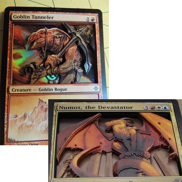
                I think style A has potential to look like a 3D layered paper style and is worth exploring. It reminded me of these 3D Magic cards some people make with several cutout layers to give it depth:

                0_1541039741586_cutout-layered.jpg

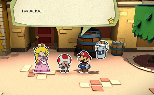
                Or Paper Mario! It could be a fun look.

                0_1541039878733_paper-mario.jpg

                Carrie Copa
                https://carriecopadraws.com/

                1 Reply Last reply Reply Quote 0
                • TessaW
                  TessaW last edited by TessaW

                  Wow Chip, I really love how this one turned out! The color palette, linework, and subtle texture are really appealing. I first viewed this on my phone and liked A initially, but after looking at it on my desktop, I'm leaning toward B. I am sort of wondering what it would look like with the dark splatters on A, but without the white outlines. Something about those splatters gives it a lot of energy and interest.

                  Website: www.tessawrathall.com

                  Instagram: www.instagram.com/tessawrathall_art/

                  1 Reply Last reply Reply Quote 0
                  • Adrian K
                    Adrian K last edited by

                    I vote for B, although I do like the splatters.

                    https://www.artbyadriankuhn.com
                    https://facebook.com/artbyadriankuhn
                    https://www.instagram.com/artbyadriankuhn

                    1 Reply Last reply Reply Quote 0
                    • burvantill
                      burvantill Moderator last edited by

                      I want to like A but I’m going to vote B.
                      This turned out really good. šŸ‘šŸ‘šŸ‘

                      Lisa Burvant
                      www.lisaburvant.com
                      Instagram & Twitter & SVS: @burvantill

                      1 Reply Last reply Reply Quote 0
                      • LauraA
                        LauraA SVS OG last edited by

                        I like B too.

                        Instagram: https://www.instagram.com/lauraintorino/
                        http://lauraaldersonart.com/

                        1 Reply Last reply Reply Quote 0
                        • lenwen
                          lenwen last edited by

                          They both great! but I prefer B 😃

                          www.lennywen.com
                          https://www.instagram.com/lunartcy/

                          1 Reply Last reply Reply Quote 0
                          • Chip Valecek
                            Chip Valecek SVS Team SVS OG last edited by

                            Thanks everyone! B seems to be the clear winner. I suppose the white outline worked well with my inktobers because it was just the character and not a full illustration. @TessaW and @Adrian-K here is a version with just the splatters.

                            0_1541072287803_final_v3.jpg


                            https://www.instagram.com/chipvalecek/
                            https://www.facebook.com/cvalecek
                            http://www.cshellmedia.com/

                            1 Reply Last reply Reply Quote 1
                            • First post
                              Last post