Society of Visual Storytelling

    SVSLearn Forums

    • Register
    • Login
    • Search
    • Recent
    • Tags
    • Popular
    • Users
    • Groups
    • Search

    WIP-Silhouette/Foreground Watercolor

    Artwork
    7
    13
    926
    Loading More Posts
    • Oldest to Newest
    • Newest to Oldest
    • Most Votes
    Reply
    • Reply as topic
    Log in to reply
    This topic has been deleted. Only users with topic management privileges can see it.
    • kaitlinmakes
      kaitlinmakes last edited by

      Hello all,
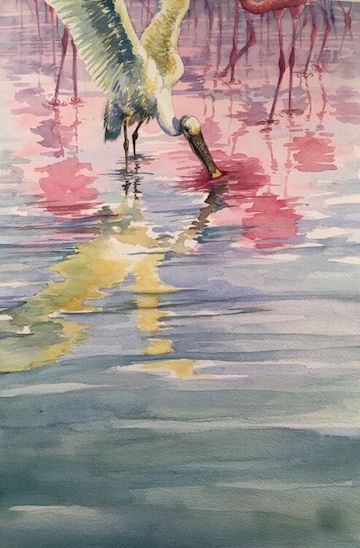
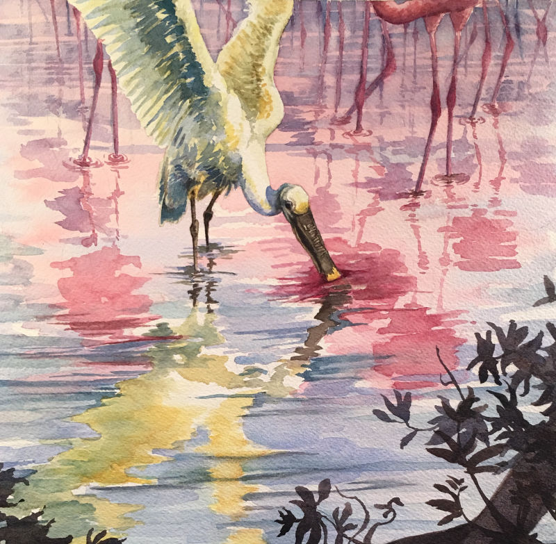
      I'm taking a community water color class, and last week we were painting reflections. I made this guy for it, but I feel like it is too top heavy.
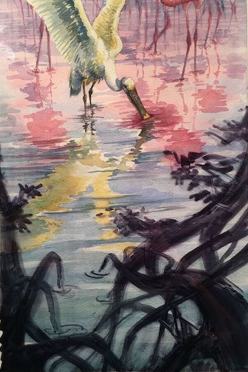
      I am playing around with doing a foreground element to help balance it out, using acetate ontop of the painting to try and figure out the shapes before I commit.
      I'm really looking to find the balance in the image and also move your eye to the central feeding bird. Are the silhouette shapes working?
      I'm very open to and appreciative of any and all feedback.
      Thank you 🙂
      0_1542844853307_unspecified-2.jpg
      0_1542844863578_unspecified.jpg
      0_1542844872193_unspecified-1.jpg

      https://www.instagram.com/kaitlin.kahn.art
      Https://www.kaitlinkahn.com

      1 Reply Last reply Reply Quote 4
      • NessIllustration
        NessIllustration Pro last edited by NessIllustration

        I think the black silhouettes are really taking over and taking the spotlight, however the color is really appealing and brings out the others! At first when you said you were adding a foreground element I started shaking my head, but when I scrolled and saw your tests I went "Ohhhhhh!" Hahaha..
        Here's what I'd do:
        0_1542848535195_crop.jpg

        It's a GORGEOUS piece, congratulations!!

        vanessastoilova.com
        instagram.com/vanessa.stoilova/

        Check out my Youtube channel for tips on how to start your career in illustration! www.youtube.com/c/ArtBusinesswithNess

        1 Reply Last reply Reply Quote 2
        • julian beresford
          julian beresford SVS OG last edited by

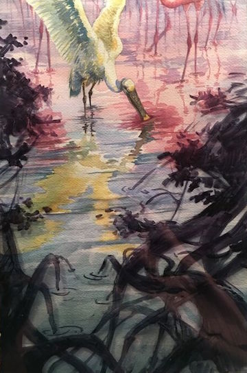
          @kaitlinmakes I really like the branches in the foreground, it frames the picture well, I pretty much concur with Ness's observations

          Julian Beresford - Freelance Illustrator
          www. jgberesford.com
          https://www.instagram.com/jbfantasticalemporium/

          kaitlinmakes 1 Reply Last reply Reply Quote 0
          • kaitlinmakes
            kaitlinmakes @julian beresford last edited by

            @julian-beresford
            @NessIllustration
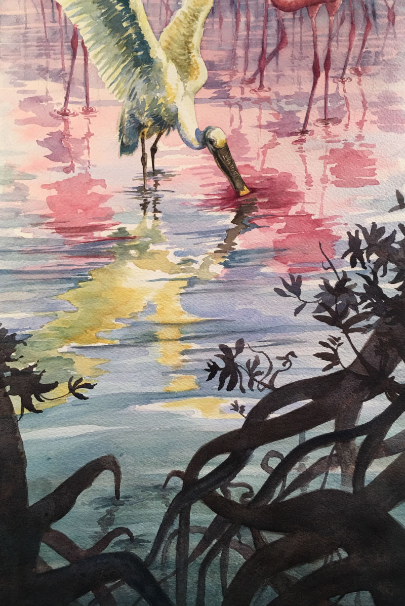
            haha - no, I agree - the black is terrible - but it's the only color marker that held up on the acetate. I think I'm going to go with a darker brown/green or brown/purple - But I haven't moved over to color studies yet.
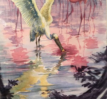
            Is the suggestion to mostly chop off the bottom third and keep the foreground branches low in the picture frame?

            Thank you so much for chiming in, you two!

            https://www.instagram.com/kaitlin.kahn.art
            Https://www.kaitlinkahn.com

            NessIllustration 1 Reply Last reply Reply Quote 0
            • NessIllustration
              NessIllustration Pro @kaitlinmakes last edited by

              @kaitlinmakes I actually love the black! It's going a bit purple on the edges, it's beautiful 🙂 It's just a bit voluminous, hence the suggestion to chop off the bottom. With the new comp, the bird sits on the thirds of the picture in both directions so the focus is clearly on him@

              vanessastoilova.com
              instagram.com/vanessa.stoilova/

              Check out my Youtube channel for tips on how to start your career in illustration! www.youtube.com/c/ArtBusinesswithNess

              kaitlinmakes 1 Reply Last reply Reply Quote 0
              • kaitlinmakes
                kaitlinmakes @NessIllustration last edited by

                @nessillustration
                Brilliant - I got your drift now!

                https://www.instagram.com/kaitlin.kahn.art
                Https://www.kaitlinkahn.com

                1 Reply Last reply Reply Quote 0
                • burvantill
                  burvantill Moderator last edited by

                  I like the black mockups. The top one more than the bottom. If you keep the dark value but add dimension to the branches with low key value of light and shadow I think that would be wonderful. Bring some of the great colors from the top into the dark but using a darker value version of them. Very pretty. 👍👍👍

                  Lisa Burvant
                  www.lisaburvant.com
                  Instagram & Twitter & SVS: @burvantill

                  1 Reply Last reply Reply Quote 0
                  • demotlj
                    demotlj SVS OG last edited by demotlj

                    Beautiful work - stunning colors and very evocative. The original is top heavy and I think the framing with the branches really helps that but I agree with @NessIllustration on the cropping.

                    Laurie DeMott
                    instagram.com/demotlj

                    1 Reply Last reply Reply Quote 2
                    • kaitlinmakes
                      kaitlinmakes last edited by

                      I just wanted to give a quick update and thank everyone for chiming in. For some reason foregrounds give me a straight up mental block and I just can't wrap my mind around them when it's time to doooo it.
                      But I appreciate the feedback, the kind words and the encouragement.
                      I did the whole scene just to see what it could look like - but I do agree with the cropping at the end. I tried to do subtle value changes and to express light, but it all quickly got away from me.
                      Mahalo.
                      1_1543136232562_IMG_4850.JPG 0_1543136232561_IMG_4849.JPG

                      https://www.instagram.com/kaitlin.kahn.art
                      Https://www.kaitlinkahn.com

                      1 Reply Last reply Reply Quote 4
                      • Nyrryl  Cadiz
                        Nyrryl Cadiz SVS OG last edited by

                        Hi! This might be too late but I actually like the first version without the trees and roots. The bottom half might look empty but that’s the piece’s way of remaining in balanced. It’s an inbalanced balance.

                        Portfolio: nyrrylcadiz.com
                        Instagram: https://www.instagram.com/nyrryl_cadiz/
                        YouTube: https://www.youtube.com/channel/UCbJCF1Im8ZO7hpGWTKOJMuA

                        1 Reply Last reply Reply Quote 2
                        • Nyrryl  Cadiz
                          Nyrryl Cadiz SVS OG last edited by

                          As for the new cropped piece though, I think it’s cropped a bit too high. It would be nice to see more of those gnarled roots but not all of them.

                          Portfolio: nyrrylcadiz.com
                          Instagram: https://www.instagram.com/nyrryl_cadiz/
                          YouTube: https://www.youtube.com/channel/UCbJCF1Im8ZO7hpGWTKOJMuA

                          1 Reply Last reply Reply Quote 1
                          • Whitney Simms
                            Whitney Simms SVS OG last edited by

                            I like the bottom one the best. It’s got the right amount of foreground. I also like the translucent nature of the new elements. It will look beautiful when you add it in watercolor.

                            1 Reply Last reply Reply Quote 0
                            • kaitlinmakes
                              kaitlinmakes last edited by

                              @nyrrylcadiz @Whitney-Simms
                              Haha well it is too late to pull back the foreground, but I didn't have the heart to take scissors to it yet! But I'm so glad you two spoke, because I felt uneasy about the crop.
                              I've always liked pieces with long bare bottoms, so I'll keep playing with that idea.

                              https://www.instagram.com/kaitlin.kahn.art
                              Https://www.kaitlinkahn.com

                              1 Reply Last reply Reply Quote 1
                              • First post
                                Last post