BIG Entry WIP composition
-
@swordofodin I like the value structure progress. I would do a life study of a beer stein. Side light it and fill with fave drink. Consume as reward for excellent study!
-
@thiskatecreates kate why you so smart just why. Good idea
 i did not know this site does emojies
instagram and twitter: @artofaleksey
alekseyillustration.com -
-
-
Your composition is amazing!
Portfolio: nyrrylcadiz.com
Instagram: https://www.instagram.com/nyrryl_cadiz/
YouTube: https://www.youtube.com/channel/UCbJCF1Im8ZO7hpGWTKOJMuA -
@nyrrylcadiz thank you!

-
I'm so digging this entry lol The composition and layout is great, and I love the idea. The idea of normal sized being big is a lot of fun
-
Very fun, and good progress. Can't wait to see more.
-
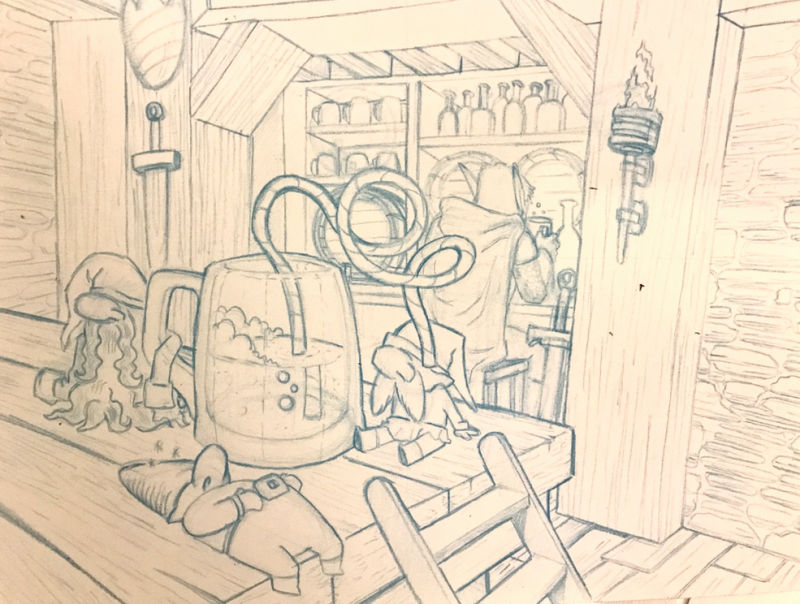
Ok redrew it on pencil. For space reasons i omitted the wizard and bucktooth gnomes but I think it still looks good.
Next step is inking.
instagram and twitter: @artofaleksey
alekseyillustration.com -
@swordofodin This is going great!
-
@swordofodin I like the simplified version you got going on now.
You might want to watch the straw in the gnomes eye. It looks a little funny ending there. Might want to just shorten it up a bit.
And personally I thought the extremely fat gnome from the early picture was a bit more fun, but is your call.
Looking good!
-The Prairie Fox
https://www.instagram.com/theprairiefox
https://www.theprairiefox.com -
@theprairiefox awesome thanks!!
-
This is looking so great!!! I can't wait to see a values treatment!! Very very cool--thanks for sharing your process with us!!
-
I feel that the straw is creating a tangent with the barrel behind it. Perhaps you could simplify the straw or remove it altogether (Although I like how it reads whimsically) Or maybe put a spout on the tankard!
-
@swordofodin This drawing is so funny. Your composition also works really well. Re: how well the concept matches the prompt "Big", I had to think about it a bit to make it match, but it works with the following sample text: The gnomes mistakenly thought that their bellies were big enough for a full mug of ale. Suggestion: the gnome closest to the viewer lying down is hilarious and is what instantly caught my eye. I like how round his belly is. Consider emphasizing beer guts on the other two, as well. Or showing one of them doing a big beer belch.
-
@johanna-kim cool thanks for the tips
-
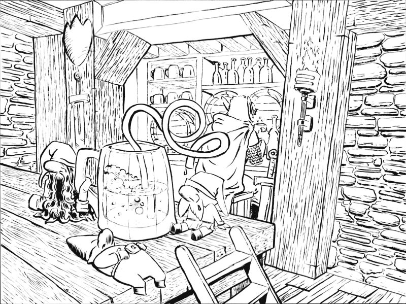
Ok i finished inking it. I messed up on a few places which I’m going tk fix on my ipad before coloring it. But here is the inked version:
-
Your gnomes are looking awesome
Portfolio: nyrrylcadiz.com
Instagram: https://www.instagram.com/nyrryl_cadiz/
YouTube: https://www.youtube.com/channel/UCbJCF1Im8ZO7hpGWTKOJMuA -
@nyrrylcadiz thanks! I cant wait to color this
-
@aleksey I am just now seeing this, but I really like the version with the darkened room! I like the overall environment. And I rather like the concept of the two staggering gnomes with their arms around each other. I like the others too, though.
My main advice at this point would be to make sure you keep eye going towards the gnomes. Although I like the torch light, maybe if it were obviously a light source for the gnomes, or else threw them into sharp silhouette, it would put more focus on them.
P.S. Oh wait, the inked version didn't load the first time. Now I see it. It does look good! You can do the focus part with color and value.


