BIG- WIP
-
@nyrrylcadiz Oh, I didn't say that well. I meant the purple in the whole bottom right color scheme, though it's true that most of it is at the bottom right. What comes to mind when I think of bright colors becoming creepy is how clouds get when there's about to be a tornado or other very severe storm. That's not a very technical description, but you probably get the idea. You think, "Oh, something's just not right about that color!" That said, now I'm running of the mouth and I'm sure whatever you do with it will be fine!
 Look forward to seeing the next step!
 -
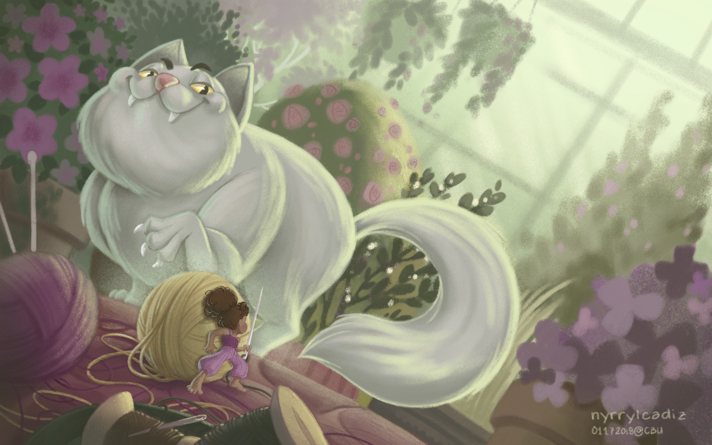
Hi guys! I just finished working on my Big piece. Please let me know if you have any critiques or suggestions. I truly appreciate it. Thank you.
-
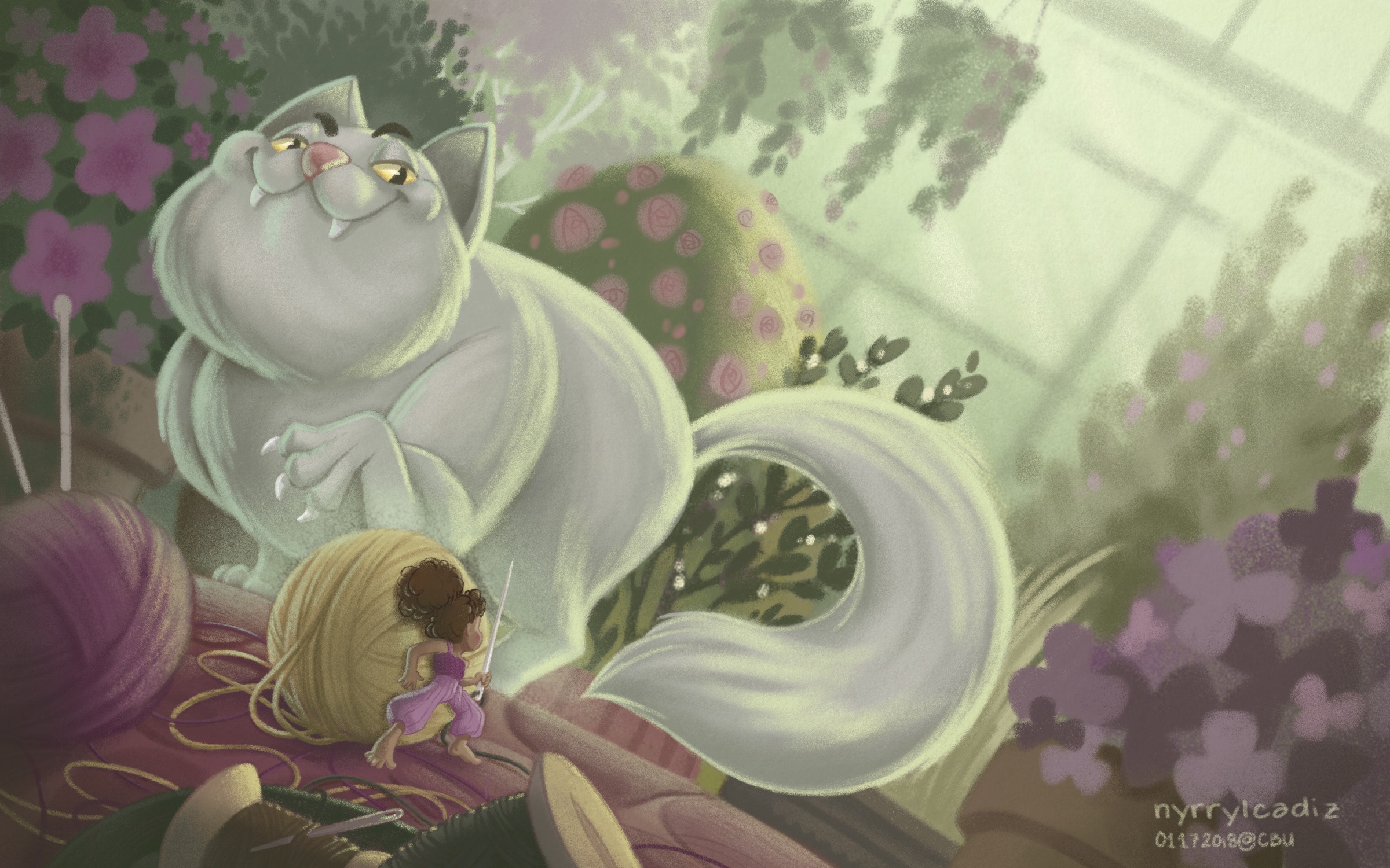
Hi! It’s me again! Here’s a new version. I edited the threads on the floor. They were too cluttered

Portfolio: nyrrylcadiz.com
Instagram: https://www.instagram.com/nyrryl_cadiz/
YouTube: https://www.youtube.com/channel/UCbJCF1Im8ZO7hpGWTKOJMuA -
@nyrrylcadiz This turned out great! There is something bothering me about the cat though, I just can’t put my finger on it. It’s not anything to do with design or perspective (those are great), I think it’s in the contrast or edges. The girl is so sharp and crisp with great colour and contrast, and the cat doesn’t seem to have the same level of sharpness. The cats body seems almost too soft and marshmallowy, maybe it just needs some sharper fur edges jetting out here or there? I’m not sure. Hope this helps. Really nice work!
-
@nyrrylcadiz That face on that cat though! Scary!
-
@nyrrylcadiz This is coming along really nice! Love the texture brushes you are using giving it a nice pastel look.
-
@inkandspatter @evilrobot @ThisKateCreates thank you!
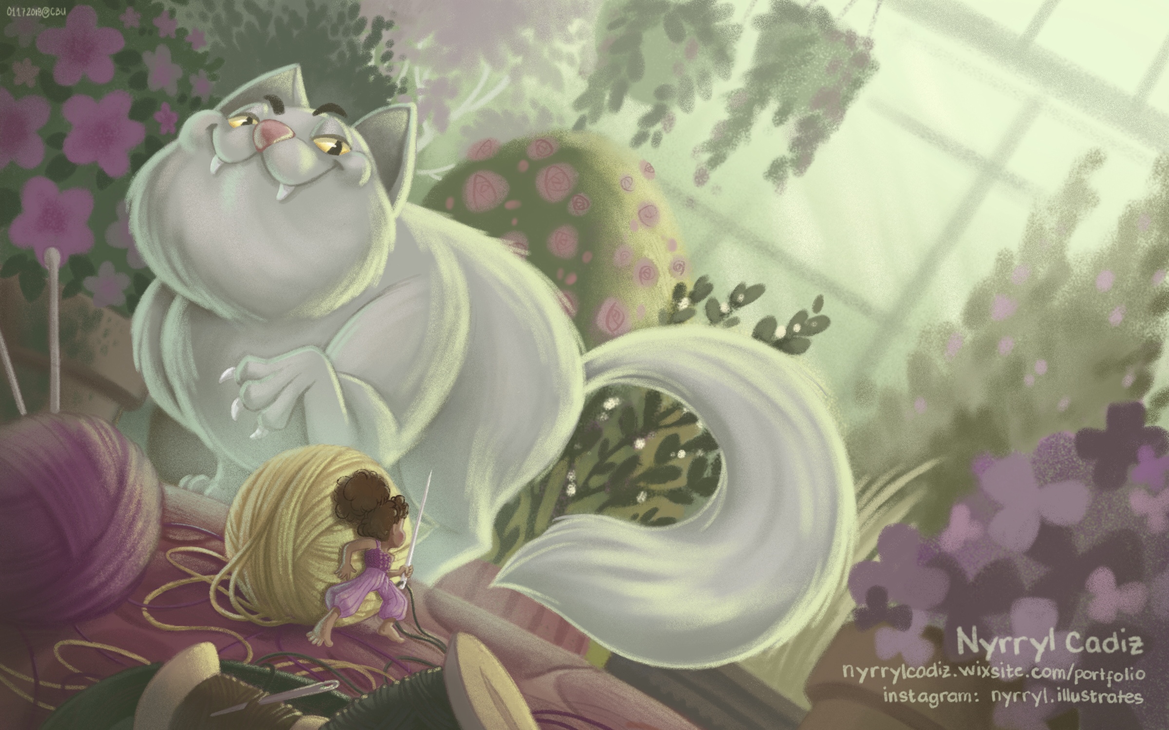
Hi, everyone! Here’s my final piece. I hope you like it.
Portfolio: nyrrylcadiz.com
Instagram: https://www.instagram.com/nyrryl_cadiz/
YouTube: https://www.youtube.com/channel/UCbJCF1Im8ZO7hpGWTKOJMuA -
@nyrrylcadiz It’s incredible! I love the lighting and perspective, it creates such a great tension.
-
Wonderful work @nyrrylcadiz , that cat's face is just brilliant! I love the colours too

-
@inkandspatter @hannahmccaffery thank you, guys! I’m very glad you like it.
 ️
️