Love WIP
-
I am also for the second one. The first one he does not seem to be as focused on her as the second. Looking forward to seeing this one colored.
-
@demotlj @KathrynAdebayo @cbrocke @Chip-Valecek Not what I was hoping to hear
 , but thanks guys, I really appreciate the advice. I can definitely see why everyone chose the second, but for some reason I still have a strong preference for the first. My husband also prefers the first, he actually doesn’t like the second at all, so I am definitely confused. The second is clearly the most popular choice though, so I’m going to ink it and maybe I will feel differently.
 -
Maybe you can take the best of both worlds! I'm really responding to the roundness in the shapes of the first composition. So maybe you can take those shapes but rework the expressions so that the male seems to be more focused. He can still have a playful and goofy "WOW WOW WOW" feeling, but I think it should be more focused on the female. Really creative idea! I like the concept a lot!
-
@inkandspatter I think that in the first picture the bird's faces are definitely cuter and the bodies shaped a little better than the second, but in the second version the birds are more focused on each other and captures their emotions better. I hope that's helpful. Your picture looks really fun!
-
@jennymwine @avfarrar That is very helpful! Maybe I don’t need to choose between them, but combine what I like from each!
-
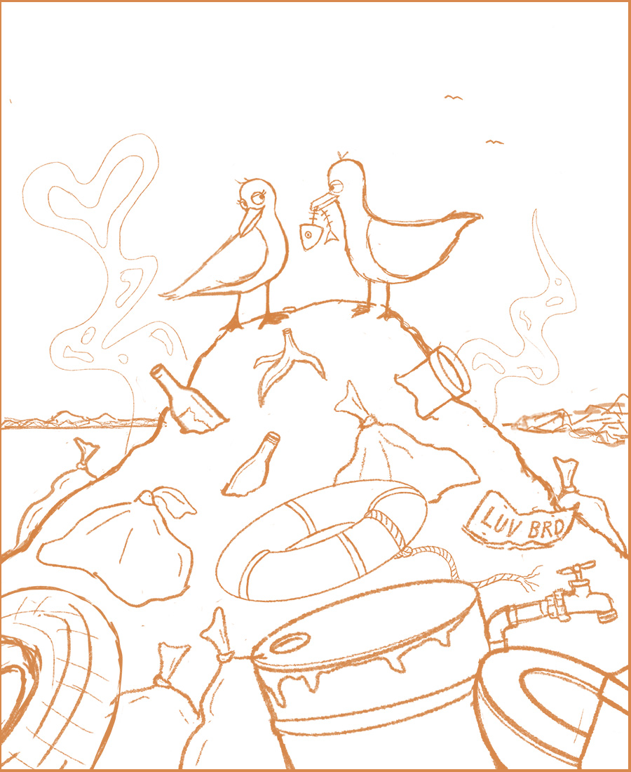
Ok, so here are my updated seagulls. Thank you so much to all of you for you advice, you have been an amazing help! Critiques welcome as always!
-
Sorry i'm a little late but I also like the first one like you, it's definitely much better now that you've added the eyelids but i preferred it when the male seagulls' head was slightly to the side so you could see both eyes, you can give him eyebrows then to add to his smitten expression - like one up and one down eyebrow if you know what i mean? The female's face is brilliant
")
-
@hannahmccaffery Thank you, I was focusing so much on the expression, I missed the second eye. Great idea with the eyebrows, I will give that a try!
-
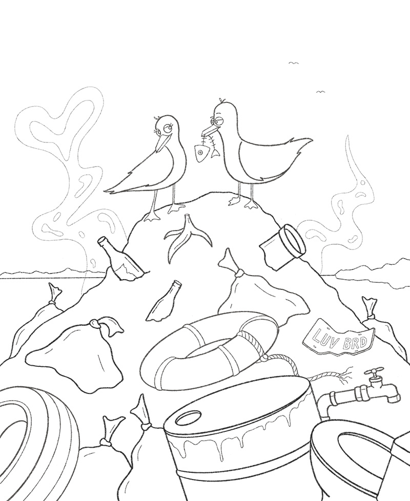
Linework finished!
-
@inkandspatter Yay! Great job! It's looking so good! I love what you did with the male bird. I think you made some really strong changes
-
@inkandspatter Looking good! The male bird's expression turned out great. The lower left and upper right bands on the life ring look a little off center to me. Might want to fix that if it wasn't intentional.
-
Ohhh wow this is so awesome! Love the LUV BRD license plate too! Curious to see what colors you will use. Keep up the good work
-
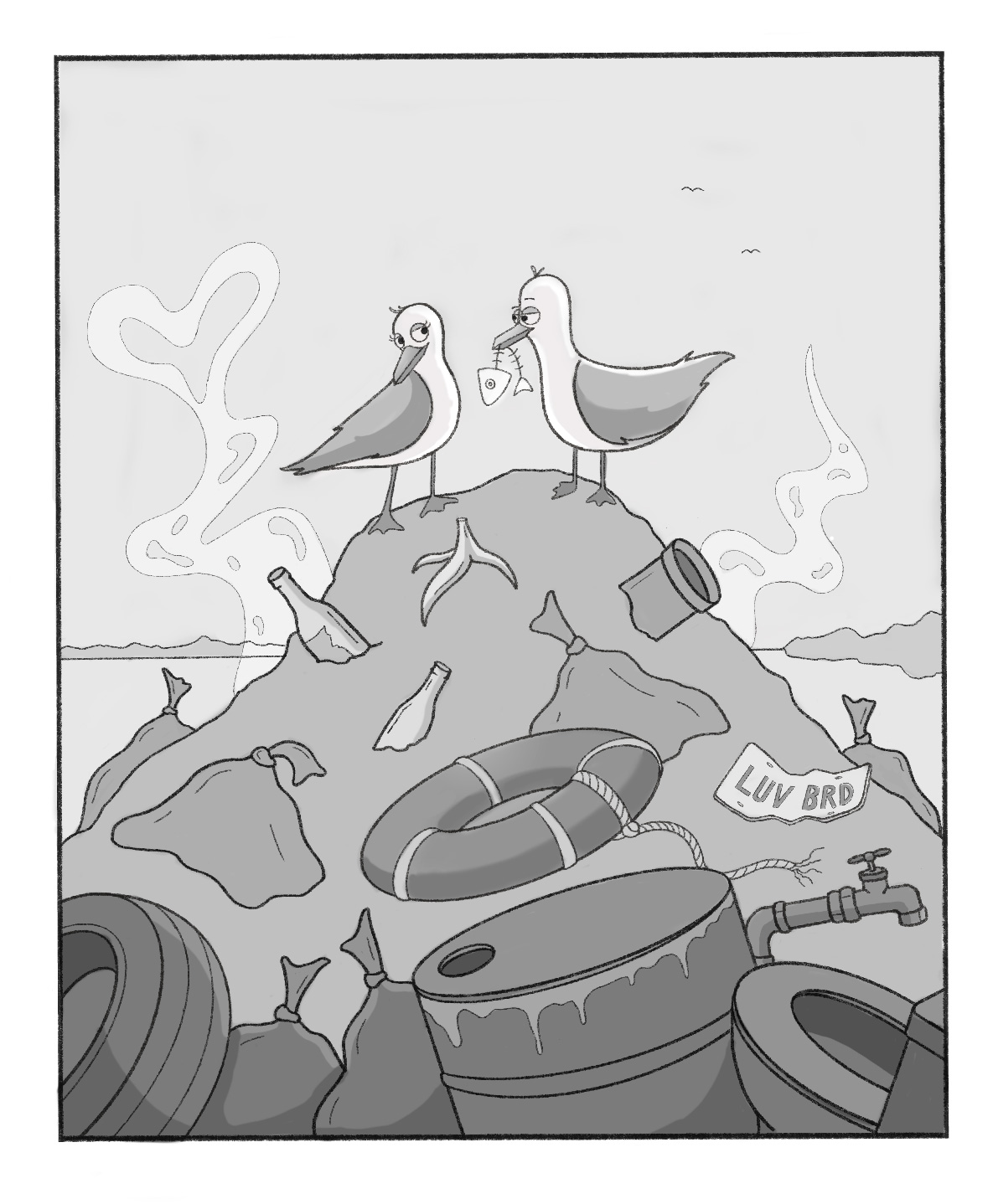
Here are my values for this composition. I don't have much experience with value studies, but I'm really hoping to improve my painting and colour skills, so I figure creating values studies before painting is probably a good habit to get into.
-
This looks great! Love it!
-
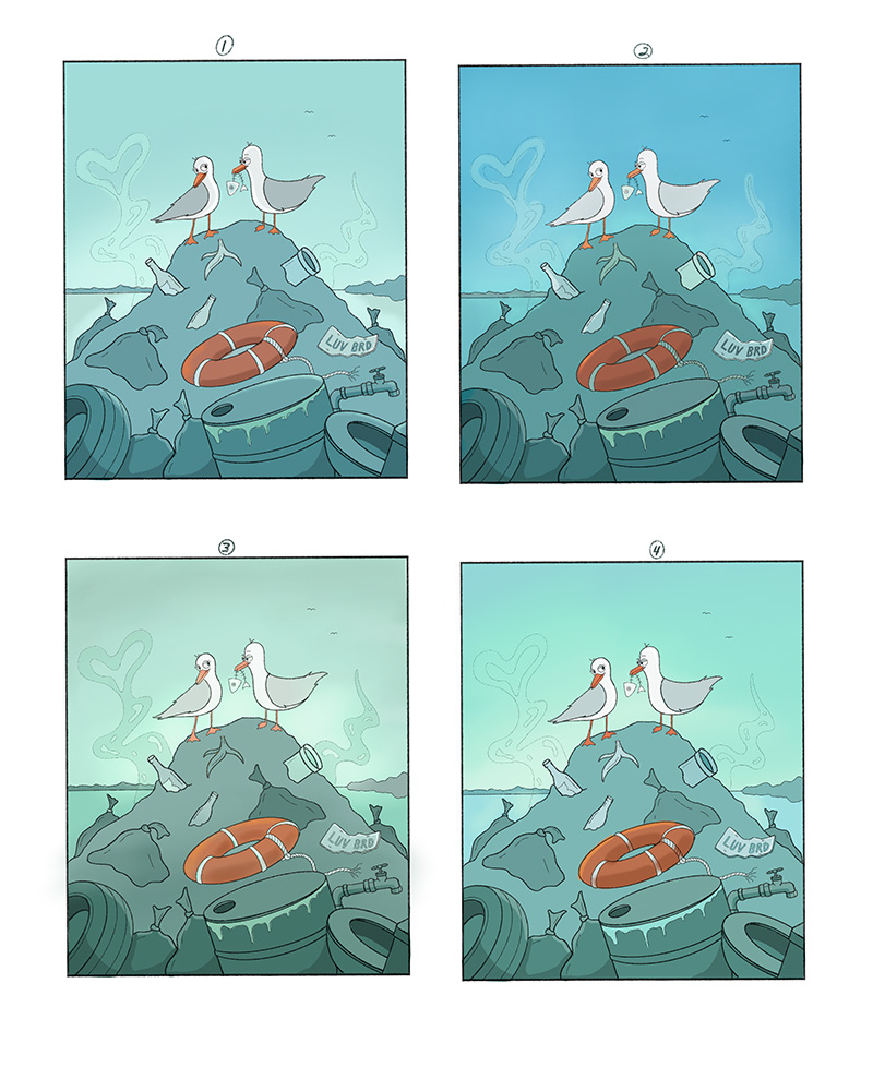
As I said before, I struggle with colour. So here are some colour studies I did for this comp, any feedback or advice is appreciated!

***The blue sky on number 2 should not be so vibrant - Procreate really sucks for exporting certain colours inaccuratley.
-
@inkandspatter 2 has more colour contrast with the orange so I like that one the best! But perhaps the 3rd green hill in number 2 if that may work.
-
@inkandspatter I agree with @Heather-Boyd I like 2. It stood out right away to me.
-
@inkandspatter same as the other two here above :face_with_stuck-out_tongue: but I like the chemical waste dripping out in picture four alot as well. Maybe add some shadings underneath the rubble too to make it more 3D-ish?
-
Here is my final, finished not perfect
Thank so much for all your feedback and help, I learned so much because of it!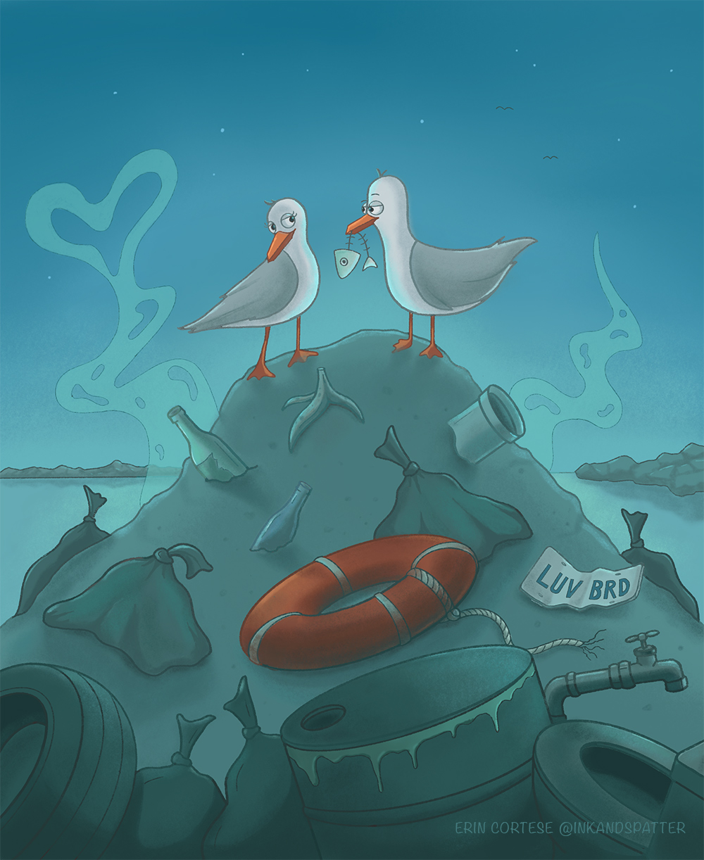
-
@inkandspatter Great job! This turned out nice.
