Society of Visual Storytelling

    SVSLearn Forums

    • Register
    • Login
    • Search
    • Recent
    • Tags
    • Popular
    • Users
    • Groups
    • Search

    Love WIP

    Artwork
    13
    30
    1931
    Loading More Posts
    • Oldest to Newest
    • Newest to Oldest
    • Most Votes
    Reply
    • Reply as topic
    Log in to reply
    This topic has been deleted. Only users with topic management privileges can see it.
    • Erin.Cortese
      Erin.Cortese Moderator @Guest last edited by

      @hannahmccaffery Thank you, I was focusing so much on the expression, I missed the second eye. Great idea with the eyebrows, I will give that a try!

      1 Reply Last reply Reply Quote 0
      • Erin.Cortese
        Erin.Cortese Moderator last edited by

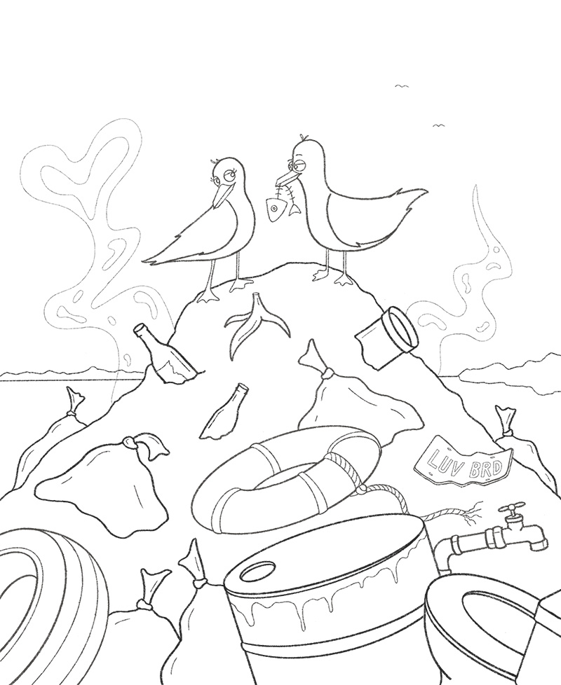
        Linework finished!
        Line_art.jpg

        jennyeickbush JerrySketchyArt 2 Replies Last reply Reply Quote 6
        • jennyeickbush
          jennyeickbush @Erin.Cortese last edited by

          @inkandspatter Yay! Great job! It's looking so good! I love what you did with the male bird. I think you made some really strong changes 🙂

          1 Reply Last reply Reply Quote 1
          • JerrySketchyArt
            JerrySketchyArt @Erin.Cortese last edited by

            @inkandspatter Looking good! The male bird's expression turned out great. The lower left and upper right bands on the life ring look a little off center to me. Might want to fix that if it wasn't intentional.

            1 Reply Last reply Reply Quote 1
            • Sas
              Sas last edited by

              Ohhh wow this is so awesome! Love the LUV BRD license plate too! Curious to see what colors you will use. Keep up the good work

              https://www.instagram.com/sasmakkinje/

              1 Reply Last reply Reply Quote 1
              • Erin.Cortese
                Erin.Cortese Moderator last edited by

                Here are my values for this composition. I don't have much experience with value studies, but I'm really hoping to improve my painting and colour skills, so I figure creating values studies before painting is probably a good habit to get into.
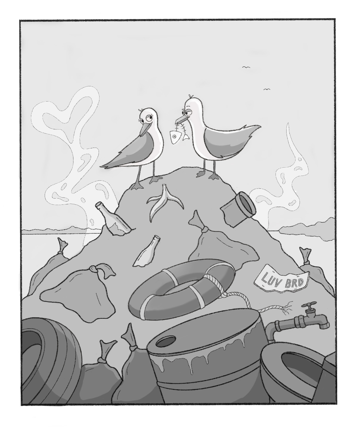
                values.jpg

                1 Reply Last reply Reply Quote 5
                • C
                  cbrocke last edited by

                  This looks great! Love it!

                  1 Reply Last reply Reply Quote 0
                  • Erin.Cortese
                    Erin.Cortese Moderator last edited by Erin.Cortese

                    As I said before, I struggle with colour. So here are some colour studies I did for this comp, any feedback or advice is appreciated! ☺

                    ***The blue sky on number 2 should not be so vibrant - Procreate really sucks for exporting certain colours inaccuratley.
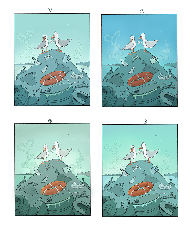
                    Values_2.jpg

                    Heather Boyd Chip Valecek Sas 3 Replies Last reply Reply Quote 1
                    • Heather Boyd
                      Heather Boyd @Erin.Cortese last edited by Heather Boyd

                      @inkandspatter 2 has more colour contrast with the orange so I like that one the best! But perhaps the 3rd green hill in number 2 if that may work.

                      Instagram: www.instagram.com/heatherboyd.illustration/
                      Website: https://heatherboydillustration.ca
                      Shop: https://www.inprnt.com/search/products?q=HeatherBoydIllustration
                      Ko-Fi: https://ko-fi.com/heatherboydillustration

                      Be blessed,

                      1 Reply Last reply Reply Quote 1
                      • Chip Valecek
                        Chip Valecek SVS Team SVS OG @Erin.Cortese last edited by

                        @inkandspatter I agree with @Heather-Boyd I like 2. It stood out right away to me.


                        https://www.instagram.com/chipvalecek/
                        https://www.facebook.com/cvalecek
                        http://www.cshellmedia.com/

                        1 Reply Last reply Reply Quote 2
                        • Sas
                          Sas @Erin.Cortese last edited by

                          @inkandspatter same as the other two here above :face_with_stuck-out_tongue: but I like the chemical waste dripping out in picture four alot as well. Maybe add some shadings underneath the rubble too to make it more 3D-ish?

                          https://www.instagram.com/sasmakkinje/

                          1 Reply Last reply Reply Quote 1
                          • Erin.Cortese
                            Erin.Cortese Moderator last edited by

                            Here is my final, finished not perfect 🙂
                            Thank so much for all your feedback and help, I learned so much because of it!
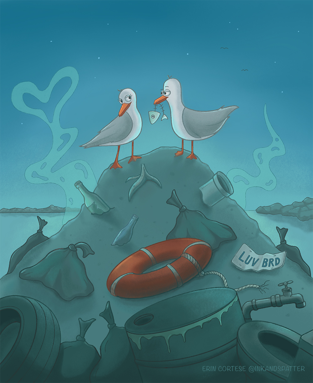
                            Love-ec.jpg

                            avfarrar Sas 2 Replies Last reply Reply Quote 6
                            • avfarrar
                              avfarrar @Erin.Cortese last edited by

                              @inkandspatter Great job! This turned out nice. 👍

                              There is beauty in life!

                              WWW.AVFILLUSTRATION.COM
                              www.instagram.com/avfillustration/

                              1 Reply Last reply Reply Quote 1
                              • Sas
                                Sas @Erin.Cortese last edited by

                                @inkandspatter It turned out great! Thank you for letting us come on your journey 😃

                                https://www.instagram.com/sasmakkinje/

                                1 Reply Last reply Reply Quote 1
                                • First post
                                  Last post