Society of Visual Storytelling

    SVSLearn Forums

    • Register
    • Login
    • Search
    • Recent
    • Tags
    • Popular
    • Users
    • Groups
    • Search

    WIP March book cover composition. Critiques welcome.

    Artwork
    21
    79
    4647
    Loading More Posts
    • Oldest to Newest
    • Newest to Oldest
    • Most Votes
    Reply
    • Reply as topic
    Log in to reply
    This topic has been deleted. Only users with topic management privileges can see it.
    • ArtofAleksey
      ArtofAleksey @Erin.Cortese last edited by

      @inkandspatter yeah i want that contrast between the spaces. I’m trying to make the well and frog feel mystical and out of place from the environment because they’re magical. Im worried its not working

      instagram and twitter: @artofaleksey
      alekseyillustration.com

      Erin.Cortese 1 Reply Last reply Reply Quote 0
      • ArtofAleksey
        ArtofAleksey last edited by ArtofAleksey

        I’m comparing the colors on procreate and the jpg I uploaded and the colors are weird and different on the jpgs, I’m gonna try the png let me know if the colors look different to you guys, I feel like I’m seeing things
        PNG:
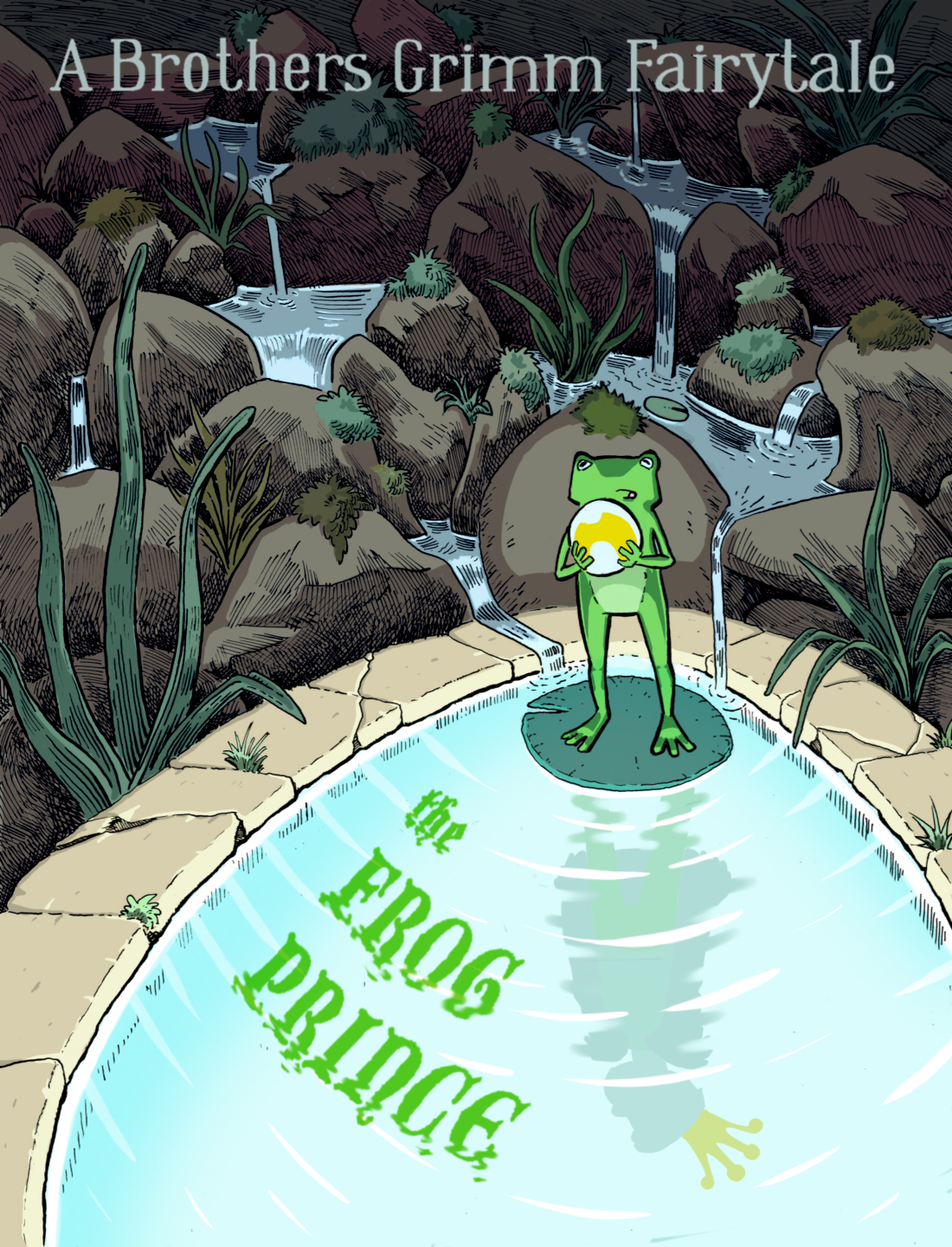
        B9B2B38D-8F55-4DE8-B39A-91E6414AA32D.png

        JPG:
        26C83AD1-82A4-4774-901A-8BFC4BD5EAB1.jpeg

        instagram and twitter: @artofaleksey
        alekseyillustration.com

        Erin.Cortese 1 Reply Last reply Reply Quote 0
        • Erin.Cortese
          Erin.Cortese Moderator @ArtofAleksey last edited by Erin.Cortese

          @Aleksey Maybe you could get that effect with high contrast lighting rather than high contrast local colours? Wait, I think I see exactly what you are trying to do. The highly saturated greens do not read like they are from lighting, they look as though they are the natural colour of the objects. Maybe you need some softer edges to make it look like a lighting effect?

          1 Reply Last reply Reply Quote 1
          • Erin.Cortese
            Erin.Cortese Moderator @ArtofAleksey last edited by Erin.Cortese

            @Aleksey After looking at your drawing again I realized that you don't have any soft edges, so they may look strange to add. Instead maybe you could shift all of the green hues on the frog and title toward blue so they would look like they were picking up colour and light from the pond. Here is a rough example of what I mean...(I added some blue to the surrounding grass too)
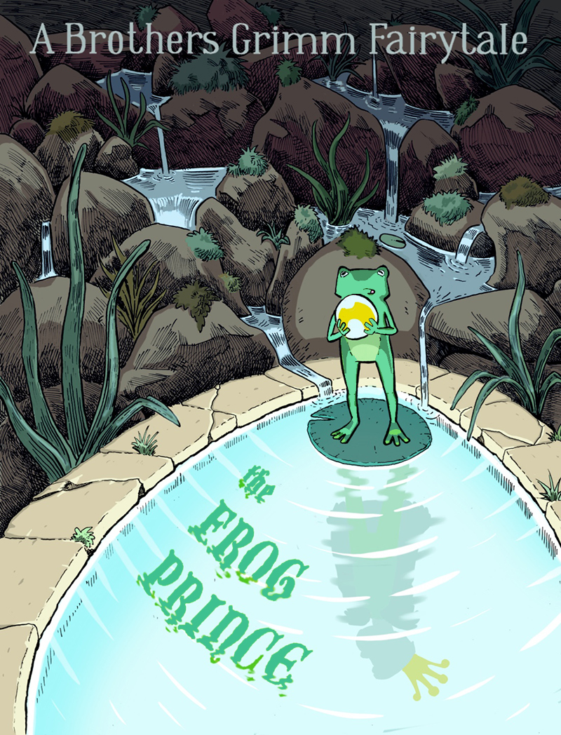
            frog.jpg

            ArtofAleksey 2 Replies Last reply Reply Quote 3
            • ArtofAleksey
              ArtofAleksey @Erin.Cortese last edited by

              @inkandspatter hmm ok ty ill play around with it a bit more.

              instagram and twitter: @artofaleksey
              alekseyillustration.com

              1 Reply Last reply Reply Quote 0
              • ArtofAleksey
                ArtofAleksey @Erin.Cortese last edited by

                @inkandspatter ok I think I figured it out, what do you think of this? You all were right there was a lot of yellow in various parts of it not just the plants and frog.
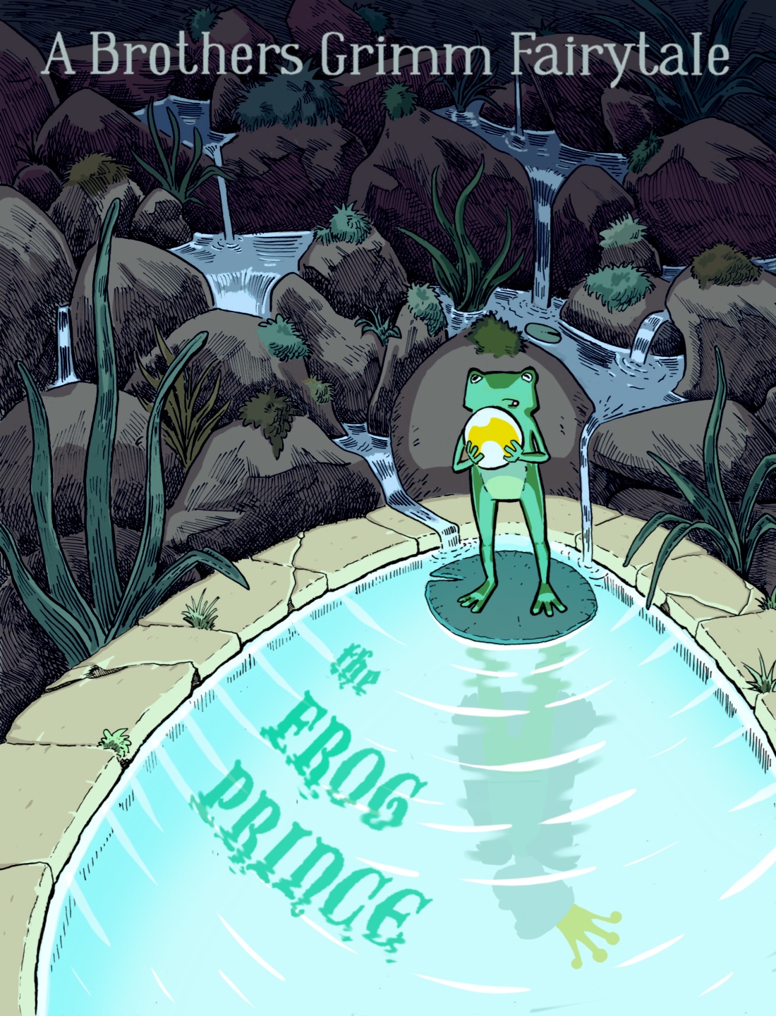
                42E63088-3F18-41F7-9FD7-45DE913242B6.jpeg

                instagram and twitter: @artofaleksey
                alekseyillustration.com

                Erin.Cortese 1 Reply Last reply Reply Quote 2
                • Erin.Cortese
                  Erin.Cortese Moderator @ArtofAleksey last edited by

                  @Aleksey Yes, it definitely ties in much nicer!

                  ArtofAleksey 1 Reply Last reply Reply Quote 1
                  • ArtofAleksey
                    ArtofAleksey @Erin.Cortese last edited by

                    @inkandspatter whew ok. I think I’m done with this.

                    instagram and twitter: @artofaleksey
                    alekseyillustration.com

                    Erin.Cortese MichaelaH 2 Replies Last reply Reply Quote 0
                    • Erin.Cortese
                      Erin.Cortese Moderator @ArtofAleksey last edited by

                      @Aleksey I know that feeling! Great work, a lot of beautiful detail!

                      1 Reply Last reply Reply Quote 0
                      • MichaelaH
                        MichaelaH @ArtofAleksey last edited by

                        @Aleksey You have made it really good, love the arcs in the text and the color is much bette rnow, for me it is finished and perfect 🙂 Great work and progress...ufff

                        https://www.instagram.com/michaelaheimlich/
                        https://www.heimlich-illustration.de/

                        ArtofAleksey 1 Reply Last reply Reply Quote 0
                        • ArtofAleksey
                          ArtofAleksey @MichaelaH last edited by

                          @MichaelaH @inkandspatter thank you so much
                          And thank you to everyone else that has helped me with all the feedback. I’m so bad with color, I may rewatch that updated color and light class will terry posted to refresh myself.

                          instagram and twitter: @artofaleksey
                          alekseyillustration.com

                          MichaelaH Erin.Cortese 2 Replies Last reply Reply Quote 1
                          • MichaelaH
                            MichaelaH @ArtofAleksey last edited by

                            @Aleksey I know what You mean, I am bad with color also, I love my sketches, but I am afraid of starting to put the color on it...I am still at the sketch phase with my cover...
                            me too, have to watch the new version of the color and light class.
                            But now, be happy, You have finished this great piece...congrats.

                            https://www.instagram.com/michaelaheimlich/
                            https://www.heimlich-illustration.de/

                            1 Reply Last reply Reply Quote 2
                            • Erin.Cortese
                              Erin.Cortese Moderator @ArtofAleksey last edited by

                              @Aleksey It’s funny you mention the new class, that’s what I am watching today! I have almost finished all the videos and the class is really great!

                              ArtofAleksey 1 Reply Last reply Reply Quote 2
                              • ArtofAleksey
                                ArtofAleksey @Erin.Cortese last edited by

                                @inkandspatter clearly you’ve been able to help me too so I’d have to agree

                                instagram and twitter: @artofaleksey
                                alekseyillustration.com

                                1 Reply Last reply Reply Quote 0
                                • MOO
                                  MOO SVS OG last edited by

                                  I like the ripples 🙂

                                  Marsha Ottum Owen

                                  ArtofAleksey 1 Reply Last reply Reply Quote 0
                                  • ArtofAleksey
                                    ArtofAleksey @MOO last edited by

                                    @Marsha-Kay-Ottum-Owen oh thank you! You have no idea how much i hate drawing ripples after this! Although I must admit I got better at it after this.

                                    instagram and twitter: @artofaleksey
                                    alekseyillustration.com

                                    1 Reply Last reply Reply Quote 1
                                    • First post
                                      Last post