Society of Visual Storytelling

    SVSLearn Forums

    • Register
    • Login
    • Search
    • Recent
    • Tags
    • Popular
    • Users
    • Groups
    • Search

    Art Book Cover March Challenge - WIP

    Artwork
    11
    26
    1874
    Loading More Posts
    • Oldest to Newest
    • Newest to Oldest
    • Most Votes
    Reply
    • Reply as topic
    Log in to reply
    This topic has been deleted. Only users with topic management privileges can see it.
    • ArtofJoseGalue
      ArtofJoseGalue last edited by

      I'm gonna take a break! I need to sleep on these palettes. Yellow maybe?
      I think the piece is about 4-5 hours away, thank you all for keeping up!
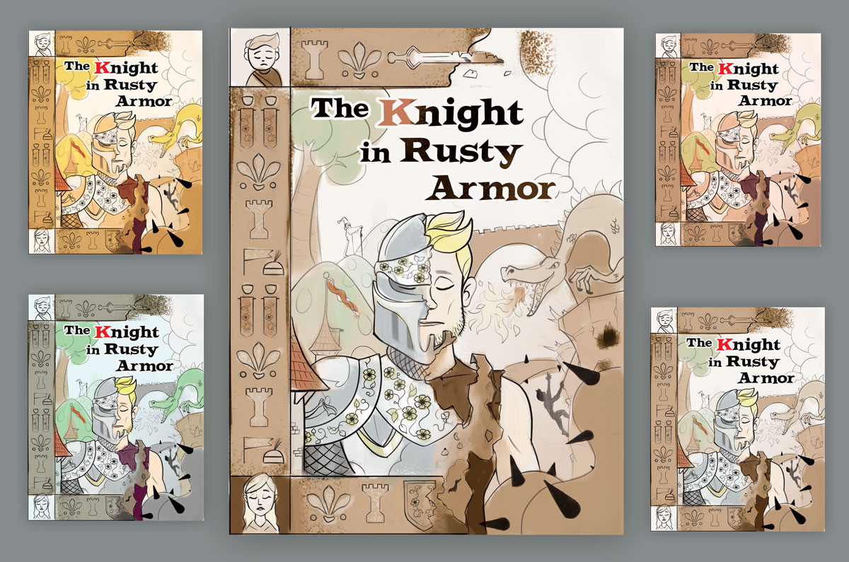
      sketch-12.jpg

      Jose A. Galue
      www.instagram.com/artofjosegalue/

      burvantill sigross Susan Marks 3 Replies Last reply Reply Quote 4
      • burvantill
        burvantill Moderator @ArtofJoseGalue last edited by

        @josegalue25 I like the yellow and also the one in the upper right. πŸ‘

        Lisa Burvant
        www.lisaburvant.com
        Instagram & Twitter & SVS: @burvantill

        1 Reply Last reply Reply Quote 0
        • sigross
          sigross @ArtofJoseGalue last edited by

          @josegalue25 I don't know the story, so I'm just going on what I can see. I reckon if you're going for this yin/yang splitting of the cover style, the title looks like it's been plonked on top. The rest of the cover has a harmony to it. I'd like to see the title more involved in what's going on around it. Invite it in to become a part of the rest of the cover.

          www.grossiebazaar.com
          www.sigross.com
          www.instagram.com/sigross/

          1 Reply Last reply Reply Quote 0
          • MichaelaH
            MichaelaH last edited by

            I like the yellow one also the most and as other have said, I would try to change the font style. You have really great concept.

            https://www.instagram.com/michaelaheimlich/
            https://www.heimlich-illustration.de/

            1 Reply Last reply Reply Quote 0
            • SCBenedict
              SCBenedict last edited by

              top left or top right.

              "Tell your own story, and you will be interesting." Louise Bourgeois

              scbenedict.com

              1 Reply Last reply Reply Quote 0
              • Bennie
                Bennie last edited by

                Top right would be my choise... title is better this way... now the rest of your illustration isn’t pushed in by the text anymore...

                https://www.instagram.com/bennievialle/

                1 Reply Last reply Reply Quote 0
                • ArtofJoseGalue
                  ArtofJoseGalue last edited by

                  Hi everybody, I've read that some of you haven't read the book.
                  I read the book many years ago, but I found this summary that is pretty good.

                  http://www.jfdperfsolutions.com/modules/news/personal_improvement-book_summary~3A_~26quot~3Bthe_knight_in_rusty_armor~26quot~3B_by_robert_fisher.html

                  Great story about family, self-help and hard challenges. Highly recommended!

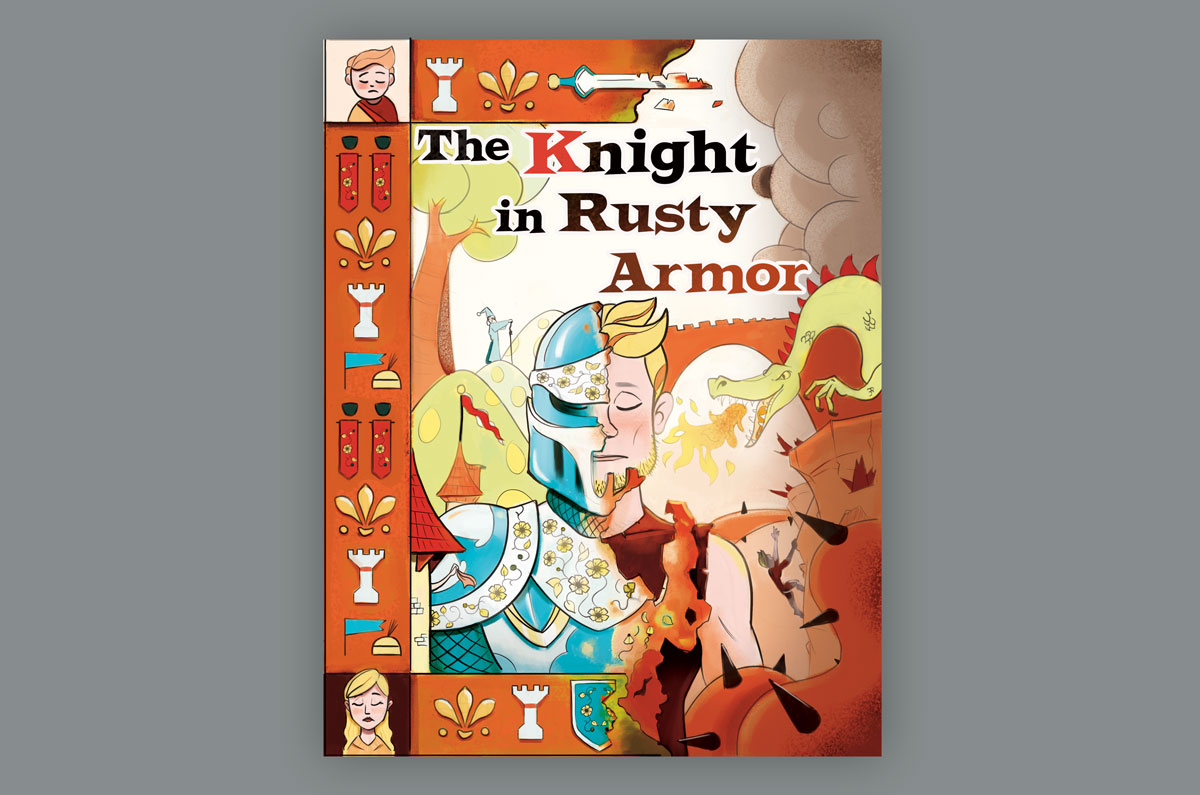
                  Below my take so far on this cover. I'm almost done but I'm gonna take a break.

                  sketch-14.jpg

                  Jose A. Galue
                  www.instagram.com/artofjosegalue/

                  Sas 1 Reply Last reply Reply Quote 1
                  • ArtofJoseGalue
                    ArtofJoseGalue last edited by

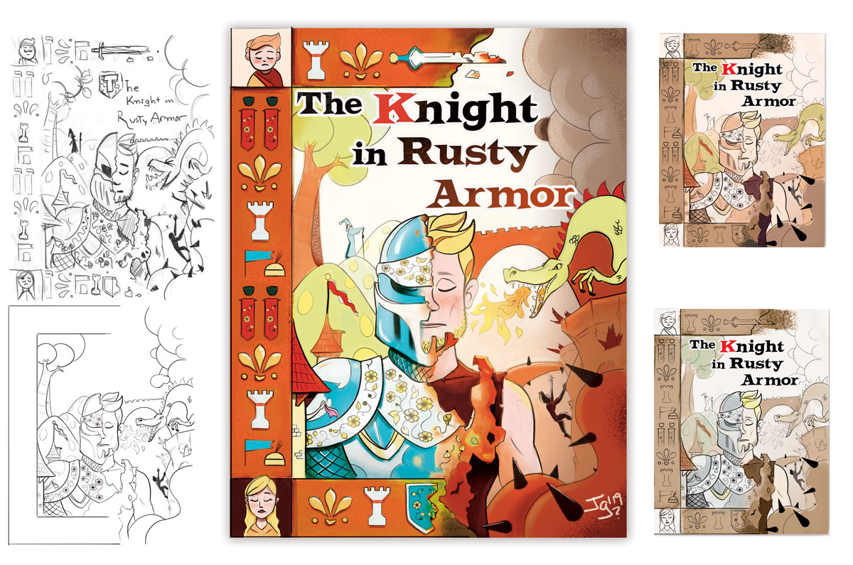
                    For those of you who like to skip until the end, here is part of the whole process and final piece.

                    sketch-15.jpg

                    Book Summary: http://www.jfdperfsolutions.com/modules/news/personal_improvement-book_summary~3A_~26quot~3Bthe_knight_in_rusty_armor~26quot~3B_by_robert_fisher.html

                    Jose A. Galue
                    www.instagram.com/artofjosegalue/

                    1 Reply Last reply Reply Quote 2
                    • Susan Marks
                      Susan Marks @ArtofJoseGalue last edited by

                      @josegalue25 It's great to follow-along on your work-in-progress.
                      I really like the border on the left half-I think it really reflects the half-ness of the Knight-that he is half-armor. The border is half-way around the book (in case I wasn't very articulate).

                      I like the palette in the lower left with the green. To my taste, it is a little more regal than the others which feel more contemporary and more earthy.

                      1 Reply Last reply Reply Quote 2
                      • djly
                        djly last edited by

                        @Johanna-Kim - wow-wee just beautiful!!

                        1 Reply Last reply Reply Quote 1
                        • Sas
                          Sas @ArtofJoseGalue last edited by

                          @josegalue25 Wow this looks great!!! Love your choice of font as well. Very medievely πŸ˜‚ Love the colors your choose. It was fun to see your progress and I learned a lot from you. Thank you for that!

                          https://www.instagram.com/sasmakkinje/

                          ArtofJoseGalue 1 Reply Last reply Reply Quote 1
                          • ArtofJoseGalue
                            ArtofJoseGalue @Sas last edited by

                            @Sas Thank you! Glad you liked it. I learned a lot from this piece too, it was so different.

                            Jose A. Galue
                            www.instagram.com/artofjosegalue/

                            1 Reply Last reply Reply Quote 1
                            • First post
                              Last post