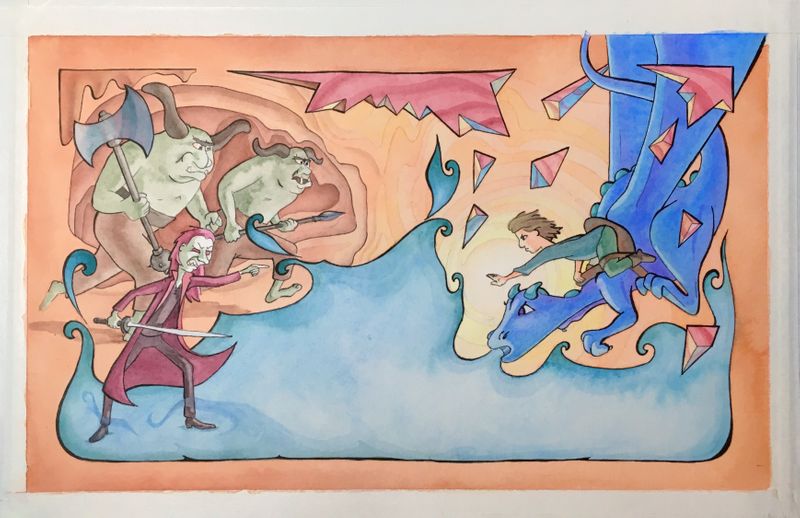
Eragon REDO! Book Cover WIP
-
Yay! It looks great, can't wait to see it all finished

-
Well, I’m finished and it’s not perfect. After my last post I finished drawing the full cover. After I transferred it to the watercolor paper and started adding color I got very depressed. I hated it. I liked the drawing but felt like I was just coloring within the lines. There was nothing special about it. I moped for a couple days and even had trouble drawing in my sketchbook. I was so far up my own butt I couldn’t see the light. I’m doing a sketchbook challenge this week so the fact that I was having to force my sketches really bummed me out even more. Then I drew something. I don’t know if anyone else would feel it but I thought it was great. Only because it made me feel good to draw it. After that the sketching went easier and I came back to my cover and added some details to help me like it if not love it. It’s time for a change and I feel like I just crawled out of a cocoon.

Lisa Burvant
www.lisaburvant.com
Instagram & Twitter & SVS: @burvantill -
Well I think it's turned out great, and you did the right thing by stepping away from it for a bit. It's a horrible feeling when you start something and you really like the drawing, then when you come to add colour it doesn't turn out the way you want it to - it's so disheartening! So well done for going back to it and working on it some more, you should be proud of a really great illustration
What does it look like with the title on it? -
@burvantill I like the backcover, great characters you did. The colors, I would only chose less saturated color for the dragon. I woul like to see Your book cover with the title on it. You did great. As for me, I am mostly not so happy with coloring my sketches, which I like a lot...I think we should color more and more be more confident in it.
-
@burvantill @MichaelaH I think it's a really common problem, I also prefer my sketches as I'm trying to "re-learn" how to colour in a simpler style, so you're not alone
like you say, it just takes more confidence and practice! -
@Robert-Smith no offense Robert but you’re barking up the wrong tree. This is a close knit community of artists that don’t need to be plagued by solicitors.
-
@hannahmccaffery @MichaelaH Thankyou for your words. They are appreciated very much. It has been a weird art week for sure.
I am working on the title portion in Photoshop today. I will post the final in the March contest thread. -
@burvantill
I definitely understand the fight you went with this piece, but I think this came out really strong. It reads perfectly for your age range and has a real professional touch to it - I can see this being in a book store. I also really enjoy the color nuances you’ve added this time around, chiefly the coloration of the crystal shards and the cave - I like how you balanced out what objects receive your line weight, as opposed to parts of your illustration that just received color treatment. It’s 100% you, with new treatments that I haven’t seen in your previous work, yet fit and make me, the viewer, strongly engage with it. I’m really curious to see how this piece influences your future work. In fact, the composition feels like it would work great as a spread too.
My crit is a little late in the game I’m sorry. But for next time, the boy holding out his arm - it might work better in the future to have him holding out his right arm, so that he is more open to the viewer and rounds out his shape more. The scary guys on the back are doing this and it really gives a sense of depth.
Nailed it.
-
Wow, I haven't read Eragon in years and years, so I don't remember the plot very well. But I thought it was an awesome idea to adjust the book cover for the age range you want to illustrate for! I think it's a great end result too, especially with the soft orange colors contrasting the blues.
I feel like I often have similar problems when it comes to colors. And I'm never sure if the problem lies with how I pick colors, how I apply them or if I forget to keep colors in mind while I'm actually sketching.
-
@kaitlinmakes good point about his arm. And Thankyou for the kissa$$.

Just kidding. ️
️ -
@Joen-Söderholm Thankyou. I think my problem lies more with the application of the color. I hold back because I’m afraid of messing it up. I forget that I could just start over if I do.