Feedback on thumbnails/composition?
-
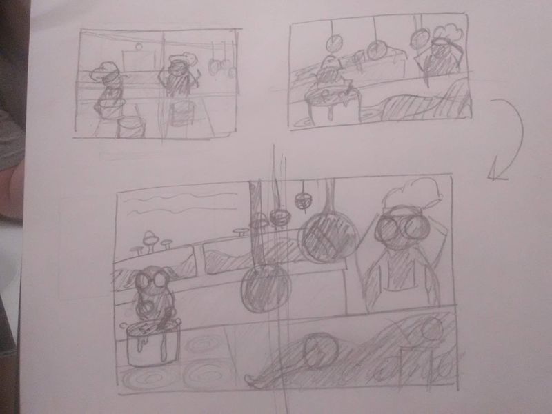
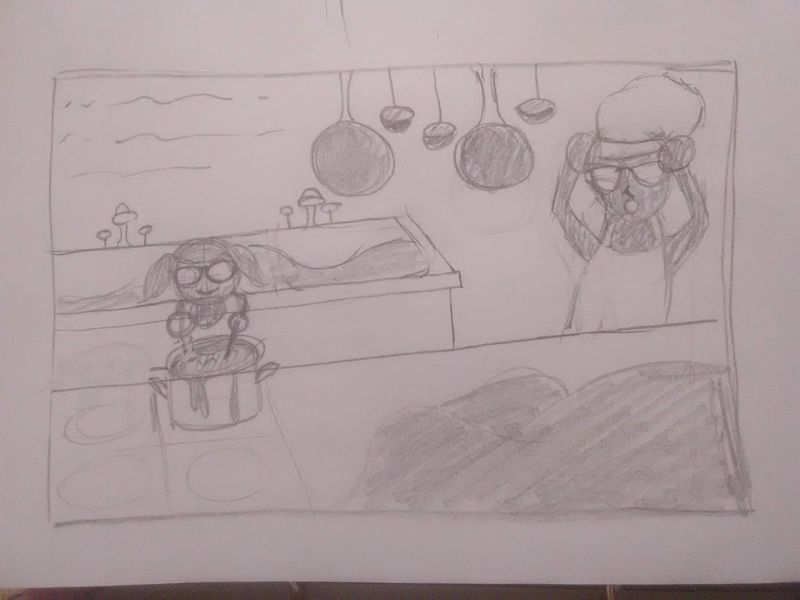
Hi everyone, I was hoping to get some feedback on my thumbnails for an illustration I'm working on to go in my very first portfolio. The idea is that a little girl wants to grow up and be a chef like her dad, and her dad walks in to find her in his restaurant kitchen cooking (and having made an enormous mess).


The big dark shape in the bottom right and the shape in the sinks is going to be the piles of destruction she's created (I'm going to fill those shapes in with dirty dishes and spilled ingredients, etc., but separate the objects with value).The sketches here are pretty rough, and were done with pencil in a sketchbook.
I'd appreciate any feedback at all (about storytelling, value, composition, etc.)
Thank you so much!!!
-
Hi
 First I like that you played in the last thumbnail more with the perspective instead of having a straight forward view on the table. It makes the whole composition feel more alive! Maybe it´s worth a try to push that even more.
I would lower the saturation of the hanging pots in the background. I feel like to have the three focal points (girl, dad, messy pile) is just the right amount to wander with your eye and to point out the hanging pots is maybe also not necessary in terms of story telling. I would also have some hanging pots behind the dad or move him a little bit more into the middle to strengthen the illusion of the pots being in the background and create more depth.
Hope it helped you a little
-
I agree with @saciia_ that the perspective change improves the piece.
If I would give this piece a keyword or two they would be: messy and surprised.
If those are the feelings you are going for I would push the tilt of the perspective even further. Making the image even further askew will push into that feeling of a messy surprise.
It would nice to see the total value layout as well. Currently the water in the sinks is blending into the girl and she might get lost. But I am not sure if you are intending this to be a value study or not.
-
@saciia_ @theprairiefox Thanks! Those are really helpful tips! I am first just figuring out the composition, but I will be doing a value study next before moving forward with a final piece.
This gives me something to work with, thank you so much!
-
I like the way the pots are hanging further down in the third drawing. Since that’s the page break you won’t lose anything by having them there. I think you should turn the father to face the girl more. 3/4 is more interesting than straight on. I can’t wait to see the mess.

-
@burvantill Thanks! It will probably take me a minute to get the mess in, haha! I've never drawn anything with a lot of objects before, but I'm going to give it a go! Thanks for the great feedback!
-
@nkdrawings I much prefer the last composition on the first page of roughs. It looks nice and busy and the perspective is slightly off giving the sense of stress or dread. The pans hanging in front might be a problem but I think you could give it a few more roughs and see where you go with it?