Chef’s Special WIP (Moment Before)
-
This is my progress for this months contest theme for “the moment before.” I decided on a chefs special surprise where our unsuspecting cook is visited by, well, the special and the guests are getting impatient! This image has gone through several composition/environment tweaks and I kind of got lost in adding background elements though they are very simple. After adding the values I showed my wife and daughter which both said the image came across as “creepy” which I understand. Is it too much, though? Do I need to lighten it or should I rework the characters? As I said I started having fun adding in background elements but now I wonder if I overdid it. There are times I look back at an earlier sketch that was cropped and wonder if I should stay with the simpler composition.
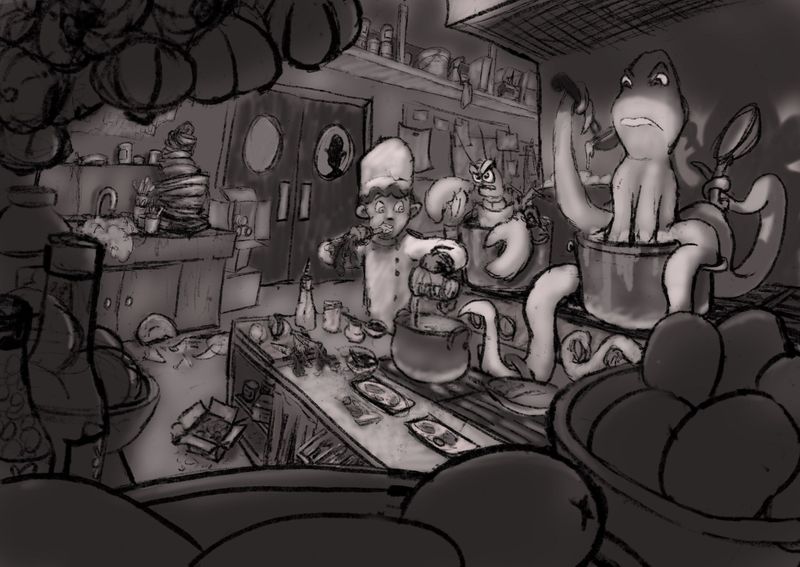
What do you guys think, is it worth going forward or should I go back to the drawing app?
-
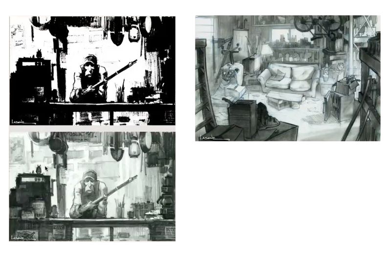
I feel there is a better and stronger concept hiding behind your sketch somewhere. It is a great drawing of the environment - such a challenging scene to draw, but I think the value can be organized better. You might want to take a look of works by Paul Lasaine. He is the master of grouping values, organing his environment with many things in them. Here are two images by him attached.
I am not entirely sure what the main story is here with the three characters - so it may need additional work on the characters to clarify the story.
-
@xin-li That's great advice, thanks! I thought the values could use more work but wasn't sure how. Those reference images are a great help!
-
I let the image sit for a few days and realized the characters were just so stagnant. It wasn’t a moment before he realizes “the food is starting a revolution,” or that “the octopus knows more about cooking than he does”, or “the bald elongated head man got really close to the window before opening the door” but was more like, “the moment before they all stood still and yawned.” Yikes! I’m sorry guys, really. So I took out the ol digital eraser and tried to make the characters more appealing, less stagnant, and less creepy. I liked the creep factor a little but it totally missed the target audience I had in mind and also felt out of place.
I liked the changes and moved forward with inking while Jake’s “finished not perfect” rang in my head. Time to finish and learn from it so the next one can be better. I plan to use @xin-li‘s awesome advice for value grouping and proceed from there. I’m thinking a light source coming from the pot would help move it up the interest scale.
Thanks for taking a look and if you read this far you get ten points and a fist bump for being awesome!
-
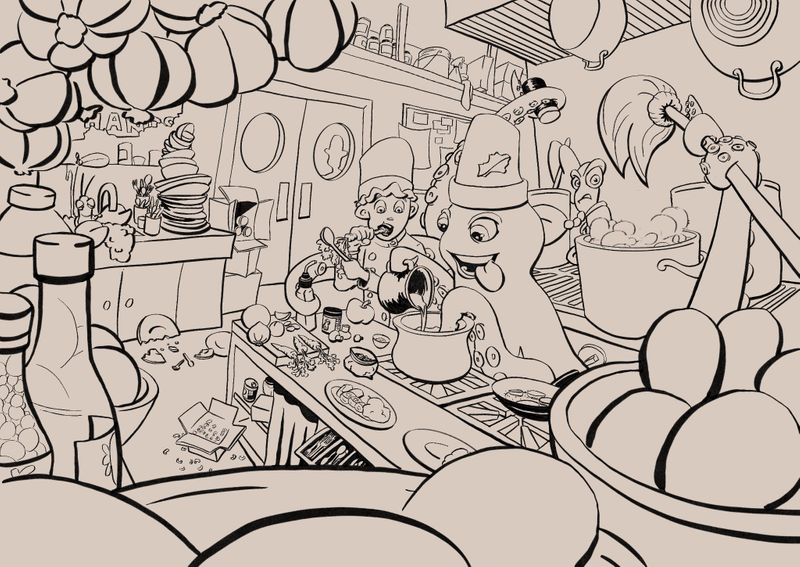
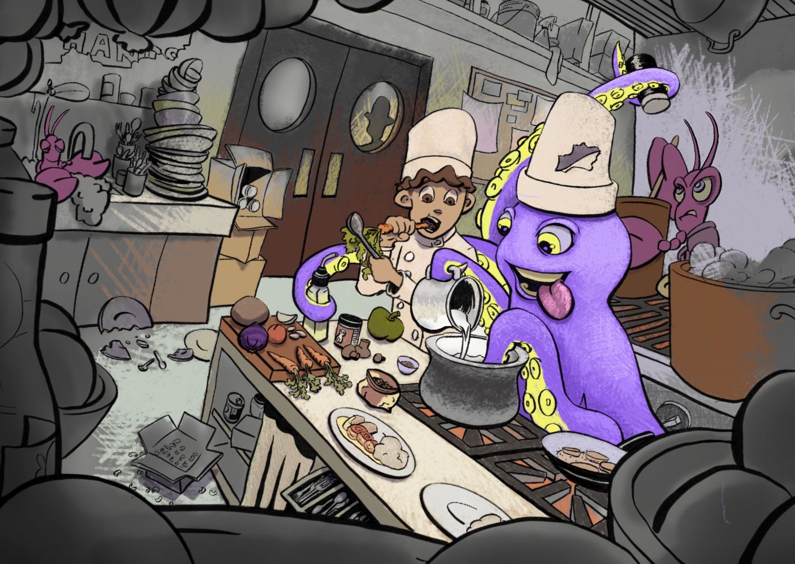
Continuing to stay the course. I’ve cropped to take away the clutter and focus more on the characters. I’m working through what I think is my biggest art handicap right now which is color. As it’s working now my idea is that the octopus is whipping up a concoction to bring color to the young chef’s bland world before the mean owner finds out.
I want to show that the color is spreading throughout the room with more saturated color at the “leading” edges to help emphasize that. It’s still a WIP but I am going to use the same hatching in the grayscale areas. I’m also going add some soft glow from the pot as a light source.
My questions are 1) does the spreading color read that way or does come across as just unfinished (the grayscale will have hatching, too) and 2) does the hatching and color actually work?
-
@Jon-Anderson said in Chef’s Special WIP (Moment Before):
- does the spreading color read that way or does come across as just unfinished (the grayscale will have hatching, too) and 2) does the hatching and color actually work?
- I'm not sure what you mean by does the spreading color read, but I think that it works. If you are going to hatch the gray as well, then I think it will look nice. Its a good color scheme that doesn't distract from the main characters. 2. yes. only if you hatch the grey as well. Then it will look intentional instead of unfinished.
Watch the spot behind the lobster on the stove, my eye is drawn to the sudden color value change, especially with the purple tentacle pointed in that direction.
This is looking so good. Its one of my favorites so far. =)x
Lisa Burvant
www.lisaburvant.com
Instagram & Twitter & SVS: @burvantill -
@burvantill Thanks for those pointers! I was afraid that the color/grayscale combo would come across as just unfinished instead of as a story element with feeling of movement. I'll definitely need to tone down the area on the right and I'm thinking that the tentacle in the back that flows between the "chefs" needs to be adjusted also to help separate the shapes. I noticed after looking at it on the phone that the main characters kinda run together when zoomed out. Thanks for the encouragement!
-
@Jon-Anderson I like your idea and this scene makes me laugh. Regarding your questions: (1) Your concept of spreading color as a metaphor for the added flavor that the octopus is bringing to the chef's cooking is really cool, but I think the hatching detracts from that effect. I feel that focusing on the color gradually turning to b/w or more subdued values at the edges, without the hatching, would communicate your message better; (2) The color palette works for me. I think if you keep to those colors, then add some light and shade values from the light sources in the room, everything may tie together.
Extra note: that silhouette in the door behind the main figures is very mysterious and pulls me away from the important action in the kitchen. Perhaps if you added another silhouette in the other door window, as if they two figures out there were just talking, it would feel less distracting.