Group run through creative environment design week 3 art and feedback
-
@Coley these are really good. I love that you added shading/texture.
There is just one thing that isn't clear. On the second one with the stairs. Are these stairs 'floating' (or overlapping)? The wall of the house seems to go in underneath the stairs. If there is indeed a space I would either add some shading, or put an extra support beam underneath the steps.
-
@nyrrylcadiz We are only on week two, and everyone is working at different paces. You should join!
-
@nyrrylcadiz joooooooooin uuuuuuuuuuus
")
-
Okeedokee ladies and gents, I may not be as present in the forums the next 6 days or so since I'm going to a comicon and not bringing a computer.
So next week's homework may be posted Monday night instead of Sunday night. But worry not! This group run through will keep going until we're all done.
Mostly because I wanna do another one after this one

So many awesome houses and couches this week
-
@Braden-Hallett Enjoy
-
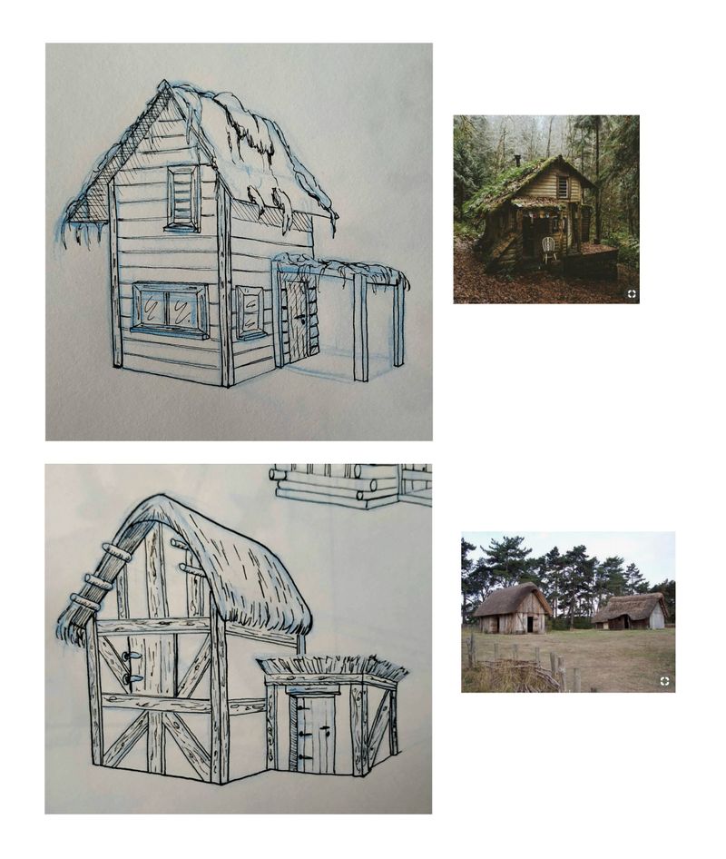
Okay, so here is my entry for the first exercise. I did them on paper, drawing nicely on a tablet is to difficult for me.
-
@murielle yes, I realized afterwards that there was an issue, the stairs start at a level even with the smaller part of the house but then are flush with the front part of the bigger part of the house lol. I didnt change it but maybe next go round I will try similar. thanks for pointing it out
-
@murielle Really nice, and on paper too..impressive! I really like your wood texture. The smaller hut in the bottom image is adorable, I love what you did with the roof.
-
@Braden-Hallett lol
 thank you so much but my schedule is jam-packed with school. I’ll probably try to catch up with you guys in a couple of months. Thanks though.
 -
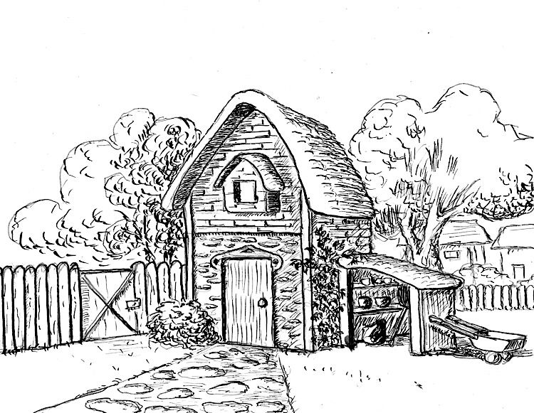
Here is my first one. I know we weren't supposed to get detailed but I am also trying to learn pen and ink so in the interest of time, I used this exercise for both design and pen work. I hope the teacher won't take off too many points for ignoring the rules of the assignment
I'd be interested in critiques, particularly regarding the inking. (One thing I learned is that it's hard to work small when inking -- this is 5x7 and the front is darker than I intended because I couldn't get the lines any finer.)
Laurie DeMott
instagram.com/demotlj -
@ErinCortese I think there cute and quaint
-
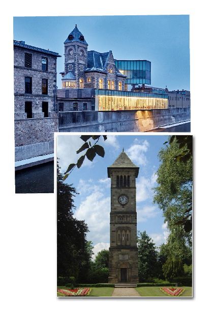
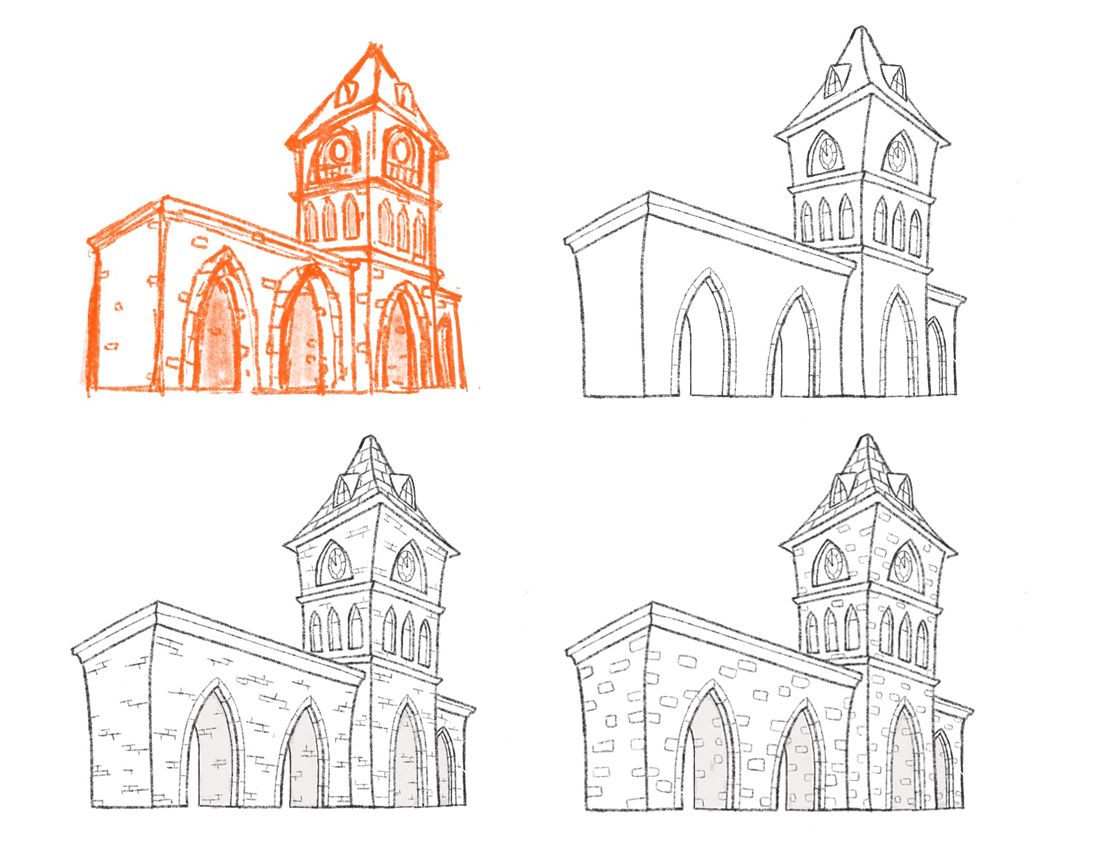
I did it! I found a process that helps me draw better buildings! I broke everything down into stages. I realized that I have to add the stylization and details after my initial sketch. It is the only way that I can visualize it for the time being. Drawing buildings feels very unnatural for me at the moment, so I need to focus on basic structure before anything else. It is a little more time consuming, but worth it! I tried a number of brick styles as well, and came up with two I like. I will probably do this in the future with other details such as doors and windows, etc.
-
@demotlj Very quaint image, I really like the design and layout! As for the inking, my critique would have to be based on whether or not this is a rough sketch. For a rough sketch, it is great - you are communicating the basic shadows and textures, and you have really created a nice tone/feel. If this is meant to be more of a finished piece, then the line work has some issues to be worked out. Inking is tough! The line work can really make or break a piece, so it is important to pay careful attention to things like being consistent with your stroke direction, making clean and deliberate strokes, and overlaying them with precision. Otherwise, it can look a little messy.
-
@ErinCortese That's really helpful. I don't even know if I was thinking about whether it was a sketch or a finished piece since I was just trying to get it done but that in itself shows I need to think things through more before I start laying down the ink. This was with a dip pen and technical pens are a little easier for me still but I definitely need to practice forethought and do more control work. Thanks.
Laurie DeMott
instagram.com/demotlj -
@demotlj I should mention, inking is not my strong suit, but here is a quick video by a professional ink artist that really helped me to understand inking techniques better. There are quite a few close up shots that let you see how the fine details are laid down.
-
@ErinCortese really fantastic!!!!
-
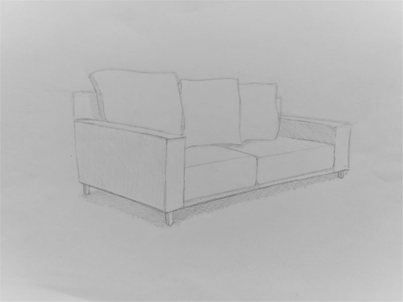
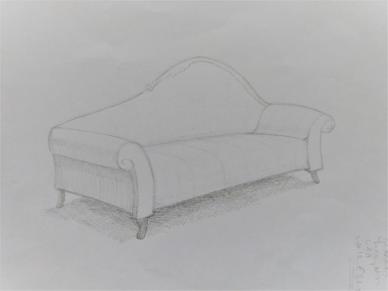
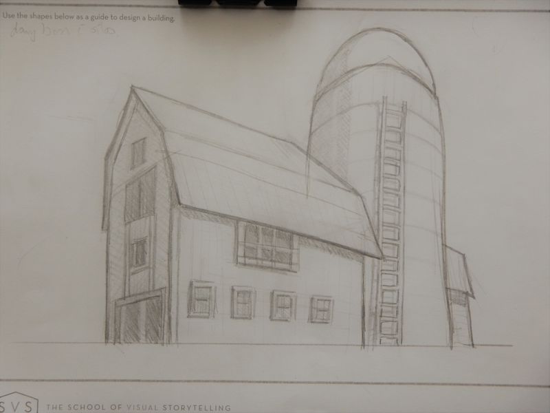
bad pics , but here are two couches and a building (dairy barn and silo)
I tried in photoshop but the tablet is my nemesis lol@Braden-Hallett if you have any crits I am open to anything! And anyone else.........fire away!
the dairy barn I actually did on the printout homework page so there are lines there that I can't erase.......two show up pretty strongly.....one is on the roof line below where the "bend" is in the roof and one is a line dropped down from the silo through the barn, can't erase ! I could put it into photoshop and do it but time is of the essence for me today and this was just a sketch for learning
-
@Coley love the barn. The roofing in the back corner could poke out a bit more, and the ladder be more to the right on the cylinder, other than that I’d say you nailed it
instagram and twitter: @artofaleksey
alekseyillustration.com -
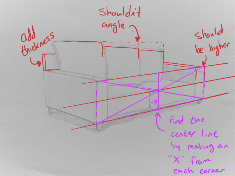
@Coley Hope you don't mind, I did a little draw over of one of your pictures. You're doing a good job for the most part. I would just suggest maybe going ahead and drawing out a few perspective lines to help you line things up.
Hope this helps. Also, if you haven't already, I would suggest that you watch the class by Jake Parker about perspective.
Instagram: @StepOne_DrawCircle
-
@Buddy-Skelton I don't mind , thanks so much! I am quite appreciative
I started Mastering Perspective course but haven't gotten very far into it, it's on my list to get through! I did struggle with the back of the couch and the arms. I guesstimated the middle of the couch..........I should have known to use the x trick as I did do Will's perspective course. I need a lot more practice and help such as this. Thanks, it is a learning opportunity for me