Group run through creative environment design week 5 art and feedback
-
@Erin-Cortese Wow! This is great and I will definitely have to step up my game

-
@Erin-Cortese fabulous !
-
-
@JerrySketchyArt Excellently done. I like your choice of simplified colors. And I like the look of the "giant wobbly brush w/o details!"
-
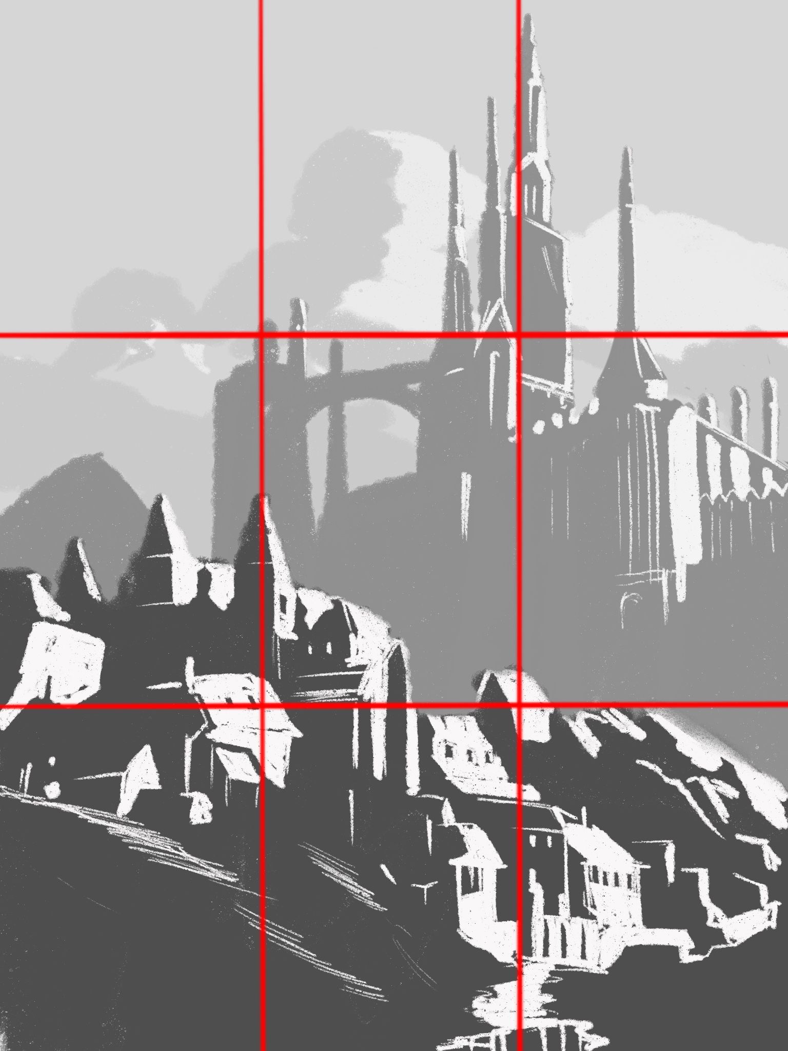
I tried to limit myself with values and not use any lines. I am amazed at how it ended up feeling. Contrast is a powerful tool...


-
@Aleksey I love it!
-
@Heather-Boyd ty! I am surprised at how amazing that grid is
-
@Aleksey what do you mean? Like how the grid helped you draw?
-
@Heather-Boyd yes! Lined things up well with it
-
@Aleksey Yes I found it incredibly helpful with my Master Copy in Creative Composition Class.
-
@Aleksey This is awesome how strongly the image is portrayed by values alone.
There's a lesson here, right?

-
@Susan-Marks yeah i am too lazy to color

-
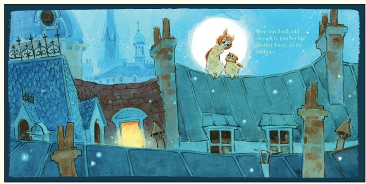
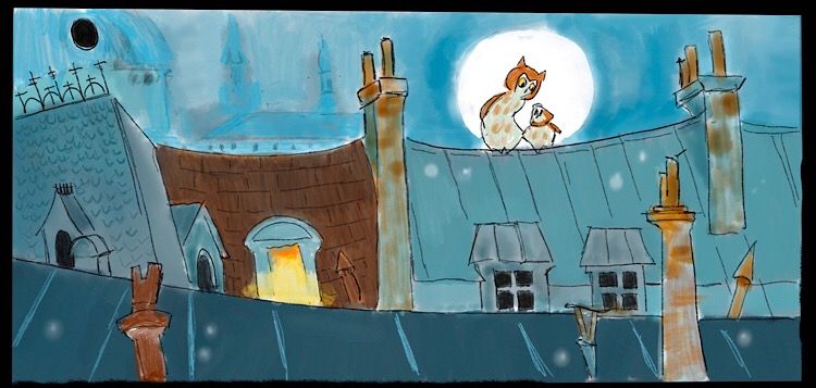
Mine is not nearly as detailed as all of yours but I chose it because I have tried to figure out how to do night scenes without having them become too drab and murky, and I liked the colors and atmosphere in this scene from a book by Lita Judge so I decided to give it a try.
Here’s the original

Here’s my copy:

-
@demotlj Nice! I think you did a really good job capturing the atmosphere and overall feeling

Did you learn anything in particular about rendering night scenes?
-
Since I will being doing this next week, is subjective drawing looking at colour, brush stroke, lightening what else and how should I approach it?
Thanks
-
@Braden-Hallett That's a really good question. Before I did this, I would have done night scenes using purples or grays, but was surprised that she really stuck to pretty saturated blues that were mostly of the same hue but in different values. Her whole piece used an extremely limited palette -- although I did it digitally, if I had been doing it in watercolor, I could have done it all with just a cool blue and a warm rust (and the yellow at the window). Even the owls were a very light value blue and rust. Colors are more muted at night so that would make sense.
Design-wise, she didn't use any perfectly straight lines which is something I struggle with all of the time. I tend to want to over-control my lines which leaves things stiff.
-
I'm playin' catch up!

-
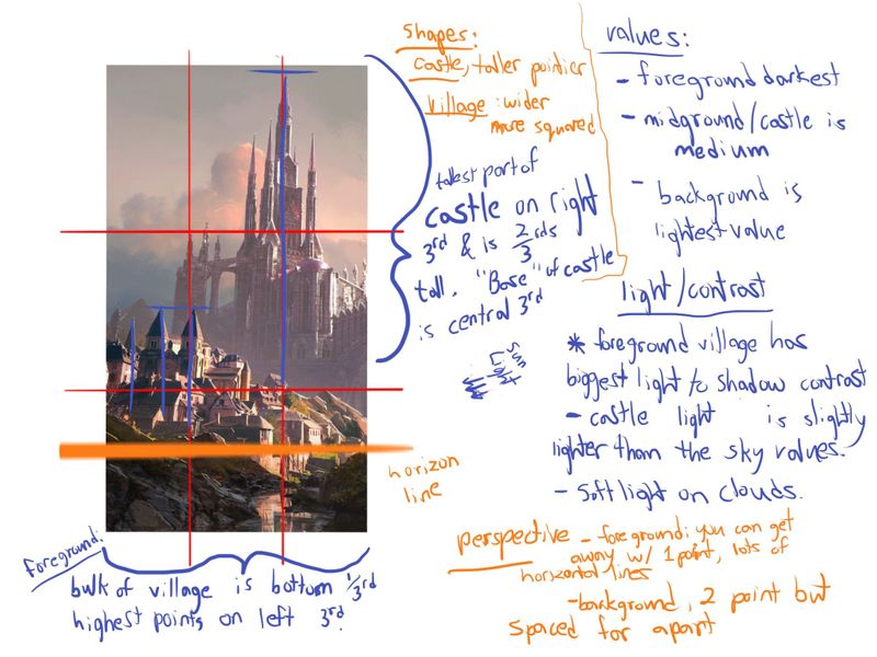
A subjective background has more to do with feeling right rather than technical accuracy, so the study (I think) focuses more on the values and composition and what makes the environment feel the way it does (happy, safe, sinister, dangerous, etc)
-
@Braden-Hallett
So colour choice is important here then? I have trouble choosing colour but I can’t take the colour class -I have too many classes inline lols.
-
@Heather-Boyd The workbook says 'composition and values, paying close attention to core shapes and proportions'.