burvant ill VS the dream portfolio
-
@Chip-Valecek @Amber-Lynn-Benton Great idea! I want to be able to do what I want with the original watercolor painting so I’ve resisted using PS to manipulate the finished paintings. I DID do this on my 50 things project though and I had a lot of compliments on that after. Plus it will probably help me see that I could push those darks without screwing up future images. Which is my biggest fear when painting because watercolor is so not forgiving. I should tweak my thinking. People paint over their oils and acrylics ALL the time. Digital could be my repair man.

Lisa Burvant
www.lisaburvant.com
Instagram & Twitter & SVS: @burvantill -
@Amber-Lynn-Benton yep. That’s how I got hooked.


-
@burvantill Do it! Do you have an iPad or a Wacom pad of some sort?
-
@Amber-Lynn-Benton thank you! That’s from a series using an old folk story/poem thing about ravens as omens.
One for sorrow, two for mirth, three for death, four for birth.Lisa Burvant
www.lisaburvant.com
Instagram & Twitter & SVS: @burvantill -
@burvantill I love, love, love that! I have an idea for an illustration with crows that I’ve been working up the courage to attempt. I have tons of sketches and thumbnails from more than a decade ago and it won’t be too hard to comp. I brought it out of the box last week when I was planning my next portfolio pieces.
-
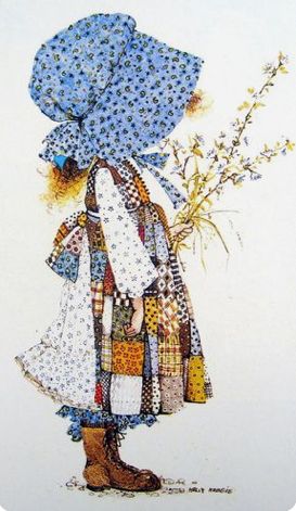
Holly Freakin Hobbie. omg. That took me back! This is a very cool exercise! I haven't watched how to discover your style, will have to!
-
@Amber-Lynn-Benton I have an iPad mini, but I will probably use my computer. I’m at home in Photoshop. I would love to have that setup from the Tools of the trade link that you posted. Was that a Wacom on that guys desk? If so it was HUGE! I showed my husband, and his response was crickets
 .
. Lisa Burvant
www.lisaburvant.com
Instagram & Twitter & SVS: @burvantill -
@Coley it’s a nice and quick video that you can watch all the way through and then jump straight into the assignment. It has some pretty interesting topics. Like how the masters got their style (not just born with it).

-
@burvantill ha ha on the crickets! I totally know that response lol
-
@burvantill That’s the Cintiq! I have a smaller Wacom pad with no screen. I mostly use it for layer masks and cleaning up files and not drawing or painting. Jago says he no longer uses PS - he’s using just Procreate right now which means maybe that big Cintiq is getting dusty?!
-
@Amber-Lynn-Benton a dusty cintiq. that’s the saddest thing I’ve heard today.
-
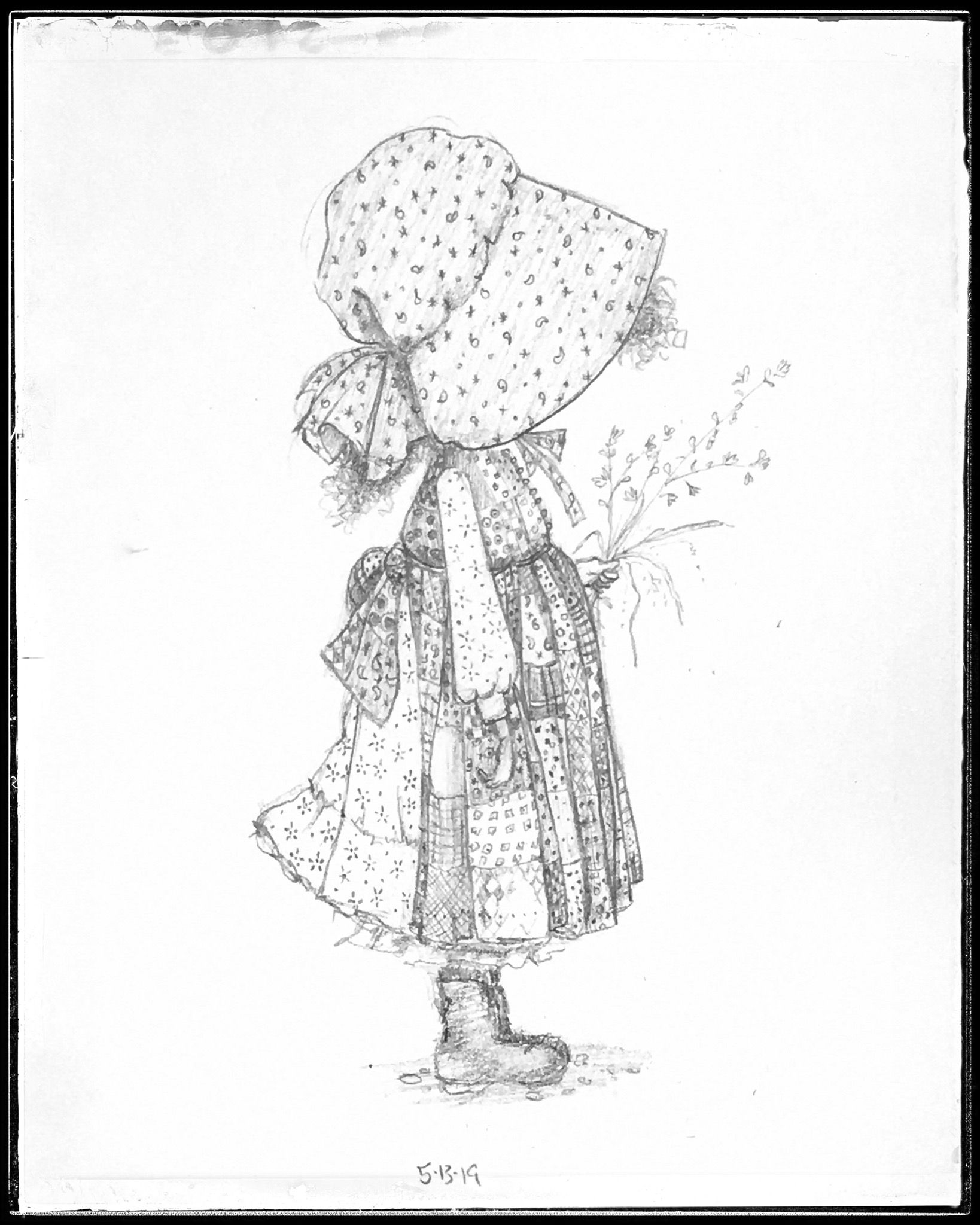
My first master copy. I went with just pencil because that’s what I had time for today. I’m learning that copying isn’t just about making an exact reproduction but looking so hard at a painting that you really see how it was done. The tiny details that would just be background noise or insignificant, become important.
-
hello! I think it is very brave from you to expose your art against your ideal portfolio to everyone's view. Thank you very much! It made me feel less isolated (whatever I draw, I am displeased with my own style... which comes on top of my lack of technique).
Coming back to your portfolio, I join the others : it is not much, maybe more values and contrast here and there. For example, your copy is fantastic (really! great job!) but I think you could push the dark (the shoes, the hat a little bit).
In any cases, this is very inspirational and I will certainly collect arts that I like and try to reproduce it for heading to the right direction too.
Thank you so much!
-
This is such a cool thing to do! I want to do the same, it's probably difficult to see the differences, but facing your style wishes and current realities must be real good step in the right direction, so I reckon you're on the right path!
Also joining the others, some higher darkness and contrast will do a lot, and maybe working in photoshop, texturing could be a lot easier so you could push those a bit too. Looking forward to the rest of your master studies, and I might join you in opening a thread like this when I am mentally prepared! -
@Nathalie-Kranich @Julia
Thankyou for chiming in. I was not expecting a critique, so it was a nice little surprise to hear from art friends. I agree about the contrast and darker values. That is my trouble area. I am going to revisit it today and punch up those darks. I was so focused on the fun calico that I thought I was nailing it. Duh. Lisa Burvant
www.lisaburvant.com
Instagram & Twitter & SVS: @burvantill -
@Julia @Nathalie-Kranich
I took your advice and I Thankyou for it.
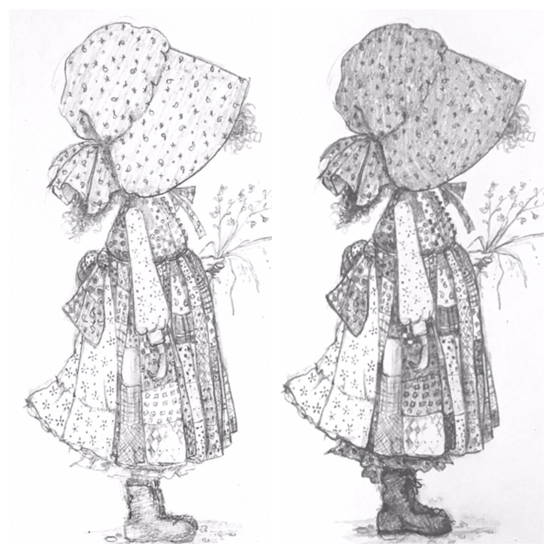
I’m much happier with this one
Just for comparison I put them side by side with a bw version of the original. I could still go darker but I’m going to move on to the next.
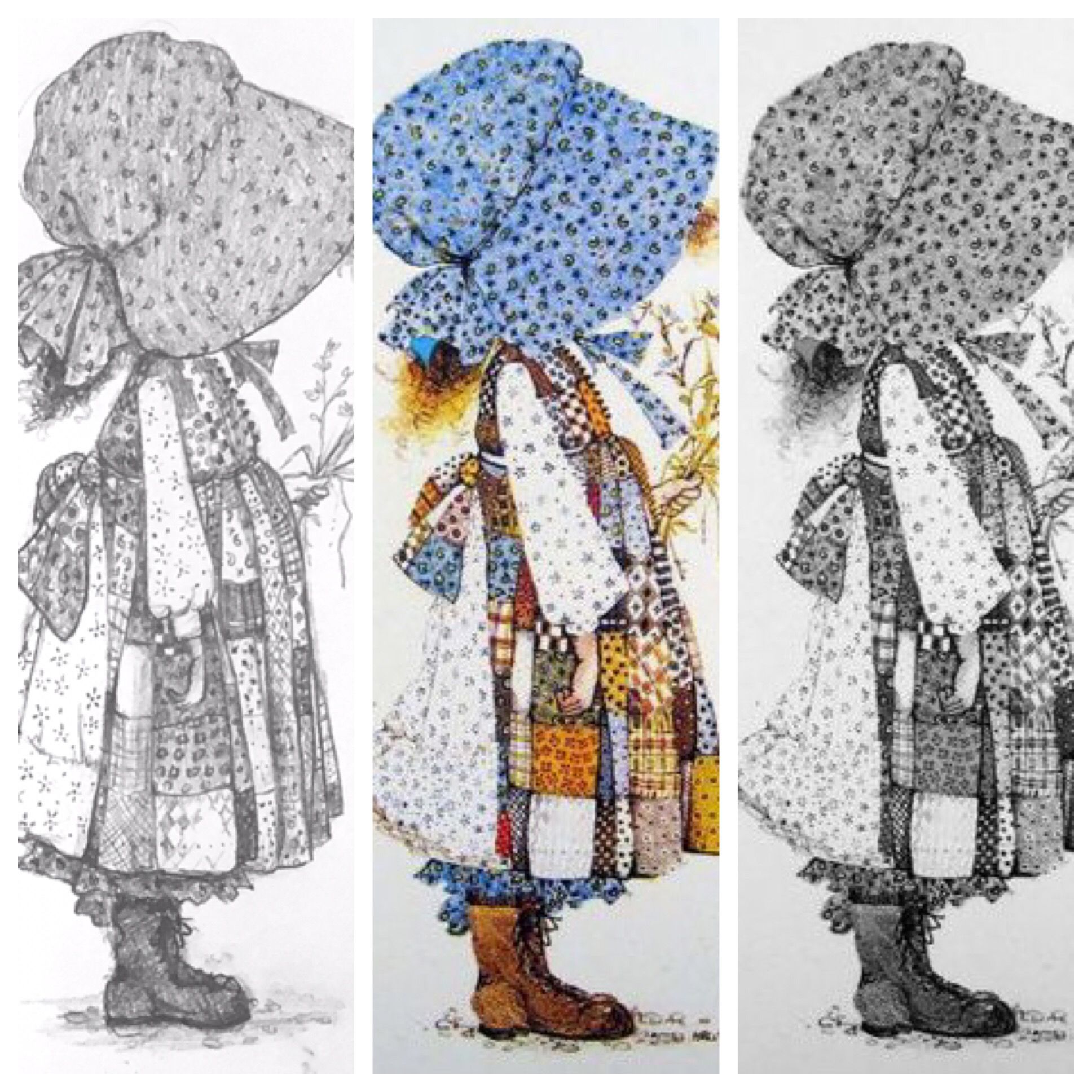
My before and after
-
@burvantill it is the perfect copy now! You can be proud. I am sure that your portfolio will go where you want to direct it in no time!
-
@burvantill it's a lovely copy, you did a great job with the many different textures on the clothes.
-
@burvantill Great job! You really managed to capture the linework and the values. I need to copy this exercise and the dream portfolio exercise.