Serious critique needed!
-
Hello there creators! My name is Ashton, and I currently find myself in the pursuit of becoming a professional illustrator/concept artist! (Beginner)
I cannot wait to meet new people and get inspired by new stories. Feel free to contact me anytime!
This being said, what could I do to improve this character design? It would mean to world to me if you shared your thoughts.
Great love and respect!
Ash
-
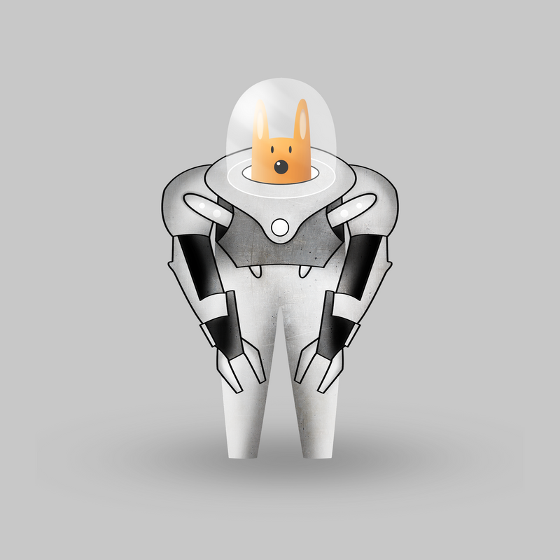
I'd like to see some feet.
") I think maybe it needs some depth to it. I like the dog staring out. Very nicely done. I wonder why you have only outlined part of it? I can see why you might want to leave the helmet because it is clear and a black line might interfere with that. It doesn't look finished to me. For some reason, having that plain gray background around it makes it look pasted on and unfinished because there are no feet and it's only partially outlined. I can kind of see the legs behind the arms like it's a ghost. Maybe that is an effect you want though. What's the story behind this character? I'm curious to know!
I think maybe it needs some depth to it. I like the dog staring out. Very nicely done. I wonder why you have only outlined part of it? I can see why you might want to leave the helmet because it is clear and a black line might interfere with that. It doesn't look finished to me. For some reason, having that plain gray background around it makes it look pasted on and unfinished because there are no feet and it's only partially outlined. I can kind of see the legs behind the arms like it's a ghost. Maybe that is an effect you want though. What's the story behind this character? I'm curious to know!Marsha Ottum Owen
-
@Marsha-Kay-Ottum-Owen Thank you, Marsha! Your feedback really helps. It's partly outlined because I didn't know how to draw the armor without the black lines. Now I know though! And yes, I agree with the depth part.
He has no feet because I wanted to go for a "Big Hero 6" style.I'll work hard on it to make it better. And I'll find a story for him aswell! Thank you!
-
Hi, Ashton! Welcome to the forum. You will find this place really helpful. Now on to your piece. Before I can give you any pointers or critiques I first need to know who this character is. Who is he? What does he do? What is he actually? Where if is he from? Where is he living now? You know, the usual context. All these information will help us in determining if your design suits the character.
Portfolio: nyrrylcadiz.com
Instagram: https://www.instagram.com/nyrryl_cadiz/
YouTube: https://www.youtube.com/channel/UCbJCF1Im8ZO7hpGWTKOJMuA -
@nyrrylcadiz You are totally right! Next time I'll work on a "behind the scenes" story before actually drawing the character!
-
Your dog is cute and securely comfortable in that space suit.
Note some repeat:
I find the light coming on the top left a tad distracting -perhaps leave out lighting -if it's a character design and not a character in a setting. Other areas like the suits arms are high contrast -takes away from the dog even as he is a colour.
Also distracted by the outline -which isn't continued from his waist down or helmet-keep the dog separate from his suit.A WIP I assume -he's got not feet. But overall I like space dog.
I hope not too harsh.Instagram: www.instagram.com/heatherboyd.illustration/
Website: https://heatherboydillustration.ca
Shop: https://www.inprnt.com/search/products?q=HeatherBoydIllustration
Ko-Fi: https://ko-fi.com/heatherboydillustrationBe blessed,
-
@Ashton-H Welcome to the community.
To pick up on some of the feedback others have offered--if you're using black outlines for some of the piece to avoid having to deal with how to define the edges without the black lines--how about going for a very different color of the background? Let's say...red. That way the white-grey-black of the character would automatically be different than the background. It won't get you around the shape definition for the "hands" against the thighs--but it would buy you a little definition.I'm new to all of this-so I sometimes look for an easy solution as I can't fix and improve all aspects at once. Darn on that but true.
-
@Heather-Boyd Thank you Heather! Not to harsh at all. I'll work hard to make it better! It has been a pleasure reading your thoughts!
-
@Susan-Marks A pleasure Susan! What you're saying has a lot of sense. I wasn't thinking smart enough! Great love and respect!