• Recent
  • Tags
  • Popular
  • Users
  • Groups
  • Search
  • Register
  • Login
Society of Visual Storytelling

SVSLearn Forums

  • Register
  • Login
  • Search
  • Recent
  • Tags
  • Popular
  • Users
  • Groups
  • Search

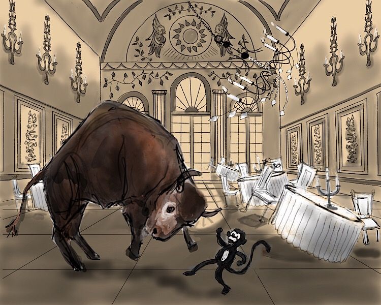
Group run through creative environment design week 6 art and feedback

SVS Class Work
9
69
5.4k
Loading More Posts
  • Oldest to Newest
  • Newest to Oldest
  • Most Votes
Reply
  • Reply as topic
Log in to reply
This topic has been deleted. Only users with topic management privileges can see it.
  • ArtofAleksey
    ArtofAleksey @demotlj last edited by 22 May 2019, 02:16

    @demotlj good choice on the low angle makes the bison look much bigger.

    instagram and twitter: @artofaleksey
    alekseyillustration.com

    1 Reply Last reply Reply Quote 0
    • ArtofAleksey
      ArtofAleksey last edited by 22 May 2019, 02:16

      E0A48D01-95CE-4094-BAD9-13256B5DCB95.jpeg

      I think I’m onto something with the values.

      instagram and twitter: @artofaleksey
      alekseyillustration.com

      1 Reply Last reply Reply Quote 1
      • braden H
        braden H last edited by 22 May 2019, 15:48

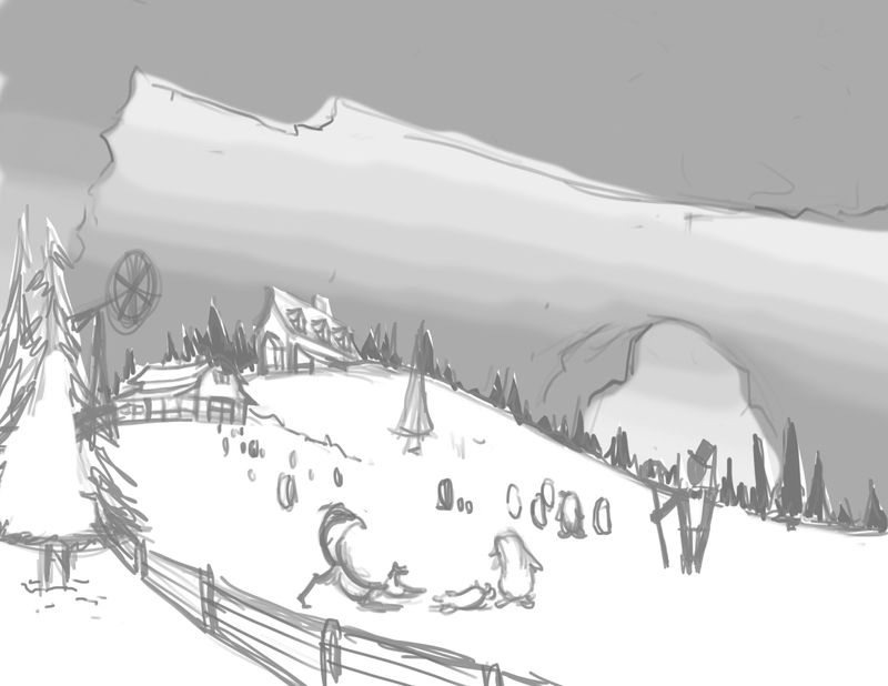
        Okeedokee! I finally get to play in my local DND game, so I'm all into the generic fantasy settings. I may finish this one day!

        The puzzle pieces I'm trying to juggle: Composition (thirds and fifths) silhouette, balance, proportion (thirds and fifths again) and value. Are there any principles I'm forgetting off the top of my head?

        alt text

        Erin.Cortese 1 Reply Last reply 7 Jun 2019, 19:04 Reply Quote 7
        • JerrySketchyArt
          JerrySketchyArt last edited by 22 May 2019, 18:11

          Planning to paint this eventually, but since this class is on design I'm going to call this homework complete.

          Side note: The odd cropping and extra space on the outside are due to game design best practices. We have to plan for a wide range of aspect ratios (think ultra wide screen vs an old 4:3 TV screen) which can shift the visible area by a decent bit.

          CED_Workbook2_Page_6 complete.png

          1 Reply Last reply Reply Quote 0
          • JerrySketchyArt
            JerrySketchyArt @demotlj last edited by 22 May 2019, 18:16

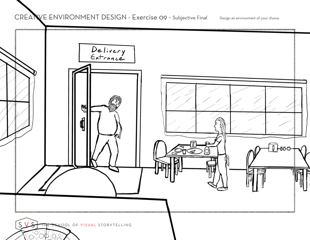
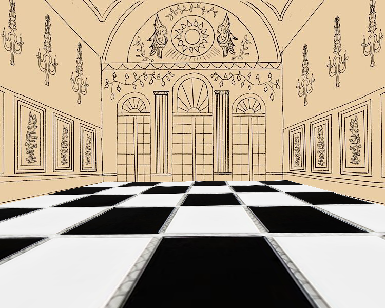
            @demotlj This is a really nice scene! Even with scribbled in characters the story is really there. I think the floor tiles should be larger in the middle and get closer together as you go out though.

            demotlj 1 Reply Last reply 22 May 2019, 18:39 Reply Quote 0
            • demotlj
              demotlj SVS OG @JerrySketchyArt last edited by 22 May 2019, 18:39

              @JerrySketchyArt I assume you mean the horizontal floor lines not the vertical ones. The tiles against the far wall are much smaller than those in front but I didn't increase the size evenly as they come closer. I'll have to fix that.

              Laurie DeMott
              instagram.com/demotlj

              JerrySketchyArt 1 Reply Last reply 22 May 2019, 18:59 Reply Quote 0
              • JerrySketchyArt
                JerrySketchyArt @demotlj last edited by 22 May 2019, 18:59

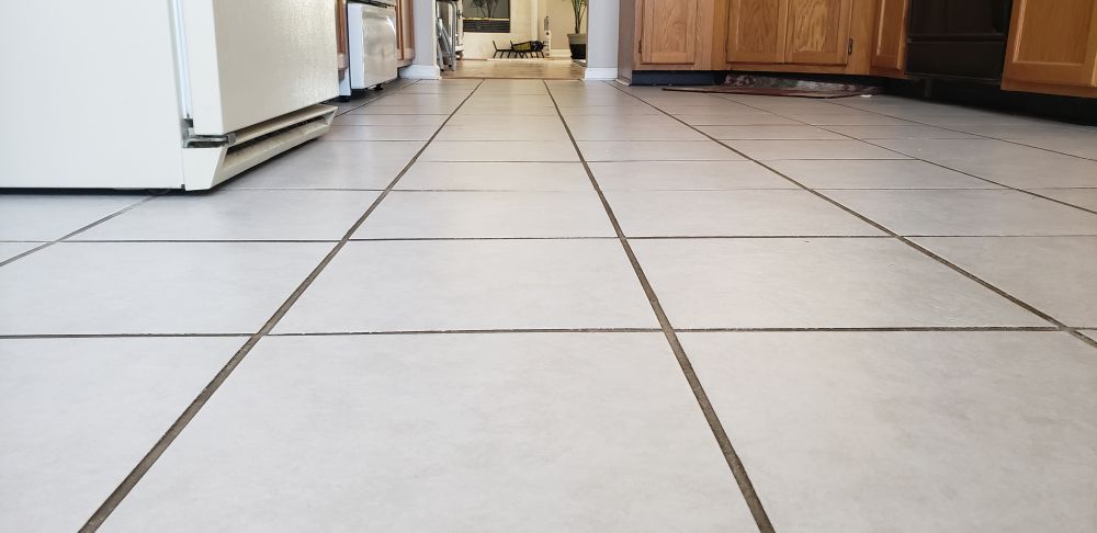
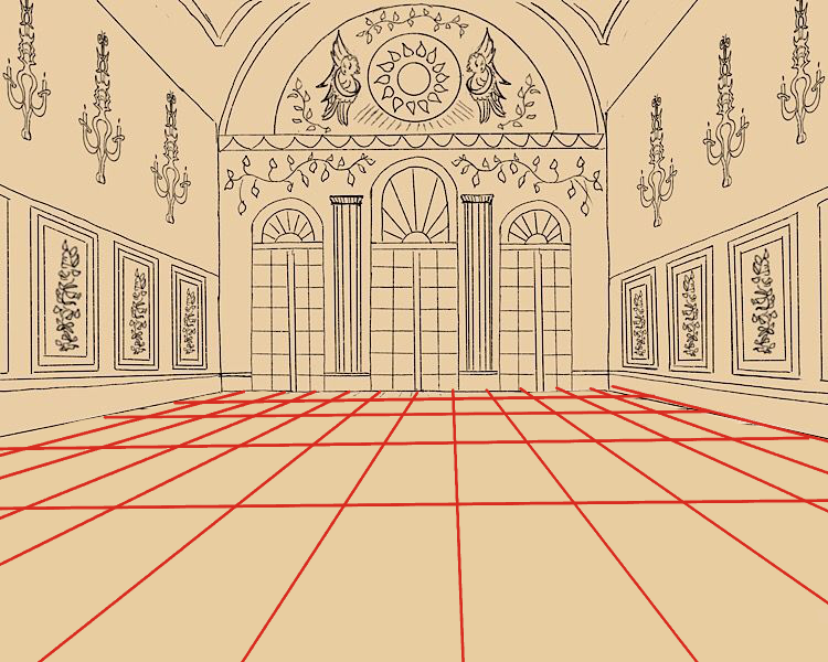
                @demotlj Both lines should get closer together as distance from the viewer increases. The ones in front of the camera should be the most square. Example:

                20190522_145353.jpg

                demotlj 1 Reply Last reply 22 May 2019, 19:03 Reply Quote 0
                • demotlj
                  demotlj SVS OG @JerrySketchyArt last edited by 22 May 2019, 19:03

                  @JerrySketchyArt On the vertical lines, I just followed the Procreate perspective tool so those should be right but the perspective tool doesn't space the horizontal lines and I admit I was just eying that... badly! (Some of it may be that I wasn't thinking of the tiles as being square but as rectangular.)

                  Laurie DeMott
                  instagram.com/demotlj

                  JerrySketchyArt 1 Reply Last reply 22 May 2019, 19:49 Reply Quote 0
                  • JerrySketchyArt
                    JerrySketchyArt @demotlj last edited by 22 May 2019, 19:49

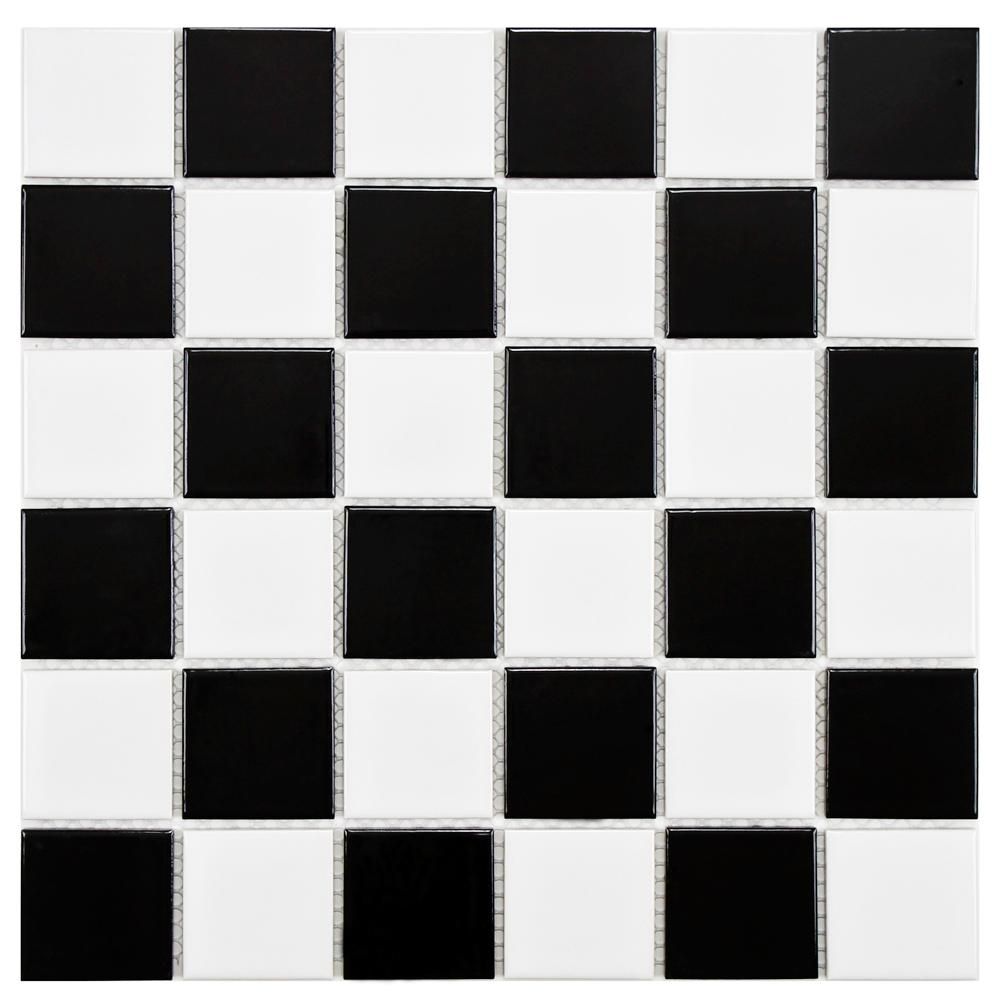
                    @demotlj I'm yet to find a good tool for quickly creating grid lines. Clip Studio has perspective rulers too, but it doesn't force proper spacing either. Argh! My solution is to find/make a checkered square grid. Import that grid and do a "free transform" into the shape of the floor/wall/ceiling/whatever. Then you can use that as a guide for your marks. 🙂 If you want more rectangular lines just add an extra line down the middle. Example over your drawing:

                    (Random grid from google)
                    black-and-white-high-sheen-merola-tile-mosaic-tile-fyfb2sch-64_1000.jpg

                    Free Transform to match floor/wall lines
                    floor grid.png

                    Draw lines with grid for better estimation
                    floor grid marks.png

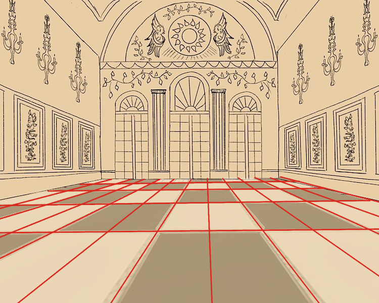
                    Rectangular floor tiles in perspective
                    floor grid fixed.png

                    demotlj 1 Reply Last reply 22 May 2019, 20:41 Reply Quote 1
                    • demotlj
                      demotlj SVS OG @JerrySketchyArt last edited by demotlj 22 May 2019, 20:43 22 May 2019, 20:41

                      @JerrySketchyArt That does look better. I think the problem is that the perspective lines aren't supposed to be used for spacing like I was doing whereas your method keeps that spacing. Thanks -- I'm going to try that.

                      Laurie DeMott
                      instagram.com/demotlj

                      1 Reply Last reply Reply Quote 1
                      • demotlj
                        demotlj SVS OG last edited by 24 May 2019, 01:03

                        I’m going to call this done. It’s still very rough (don’t look at it too closely) and I will add other characters, tweak the placement of things, and improve the line art but for this exercise, I think this is as far as I need to go. I really had to think about interior design more than I ever have before so it was really a helpful exercise.
                        51745826-E5C8-47EC-8145-FD7BF7293726.jpeg

                        Laurie DeMott
                        instagram.com/demotlj

                        1 Reply Last reply Reply Quote 0
                        • Coley
                          Coley last edited by 6 Jun 2019, 17:06

                          dreambedroomthumbs.jpg

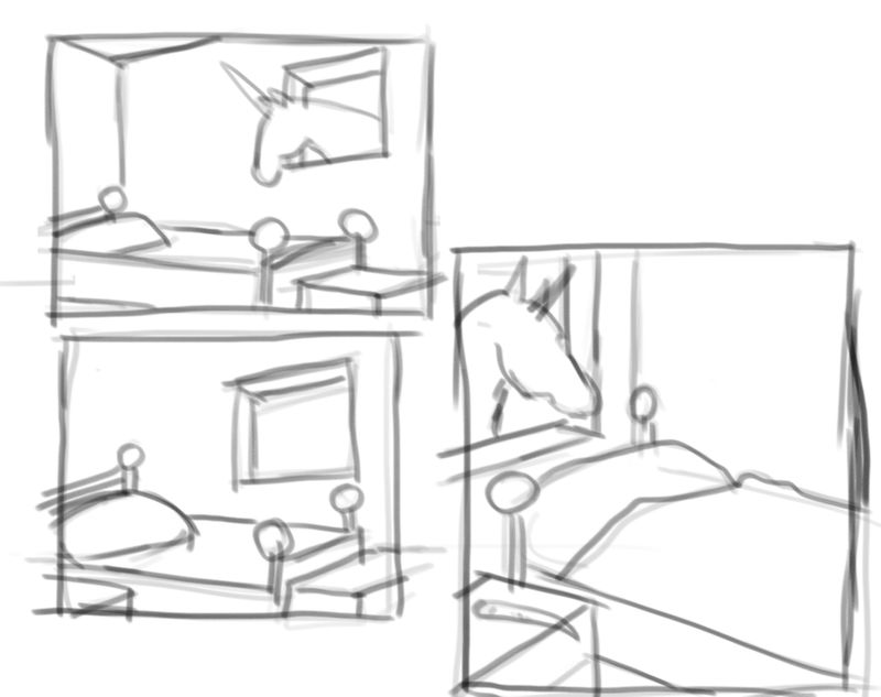
                          starting my subjective final. I decided on doing an interior just because it moved me when I had the idea lol. I had the idea of doing something that I would have loved as a kid. and that was to have a window in my room that opened to either a paddock or a stall for my pony! So these are my thumbnail ideas. Very open to feedback! I tried to keep perspective and rule if thirds etc in mind but I have been struggling with it too. new to all this. any advice appreciated. p.s. am online now watching the live event! exciting!

                          https://www.instagram.com/nicoleledrewmay/

                          braden H 1 Reply Last reply 6 Jun 2019, 23:21 Reply Quote 3
                          • braden H
                            braden H @Coley last edited by 6 Jun 2019, 23:21

                            @Coley Neat! What kind of mood or feeling are you goin' for?

                            Coley 1 Reply Last reply 6 Jun 2019, 23:33 Reply Quote 0
                            • Coley
                              Coley @braden H last edited by 6 Jun 2019, 23:33

                              @Braden-Hallett I'm thinking something sort of like childhood dream come true lol. Basically a horse crazy kid's bedroom with lots of horsie decor. Horse themed bed comforter, pair of riding boots on the floor or something, horse poster and horse show ribbons. Basically my childhood dream room Ha ha. I don't know if that's what you mean by theme or mood? The child might be around 10 or 12. I guess for subjective the mood is quite important....is fun a mood lol? I'm really new to illustration so not being completely married to reference and just thinking about if I like the look of my piece rather than what story it tells is all new to me. But exciting. Any other feedback or questions that get me thinking harder are welcome!

                              https://www.instagram.com/nicoleledrewmay/

                              1 Reply Last reply Reply Quote 0
                              • Coley
                                Coley last edited by 6 Jun 2019, 23:38

                                15598640868522234855967405990528.jpg

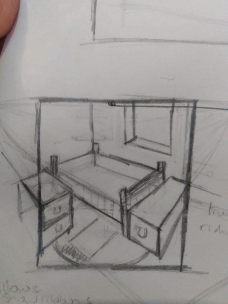
                                Another thumbnail I just did. Liking where this one is starting to go. Gonna do a bunch more tomorrow. I've spent the last two days reviewing most of the videos in the course ( except crits) so I could remember concepts while I tried to figure out thumbnails. I'm sure I'm missing stuff but I've rarely ever done this kind of thing and I'm really so darned excited!

                                https://www.instagram.com/nicoleledrewmay/

                                1 Reply Last reply Reply Quote 1
                                • Coley
                                  Coley last edited by 7 Jun 2019, 15:45

                                  dreambedroomtonalthumb.jpg

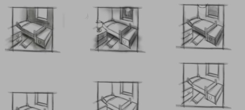
                                  tonal possibilities for different lighting scenarios......think I'm maybe going with the first one but starting to work on an intermediate sketch first. Gonna leave the horse/unicorn etc out for now. Might just develop this environment and do another with characters later. I am not an environment gal so this is excellent practice

                                  https://www.instagram.com/nicoleledrewmay/

                                  1 Reply Last reply Reply Quote 2
                                  • Erin.Cortese
                                    Erin.Cortese Moderator @braden H last edited by 7 Jun 2019, 19:04

                                    @Braden-Hallett Just seeing this for the first time, this looks great! Your work always seems so effortless, its both intimidating and inspiring. Every time I look at one of your pieces I am reminded I need to loosen up.

                                    1 Reply Last reply Reply Quote 1
                                    • Erin.Cortese
                                      Erin.Cortese Moderator last edited by 7 Jun 2019, 19:06

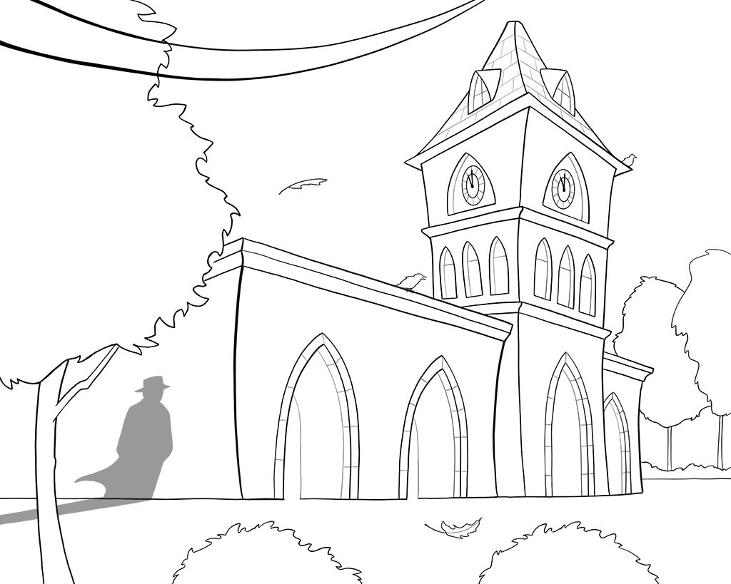
                                      Ok so being short on time last month and being that I fell behind, I used one of my earlier exercises for my subjective composition. I am excited about this one because I am going to be experimenting with something kinda cool.

                                      Clocktower.jpg

                                      Coley 1 Reply Last reply 7 Jun 2019, 19:23 Reply Quote 5
                                      • Coley
                                        Coley @Erin.Cortese last edited by 7 Jun 2019, 19:23

                                        @Erin-Cortese this hits all the marks for me. The shadow is pretty cool!

                                        https://www.instagram.com/nicoleledrewmay/

                                        Erin.Cortese 1 Reply Last reply 7 Jun 2019, 19:43 Reply Quote 1
                                        • Erin.Cortese
                                          Erin.Cortese Moderator @Coley last edited by 7 Jun 2019, 19:43

                                          @Coley Thank you! My husband had a look and said the power lines look like they do not attach to anything, like he could not imagine the placement of the pole outside the frame. Did you get that feeling too? I put them where they looked best in the composition, but if it’s not believable I think I need to move them 😞

                                          Coley braden H Nyrryl  Cadiz 3 Replies Last reply 9 Jun 2019, 04:24 Reply Quote 0
                                          24 out of 69
                                          • First post
                                            24/69
                                            Last post