Red Riding Hood - Composition Critique
-
Hello, first time posting so very excited and anxious

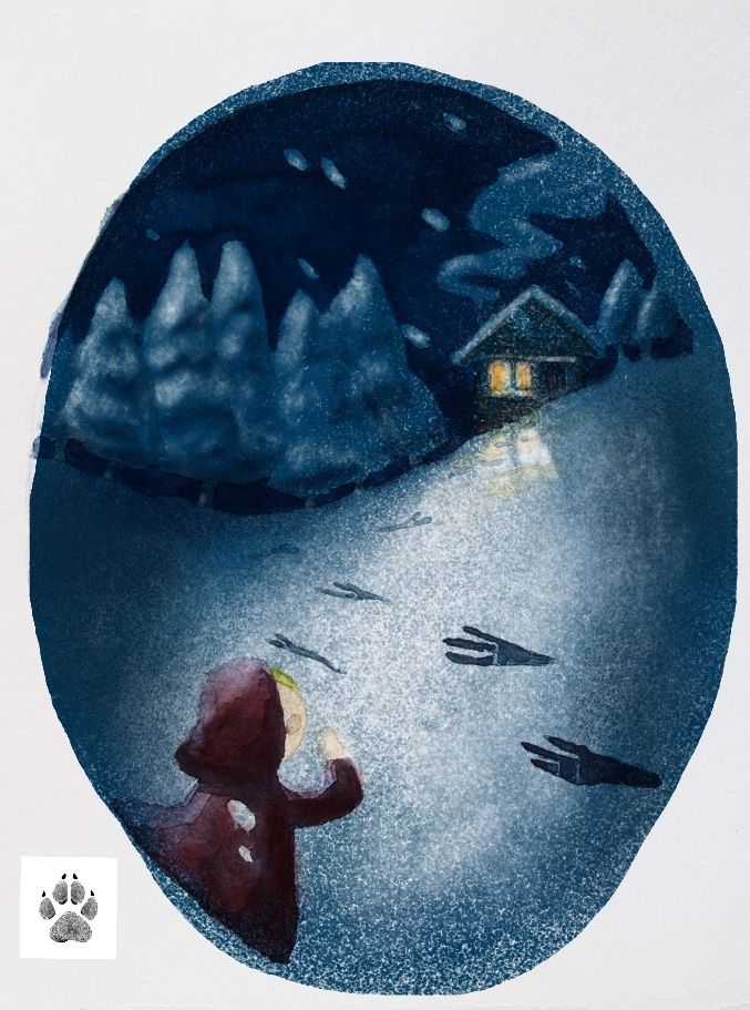
I'm going through Creative Composition and made this red riding hood illustration. I wanted to diversify my portfolio with it too, which is why it's a 1) vignette 2) at night and 3) in Winter.I'd really like to get critique on what I could do better in terms of composition and finish. I'm no watercolour pro but would always appreciate more critique too.
Thanks!
-
Hi there,
No need to be nervous, everyone is so nice here and the feedback you get will always be constructive and helpful")
I really like your composition, it's balanced really well and I like the idea of the footprints of the wolf. There are a couple of things that I think could improve it though:
1.) I find the fact that the footprints come from the right and then sharply turn towards the cabin a bit distracting, maybe the footprints could be coming from the left so that our eyes follow them to the cabin.
2.) If you do change the direction of the footprints, I would move red riding hood to the right of the illustration so that it balances it better.
3.) Your character is lovely and I like the position you have her in, but i would make her cloak a lot more red, and add a bit more hair to the side of her face, maybe it's blowing in the wind? Maybe she could also be carrying a basket so we would see part of that too? I think she just needs a bit more character so we know she's red riding hoodApart from that though I think you have a really nice piece here, the light coming from the cabin is lovely, especially on the snow! I'm looking forward to seeing where you take it next!
-
almost the same thing like Hannah already said: I would make the footprints from left side to the house and the girl on the right side, the girl should have really red cloak and some more flying hair would be nice. The footsteps looks like from some bird, if it is from wolf, I would change it. I find it great, taht you change all the things, like winter, ...But the night time, it is to bright for night, maybe more shadows on the snow and trees.
-
@Nelson-Yiap-0
Looks like you're getting some great feedback. The two posts above seem spot on to me. I like this image a lot. It is dramatic and tells a lot of story very effectively.
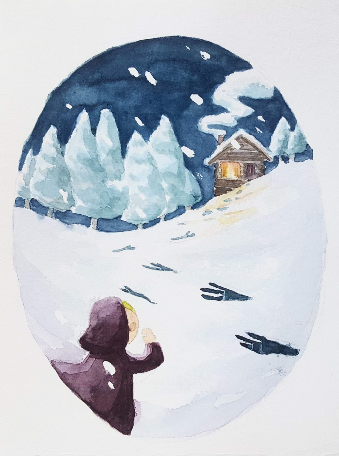
I'd suggest going a lot darker with your values. I took your image and just deepened the dark values. Snow is a funny thing. We know it is white, but it very rarely is pure white, especially in a night scene. Also, by darkening the rest of the image, you can really get the light from the window to feel more warm and inviting.
Also, I found a wolf footprint you might like.
Great work! This is a really good start. I'm looking forward to seeing where you go with it!
-
@sketchbook Oooh this looks great now that is has been darkened!
-
I like your piece. I don’t get night, I get more late evening. My eye went to the cabin as my main focal point and I almost had to look for “Red” as she is known in our house.
For knowing the story I knew they were supposed to be wolf tracks, but if I were not knowing then story I would think more bird. Also the tracks are really dark, unless they are supposed to be the primary focal point.
Can’t wait to see more.
-
@sketchbook This looks amazing with the darkened tone, and the dramatic lighting, wow! Thank you all for your comments. I'll have another look at the piece. This is really great feedback