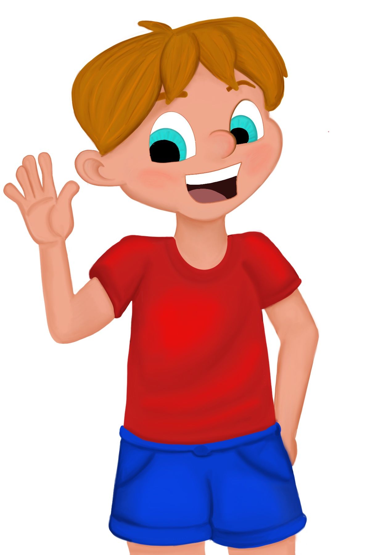
Thinking I am done, therefore I am sure it can be taken further
-
I think you are very close. His nose is getting lost, though. Maybe a bit of highlight and shadow on his face to help with his facial structure.


-
I think you could work on two things that caught my attention. First are the proportions. His arm and forearm should be equally long. I would also work on his hand-to-face relation. It doesn't have to be very realistic because convention is cartoon like. However I think the design would benefit if you make his hand bigger (because our hands are aprox as long as our faces) and more round in shape to make it similar to his face.
When I look at the color version I think there is something off with the skin and hair tone because probably there is blue or black in it? It wouldn't be necessary a problem but comparing to his bright and saturated eyes the skin and hair look too gray. I think he should be as saturated and bright as his eyes or maybe you should change the color of his eyes to match the skin.
I really hope it makes sense
-
The issue with the color is the clothing. Super Saturated blue and red is making the rest of him wash away. Tone down those colors and it will looks smoother.
-
@burvantill said in Thinking I am done, therefore I am sure it can be taken further:
I think you are very close. His nose is getting lost, though. Maybe a bit of highlight and shadow on his face to help with his facial structure.


Thanks. I noticed after I posted this the layer defining his eye and nose was behind, but I boosted it a little more.
Thank you for your input.
-
@MartaD said in Thinking I am done, therefore I am sure it can be taken further:
I think you could work on two things that caught my attention. First are the proportions. His arm and forearm should be equally long. I would also work on his hand-to-face relation. It doesn't have to be very realistic because convention is cartoon like. However I think the design would benefit if you make his hand bigger (because our hands are aprox as long as our faces) and more round in shape to make it similar to his face.
Made total sense. Hands are a weakness right now. Well so are bodies in general. I enlarged his hand and extended his upper arm some.
After pointing out the skintone you were right something was off.
Thank you for your input.
-
@Aleksey said in Thinking I am done, therefore I am sure it can be taken further:
The issue with the color is the clothing. Super Saturated blue and red is making the rest of him wash away. Tone down those colors and it will looks smoother.
When I did that everything looked gray and not alive. So instead I upped the saturation of the skin and a little of the hair. I hope I didn’t go too far.

Thanks for the input!
-

Here he is now. Still losing the nose a little. Maybe I should just make it a smidge bigger so it covers the far eye just a little more, that might help.
Thanks for all the input!
-
Oh that looks much better good job
-
Yes! Everything is much better now! His hands matches the head!
If it comes to color the only thing I would suggest to work on are the blackest parts. Instead of pure black in this mouth I would use very dark red/pink maybe and add a little bit of saturation to his tongue. In his eyes you could use very dark blue.
Using pure black in drawings like this makes and impression that there is a hole in the drawing. the solution is to mix black with another color. -
I wouldn't worry about the nose, I think it matches his face and it doesn't have to be bigger or more prominent.
-
Hi! I just find the boy’s clothes too saturated, the red and the blue are clashing with each other. Perhaps desaturating the shorts in order to ease up the tension.
-
@nyrrylcadiz The shirt isn't too bad, but the shorts are a bit blinding.
Idea:

Knock the saturation down on the shorts maybe. Even a saturated color works, when there is some shading/shadowing.
-
Just wanted to pop in and mention my admiration for how you're using this critique to your advantage and improving your character by considering the suggestions given. To me, it is really a great example of colaboratoon and individual expression working powerfully together.
-
@CLCanadyArts exactly
-
@KathrynAdebayo I do really appreciate it too! I really didn’t see how washed out his skin was until it was pointed out to me. I still might mess with the saturation of his shorts some.