Society of Visual Storytelling

    SVSLearn Forums

    • Register
    • Login
    • Search
    • Recent
    • Tags
    • Popular
    • Users
    • Groups
    • Search

    Godzilla WIP. Feedback always welcome!
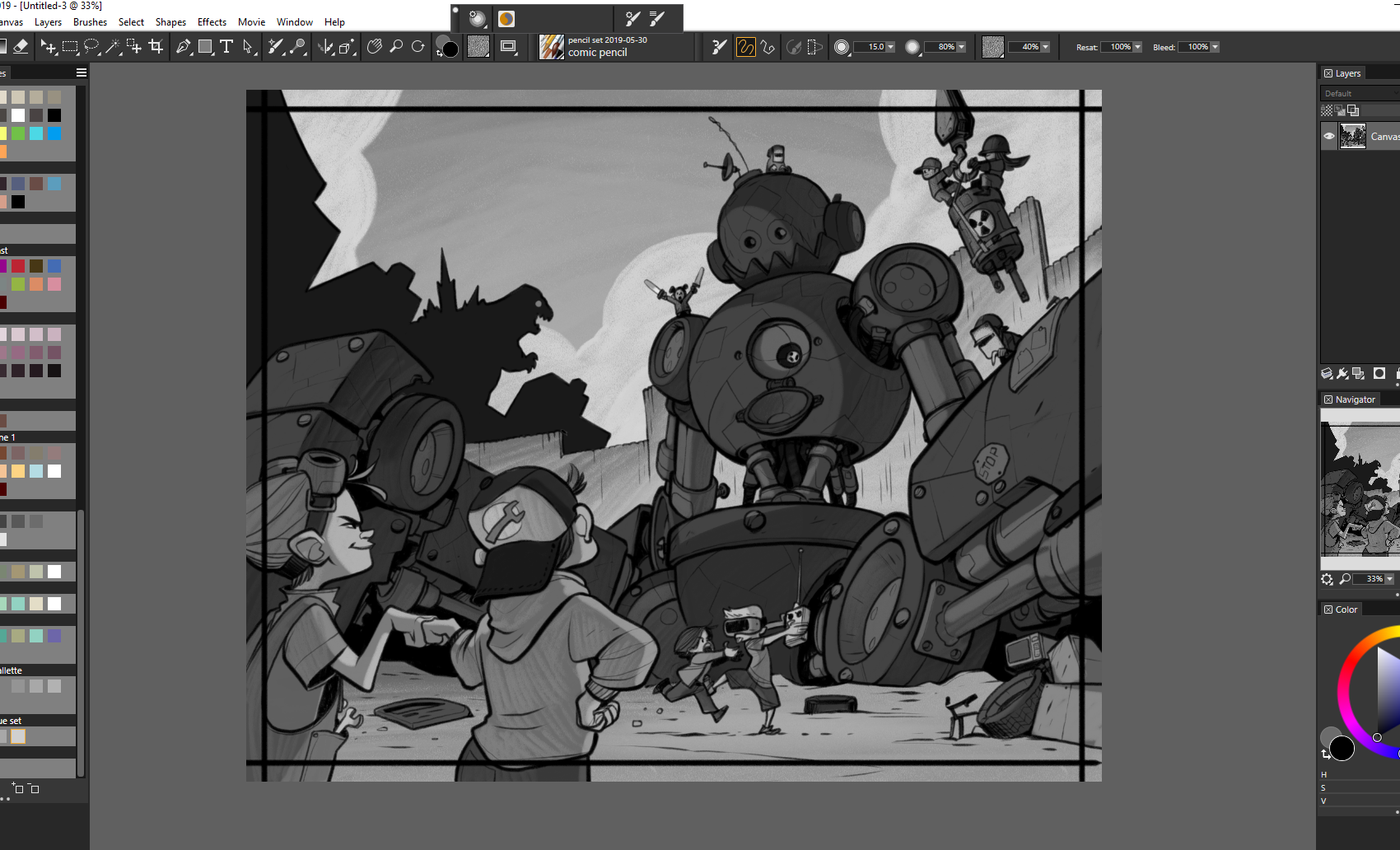
    Artwork
    30
    83
    7221
    Loading More Posts
    • Oldest to Newest
    • Newest to Oldest
    • Most Votes
    Reply
    • Reply as topic
    Log in to reply
    This topic has been deleted. Only users with topic management privileges can see it.
    • braden H
      braden H last edited by

      Basic light map!

      I keep things a little dark until I add colour so I have somewhere to go when I paint.

      d5e028a1-4887-4082-84dd-810b35b59ee3-image.png

      Dima Eichhorn 1 Reply Last reply Reply Quote 3
      • Susan Marks
        Susan Marks @demotlj last edited by

        @demotlj I agree-I suggested that the guys do a 3 point perspective on "what's my process"--they often refer to it, as in "well it took me a really long time to do a drawing, illustration until I got my process down.."

        braden H 1 Reply Last reply Reply Quote 1
        • Dima Eichhorn
          Dima Eichhorn @braden H last edited by

          @Braden-Hallett So complex image. 😍 Can't wait to see the coloured version.

          https://www.instagram.com/dima_eichhorn/

          1 Reply Last reply Reply Quote 1
          • Nyrryl  Cadiz
            Nyrryl Cadiz SVS OG last edited by

            It[s coming along pretty nicely. I can’t wait till it’s finished

            Portfolio: nyrrylcadiz.com
            Instagram: https://www.instagram.com/nyrryl_cadiz/
            YouTube: https://www.youtube.com/channel/UCbJCF1Im8ZO7hpGWTKOJMuA

            1 Reply Last reply Reply Quote 1
            • theprairiefox
              theprairiefox last edited by

              @Braden-Hallett this is coming along nicely. I do love seeing your process as well. Definitely shows the holes in mine and where I need to work on improving my process. Thanks for sharing and reinforcing all the great stuff we learned in class.

              -The Prairie Fox
              https://www.instagram.com/theprairiefox
              https://www.theprairiefox.com

              1 Reply Last reply Reply Quote 1
              • braden H
                braden H last edited by

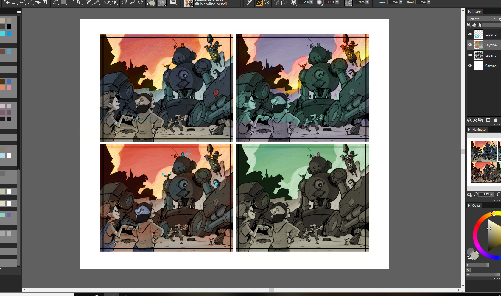
                Little colour studies. I'm trying more for 'flavour' of light and BIG local colours rather than making it look like a mini finished painting.

                b882f45c-4aa5-4103-8351-bd50666ea063-image.png

                f4835a15-dfcf-4c5d-ab89-b47c6464cdef-image.png

                theprairiefox Heather Boyd 2 Replies Last reply Reply Quote 4
                • theprairiefox
                  theprairiefox @braden H last edited by

                  @Braden-Hallett I like the green sky. Green just goes with Godzilla. Not sure what you would do with the robot color if you do a green sky though... maybe try a rust-ish color? Play green off red?

                  -The Prairie Fox
                  https://www.instagram.com/theprairiefox
                  https://www.theprairiefox.com

                  braden H 1 Reply Last reply Reply Quote 1
                  • braden H
                    braden H @Susan Marks last edited by

                    @Susan-Marks That would be neat to have a podcast on it, but they've all got videos in the subscription that goes into each of their processes in detail for the most part 🙂

                    1 Reply Last reply Reply Quote 0
                    • braden H
                      braden H @theprairiefox last edited by

                      @theprairiefox Green really does go with godzilla 😃 but I really love the idea of the city in the background on fire.

                      1 Reply Last reply Reply Quote 1
                      • Heather Boyd
                        Heather Boyd @braden H last edited by Heather Boyd

                        @Braden-Hallett

                        I like the purple sky. It’s both warm and cool and is a nice breather from the burning of the city but maybe have the kids in the foreground have the orange glow of the 5th work.

                        I so sorry if I’ve asked this before but how do you apply the colour on top of your black and white while keeping the pencil/brush strokes in your black and white, overlay is the only way I know, but your colours are much nicer?

                        Instagram: www.instagram.com/heatherboyd.illustration/
                        Website: https://heatherboydillustration.ca
                        Shop: https://www.inprnt.com/search/products?q=HeatherBoydIllustration
                        Ko-Fi: https://ko-fi.com/heatherboydillustration

                        Be blessed,

                        braden H 1 Reply Last reply Reply Quote 1
                        • braden H
                          braden H @Heather Boyd last edited by

                          @Heather-Boyd I use a colourize layer. In Painter it effects only the hue and saturation leaving the values completely alone. So it's a lot like using an overlay layer while keeping the value at 128 except that I can just pick whatever colours I want instead of having to worry about the value of the colour I'm using 🙂

                          I'm pretty sure the comparable layer type in photoshop is a 'colour' layer. Though I could be wrong.

                          The trick I find is to start with fairly unsaturated colours (under 64 or so) and then pick things you want to shine through with higher saturation.

                          1 Reply Last reply Reply Quote 1
                          • braden H
                            braden H last edited by

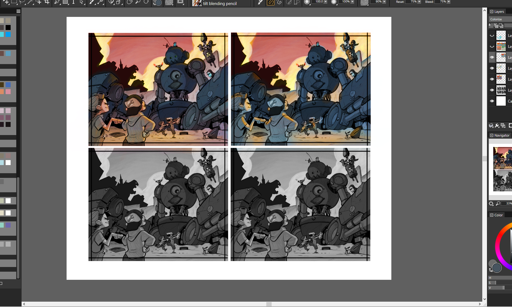
                            Picked some local colours keeping my basic colour study in mind. From here on out it's all on one colour layer with linework separate so time for painting with wild abandon 😃 Some things'll get brighter, some things'll get darker, and it'll slowly work its way to final.

                            3b9eeec0-7059-4e2f-8642-09f399d0d2e0-image.png

                            Erin.Cortese 1 Reply Last reply Reply Quote 7
                            • Erin.Cortese
                              Erin.Cortese Moderator @braden H last edited by

                              @Braden-Hallett Love this!

                              1 Reply Last reply Reply Quote 1
                              • Nathalie Kranich
                                Nathalie Kranich last edited by

                                Looking great, I'm always excited to see an update on this 😃

                                www.nathaliekranich.com
                                https://www.artstation.com/nathaliekranich
                                https://www.instagram.com/nathalie.kranich/?hl=en

                                1 Reply Last reply Reply Quote 1
                                • braden H
                                  braden H last edited by

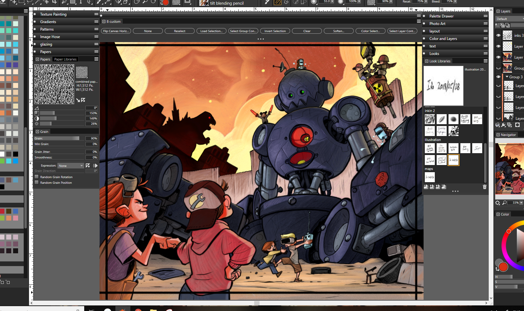
                                  Painting continues! I think the oranger sky says 'fire' more than the reddy/purple sky 🙂 That friggin' robot's got so many little bits... Ugh. Keep in mind, I haven't even started rendering any of the kids yet.

                                  cdc81ed3-d291-4d4c-ac3c-74a5cf5ad23a-image.png

                                  Heather Boyd 1 Reply Last reply Reply Quote 3
                                  • braden H
                                    braden H last edited by

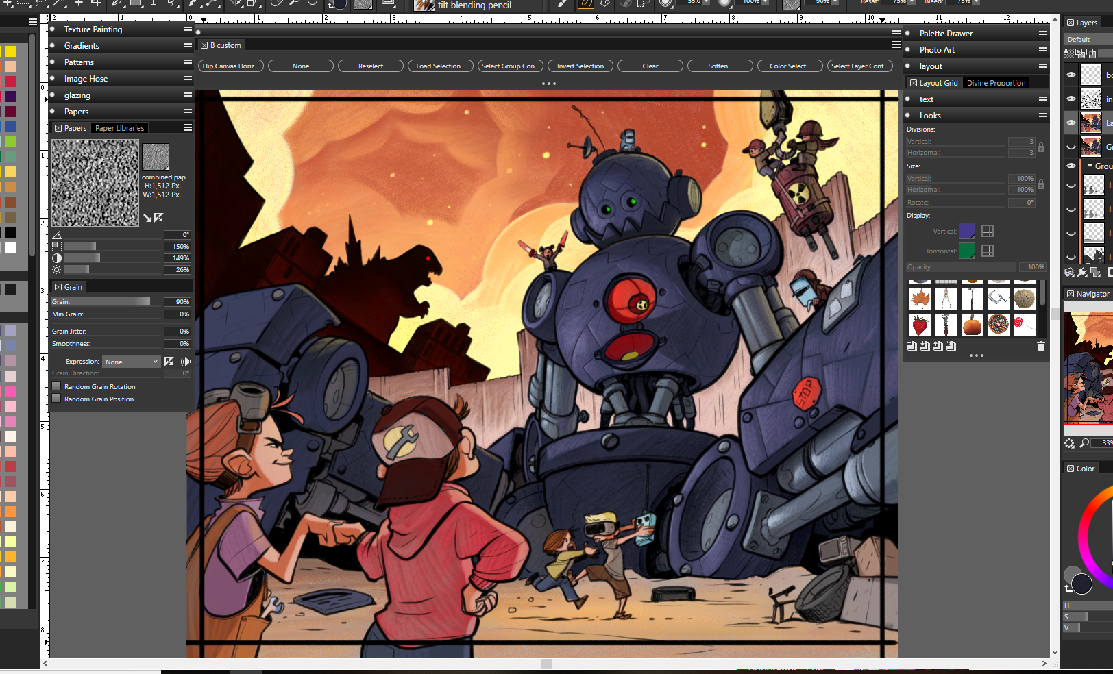
                                    Next up I finished painting the last two kids, then flatten eeeeeeeeverything and do some fixes and glowies.

                                    And then I think I'm close to done 😃

                                    6661711f-ecc1-4ac4-b335-cd913de80251-image.png

                                    1 Reply Last reply Reply Quote 3
                                    • Heather Boyd
                                      Heather Boyd @braden H last edited by

                                      @Braden-Hallett

                                      The robots purple so there’s at least that. 🙂

                                      Instagram: www.instagram.com/heatherboyd.illustration/
                                      Website: https://heatherboydillustration.ca
                                      Shop: https://www.inprnt.com/search/products?q=HeatherBoydIllustration
                                      Ko-Fi: https://ko-fi.com/heatherboydillustration

                                      Be blessed,

                                      braden H 1 Reply Last reply Reply Quote 1
                                      • bnewman
                                        bnewman last edited by

                                        Amazing work man. You are a render-beast! Are you finished with the sky? It looks a bit cut out to me and different from the rest of the piece. A bit distracting even. Some kind of vortex of doom up there... Just an observation.

                                        braden H 1 Reply Last reply Reply Quote 1
                                        • ?
                                          A Former User last edited by

                                          I love looking through your process of creating this piece! It's definitely a strong one! I really enjoy those two kids fighting over the remote.

                                          1 Reply Last reply Reply Quote 1
                                          • theprairiefox
                                            theprairiefox last edited by

                                            @Braden-Hallett love how it is coming out... but something is not quite right with the colors. Unfortunately, I am not good enough to know what!?!?! It is driving me crazy.

                                            I wonder if you changed the robot's plug to a neon (nuclear?) green instead of the red. I think the warm colors are over powering it.

                                            I am sorry I can't pinpoint it. Something just feels off though.

                                            Oh, on a side note, the texture on the robot's metal looks great the way you did it! Came through beautifully and is not distracting at all.

                                            -The Prairie Fox
                                            https://www.instagram.com/theprairiefox
                                            https://www.theprairiefox.com

                                            braden H 1 Reply Last reply Reply Quote 1
                                            • First post
                                              Last post