WIP July contest - Summer vacation gone wrong
-
Hey guys! I'm gonna try out this feedback-during-the-process thing. I'm open to any suggestions, but I'm currently working on what to do with the background. . . Here's what I've got so far:
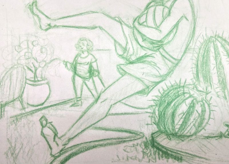
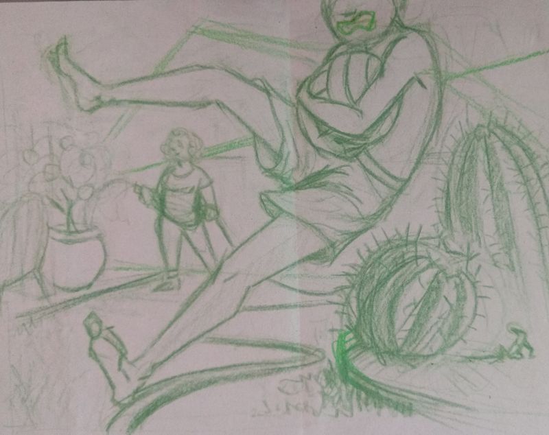
Also, does it work the way it's cropped? (That right foot is too close to the edge I think) I didn't include the head because it seemed to draw attention away from what's about to happen. . . but maybe not. . .
-
@Kuarahy if you can show us the uncropped version maybe we can help. I think it looks good overall. It comes across to me as a frame within a comic book panel rather than as a stand alone illustration. Maybe you could intentionally make it one.
Also...poor boy! That is REALLY going to hurt!!! -
@Kuarahy I like your concept! There is a lot going on and it has an great suspense. I think adding his head would not be distracting at all, adding his face and a scared emotion will only complement your story.
-
@Kuarahy my first reaction to this piece was ow! That's gonna hurt! almost as much as falling in stinging nettles :smiling_face_with_open_mouth_closed_eyes:
The image is easy to read, there's detail but not too much, great sketch!:smiling_face_with_open_mouth_smiling_eyes: -
I like where you going with this! Yeah, I think I would like to see it with his head too. Looking forward to see the progress
")
-
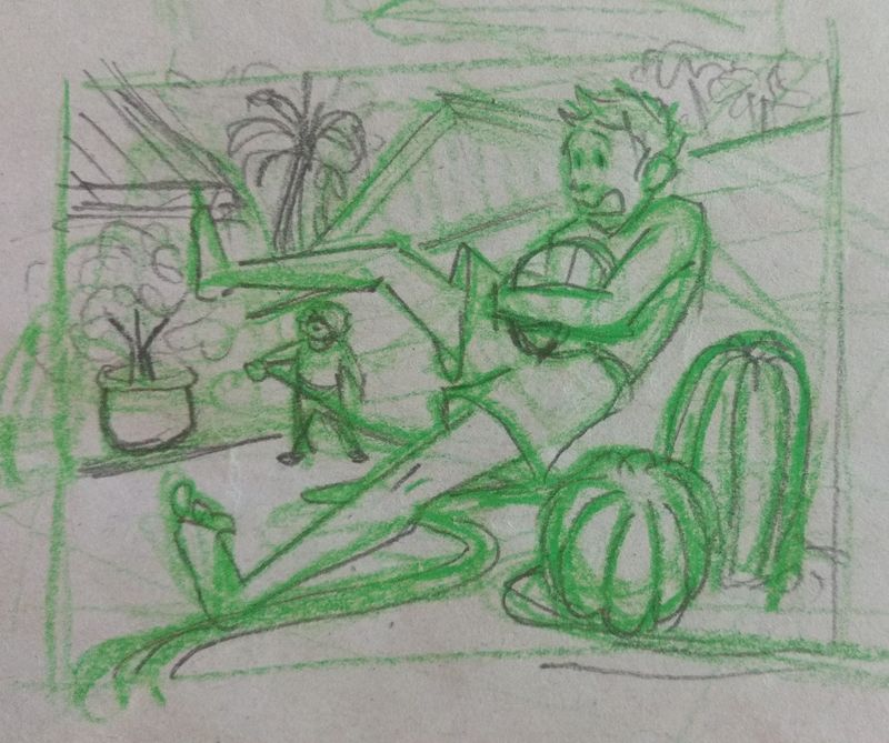
K! I haven't had time to work on this till today, but here's the first sketch, added to a little. Also I did a quick thumbnail with his whole head included. I'm finding it tricky to get the lady with the hose far enough away to fit framed between the legs, yet not so far away that it stretches the space out. . .
-
Hello
I really prefer your thumbnail with his whole head in, his facial expression is brilliant and really adds to what's happening in the illustration I see what you mean about the woman, she does look a bit squashed in that space, maybe she could be where that big pot is but facing towards the right instead? You could always make the illustration a bit longer on the left so the woman character can have more space and you can show the perspective a bit better -
I really like this last sketch, I did like how his leg overlapped the woman in the background a bit for some depth in the first sketch, I think in the final you could possibly blur her out, and throw a cool color on her. Great start!
-
@Kuarahy I like the your use of space better in the first sketch, but it is nice seeing his whole head. Maybe you can combine them by just adding the head to sketch 1 and cropping elsewhere if necessary?
-
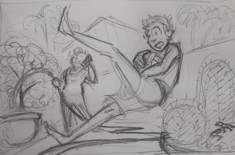
Ok! I think this works out the spacing issues and gets his head in the frame. . . I still need to figure out exactly what I want for the pot that's being watered, but I'm feeling better about the people!
-
@Heindel you're right, it was that they overlapped, that's what made it work so much better :smiling_face_with_open_mouth_cold_sweat:
-
@Kuarahy turning into a great composition!
-
@Kuarahy okay, take everything I say with a grain of salt, I am a total beginner when it comes to illustration, the woman looks very good, the pot she is watering looks to me like it is on the same plane as the boy.... could you tuck that behind the foot? and the cactus almost looks like a foreground element and he is going to fall behind it in the last sketch, do you think it would look better if it the cactus was smaller, or maybe just to be on the page a little more? Also, Great Job! it is looking very nice and telling a great story! keep it up, you all are very inspiring to me!
-
This might be coming a bit too late but I think you piece would look great on a portrait format canvas. I love the concept.
Portfolio: nyrrylcadiz.com
Instagram: https://www.instagram.com/nyrryl_cadiz/
YouTube: https://www.youtube.com/channel/UCbJCF1Im8ZO7hpGWTKOJMuA -
@Nyrryl-Cadiz hm. . . I'd thought about portrait, but then I couldn't figure out how to keep his leg fully extended and still in the frame. . . but maybe I'll play around with it a little more. I've been finishing a different piece, so this one's been on the back burner this past week.
-
It's been a while, but here's an update:
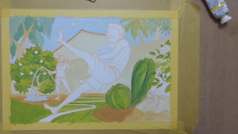
I'm hoping to get a definite Arizona suburb vibe with the colors. . . but we'll see how it goes!! I'm a little anxious about getting those skin tones looking good. . .
-
I think it looks really good so far. In regards to feeling nervous about skin tones... some of the best art advice I ever got: do the hardest part first.
That way, if it doesn't go as planned, it's not as hard to start over or change things up... Thanks for showing your process and letting us in on your creative flow. -
@KathrynAdebayo that's great advice! I guess that's what I'll be working on next then! I've been putting it off :smiling_face_with_open_mouth_cold_sweat:
-
K, I've been slowly plugging away at this. I try to take a picture at the end of eat sitting, so here's a few:
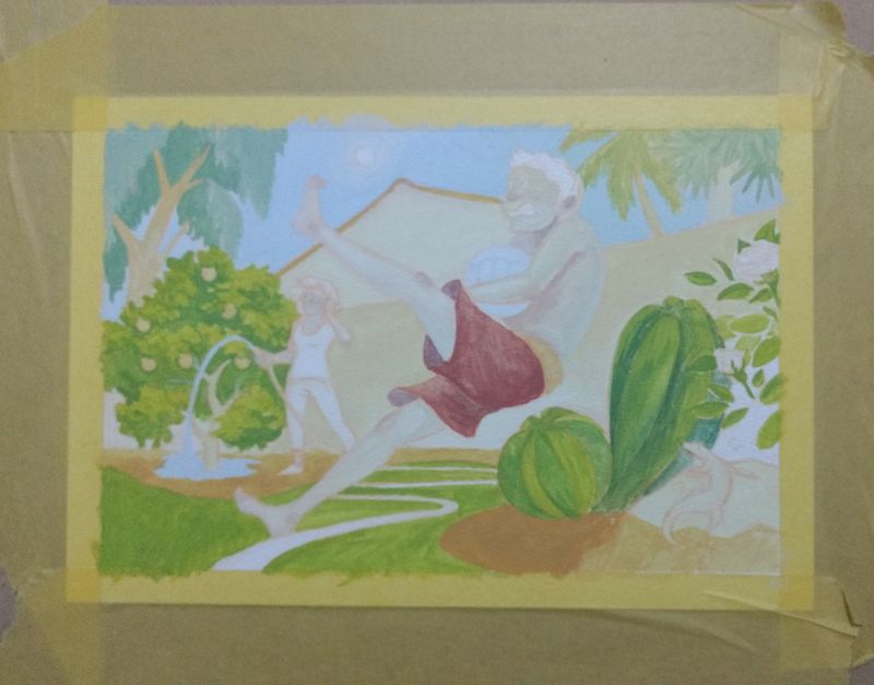
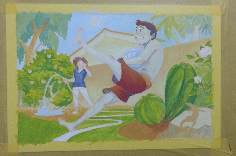
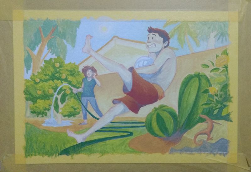
I'm getting close! We'll see how much patience I have left :smiling_face_with_open_mouth_cold_sweat: