July WIP
-
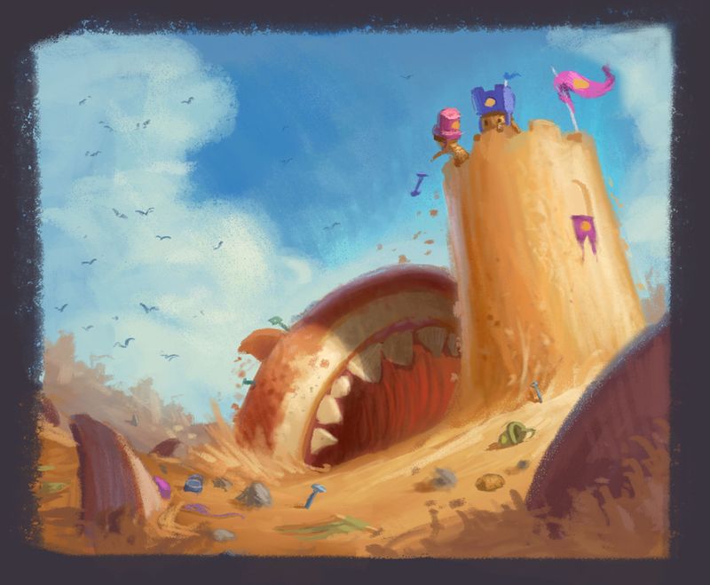
A quickpaint color test for the shark concept. Interested to hear your thoughts on it before going much further. Might try another version and convert the sand at the bottom to water which might give some nice reflections and color variety.
-
It looks like I’m in agreement with the majority here. I like #2 the best. It looks like it’s got the most potential and what’s worse than sand sharks to ruin a summer vacation?? Looking forward to seeing the finished piece. And congratulations on the new baby! Lots of hard work but so much fun at the same time, especially if you can still find snippets of time here and there to make time for your artwork:)
-
@Gary-Wilkinson Love the colour, this piece is a lot of fun!
-
Wow, I love the colors! Looks very summer-y heh
")
-
Wow this is great! I love the colors, any classes you’d reccommend for learning your color sense?
And I agree, I think some water towards the bottom would add some visual interest for sure!
-
Welcome back Gary and congrats on the little one and the book! I've missed seeing your work here and it's good to see your new wip. I see you went with 2 (I like both 2 and 3) which is great! I gotta say, I really wish I could thumbnail and simplify like you do. And I love those fluffy clouds! I can't wait to see the progress.
-
@Sean_H The color and light course at svs is very useful and so is the one over at schoolism by Dice Tsutsumi. I would say it's always useful to look at the colors other artists use too and see what works along with learning about values and color theory. 2 of my favorite artists for their color work are Ty Carter and Sam Nielson. I think Ty has a course on svs and Sam has a very intensive one over at schoolism too.
@Jon-Anderson Thanks Jon! My thumbnails come from even smaller thumbnails just to test out concepts and shapes. Non of the above arose instantly and I doubt they will remain that way in the later stages, but as long as I start with basic shapes I have less of a chance of losing way my in the painting.
-
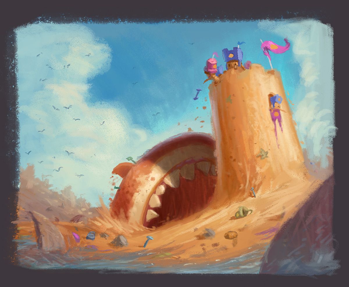
Added some water and moved around a few elements. Any better?
-
Such an interesting story, wow!
I like the added water. To increase readability of the piece, I might add a bulge from the body of the shark on the left under the sand.Thank you for sharing!
-
@Gary-Wilkinson I like it and agree with @KathrynAdebayo about adding a bit of bulge. Also, how about a bit more debris in the mouth of the one attacking the tower? It could be overdone for sure but maybe a little could add to the threat perception.
-
Love the vibe of this piece. very unexpected in a good way, and beautiful color. I love the kids are so small compared to the sand castel.
The only thing I am wondering is that the sharks do not read so well. I am wondering if they could be from a different angle so one of them look definitely shark, and maybe the color could be more different from the sand castel. Right now, the sharks look more like a part of the sand sculpture. -
@Gary-Wilkinson Thank you so much!
-
@xin-li Thank you for the feedback. I agree about the shark's readability. I was originally going to have the shark made out of sand, but it wasn't working and got lost later on when correcting. Tried to adjust things somewhat and liven up the colors a bit more.
Going to call this one done as I've got too many other things I need to get back to
 Tried to be a bit different with this than my usual paintings by only painting on 1 layer for most of it, with only 1 brush. I like how painterly it turned out and might experiment with this a bit more in the future
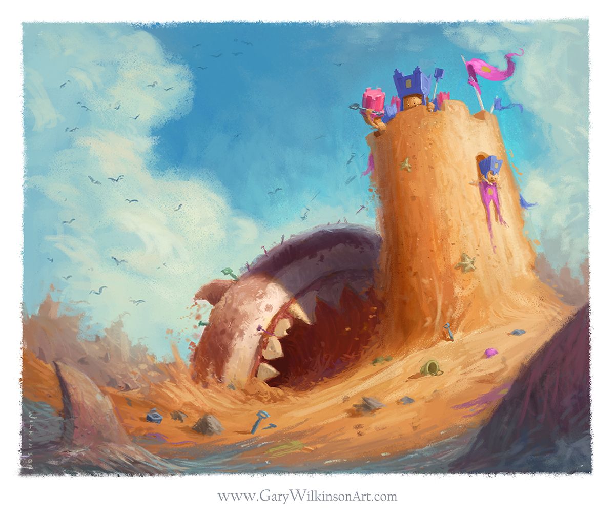
-
@Gary-Wilkinson wow. so cool that you did in 1 layer and 1 brush.
-
@Gary-Wilkinson not sure if you will see this as this topic is a few months old, but I just loooove this so much! I was curious about the 1 layer painting approach, do you paint on a normal layer and was it an oil brush or pastel or something like that? I'm playing around with various approaches so was curious!
This is just such a fantastic piece in concept and execution, I love the painterly style!