How to ink group run through week 5
-
@chrisaakins this is really nice. Thanks for the tip on throwing some paint down. Great idea.
-
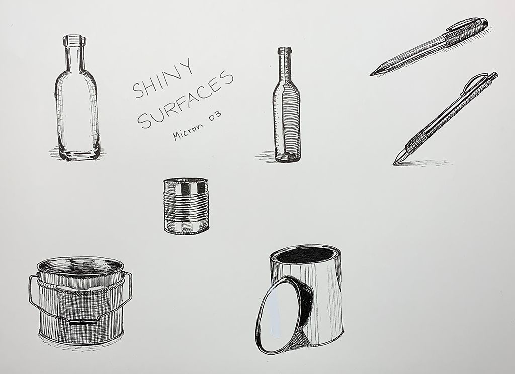
Round 3 - Shiny Surfaces
Yesterday my husband said the shiny sphere that I did does not look shiny. So today I am working on shiny surfaces.
Now that I am taking on objects using reference, I am noticing that the direction of hatches really make a difference in communicating the look and feel of the object, and I am confused about what hatches work best where. I understand the concept of contour lines, but beyond that are there any general guidelines about what type/direction of hatch marks work best to communicate the shape or gradation? I copied an object out of my book the other day that used diagonal hatches running opposite contour lines to communicate a darker area. It was very clean and worked beautifully and I wasn't sure why it was so much better than other approaches. I guess what I am wondering is if these are little gems we will just stumble upon as we experiment, or if there is some sort of concept/guidelines we can use to figure out what would work best.
-
@Braden-Hallett this whole team is super rad!
-
@Aleksey said in How to ink group run through week 5:
@Braden-Hallett these are fantastic! I love how you made the helmet shapes match the head shapes
Thanks! I was gettin' sick of circles

@xin-li said in How to ink group run through week 5:
I did not practice gradienct today, got carried away by painting woods.
That last forest scene is stunning!
@Aleksey said in How to ink group run through week 5:
I was thinking about using a wash but i want to know if anyone would be willing to do a draw over and help me out with doing it with hatching. Pleases.
Are you gonna be using the wash to block in the area behind the characters? Or to reinforce the hatching?
@Erin-Cortese said in How to ink group run through week 5:
I am finding it so difficult to lay shapes down in ink
I'm tempted to go back and relisten to the segment on contour lines myself
")
@demotlj said in How to ink group run through week 5:
to my frustration the only pens I had with me were tombow markers
Yer doin' what you can with what you have. That's more than what most people do in that situation (which is nothing)
@chrisaakins said in How to ink group run through week 5:
you can throw down some paint on your page and ink over it and it feels and looks way cooler
Wow! It really does! That's an awesome effect.
@Erin-Cortese said in How to ink group run through week 5:
I am wondering is if these are little gems we will just stumble upon as we experiment, or if there is some sort of concept/guidelines we can use to figure out what would work best.
Pretty sure it's a little column A, little column B
 What works for one artist doesn't work for another (hence all this practice )
 -
@Erin-Cortese no i think its for each illustrator to decide for themselves haha i just wish mine were a bit neater.
instagram and twitter: @artofaleksey
alekseyillustration.com -
@Aleksey That’s funny you say that because the reason I asked is because I wish mine were so much more loose and natural

-
@Erin-Cortese finding the right balance is key! But maybe it doesnt really matter to anyone but the illustrators themselves
-
@xin-li Thank you. It has definitely helped me. I am no longer worried that I might mess up a painting... well that's not entirely true, but it has helped. LOL

-
Tryin' to get in some local value and gradients and stuff.
It's not a part of my inking brain that I've developed yet
-
@Braden-Hallett looking good. I really like what you did with the glass and the desaturated value behind it.
-
@Erin-Cortese @Aleksey I like both your lines. I wish mine were neater like yours Erin. Aleksey, I love how detailed you work.
-
@chrisaakins @Erin-Cortese ive realized that I actually dong enjoy using the brushpens as much as i like using dip nibs. Im gonna give thst a go on a few of my inktobers
-
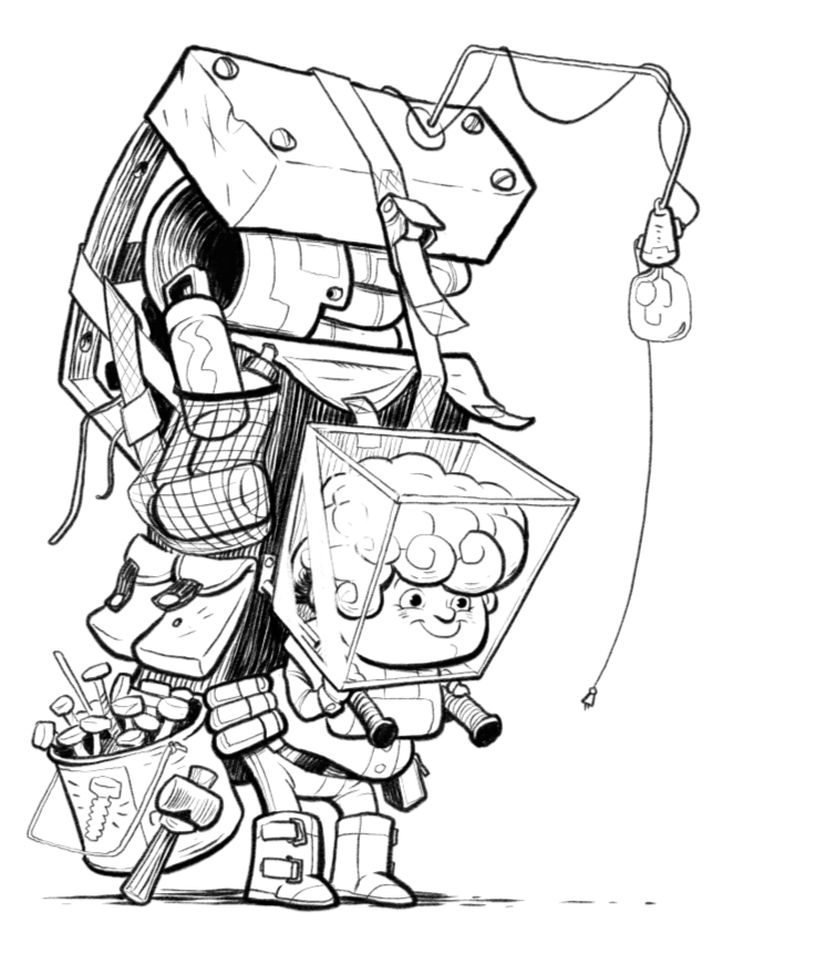
@Braden-Hallett This one is my favorite so far. He has a Samwise feel to him.

 And his helmet
  so great
 -
@Aleksey I have a question regarding your orange pencil drawing under the ink. @Jake-Parker does this and I’m trying for the first time. When you scan in the ink drawing is it easy to remove the orange? Jake says it is and I’m pretty good at Photoshop, but I was just wondering what you do.
Lisa Burvant
www.lisaburvant.com
Instagram & Twitter & SVS: @burvantill -
@burvantill i dont do what jake parker does as often, i use “hue saturation” in photoshop first and select “red” or “blue” (depending on what pencil you’re using) from the drop down and put brightness to max or saturation to zero, or both. then i use the “levels” feature because I don’t like how photoshop messes with my lines so it’s always different for the second step.
Another thing im starting to do for time and sanity is draw it on an ipad or clips studio or whatever, print it on card stock in blue or orange (as @Jake-Parker suggested but I might change to bristol because my printer has a special slot for fancier paper and i want to use pen nibs) ink on card stock or on lightbox, rescan it and get rid of the blue/orange in photoshop. This way i can have original inked pieces that i can look at and go “oooo pretty”
instagram and twitter: @artofaleksey
alekseyillustration.com -
@Aleksey Okay
That’s what I’m doing right now. I drew it on my iPad and just printed it out on card stock. After inking I will scan it back into the puter. 

Lisa Burvant
www.lisaburvant.com
Instagram & Twitter & SVS: @burvantill -
@burvantill have you used pen or brush on cardstock? Curious to know if it tears up the paper at all
instagram and twitter: @artofaleksey
alekseyillustration.com -
I was working on this month's contest and I got really stuck on the color study so I decided to try putting some of this inking practice to work on the piece. It's not easy to apply all of the different gradient hatching for local color and shadows and form and I think I still need more darks. I'd love to hear your critiques on the inking based on what we have been learning. (This is digital technical pen in Procreate.)
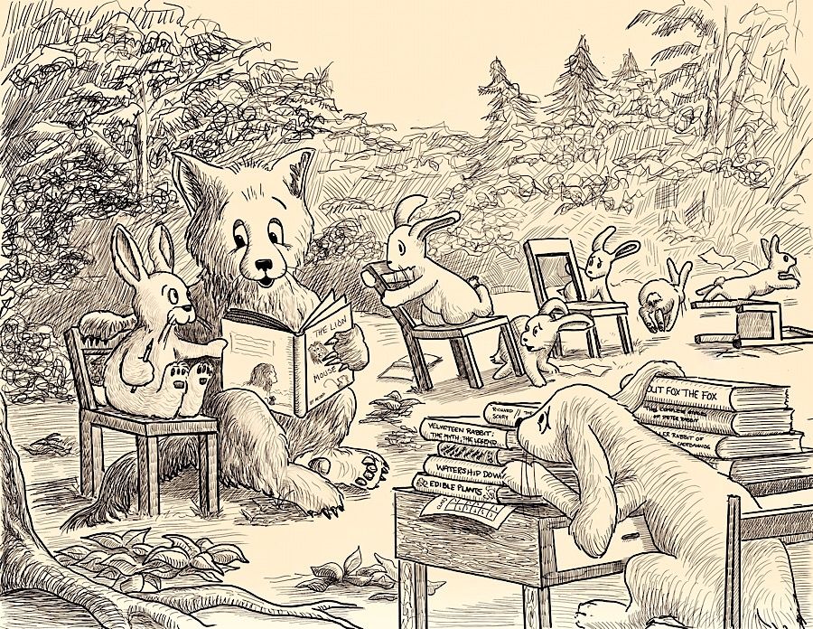
Laurie DeMott
instagram.com/demotlj -
@demotlj looks great. I think doing just ink might work too. I like how you kept the details vague for the background. The one thing all those lines in the background are doing though is taking some focus away from the characters. I would put nice thick lines around the main characters you want us to see and it should do the trick. It has a really nice older cartoon/ book illustration style to it.
instagram and twitter: @artofaleksey
alekseyillustration.com -
@Aleksey I think you are right about the background feeling distracting. I'm going to look at some old illustrations and see what they did. Maybe they didn't vary the line direction as much as I did.
Laurie DeMott
instagram.com/demotlj