Society of Visual Storytelling

    SVSLearn Forums

    • Register
    • Login
    • Search
    • Recent
    • Tags
    • Popular
    • Users
    • Groups
    • Search

    Sept contest - which version?

    Artwork
    12
    15
    574
    Loading More Posts
    • Oldest to Newest
    • Newest to Oldest
    • Most Votes
    Reply
    • Reply as topic
    Log in to reply
    This topic has been deleted. Only users with topic management privileges can see it.
    • demotlj
      demotlj SVS OG last edited by

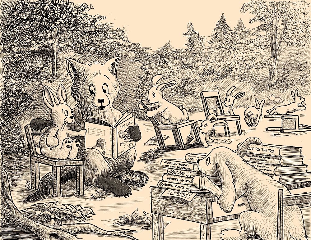
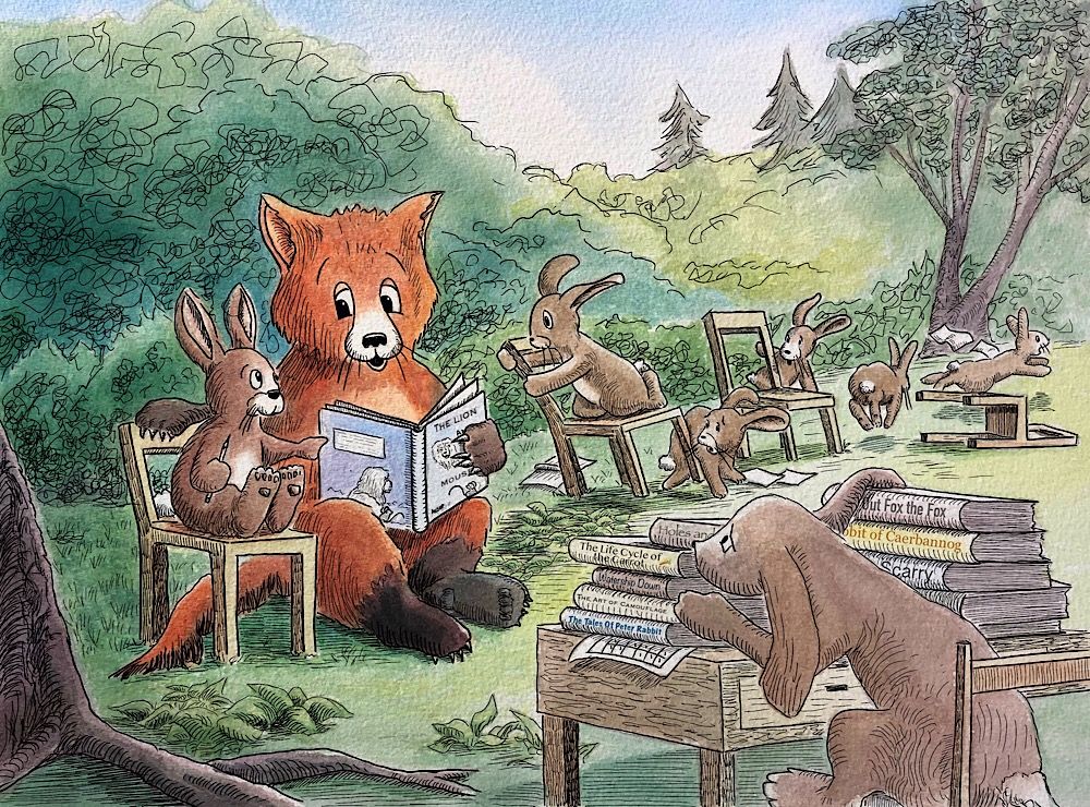
      I did two versions of my entry for the contest. The first is digital pen and ink in Procreate which has the advantage of being different, and the second is traditional watercolor with digital ink which has the advantage of being in color. I’m not looking for critiques because I can only do minor changes at this point but am curious to see which people prefer.

      2D14A233-E789-4C3E-8FCD-95C9659982B7.jpeg

      2EE327A4-7C72-4F97-98A5-9512DFF3990C.jpeg

      Laurie DeMott
      instagram.com/demotlj

      ArtofAleksey KajsaH DOTTYP 3 Replies Last reply Reply Quote 5
      • ArtofAleksey
        ArtofAleksey @demotlj last edited by

        @demotlj lovely!

        instagram and twitter: @artofaleksey
        alekseyillustration.com

        1 Reply Last reply Reply Quote 1
        • TessaW
          TessaW last edited by

          I like both pretty equally, however I am drawn to the subtle texture of the watercolor paper in the color version- so that is giving it a slight edge for me over the sepia one.

          Website: www.tessawrathall.com

          Instagram: www.instagram.com/tessawrathall_art/

          1 Reply Last reply Reply Quote 1
          • theprairiefox
            theprairiefox last edited by

            I would lean toward the linework in the single color image. Both are very nice though. I am pretty partial to B/W linework so I might be biased.

            -The Prairie Fox
            https://www.instagram.com/theprairiefox
            https://www.theprairiefox.com

            1 Reply Last reply Reply Quote 1
            • Shara Mills
              Shara Mills last edited by

              I like the color version better. I think the values of the color help tell the story. In the first version the areas with a lot of line get a lot of visual weight. They don’t direct as clearly to the focal point and story elements as well as the color version.

              Admittedly, I must confess my bias to watercolor and ink. Though I really do think it reads better. 👍🏻

              facebook.com/SharaMasulonisMillsIllustration/

              APHOTICMOTH 1 Reply Last reply Reply Quote 3
              • KajsaH
                KajsaH @demotlj last edited by

                @demotlj I love the color version! Your style reminds me of the original Winnie the Pooh illustrations 😍

                https://www.instagram.com/kajsah.art/
                www.kajsah.com

                demotlj 1 Reply Last reply Reply Quote 1
                • demotlj
                  demotlj SVS OG @KajsaH last edited by

                  @KajsaH I went to an exhibit of E. H. Shepard’s Winnie the Pooh sketches and finished works at the Boston Museum of Art last fall and spent a lot of time studying them! I love him and Robert McCloskey and that whole period.

                  Laurie DeMott
                  instagram.com/demotlj

                  1 Reply Last reply Reply Quote 0
                  • Coley
                    Coley last edited by

                    i think I am leaning to the colored version too but it'a a close call. lovely!

                    https://www.instagram.com/nicoleledrewmay/

                    1 Reply Last reply Reply Quote 1
                    • APHOTICMOTH
                      APHOTICMOTH Moderator @Shara Mills last edited by

                      @Shara-Mills said in Sept contest - which version?:

                      I like the color version better. I think the values of the color help tell the story. In the first version the areas with a lot of line get a lot of visual weight. They don’t direct as clearly to the focal point and story elements as well as the color version.

                      Admittedly, I must confess my bias to watercolor and ink. Though I really do think it reads better. 👍🏻

                      I agree with Shara. 🙂

                      All my links: https://APHOTICMOTH.carrd.co/

                      1 Reply Last reply Reply Quote 1
                      • demotlj
                        demotlj SVS OG last edited by

                        @CLCanadyArts @Shara-Mills Thanks for your insight on what makes the color version better for you than the ink because it not only helps me to decide on which version to submit but will help me in future pen and ink drawings. I think you are absolutely right about main characters getting lost more in the ink so I’m going to try to work on defining the focal point more when I’m just using ink.

                        Laurie DeMott
                        instagram.com/demotlj

                        1 Reply Last reply Reply Quote 0
                        • lmrush
                          lmrush Pro SVS OG last edited by

                          They are lovely, I am leaning towards the watercolour, good luck!

                          Lisa Rush
                          www.lisarushgallery.com
                          www.facebook.com/ArtbyLisaRush/
                          www.instagram.com/lisarush11/

                          1 Reply Last reply Reply Quote 0
                          • DOTTYP
                            DOTTYP @demotlj last edited by

                            @demotlj Both! It is a hard choice but I think the colour one.

                            scribbles.artstation.com
                            www.instagram.com/dottypaints

                            1 Reply Last reply Reply Quote 0
                            • demotlj
                              demotlj SVS OG last edited by

                              Thanks everyone. I decided to go with the color since the majority were leaning that way. It was fun playing with the different styles, though.

                              Laurie DeMott
                              instagram.com/demotlj

                              1 Reply Last reply Reply Quote 0
                              • Sofie Schollaert
                                Sofie Schollaert last edited by

                                just saw you posted the coloured one... good choice, that is my favorite too 🙂
                                Love the illustration by the way, it's such a nice style too.

                                • Life is cuter when you draw it! -

                                instagram: https://www.instagram.com/sofie.schollaert/
                                website: https://studiomosa.be/

                                1 Reply Last reply Reply Quote 0
                                • Monica Duque
                                  Monica Duque last edited by Monica Duque

                                  I'm loving the second one, in color. It helps direct my eye throughout the scene setting. Also, in the first one, in order to execute the texture of the trees in the background, I think it causes too much ink noise. Therefore, the watercolor helps minimize the use of inked texture and lets the color do the talking. Well done, looks great!

                                  1 Reply Last reply Reply Quote 0
                                  • First post
                                    Last post