Discovering our style - Who's in?
-
My second Portfolio. Maybe surprising? It's quite different to the first one. :face_with_stuck-out_tongue:
 I made it up based on the need to start with something easily achievable, which is fun at the same time. I'm thinking more of editorial, non-fiction illustration. Still not sure where to fit it best ...
Ignore the subject matters in any case. My choices weren't neccessarily what blows me completely off, but the question: What would I like to I try with my "style"/What would be a fun and fast way to draw on a daily base?Sorry for not putting all the artists names. This was a faster process and you don't always get the artist's name, say, from pinterest. It's very confusing.
Briony May Smith
Catherine Pape
Cyril Pedrosa
???
Mabel Ye
???
Katja Gehrmann
Voctoria Antolini
Natalie Andrewson
Kim Jung Gi US
Mikkel Sommer
???
Natalie Andrewson
Tom Boothe
Natalie Andrewson
3x Núria Tamarit
Tim Möller-Kaya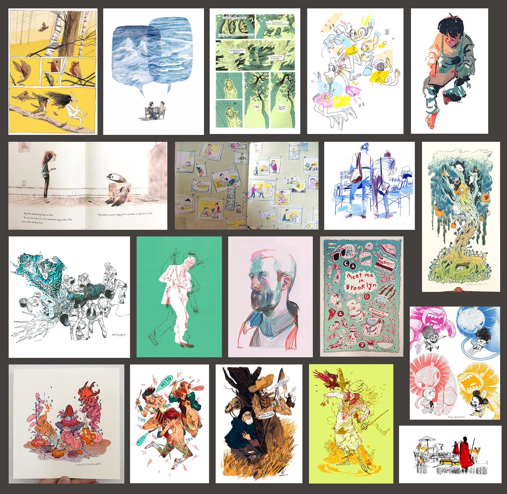
This is what I found: fast lines, vivid colors, colors not always in place, and made up for the design ignoring natural colors, leaving parts of the image blank. Flat blocked-in colors. Few colors per image, sometimes handled like in multilayered printing techniques (few colors printed above each others - don't know how to describe this in english
 ). Partly brightly colored lines. I cannot name a certain color contrast here ... any ideas? Besides some monochromatic or analogue colors. Forgot so much about colors in all these years!
Few detailed or non existant background, higher level of abstraction then in Portfolio #1, expressionistic, much movement ...Does this make any sense to you? I can imagine to grab some of the elements and go experimenting within the visual language I am capable of.
@neschof Awesome! I see a lot of things there, but am too tired for writing them down right now
") I'll post it later.
I'll post it later. -
@Meta It is also late here and I'm off to bed
") but a first thought on your new portfolio. I'd class these as "drawings", in contrast with your previous portfolio which was definitely full of "paintings". Except the image of the boy in the top right of the new set. This seems more painting than drawing to me and doesn't sit comfortably in this new set, even though it is a sketchy sort of painting I could definitely be wrong, viewing with tired eyes, I'll have a closer look tomorrow.
but a first thought on your new portfolio. I'd class these as "drawings", in contrast with your previous portfolio which was definitely full of "paintings". Except the image of the boy in the top right of the new set. This seems more painting than drawing to me and doesn't sit comfortably in this new set, even though it is a sketchy sort of painting I could definitely be wrong, viewing with tired eyes, I'll have a closer look tomorrow.I also realised I didn't give any of the artists names in my portfolio. I'll add them tomorrow too.
-
@Braden-Hallett - Libraries, caldecott winner lists online, other lists online, and looking at everyone's dream portfolio here. I don't yet know what will make the cut for my top 20 pieces, but I've been taking about 20 minutes each day to research new artists.
@Chip-Valecek I think if the pieces look different stylistically it's okay because our job is to steal little pieces from the artists we like and allow those combinations to form into our own unique style. That's my take at least. I am trying to stick to published childrens book illustrators at the moment though, but that's the only self imposed constraint.
-
@neschof Can you please include a lists of the artists? I see some stuff in there calling me :smiling_face_with_open_mouth_smiling_eyes: I will look it over later and do my best to add to what you're seeing.
-
@Braden-Hallett I did this excise earlier this years. I had a lot of artists name in mind. I used pinterests search to find images of the artists I have in mind, and see similar images suggested by Pinterests.
My biggest challenge was to narrow down to 20 images. I think I would have given up doing that if I did not have a deadline (I did the excise in one of Lee's interactive class). But I am so glad I did that, and I am planning doing this as a yearly ritual. -
@neschof Here are the artists for my images (sorry I forgot to include them before). The stars are how much I like the artist's work as a whole. So 5 stars means I love everything they do, one star means I was attracted to this specific image but not so much the artist's general style.
There is one image that I don't know the artist for - I tried reverse image searches etc. and found nothing! It looks like a children's book spread so if anyone recognises it please let me know - I would love to see the whole book!
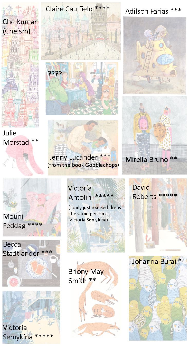
Here are some links to these artists for interested people:
http://clarecaulfield.co.uk/
http://www.mounifeddag.com/
https://www.artistpartners.com/portfolios/david-roberts/
http://www.wolphins.com/illustrators/victoria-semykina
http://www.jennylucander.com/books -
@xin-li & everyone, For both portfolios I started wit 76 and 65 pieces of work. For each, I copied all of the images to a new folder for not loosing any. Then I started deleting what looked paler in comparison to the others.´, till I had only 20 left. This took me less then half an hour. I usually find it easier to delete what's redundant, instead of to pick what's good. Maybe this helps someone.
-
@Meta exactly what I did - It means you can be more flexible when adding images - anything that catches your eye. Then repeatedly filter through them all deleting any that don't shine when sitting beside all the others. At the end I also tried to only include one image per artist. This was hard! but I think worthwhile to not have too much an overwhelming influence from one or two people.
-
@Meta thank you for sharing your process, very interesting. I used a similar approach as you did, but the whole process took me about a week (I had to take breaks in between). I did not think the image collections I gathered were perfect that I could not get rid of any. It is more like many images has something speaking to me, but also have things that I am not very interested in. It was hard for me to compare them, such as: I really like the theme of this image, but I am not into a very bright color scheme. Or I love the composition of that image, but I am not into the horror theme. So the whole process for me was about studying my art heros, but also about a conversation with myself to figure out what is really important for me.
-
@xin-li So why not opening several folders, naming them "composition", "light", "theme", "color" and whatever box you want, and sort your images like that? This can be a parallel process to your dream portfolio, and you don't loose track of the things you want. Maybe it's easier to choose the pictures then? Just picking the best things from each folder ... Just an idea.
Ah, and it also took me many hours to get together all the images. I was just refering the time of sorting them out which was quick. -
@Chip-Valecek i wonder if this may help. Last Spring I got a portfolio review from Laurent Linn and in my portfolio I had a lot of cartoony characters that I’ve been drawing my whole life mixed in with my children’s art. Now to me they’re all children’s art but to him the two styles were so different that he said why don’t you just leave out the cartoony stuff for now and focus on the other stuff and it really helped me focus more. It was a bummer because I like the cartoons but he did say, “for now”
 I do still have them on my website in a separate page but in my gallery and my physical portfolio I left them out.
 -
@Braden-Hallett i had a huge board that I’ve been doing for a while of art that I just liked. I started there and chose the images that I felt were the direction that I want to take my art. Like @xin-li said it was tough to whittle it down to 20. I did it in the spring this year and I’ve been adding and subtracting images as I grow, trying really nail down what I want to do. I feel like this will be a lifelong project. Lol. I like the organization and ease of Pinterest to change it as I go. If I see something out in the world I try and find it online and then add it in to the dream board.
Lisa Burvant
www.lisaburvant.com
Instagram & Twitter & SVS: @burvantill -
@neschof Thank you!
-
Thanks everyone for the info
I think I may make a comics dream portfolio and a kid's book dream portfolio. And also stop overthinking it. I'm really overthinking it.
-
@Braden-Hallett yep. Get out yo head and just do you.

-
@Miriam Yes! I think that's where the folky stuff comes in more, but even the sci-fi stuff has a lot of earthyness to it.
@Zachary-Drenski I love the idea of quient action, thanks for putting that into words.
-
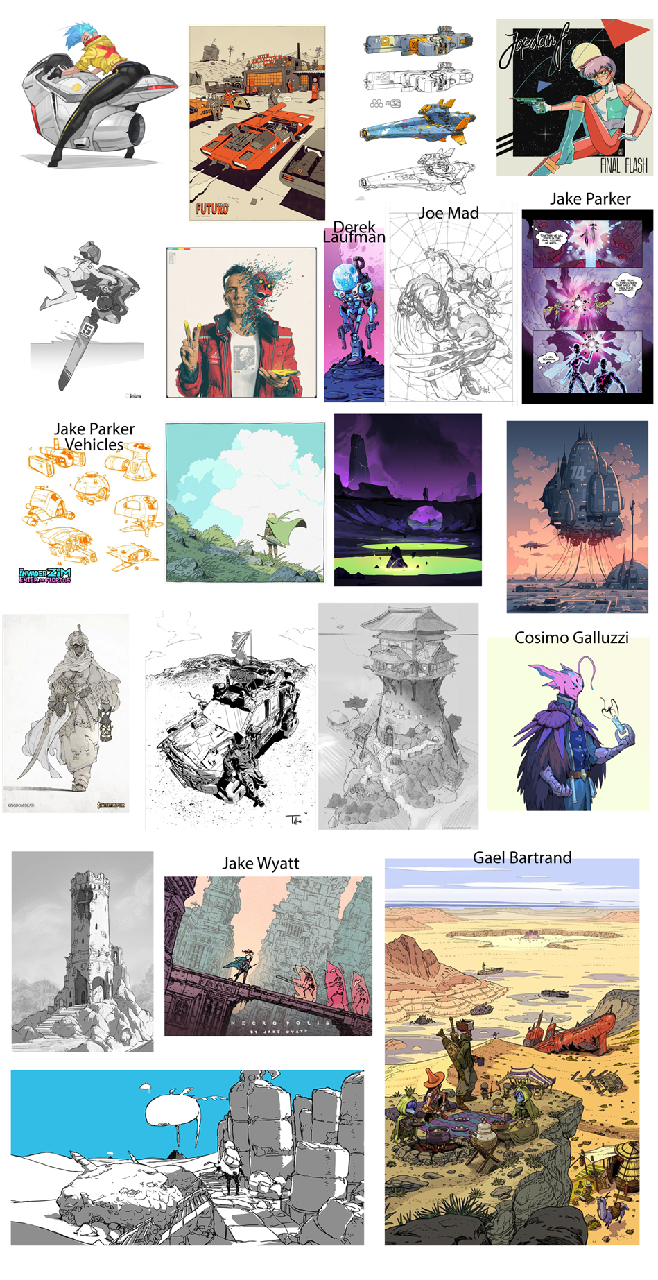
I made my own thread but I thought I would join in here on the discussion. I noticed everyone kind of keeps to the same style of artists.
Is that on purpose or would a diverse set help? LIke Jake mentions Bill Watterson and Masamune Shirow. Two worldly different artists/cartoonists.
-
@Meta Your first portfolio looked very animation inspired, your second one looks more like the images belong on posters for bands and concerts. What jumps out to me is that each of these look like they could have been done in a sketchbook. They have a very traditional vibe, and it looks like the artists are showing their brush, pen, pencil strokes very confidently and purposefully.
@Elena-Marengoni We have some overlap in our dream portfolios. You have great taste

@neschof Colors- I am seeing a lot of desaturation overall, with a bright, saturated focal point. A lot of bright orange and pink set against blues, whites, and browns. Also, kind of goes without saying but the the mark making is super organic in all of these. Thanks for posting the artists names. A lot of great stuff in there.
@jthomas I stuck to published childrens book illustrators when creating my dream portfolio but I'm really inspired by all kinds of art. I am trying to develop a style to fit the market so its a good way to orient myself as I begin making a portfolio. Some thoughts on your dream portfolio, lines look like they are done with a pen not a brush. Really clean and accurate linework, with straightedges included. Accurate proportions and accurate perspective. Not a lot of cartoony stylization. A lot of long shots but with some interesting camera angles.
-
@Zachary-Drenski thank you, I’ve been trying to analyse my own work this morning and have discovered I seem to be a little obsessed with red / green palettes. I think I’ll start my own thread to track progress with this. Would be great to see your dream portfolio when it’s ready!
-
I spent way too long on this :smiling_face_with_open_mouth_cold_sweat:
So, I thought I knew myself better, but this turned out much different than I thought.
I am noticing a bunch of stuff that I've written down but it's a long list and you all don't have to point out any commonalities that you see. I thought instead I'd talk about how I came up with this grouping and would be interested in hearing how you picked yours.
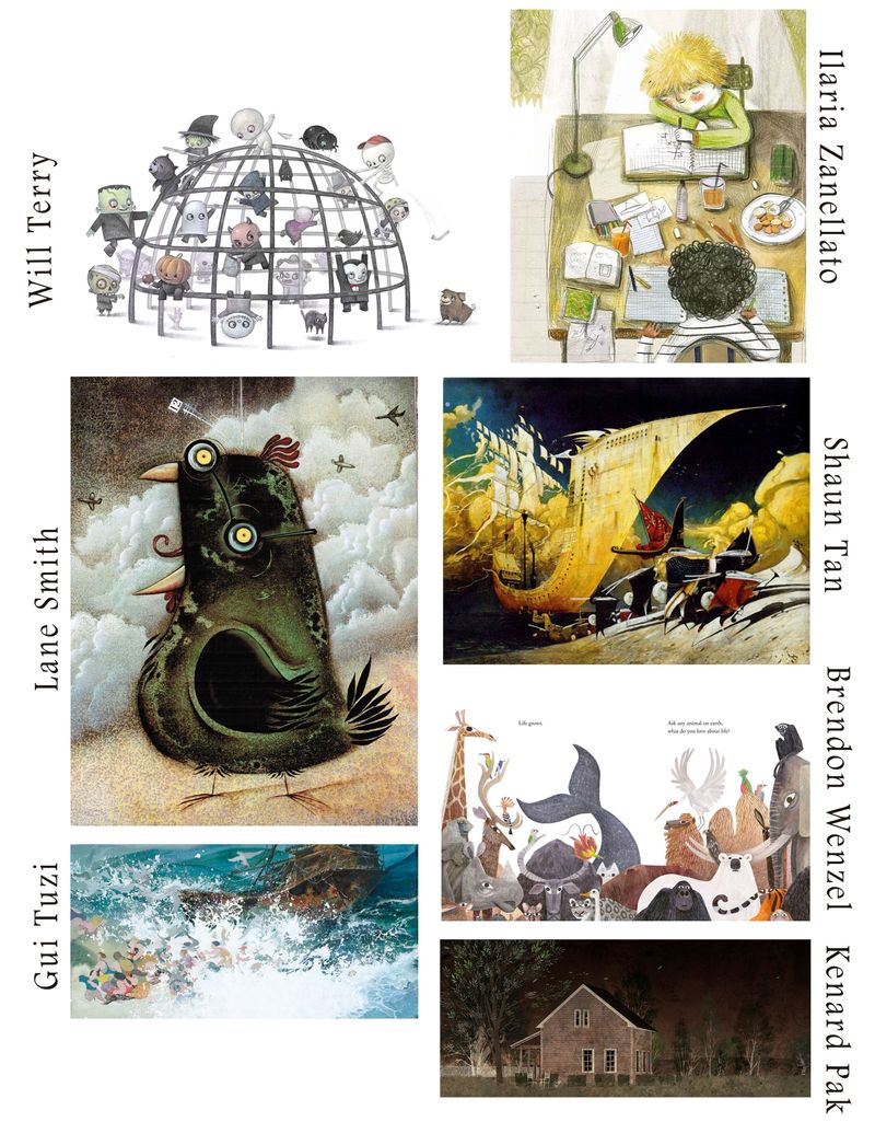
I set 2 rules and I wonder what you guys think about them? The first rule was that I would only choose published picture book illustrators (admittedly, I don't know what Ilaria Zanellato does but she looks the part and I love her work).
The second rule was that I would only pick one piece from each artist. I did that so that I would be forced to choose only art that I really love and with a wider range of artists I thought it would be easier to find common themes and techniques that represent what I want to do.
Also, 1% doubt and it was out. I cut a lot of great stuff but my gut told me it didn't belong. (Wipes sweat from brow) I'm done now, right? Oh yeah, now the hard work begins