Dec WIP
-
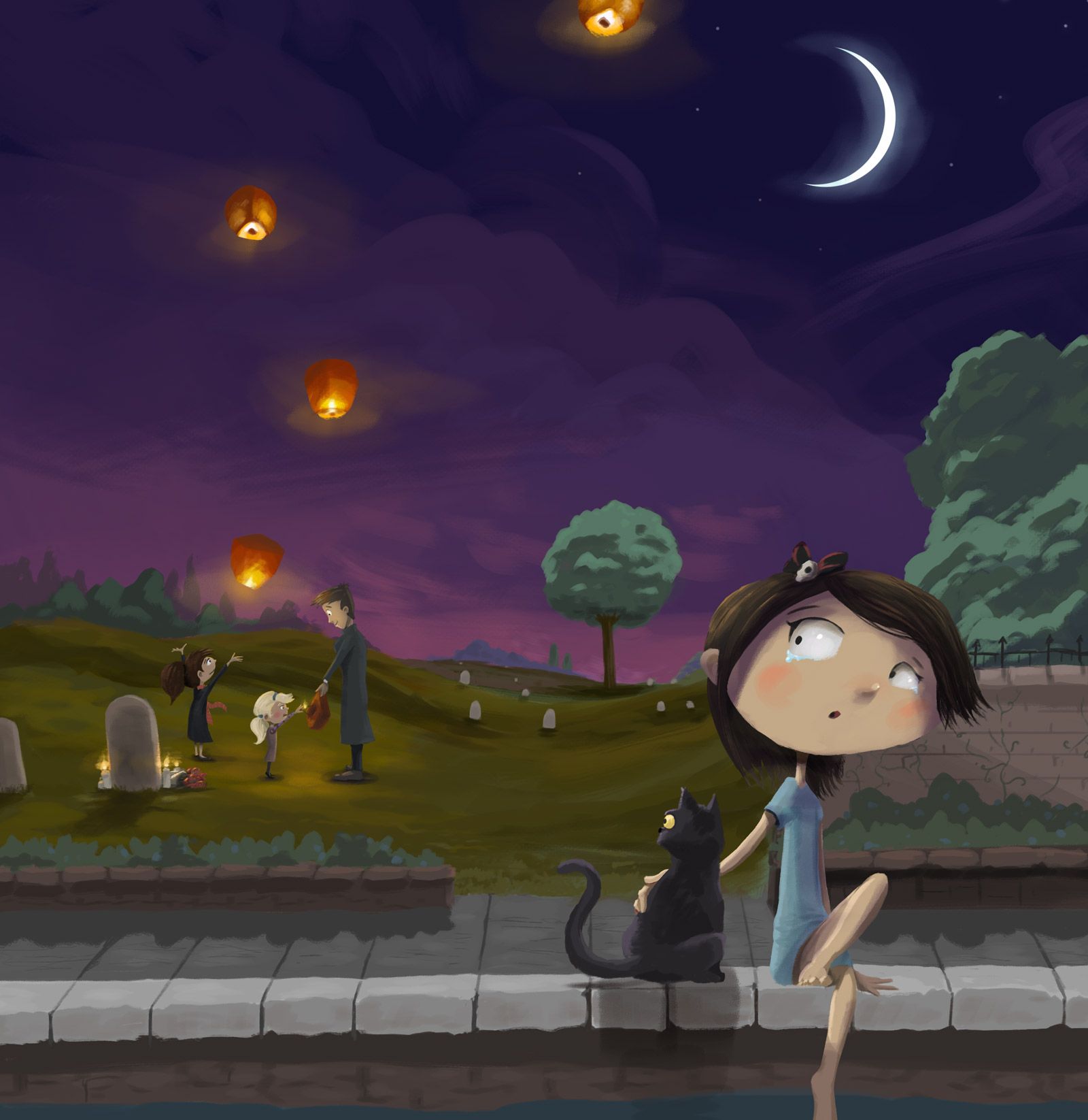
Worked on sketching/refining the base sketch out until I got to the line art that I thought I'd start blocking colors in.
I'm kind of running into a big question for me which is based on style. I'm wondering if I even LIKE working with the line work, rather than using it as a loose framework and then just painting straight over everything. I think I'm starting to narrow down what actually feels natural for a style.
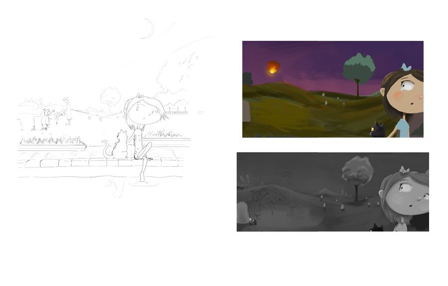
I'm going to experiment with this a bit and do 2 full versions. One version I'm going to follow the line art, starting with value, then adding color. The second one will be slapping paint right over it. I started experimenting with both, including what color palette I'm thinking I'll end up going. I've been liking this purple/pink overtone for the sky with some tests. We'll see what sticks

-
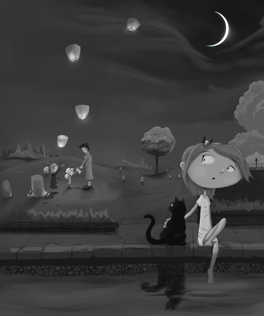
Value version based on the line art...
I'm trying to work out the silhouettes a bit better and this is going to be the first rough for the colors going on top of it.
-
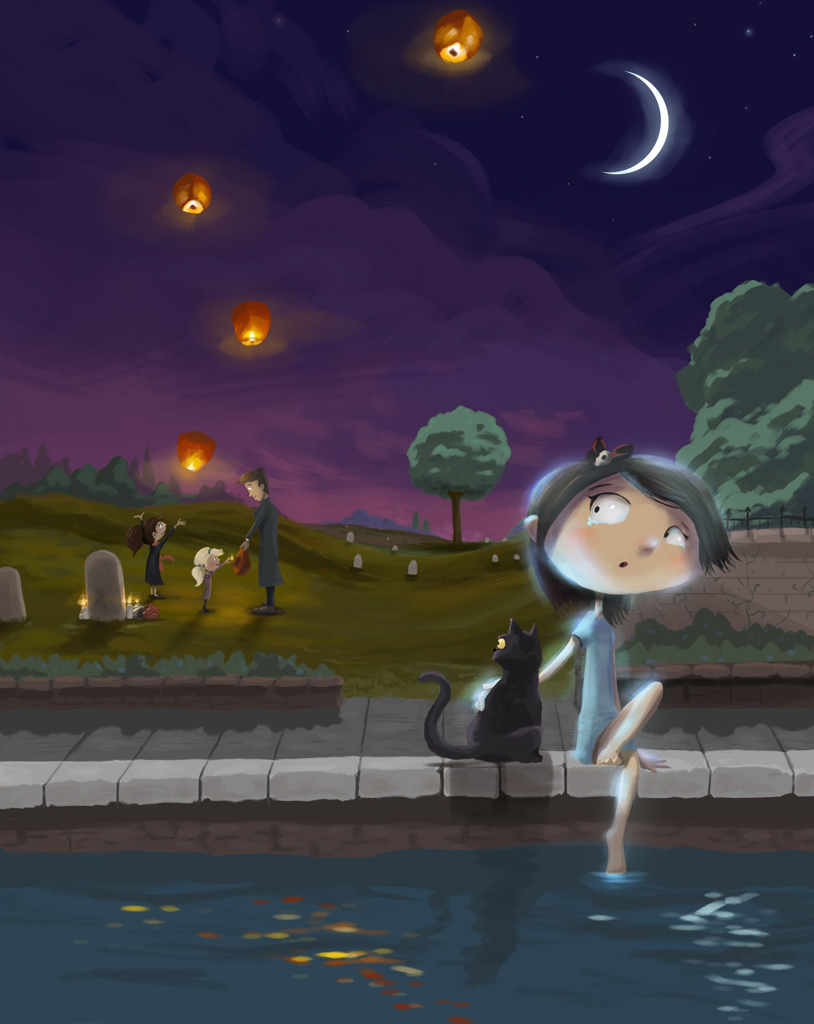
Ehhh... I don't like how this is working so I think I'm actually going try the other method. I'm just feeling like laying down colors over the value painting is fighting me to get what I want. It's looking muddy to me and I'm not getting it to come out quite right.
-
@jdubz It is hard to colorize straight from values!
-
@JoannaH Yeah... I'm still pretty new to color in general, so I'm looking at all these different types of techniques and I'm seeing a lot of people do tutorials where they build values then layer in colors.
But for me it just doesn't feel right. The more I try doing it that way, the more I feel trapped or limited by it.
-
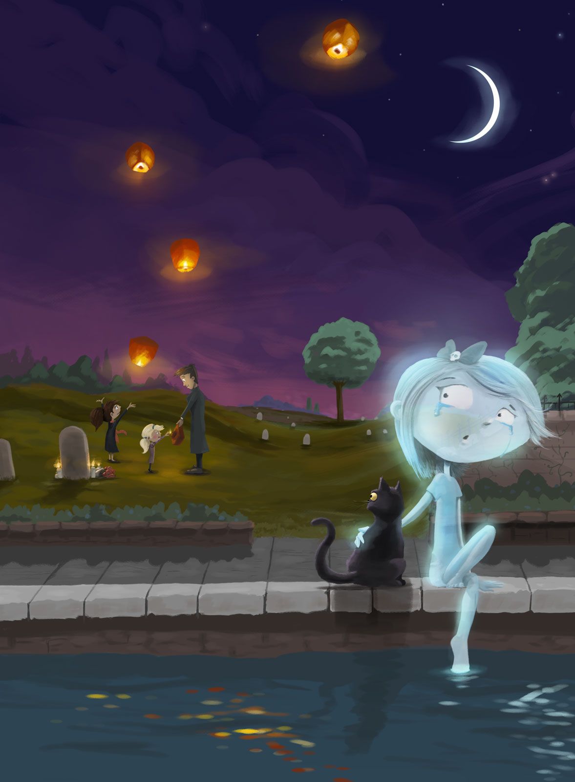
Ok here is the totally repainted one. This time I painted right over all the line work and then built the forms organically just pushing/pulling on the same layer. I still need to work on making her a ghost and work on some of the lighting.
I think I want to expand the water a bit like in the one above. It feels like it needs that extra element where she doesn't create a reflection to reinforce that she's actually a ghost.
Do the shapes read well? I'm trying to take the comments from the live critique yesterday to heart where Will had said I need to work on finishing strokes where details should be and take away strokes where detail shouldn't be.
-
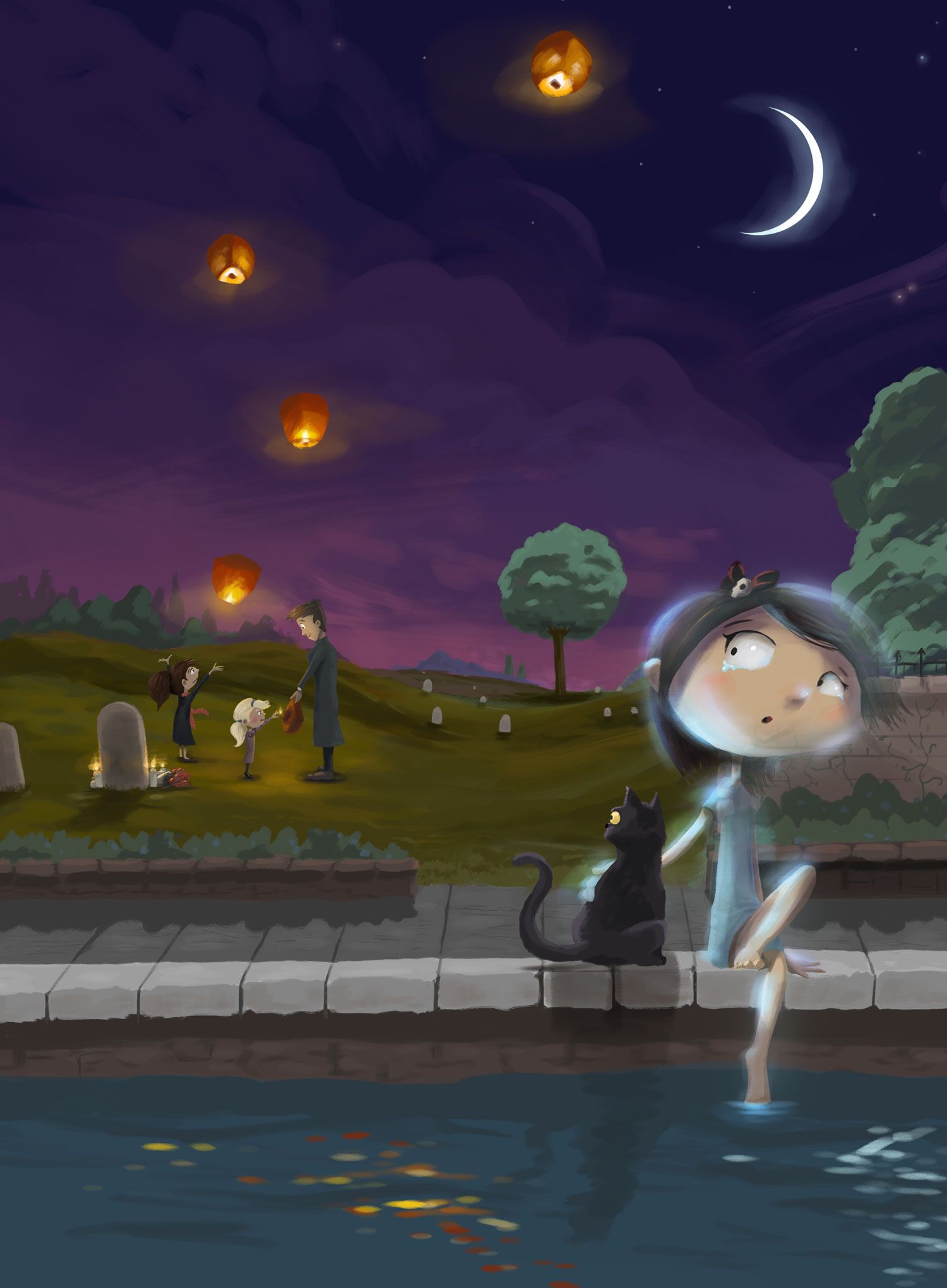
Finished other lights I was thinking about putting in.
My main concern is whether or not she reads as a ghost or not. Does it come off that way?
-
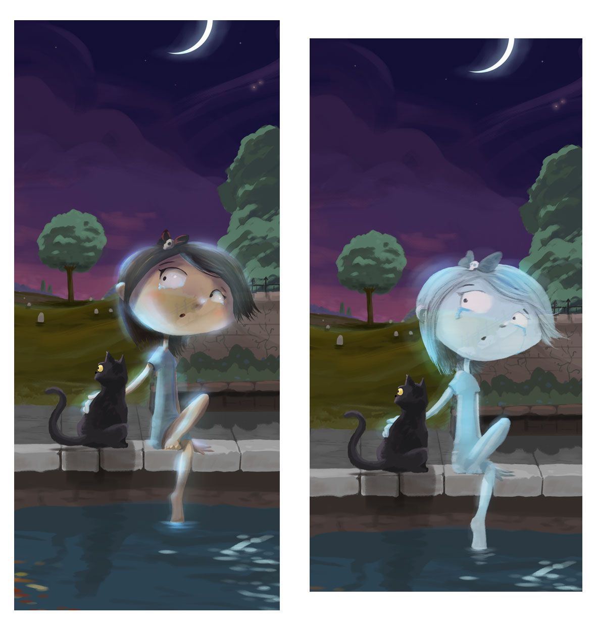
@jdubz I didn't get that she was a ghost. Did you try making her transparent? I think of ghosts as being sorta see through.
-
@carlianne Ok good to know thanks! I've got to see how I can make this work
")
-
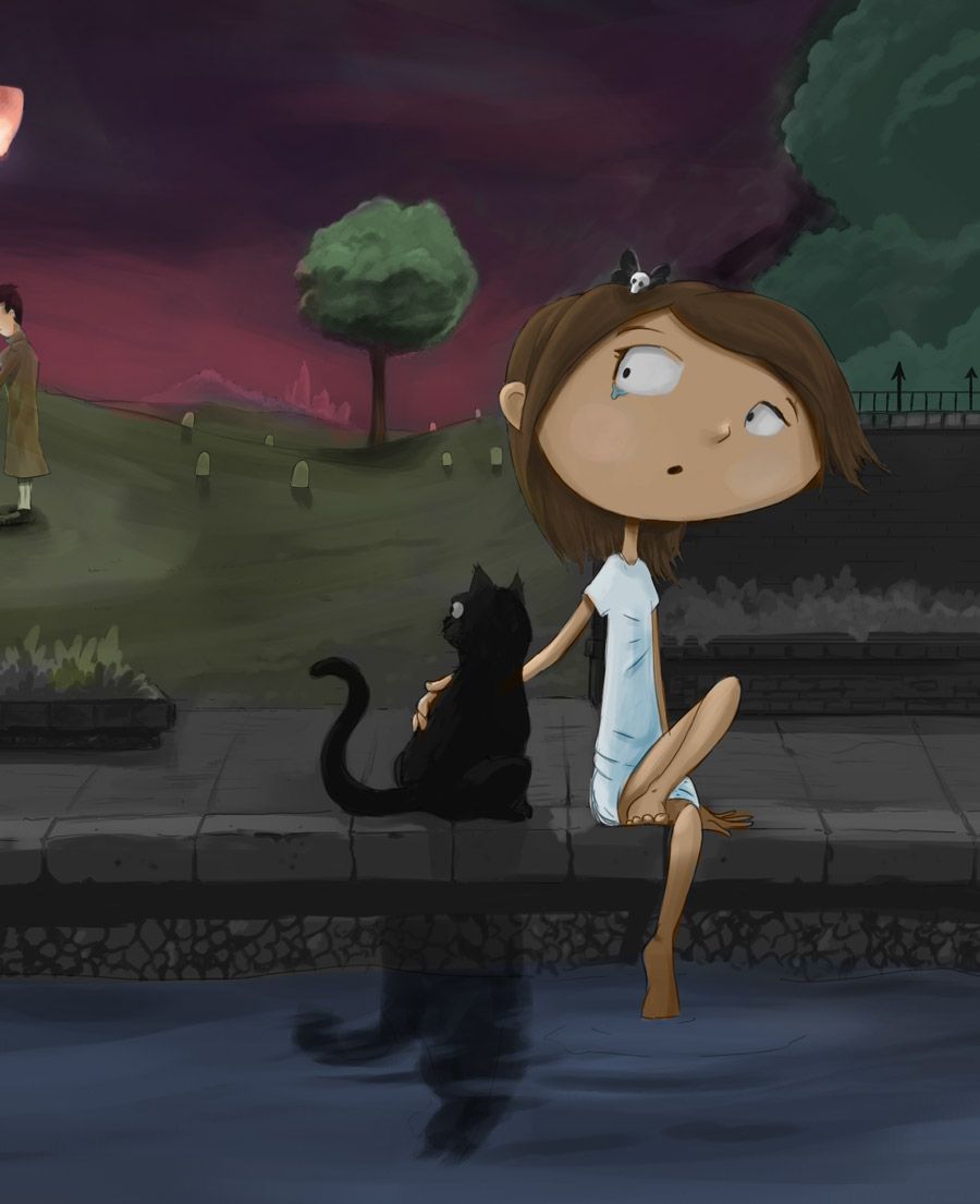
@carlianne Does making the edges of her transparent come across as ghostly??
-
Hmmm.... It's better, but I still don't think I would get it on the first read. When I think of transparent objects like a water glass, I think they look more transparent in the middle, and more opaque on the edges, maybe you could try that?
I really like the concept by the way.
-
@carlianne I'm not sure I like the one with it transparent in the middle... it just feels kind of busy. I tried to quickly redraw her in "full ghost mode". How does that feel comparatively?
-
@jdubz I think full ghost mode works much better
You could even make her a tad more transparent and give her a glowy halo to really sell it -
Oh yeah! I totally agree with Branden. Full ghost mode totally reads, more glow/transparency could be fun - but your call.
-
"full ghost mode" for the win.
-
Full ghost mode yes! Other option is to lighten her layer ( if she's on a separate layer) and have some background showing through? Really sweet! I love your style!
-
@jdubz I saw you said you were coloring over the value layer. Some people seem to be good at that but it's not my preference.
Here's how I like to keep my values in check while coloring
- Create a new layer on top of all other layers.
- Fill that layer completely with white.
- Change that layer's blend mode to 'color'
You can turn that layer on and off to see your painting in grayscale. I don't know if you already know that hack but learning that made my life so much better so I thought I'd throw it out there.
Awesome painting by the way! I love the concept.
-
Thanks all - really sounds like that's the way to go. Really appreciate the feedback.
-
@Zachary-Drenski Ahhh interesting I see what you mean. What I ended up doing is create a hue/saturation adjustment layer at the top and set it to grayscale and then I just turn it off and on. It sounds like it's doing the exact same thing.
I think I'm going to try some more of painting on the grayscale. It seems like the final result has a specific look I'd like to try and master, but it's really counterintuitive to how I want to work hah.
-
Cleaned up the cat and the girl and then added several more layers of glows to her, and then made her transparent in the middle to point @carlianne made which was it should be transparent in the middle. I think that worked a lot better!