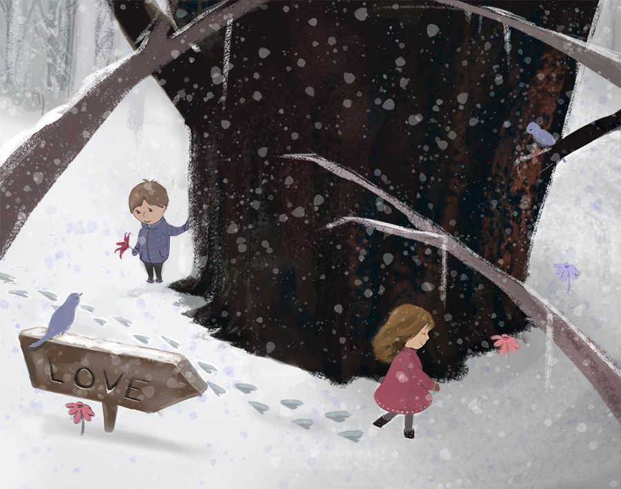
January WIP heart tracks
-
@Julia-Liberali great idea for a potential place on the tree for text. Thank you!
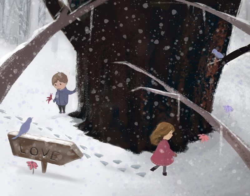
Given the prompt, maybe Will is my focal point so I understand what you mean about it being a bit confusing about where the focal point is. I will definitely have to think on this a lot more! I added the flower to his hand and kept it brighter than anything else in the illustration but maybe it's not enough. There's a lot of directional lines that don't lead to him. Anyhow, food for thought, I really appreciate your thoughts! -
Thanks so much for the feedback @BichonBistro @chrisaakins @jdubz @peteolczyk . It's really great to hear what others think, much appreciated because I was having trouble getting away from it as we all do once we're a bit invested in our own stuff.
Thanks again and happy weekend ️
️ -
@Coley I think if you placed the girl on the right third you would fix your composition. It would provide a solid focal point with her red dress. It would also make more sense. Right now it appears they are together and she's just exploring. If she was moved over it would heighten the sense that he is discovering her tracks and that they lead to her and to love.
-
@chrisaakins thanks Chris. I agree, I just wondered about her"leaving" the illustration. I know they typically say that's a no no. It might work tho if I have her head kind of turned back a little just glimpsing back tho. Hmmmm.
Thanks for that! P.s. I totally loved your December contest entry with Hansel and Gretel! -
@Coley Aww thanks! Maybe if it was obvious she is circling the tree or looking up at the birds. I think the large roundness of the tree works in your favor here because the eyes circle around its girth hoping to get her to the man.
-
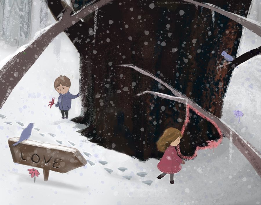
if anyone is hanging around the forum and sees this, I did a little bit of work today. I moved the girl along and changed her gaze so she's looking kind of down (thought maybe then she's not looking out of the painting), but moving her I think made things a bit more balanced.
I might toy with making the tracks in the snow just regular tracks? I don't know if they need to be heart shaped seeing as the sign makes it quite clear it is the track of l.o.v.e lol")
-
@Coley said in January WIP heart tracks:
if anyone is hanging around the forum and sees this, I did a little bit of work today. I moved the girl along and changed her gaze so she's looking kind of down (thought maybe then she's not looking out of the painting), but moving her I think made things a bit more balanced.
I might toy with making the tracks in the snow just regular tracks? I don't know if they need to be heart shaped seeing as the sign makes it quite clear it is the track of l.o.v.e lol
It does have a more balanced feel
 I think the heart tracks suit the text better than regular footprints. Maybe it's the romantic in me, but I see an inverted heart shape made by the lower branch, base of tree, girl's front and icicle ️
-
@BichonBistro that's pretty cool!!!
️
-
@Coley I'd say you put your heart into this one

-
So cute! I like the heart shaped footprints. perfect for Valentine's day right around the corner
 ️
️ -
Your illustration is so lovely and cute, I love it

-
@BichonBistro lol!
-
thanks @KaraDaniel and @Lobalyss
-
This is so sweet. I love the work you put into it. I agree that it’s prefect for Valentines Day! Well done!
-
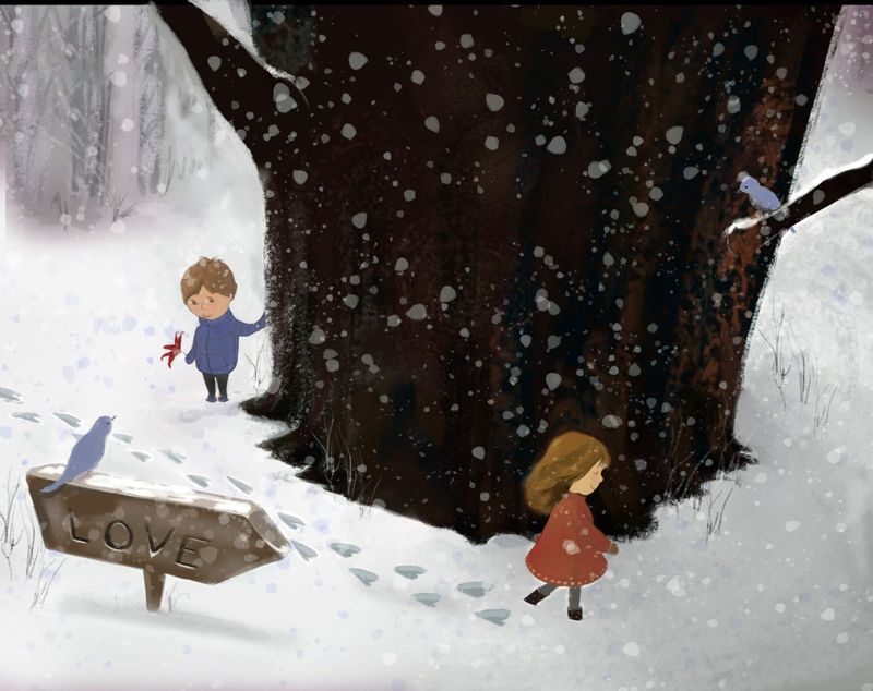
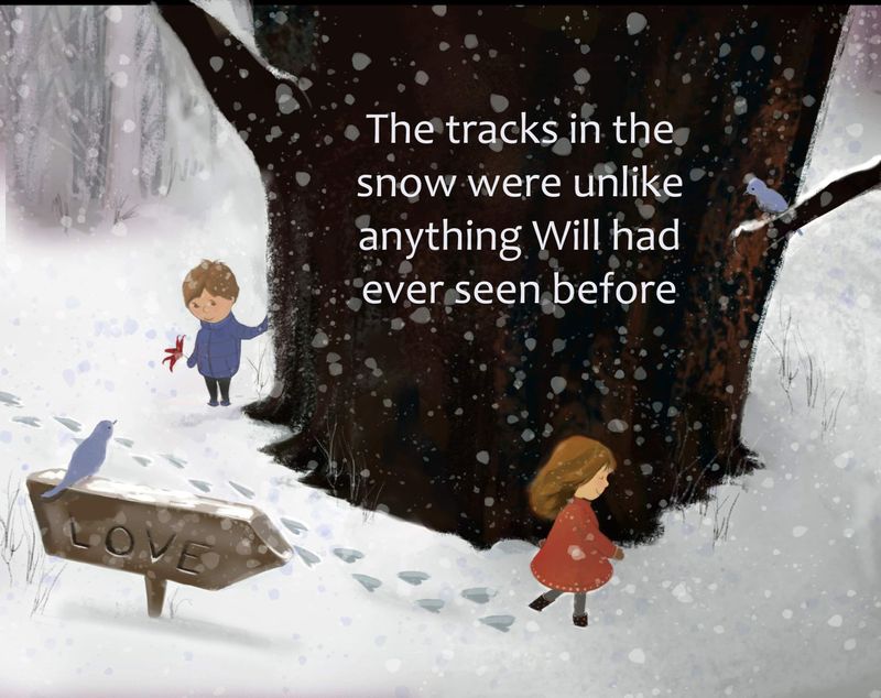
Very nice! I'm just not sure if you need the little white icesicles hanging down from the branches. I think they might be a little distracting.
-
@deborah-Haagenson I was wondering that too. Gonna toy with removing them. Thanks
️ -
@Coley this is super lovely!! I prefer the second image, I don’t think you need the branches at the top.
 ️
️ -
@Rachel-Horne thanks so much
I'm playing around with keeping some of them or removing them etc etc lol. I appreciate the feedback thank you ! -
Some changes. Things are warmed up and flowers mostly removed and little twiggy alder sort of things poking through snow added. Background trees lowered. Realizing I need soft shadow under the characters. Going back and forth on branches or no branches! I like the depth they add but they're maybe a bit too angular? If anyone has thoughts on that let me know. And text or no text?
The one with branches doesn't have some of the changes yet eg warming up of colors etc
-
I like it but i dont know how i feel about a big sign with an arrow that says “love” i think it would be more impactful as an illustration if it was telling me the same message without a sign.