FEBRUARY CONTEST: NIGHTFALL
-
@marshallx this is really nice. I love the coloring in it.
-
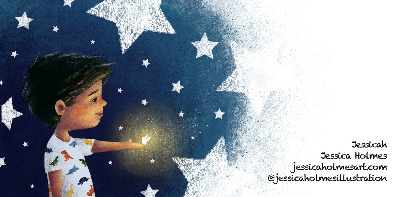
First time posting here! This is an illustration I created for my portfolio. It will be presented with some made up text on the right hand side where I put my info.
-
I'm not sure if this is allowed, so just disregard it if it isn't, but I wanted to do some speculative book covers for my portfolio so tried to combine it with this month's theme and did a book cover for Peter Pan
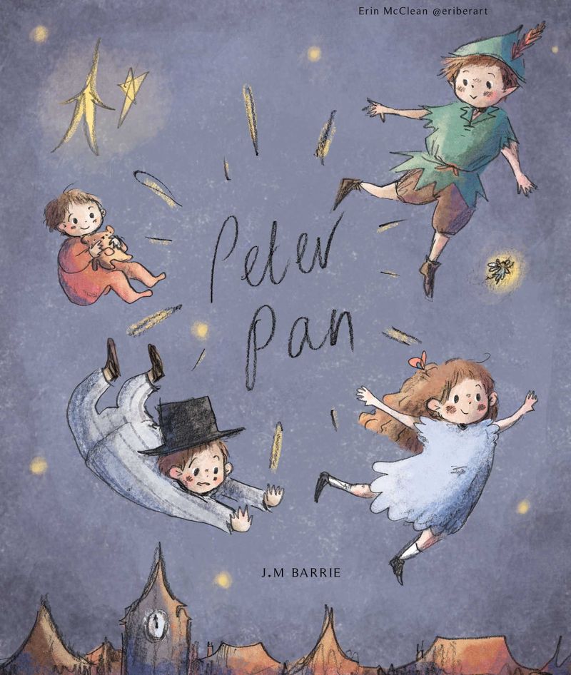
Instagram and Twitter: @eriberart
Website: www.erinmcclean.com -
Maybe I'm not posting in the optimum format/dimensions, but when I post images they tend to be low quality unless you click on them to open them in a new web page
 Not sure why this is, as no one elses images look pixelated to me!
Instagram and Twitter: @eriberart
Website: www.erinmcclean.com -
@eriberart On both my laptop and phone screen your image looks fine. Not pixelated, and when I click and open it I can't tell the difference.
I know what you mean about it doing that sometimes though... no idea why.Nicola Schofield
Twitter: twitter.com/NSchofieldArt
Instagram: instagram.com/NicolaSchofieldArt/ -
Nightfall or Knight-fall. Inspired by Lee White's hot yoga session.

-
@neschof Strange! The quality of my own image looks so poor on my laptop... I guess that is okay if it looks fine for everyone else though haha!
-
I work with the resolution at 300 dpi in PS. Then when I'm ready to submit, or submit for feedback, I reduce the resolution to 72 dpi, change the dimensions to about 1200×900 and save as a .jpg, with quality of 11. This keeps the size down to the 500 kb and the image looks pretty clear when submitted. Keep a 300 dpi copy though to make changes. I was given this info by another member a few months ago.
-
Love the style of your boy and the texture!
Instagram: www.instagram.com/heatherboyd.illustration/
Website: https://heatherboydillustration.ca
Shop: https://www.inprnt.com/search/products?q=HeatherBoydIllustration
Ko-Fi: https://ko-fi.com/heatherboydillustrationBe blessed,
-
@Heather-Boyd Thank you!
-
@RitaGoldner thank you!
-
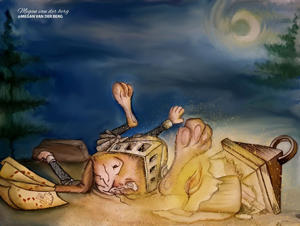
@Coley I love that! The render on the mouse is so fluffy and the texture and lighting everywhere are beautiful!
-
@Nathalie-Kranich thank you! I struggled with it maybe being too dark and colors too saturated, still not sure on it ha ha. But I do like the little mouse
")
-
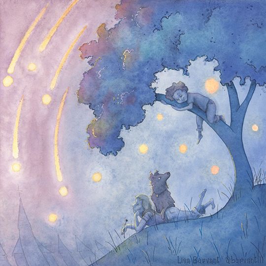
Lisa Burvant
www.lisaburvant.com
Instagram & Twitter & SVS: @burvantill -
@burvantill This has a lovely feeling to it.
-
@burvantill ooh how I adore watercolor! My stuff tends to be more digital these days but I like how you can mix mediums!
-
@eriberart It doesn’t seem pixelated to me! Love your Peter Pan cover!
-
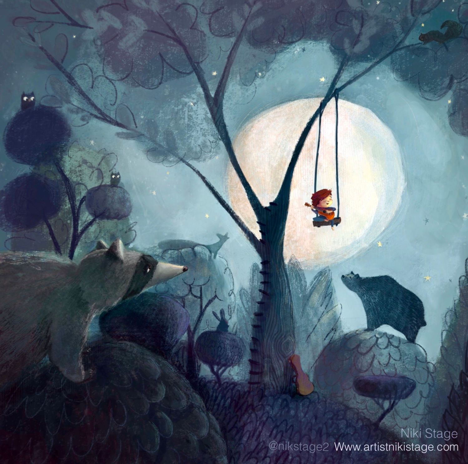
Hello! It’s been too long since I’ve entered a contest here:) A moonlight Serenade at Nightfall - this one inspired by my son who loves to play guitar. Wouldn’t it be lovely to have such a captivating audience
 134879C1-FA73-4DF0-B21A-EA63F140D1A0.jpeg
Niki Stage
www.artistnikistage.com
Instagram @nikstage2
Twitter @stage_niki -
@nikstage, love it! You might want to resubmit your piece since it’s showing up as a link rather than on your post. Maybe it’s just my phone??
-
@Jeremy-Ross Can’t figure out how to upload it? Please help!
Niki Stage
www.artistnikistage.com
Instagram @nikstage2
Twitter @stage_niki