WIP take two (critique is appreciated)
-
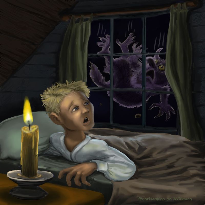
So after some much needed love and feedback from you all, I have started reworking this piece. I don't think skillwise speaking I can do everything people have suggested but I am giving it another go. I decided to keep trying the painterly look but switched to a brush of my own making. I didn't change the monster at all because after I changed the lighting behind him I really liked him. I want to give the boy more of the texture of the monster but I haven't quite figured that out yet. I upped the brightness over all. I haven't done anything to the candle yet.
Is this an improvement? I don't have a whole lot of time this month to devote to this, but since I am home sick and the fever broke, I thought I would work on this today.
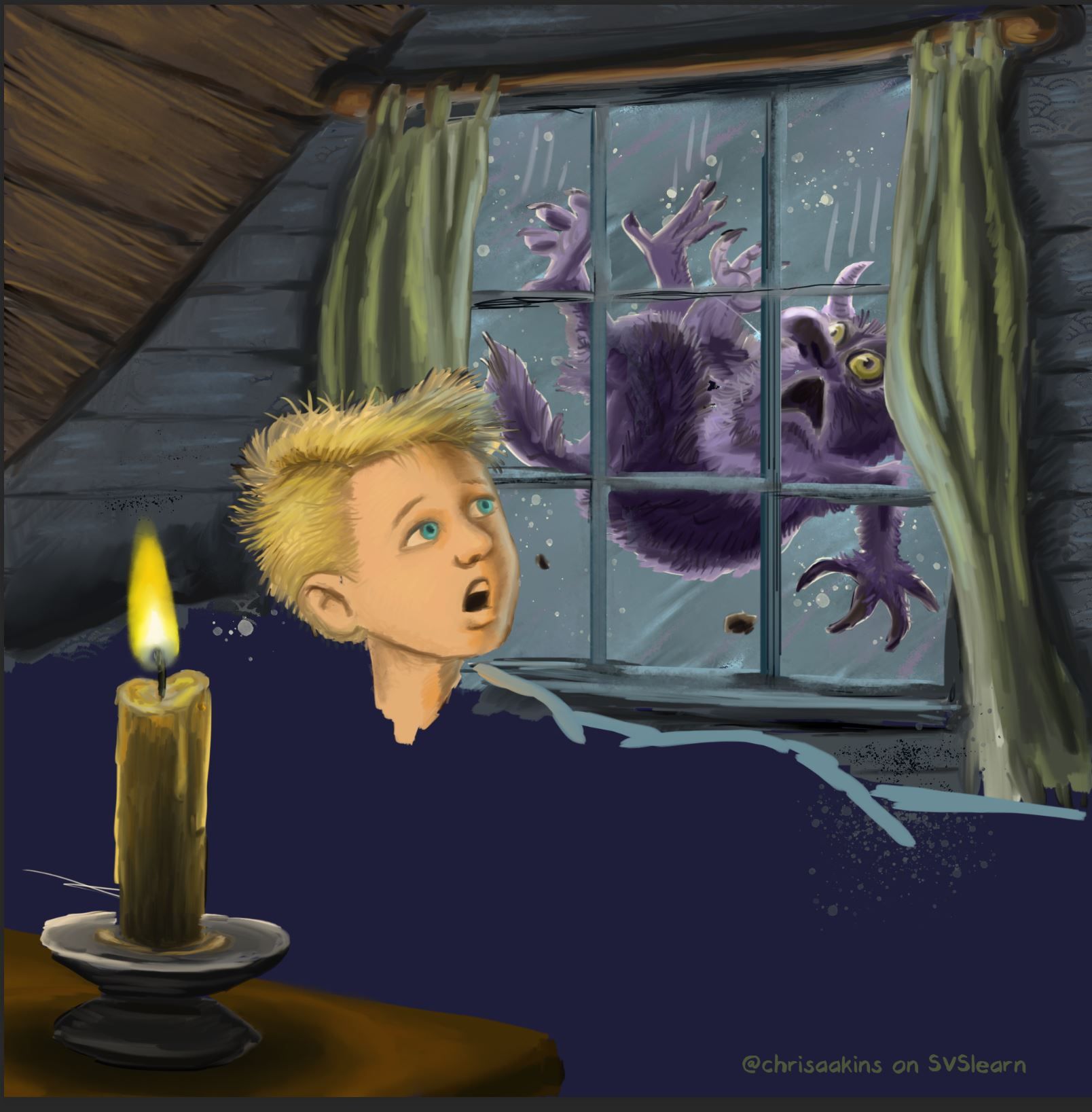
Does the face shape and lighting look better on the boy and background?
The backstory of the monster is that they dance on your rooftops during rainy nights. Sometimes they accidentally fall off and we hear the thunder of their crashing. -
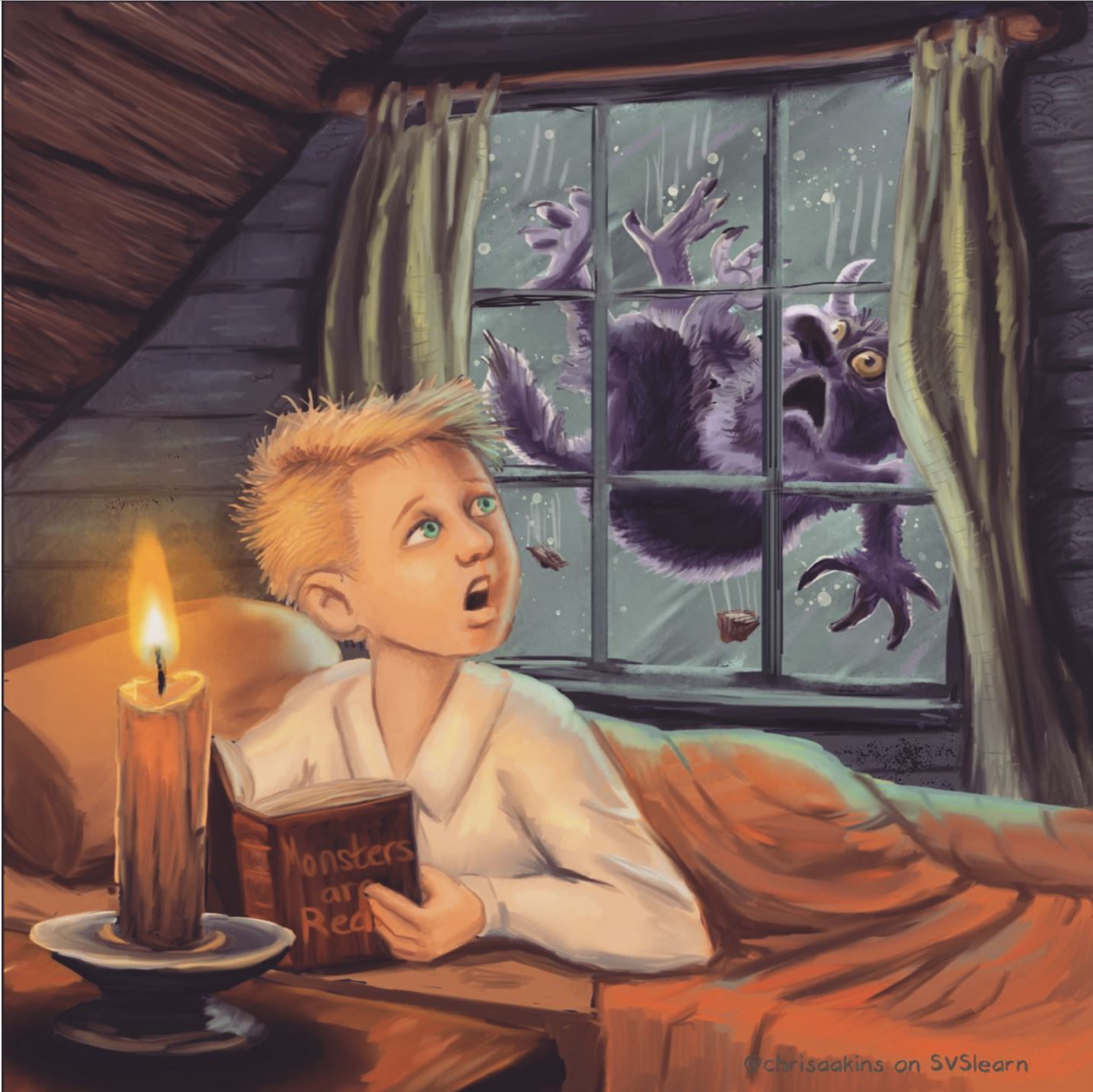
More progress...
I think I will have him holding a book titled Monsters Are Real for a little easter egg. -
@chrisaakins great improvement! I like it!
Portfolio: nyrrylcadiz.com
Instagram: https://www.instagram.com/nyrryl_cadiz/
YouTube: https://www.youtube.com/channel/UCbJCF1Im8ZO7hpGWTKOJMuA -
@Nyrryl-Cadiz Thanks! I couldn't have figured it out without your help! Your draw over helped me see immediately what was wrong. I stole your shirt idea, too. Hope you don't mind.
-
@chrisaakins This is looking great Chris. For feedback i feel that when i block the candle with my hand that the composition improves. It is one of the brightest brights and a point of very high contrast. It also has high detail and seems super important somehow. Maybe crop in a bit and use a simple lamp that is mostly of camera? Or remove the light source altogether and light the boy from outside? Other feedback would be that if you do keep the candle that the ellipsis are a bit off on the candle holder - especially the very bottom ellipse. The boards to the left of the boy that form the slope of the roof are at odds with the perspective of the room - i feel like the lines should be closer to horizontal to look right - i feel like the mullion close to the boys eye is our eye level - the tilt of the ceiling boards puts the vanishing point on the page and creates an extreme perspective in the piece that is not evident elsewhere - I would love to see the boy in a more natural pose - maybe sleeping on his back with covers pulled up? I would also love to see one of your mice here instead of the boy! i think that would really work well and be very children's bookish - maybe with a night cap on and once again the covers pulled up - i think putting your awesome mice into situations a la Richard Scarry would be great to see.........
This is why i usually delete my feedback before i post it - i feel like i come off as a jerk in a way and that my feedback is most likely annoying - it is a risk to give feedback too because in wanting to help we can really demoralize someone - i usually chicken out these days because i feel like i don't really know that many people here anymore and have not built up trust with folks....anyways .... those are my thoughts and i did not delete them but feel free to ignore them") This will be great no matter what you do Chris. Really looking forward to seeing the finish on this.
This will be great no matter what you do Chris. Really looking forward to seeing the finish on this. -
@chrisaakins looking good, I really like the monster, I don't think I could see him much before. Two suggestions would be:
The monster is quite detailed - you can see his claws and fur and eyes and stuff clearly (which I like) but then the curtains, blanket, etc. are closer to the viewer but less distinct / soft / kinda blurry looking. Maybe add more detail / texture / hard edges to the room objects?
Someone in the other thread mentioned that the boy has a modern hair style and it doesn't really fit with the candle and old fashioned feel of the rest of room and I can't unsee that now!
I'm glad you're starting to feel a bit better - flu is horrible, I hope you're up and about soon.
-
@Kevin-Longueil haha! No worries. I appreciate the feedback, especially from you because I am a fan of your work. I think the candle and his position will make sense when I put the book he is reading into play. Thanks for the advice on the candle holder. I plan on fixing the ellipse. Is there a tool in photoshop that does ellipses?
About the boards, I honestly didn't draw out the perspective. I will take a second look at it. Thanks!
@neschof Thanks for your input! I plan on going back and putting in more work into the curtains if I have time. As for the modern haircut, I looked it up and this one is pretty classic. I think I will keep it.
-
@chrisaakins happy to be corrected
I'm giggling to myself here thinking about how my mind simultaneously thought "that purple roof-dancing monster is looking great" and "maybe the boy's hair style is not 100% accurate for the time period"
 illustration is crazy.
Nicola Schofield
Twitter: twitter.com/NSchofieldArt
Instagram: instagram.com/NicolaSchofieldArt/ -
@neschof I know right? We will blame it on Will. Lee, Jake and the gang.
Also, the scraps of roof coming off now look like turds. Which may be appropriate since he is falling.
-
Definitely looking better! The lighting on the face is so much better and the monster reads better too. I love that monster. He's pretty fun. I hope he doesn't hurt himself lol. Serves him right stomping around on human roofs tho

-
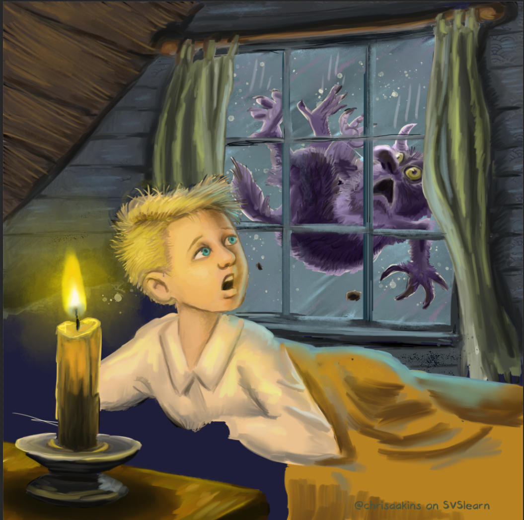
I think I am mostly done. I did a lot in six hours. My hands are cramping from holding the pen.
I like the general composition now and I think I am fine with the values and colors now, too. I am not totally happy with the blanket and the curtains but I have to stop for a bit. Does it look finished and polished? I might want to add a texture layer over the whole thing as soon as I figure out how.
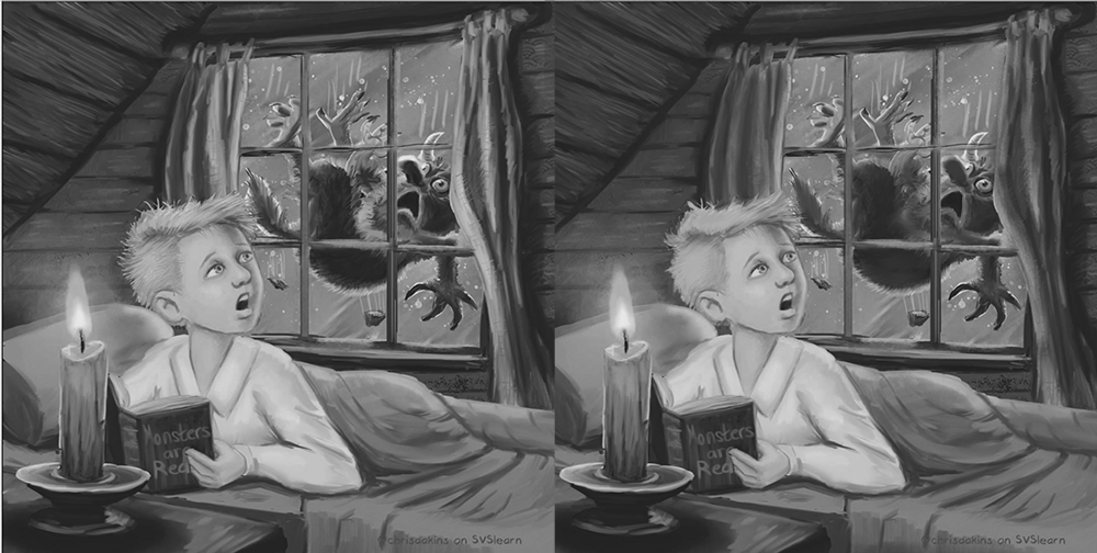
Before:
-
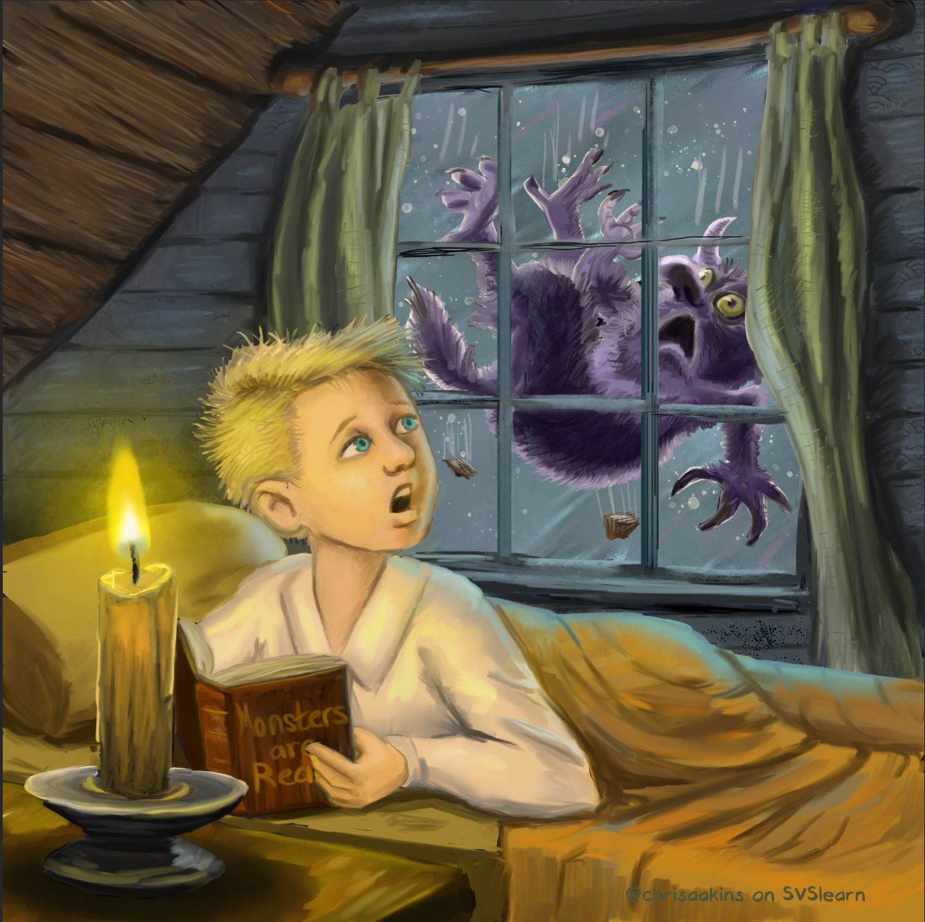
SO I was going to upload it to instagram and I thought I would play with the filters. What do you think of the reddish old-timey look?
-
@chrisaakins said in WIP take two (critique is appreciated):
Also, the scraps of roof coming off now look like turds. Which may be appropriate since he is falling.
Pah ha! They didn't, until you said that!
You work fast! The new version is looking good. Is the monster identical in both, you just lightened the background? It's amazing how the details inside the shape of the monster are more legible on the new version.
Nicola Schofield
Twitter: twitter.com/NSchofieldArt
Instagram: instagram.com/NicolaSchofieldArt/ -
@neschof Pretty much. I added a few hairs here and there.
-
Wow, this piece has come on heaps and bounds already! I really like all the changes you’ve made. I am leaning more towards the softer, warmer lighting of the version with the filter. The yellows lighting of the other version feels a bit harsh, where as I associate candle light with a warm comforting glow.
Instagram and Twitter: @eriberart
Website: www.erinmcclean.com -
@eriberart Me too! I was really pleasantly surprised at how much it improved it. I feel like I cheated a little using an IG filter at the end, but I'll take it any way I can get it.
-
@chrisaakins don’t feel like you’re cheating! I don’t think it’s that different from using layer modes on photoshop to alter the colours in a piece and I do that all the time
 I also save colour schemes I like and use the eye dropper tool to ‘steal’ colours haha
 -
Wow! That is a dramatic improvement in one day! I like the rose-colored light as well. I hope it was a positive experience in the end.
@Kevin-Longueil Don’t feel too bad. Some people like tough critiques. That’s why we ask! Not to get off topic, but since we’re on an international forum, I’m reading a book that discusses international cultural differences, including feedback style. Apparently Americans are among the most hesitant people in the world in giving direct negative feedback!
-
It's much improved! In my opinion you could group the values of the curtains and monster a bit more to help with quick readability. Also, my personal preference would be to simplify the hair so it isn't so stringy and break up the silhouette of the hair strands so it's more varied to convey "bedhead" better.
About the filter- that's one of the great things about digital. I change my colors all the time in photoshop using similar means. If you relate it to traditional technique, it's almost like using glazes at the end to unify the colors.
Website: www.tessawrathall.com
Instagram: www.instagram.com/tessawrathall_art/
-
@TessaW I like the value choice you showed me. I will try to make that happen. I kinda like the hair but maybe I can make it more like the monster's.
@LauraA It was a great experience. I learned a ton of techniques from it. It may not be in the sweet sixteen when it is all said and done , but I think now it is a successful piece.