Society of Visual Storytelling

    SVSLearn Forums

    • Register
    • Login
    • Search
    • Recent
    • Tags
    • Popular
    • Users
    • Groups
    • Search

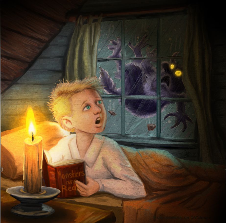
    Texture or no?

    Artwork
    10
    11
    392
    Loading More Posts
    • Oldest to Newest
    • Newest to Oldest
    • Most Votes
    Reply
    • Reply as topic
    Log in to reply
    This topic has been deleted. Only users with topic management privileges can see it.
    • Kali
      Kali last edited by

      I’m not too big of a fan of the texture. I say that if it isn’t needed to convey the story, then you’re probably good without it!

      In some of my school work I had used a paper texture over a lot of my work only to regret it now, since the work more often than not was stronger without it.

      1 Reply Last reply Reply Quote 0
      • Kevin Longueil
        Kevin Longueil SVS OG @chrisaakins last edited by

        @chrisaakins Maybe on the blanket and curtains? - and toned down quite a bit for the walls and ceiling but i think keeping it off everything else would be good. But if it is a choice between the two versions i would say no texture.

        Portfolio: kevinlongueil.com
        https://www.instagram.com/kevinlongueil/

        1 Reply Last reply Reply Quote 0
        • NessIllustration
          NessIllustration Pro @chrisaakins last edited by

          @chrisaakins I like the textured version! I think it looks less "photoshoppy" 🙂

          I have to say, I am SHOOK by how thoroughly you've improved this illustration in just a short time. It is night and day! However I still think you're missing a big opportunity with the lighting. Candle light at night is an intense lighting situation: bright warm light very focused in one area, the rest in darkness and big shadows. In your picture, everything is lit very uniformly. I've added a few filters quickly in Photoshop to show you what I mean and how you could make this lighting more accurate and also more visually interesting:
          Untitled-1.jpg

          vanessastoilova.com
          instagram.com/vanessa.stoilova/

          Check out my Youtube channel for tips on how to start your career in illustration! www.youtube.com/c/ArtBusinesswithNess

          1 Reply Last reply Reply Quote 3
          • ArtofAleksey
            ArtofAleksey last edited by

            Hmm i cant really tell the difference very much. It took me a while.

            instagram and twitter: @artofaleksey
            alekseyillustration.com

            1 Reply Last reply Reply Quote 0
            • NicolaSchofield
              NicolaSchofield last edited by

              I’m a sucker for texture - love it. But maybe just in the background here, or at least less on the boy’s face.

              Nicola Schofield

              Twitter: twitter.com/NSchofieldArt
              Instagram: instagram.com/NicolaSchofieldArt/

              1 Reply Last reply Reply Quote 0
              • A.G.Meade
                A.G.Meade last edited by

                I agree with @Kevin-Longueil - I think some texture on the walls and bed would look good, but less (or just not at all) on the rest of the piece. Looking great!

                Instagram: https://www.instagram.com/a.g.meade/
                ArtStation: https://www.artstation.com/ag_meade
                DeviantArt: https://www.deviantart.com/ag-meade

                1 Reply Last reply Reply Quote 0
                • braden H
                  braden H @chrisaakins last edited by

                  @chrisaakins I agree with @NessIllustration . This is MUCH improved.

                  I always love texture, especially if it's to make it look like a painted surface (selectively applying texture to different object is tougher, but still worth it)

                  If you don't mind a suggestion, I would try throwing a mask layer on your texture (I'm assuming you're using an overlay or multiply) and then throwing around some greys in the mask layer to knock back the texture (more texture in dark or unimportant areas, less texture around focal points). If you use a nice blotty brush (maybe something with a very random stamp?) it'll blend it all in. That way you can keep the nice bright candle and clean-faced kid (texture overlay can muddy things up)

                  burvantill 1 Reply Last reply Reply Quote 1
                  • chrisaakins
                    chrisaakins last edited by

                    Haha! A divided house. I think I am leaving it the way it is at this point. I am ready to move on to something else. Now I just need a new assignment. But I can't tell you how grateful I am for all the help and support. You guys and gals are just the best!
                    @Kali @Kevin-Longueil @NessIllustration @Aleksey @neschof @A-G-Meade @Braden-Hallett

                    Chris Akins
                    www.chrisakinsart.com
                    www.instagram.com/chrisakinsart/

                    1 Reply Last reply Reply Quote 4
                    • KathrynAdebayo
                      KathrynAdebayo last edited by

                      This turned out so well!!

                      1 Reply Last reply Reply Quote 0
                      • burvantill
                        burvantill Moderator @braden H last edited by

                        @Braden-Hallett @chrisaakins I agree. Less texture in the important places like the face and light.

                        Lisa Burvant
                        www.lisaburvant.com
                        Instagram & Twitter & SVS: @burvantill

                        1 Reply Last reply Reply Quote 0
                        • First post
                          Last post