Critique Requested
-
Hello everyone! I hope you guys are all well.
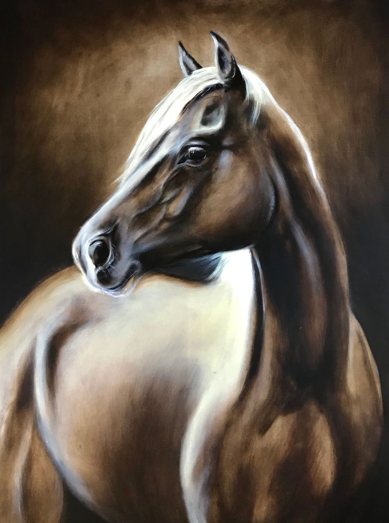
I would love some critique on my latest oil painting
") I am almost finished, but I feel like there is still something missing. The body of the horse is quite a large blank space and I am not sure how to make it more interesting and put more focus on the face. I was going for a more monochromatic colour palette.
I am almost finished, but I feel like there is still something missing. The body of the horse is quite a large blank space and I am not sure how to make it more interesting and put more focus on the face. I was going for a more monochromatic colour palette.Thank you everyone, and stay safe

-
Hi @annagv_artist, so I hope you don’t mind but I did a few mods to remove attention from the body since you’re not happy with that in your piece.
Portrait only
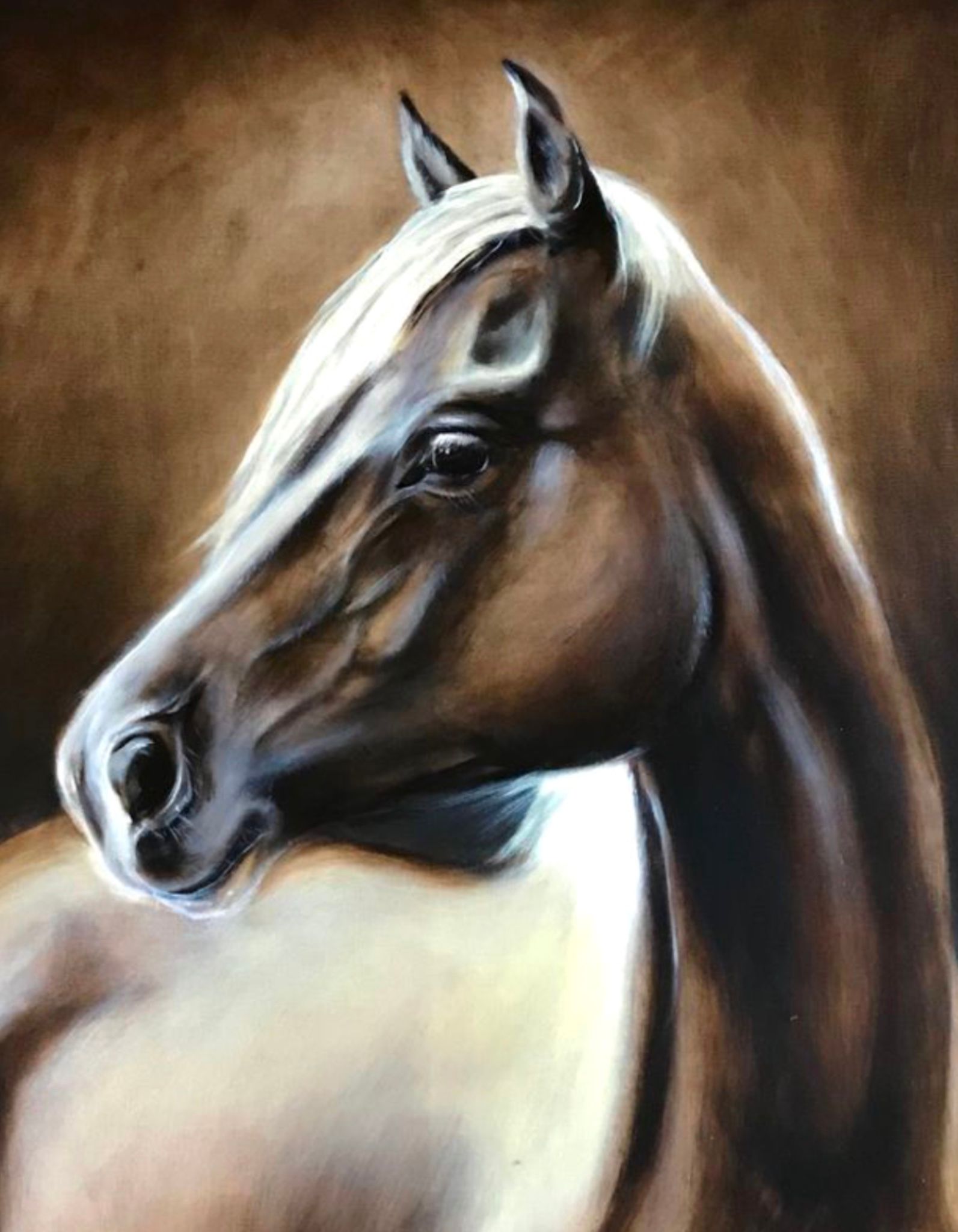
Gray background
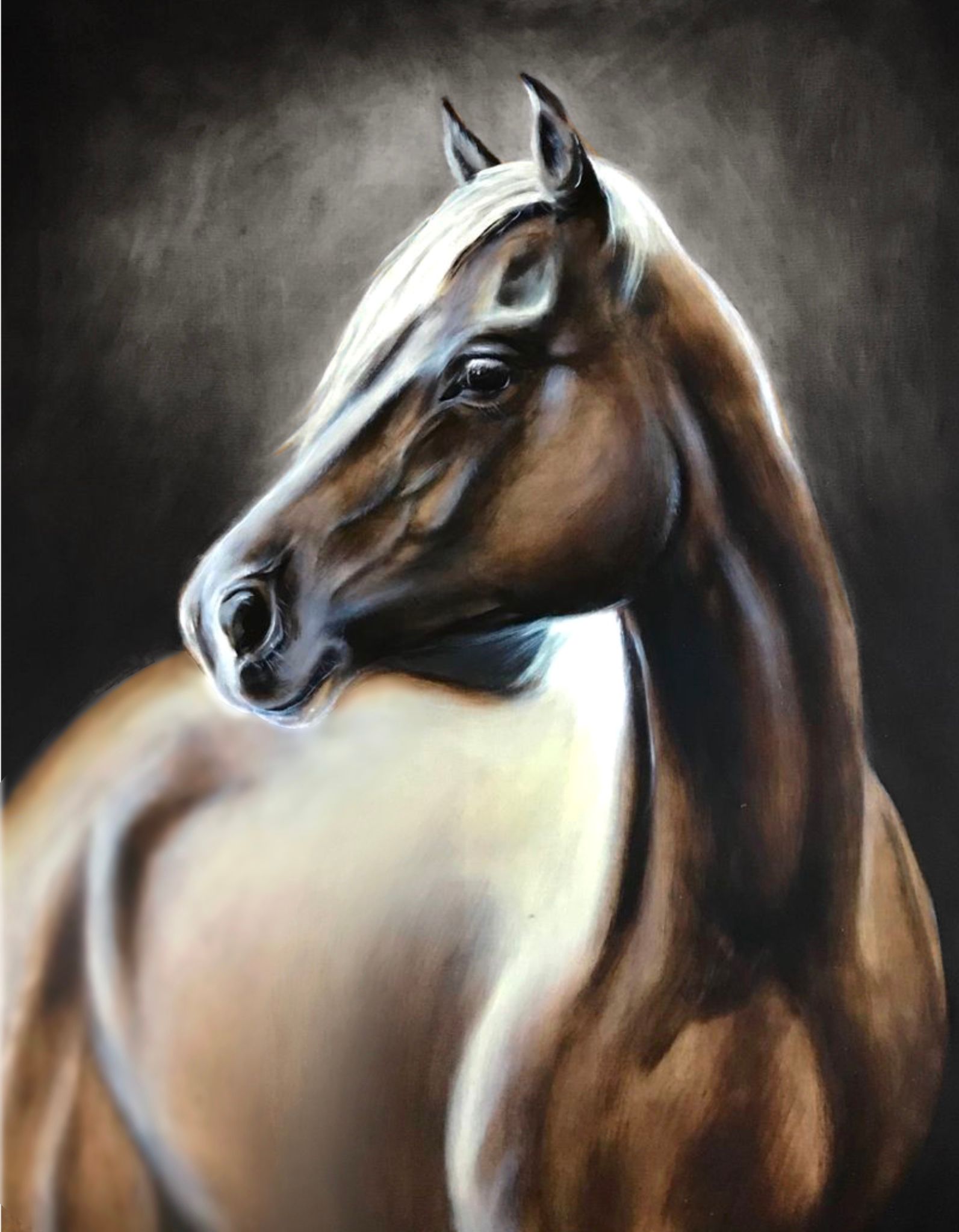
Blurred body
-
Hi - I think maybe you should have just one light source in a piece like this. That might help. Then maybe you didn't have a reference for this part of the horse. If it were me, I might get a 3D horse as a reference, shine a light on it where the light source is coming from. The head of the horse is beautiful!
-
@Jeremy-Ross I think the top one of your's is the best. The head is bigger. Maybe a smaller head and smaller body would work too.
-
beautiful painting!
-
@Jeremy-Ross No problem, thank you so much for your input I really appreciate it
-
@deborah-Haagenson That's a good idea with the 3D horse reference and only one light source. I will definitely give it a try. Thanks!
-
@KathrynAdebayo Thank-you!