GraffitiBot WIP. Open to critiques
-
Okay, I am REALLY having fun with this and learning a ton in the process. Haha! You ever get really excited about something you are doing and don't really have anyone else who is as excited about it as you. Same.
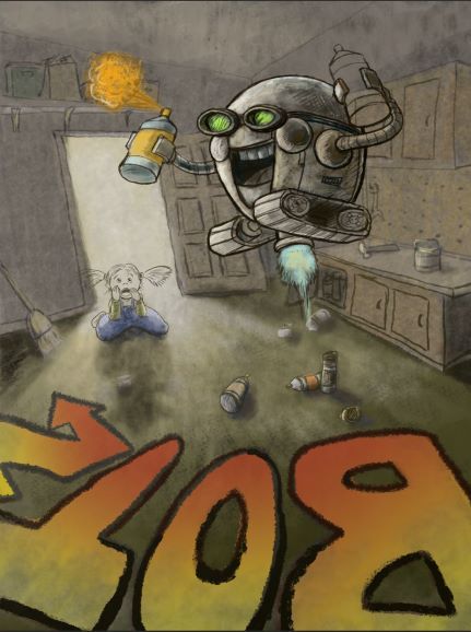
Does the overall composition work? I am not through with the girl or the bot but I needed to take a break and maybe get some feedback. Been at this for like five hours.
Reminds me of 80's illustration which is fine by me. #childoftheeighties
-
This is so fun! I love the girl’s expression and position in the background.
-
Hi @chrisaakins, looking awesome! Love the camera angle!
-
@sarahlash @Jeremy-Ross Thanks!
@gavpartridge I think I fixed a little bit of the perspective. The shelf above the door's lines were way off. I also shaded in the walls a little more to define the ceiling a bit. Hopefully, it made it a little more believable. I'm not going for perfection just does it look believable.

New Questions:
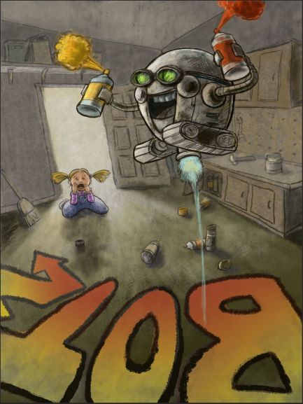
Does it read that the robot is the graffiti artist? Also, is the red in his hand too much? I tried toning it down but it still really pops. Should I change it to black?
Also, I am thinking this is the style I would like to do for a graphic novel. Do you think it would work for that?
Last. What the heck color should her shoes be?
-
@gavpartridge oh! I see now. It was bothering me too.
-
@chrisaakins I definitely would keep the red. The paint is kind of the point, right? If you change it to black I think it would get lost.
-
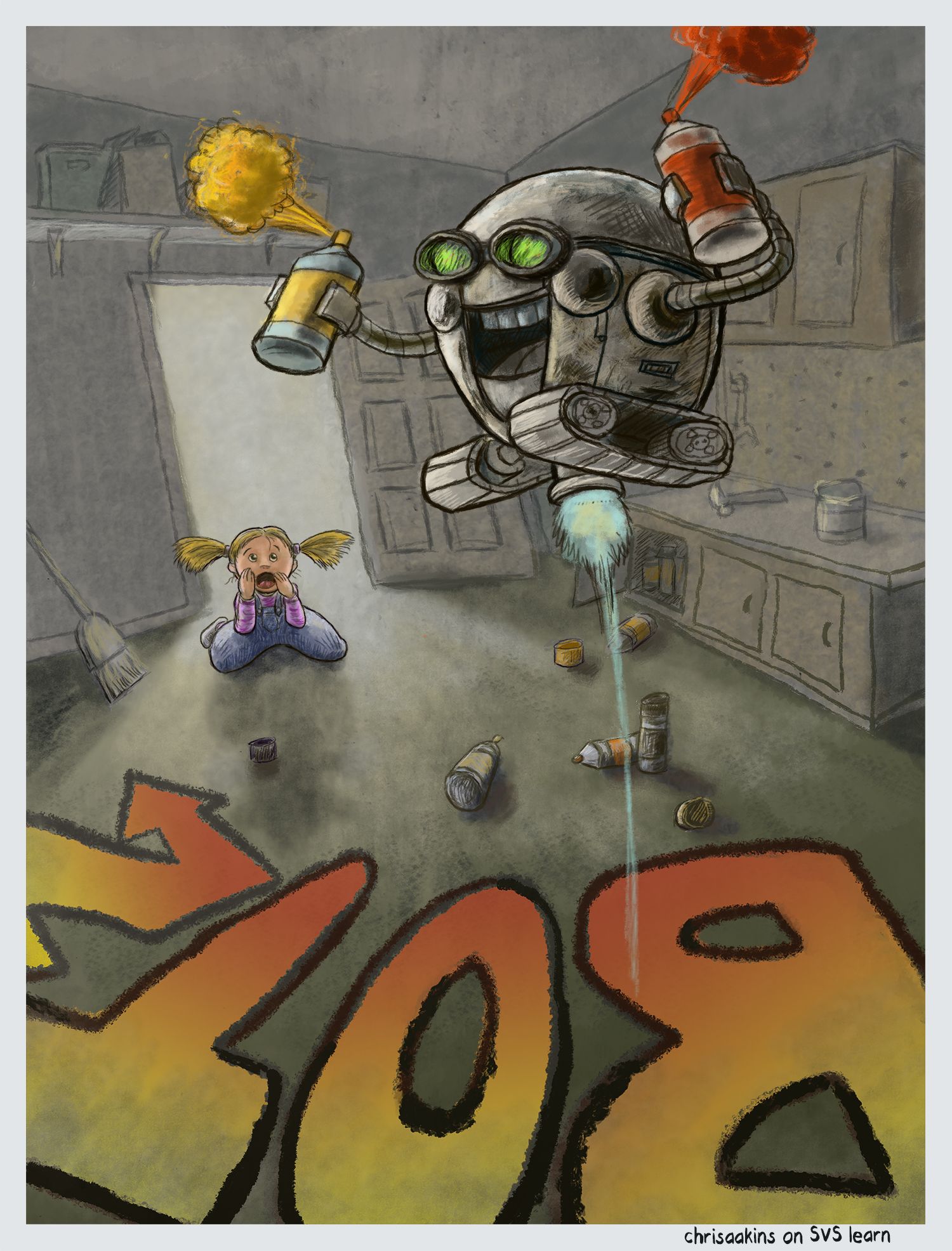
I think I am done-ish unless anyone sees something I ought to change. I think this is one of the best pieces I have done so far. Thanks for all the help!
-
@chrisaakins it looks very good but don’t post it yet! You still have DAYS to keep working on it. If you feel it’s fine then just sit on it and look again in a few days.
I think that your bot could use a little more separation from the background. Maybe make the background cooler since the bot is a warm grey. The cabinets especially.
Lisa Burvant
www.lisaburvant.com
Instagram & Twitter & SVS: @burvantill -
This post is deleted! -
@burvantill you are probably right, but my daughter is getting married this month and my finals are due at the end of April so this is the time I have.
-
@burvantill Alright, I took it down. I am always too rash. How can I fix the contrast? Also @Neha-Rawat I would be curious of your input.
-
Here it is with a cooler background.
-
@chrisaakins Okay don't be mad... but I like the other one better
 . I did a quick draw over to show what I meant. I cooled off the background to the right of the bot only, I warmed up the shadow side of the bot and I lightened the background just around the bot. All the changes are just slight but the bot pops just a bit more.
Happy Easter!
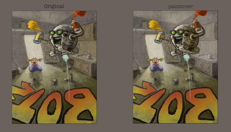
PS. i did it quick so the light area above his head may be too light. -
@chrisaakins Haha yeah I saw that you had already posted it and my comments were very nit-picky to I didn't feel good about leaving it here

I really like the pop of the yellow and red against the neutral background. I think burvantill's paint over is making it pop more with those subtle changes.
There are multiple elements placed almost touching to the bot which making the area around the bot too cluttered and the spaces beyond it too empty.
- The hammer on the counter top is almost touching the bot. Maybe shift it a little further. Also the perspective of the hammer head is a little off I think.
- The open cupboard door just below the bot
- The tools hanging on the wall just to it's right are making it look a little cluttered
- The blue glowly line cutting across the paint cans.
Maybe have them spaced out a little more but still maintaining the randomness of it all.