Society of Visual Storytelling

    SVSLearn Forums

    • Register
    • Login
    • Search
    • Recent
    • Tags
    • Popular
    • Users
    • Groups
    • Search

    Vote - Color Comps for Canyon Illustrations

    Artwork
    5
    6
    298
    Loading More Posts
    • Oldest to Newest
    • Newest to Oldest
    • Most Votes
    Reply
    • Reply as topic
    Log in to reply
    This topic has been deleted. Only users with topic management privileges can see it.
    • baileyvidler
      baileyvidler last edited by

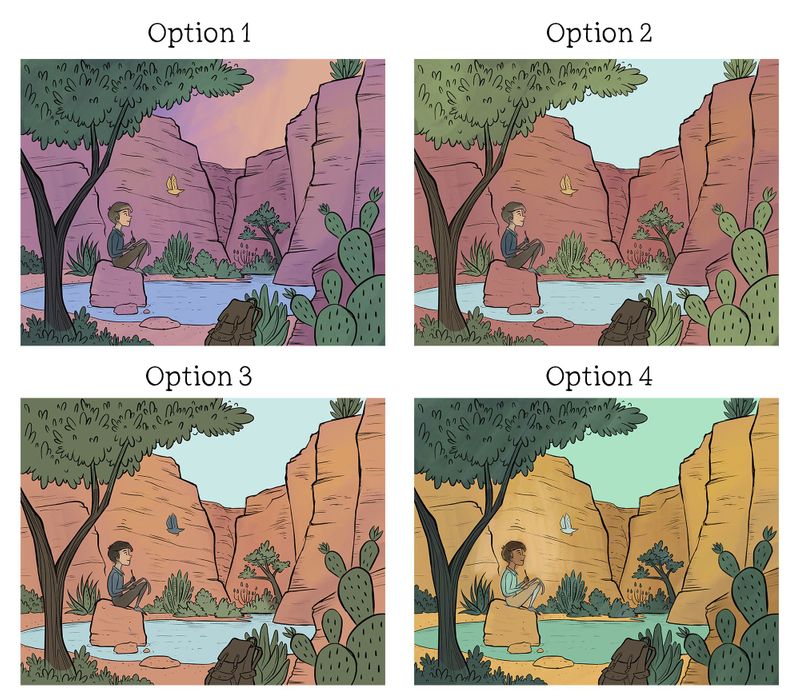
      Hey guys! I made a few color comps and now I'm stumped. Do you have a preference? Any other critiques would be greatly appreciated as well!

      BV00061 - Boy Drawing Bird - Color Comps.jpg

      Bailey Vidler
      Portfolio: baileyvidler.com

      burvantill 1 Reply Last reply Reply Quote 1
      • burvantill
        burvantill Moderator @baileyvidler last edited by

        @baileymvidler I like option 1. Maybe lighten the sky a little for the great silhouette and maybe add a little contrast down in the canyon a bit. I love the purple orange scheme. 👍

        Lisa Burvant
        www.lisaburvant.com
        Instagram & Twitter & SVS: @burvantill

        1 Reply Last reply Reply Quote 0
        • Aaron_T
          Aaron_T last edited by

          I kind of want to know where/when the scene is...I see you're in the southwest too, so you know that the cliff walls tell a very different story depending on where you are and the time of day!

          All that aside, I'm torn between the sunset colors of 1 and the peaceful palette of 3.

          https://www.instagram.com/aaron_t/

          1 Reply Last reply Reply Quote 0
          • Mairin Kareli
            Mairin Kareli last edited by

            I also like 1 and 3 - 1 is more an evening feel and 3 more daytime. I like the contrast between the sky and cliff in 3.

            https://www.instagram.com/mairinkareli/

            1 Reply Last reply Reply Quote 0
            • bradyblack
              bradyblack last edited by

              I am also 1 and 3. Like the purples in 1. Maybe add more purple shadows for a combo.

              http://www.instagram.com/seriouscreatures
              http://www.instagram.com/bradytheblack

              1 Reply Last reply Reply Quote 0
              • baileyvidler
                baileyvidler last edited by

                Looks like general consensus is 1 or 3. I'm personally feeling more daytime than evening, so guess we're going 3!

                @Aaron_T Thanks for the reminder about the shadows on the canyon walls. Completely slipped my brain!

                @burvantill Yeah, the silhouette feels really good. I will make sure it's very clear.

                @bradyblack That's a good idea! I will add some purple deeper into the canyon.

                @Mairin-Kareli Thanks for your feedback! I think the contrast is why 3 is a winner.

                Bailey Vidler
                Portfolio: baileyvidler.com

                1 Reply Last reply Reply Quote 0
                • First post
                  Last post