July Prompt - house falling on witch - silver shoes
-
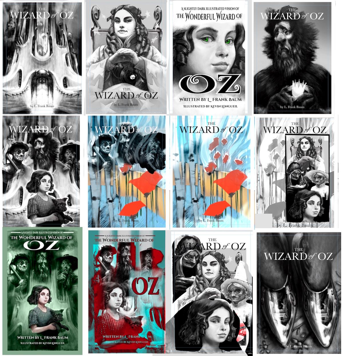
First batch - these are very cut and paste'ish but i thought i would start a threat with my attempts here - i am liking the lion and the silver shoes the best at the moment - any of these feel worth pursuing to anyone? - these are Super rough - just ideas really - i'll keep working at it - any feedback is alway s very helpful!

-
Shoes for my vote
 Definitely the most striking design to me, and the concept of the reflection is great too.
 -
The shoes! They are simple, they stand out with their nice magpie quality, and the reflection device is nice. I love the lion as well, especially for his expression, and he was the first one to stand out until I got to the bottom. But he doesn't convey the primary focus of the story, so I'd save him for a great interior illustration.
The wizard's castle is nice too, especially since you seem to have invented some kind of architecture of your own, and it's certainly appropriate as it's the characters' destination in the story, but I think the shoes are more surprising. I tend away from composite covers, though I know they're a thing in book covers and movie posters. Perhaps it's a prejudice, but single images just have better focus.
-
I like the shoes, but I might put the heals closer together, since there magic is about clicking the heels together. I also like the blue cover without characters. I think I like that one the best.
-
@Kevin-Longueil Wow, pretty amazing thumbnails. I have to agree that the shiny red shoes is the one that reads the best for me too. I also love the bottom lefthand image, the characters behind Dorothy sort of mimic the Emerald CIty, I could really see this as a book cover or as a poster.
-
@Kevin-Longueil Okay. Jumping on the bandwagon here but the shoes look awesome and are such a break from the norm as to be very eye catching.
-
@Kevin-Longueil I personally like bottom row first one. If i was in a book store and all of these were on display that is the first one to pop out to me.
-
Shoes for me @Kevin-Longueil! But all are interesting.
-
@Kevin-Longueil Another vote for the shoes here! They feel mysterious and a bit sinister.
-
Dorothy and toto with the three buddies behind (the green one and the one above it) would be a good choice for general audiences, including young readers. I feel like the shoe one is very stunning and would probably target adult audiences more- which might be a good strategy. It hints at and edgier story and a more philosophical approach to reading the book.
-
@Kevin-Longueil super rough - by that I hope you mean design elements, cut and paste title etc and not the actual super duper drawn parts lols. Slobbering done. Love the shoes, they are phenomenal especially the reflection, though Dorothy's legs look a bit bumpy or rough but anyways. Love the lion as well but a tad odd to have him without the others especially since he isn't the main character which is why the shoes work so well (good tension also between whether it is the witch or Dorothy in those shoes -ref from the movie, may not be in the book, I haven't read the book). And then the overall green one -all characters, a bit safe though but beautifully executed. The blue cut out, wind swirl and red poppies without the characters is very intriguing but doesn't say the Wizard of Oz to me.

-
These are all great. I think the shoes stand out in part because they are so strikingly different than the other covers that mostly feature portraits. You've also nailed the reflective texture gorgeously.
I wonder if your choice of cover will have to do with your target audience... The shoes lean toward a more mature audience, and it seems to me that covers for mature audiences seem to more commonly embrace distinctive framing of objects as much as they do portraits of people. I think more mature audiences don't necessarily want to have their characters visually defined as readily as younger audiences tend to use appearance as an entry point into identifying with the characters. So I wonder if the portraits lean toward a younger middle grade audience. I feel like you might want to put on an Artistic Director/Editor/Publisher hat and decide which demographic you're pointing the book toward.
Even so, it seems most of the portraiture does indeed have a more "fleshed out", "mature" take on the subject matter. So I wonder if, in your heart, you're leaning toward an older demographic anyway, which might lend itself toward ditching the portraits in favor of the shoes, and mashing the portraits into perhaps as an inside cover feature ala Gregory Maguire's soft-cover editions of his "Wicked Years" novels. That would be outside the scope of this particular challenge, but an interesting piece to put in your portfolio, especially if you can get some "mockup" shots of the illustrations in context.
My vote would be for the shoes because I think the implication of "subtext" in the illustration lends itself to the mature reader's inclination to look for metaphor, analogy and symbolism in their reading, and that tendency is echoed by the use of the reflection. You could literally go to town with what is actually reflected in them, and how it's logical/illogical... Do the reflections need to totally match in each shoe? How creepy would that be if they were ever so slightly... different... ?
(On a side note, how 'bout the idea of stereoscopic side-by-side imagery that when viewed through a set of appropriate viewers becomes 3-dimensional...? Or perhaps a selling the book with a pair of green-tinted glasses that reveal hidden details as the readers don them to look at images spread throughout the book or make things 3-D... Oy, I wish I could afford to do these ideas... They're totally outside the scope of the prompt, but fun to imagine!! LOL!)
-
I think the shoes may be the way to go
 Thank you All for your feedback - it is so helpful to me - I really like the shoes myself but was thinking that no-one else would! So i am SUPER surprised to here the opposite - thank you again!!
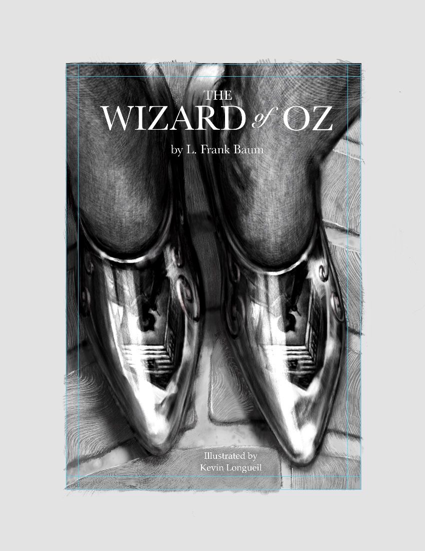
@KathrynAdebayo Thank You for the feedback Kathryn! So glad to hear that the reflection of the house above the Witch's head is noticeable

@LauraA Thank you Laura! I rally appreciate your helpful feedback!
@deborah-Haagenson Thank you for the feedback Deborah! Super helpful.
@Rachel-Horne Thank you for the feedback Rachel! (The thumbnails are just miniature versions of illustrations i've already done and put through a bit of cut and paste...feels a bit like cheating....)
@chrisaakins Thank You for the feedback Chris! very helpful!
@Chip-Valecek Thank You Chip! I appreciate the feedback!
@Jeremy-Ross Thank you Jeremy! very much appreciated!
@carriecopadraws Excellent! mysterious and sinister is good Thank you for the feedback Carrie!
@TessaW Great feedback Tessa! slightly edgy is just what i am going for - Thank you!
@Heather-Boyd Thank you for the kind words and feedback heather! Great feedback - very helpful!
@Coreyartus Wow! Thank you Corey! Super thoughtful feedback. I get what you are saying about portraits.. i have thought about the fact that it is not really a thing....but it is a thing i am drawn to myself ...a hopefully good character design to help the imagination along.....kind of like what a good book cover does in a way. I have about 20 drawings done for the Wizard of Oz in this style - you can see a bunch of them on my portfolio site. Thanks again!
@gavpartridge Thank you for the feedback and kind words Gav! -
Oh my word ..these are all incredible! I always feel bad as I find it really hard to get quiet time to keep up with reading let alone post or commenting on images on the forum, but I'm so glad I did tonight as these are epic! I couldn't decide initially, my top three were the lion (top right) the bottom left (green image - couldn't stop looking at the characters in the background - awesome artwork) and of course the shoes! I think the shoes take the prize for most striking and unusual. Amazing work, well done, you're so talented.
-
@Lorna-H Thank you so much Lorna!! I really appreciate the feedback and kind words!!
...I up-voted your comment but it is showing as zero...which means I, or someone else must have down voted it first, by mistake - if it was me i am sorry and..embarrassed...if it was someone else i'm sure it was just a scrolling mistake...(i've only seen one down vote since the beginning here on the forum) Thank you again!
 -
@Kevin-Longueil - lovely to get your message. Don’t worry at all about the accidental down vote thing
 , as long as I haven’t offended anyone I’m happy! It’s such a supportive and constructive forum. To be honest, I’m not really sure how we’re meant to make use of the up and down vote thing! If anyone knows please tell me. Are we meant to upvote all who reply to us in helpful way or every post we like in general? I’ve tended to reply in person to people but kind of forgot about the upvoting and I’ve mainly been upvoting the entries I liked in the contest, I’m just not sure how to use them in general! I’ll start up voting more now I know more about it! Geez, how clueless am I?
-
Finally got some time to work on this - had the idea of putting bricks under her feet...the witch is not technically on the yellow brick road when the house lands on her...but I think it works much better this way...bending the story a tiny bit is probably ok for the cover? Still a lot of work to do...bricks need texture - spent all day trying things out - had about a full day of crosshatching failures though....but tomorrow is a new day
 Do you think the bricks are working conceptually ?
-
@Kevin-Longueil very cool
-
@Kevin-Longueil WOW. I love the contrasting textures, you really got fabric of the stocking feet and the metal quality of those silver shoes. The reveal (in the reflection!!) that this is the moment before the house falls is brilliant. I love seeing the brick road too, totally working conceptually for me.
-
@Nyrryl-Cadiz @Lucky-Platt Thank you both!! I'm glad the the bricks are working
