June Contest: Post Crit Arena Updates.
-
Hey Gang,
After todays top 16 I wanted to try out some the suggested edits I received. I'm digging the piece a lot more. Before there was something off a little, but I couldn't quite place it. I think it makes more sense too from a story perspective that the lantern would be close by the monkey.
Wanted to share the update and see what people thought
")
SVS Submission.
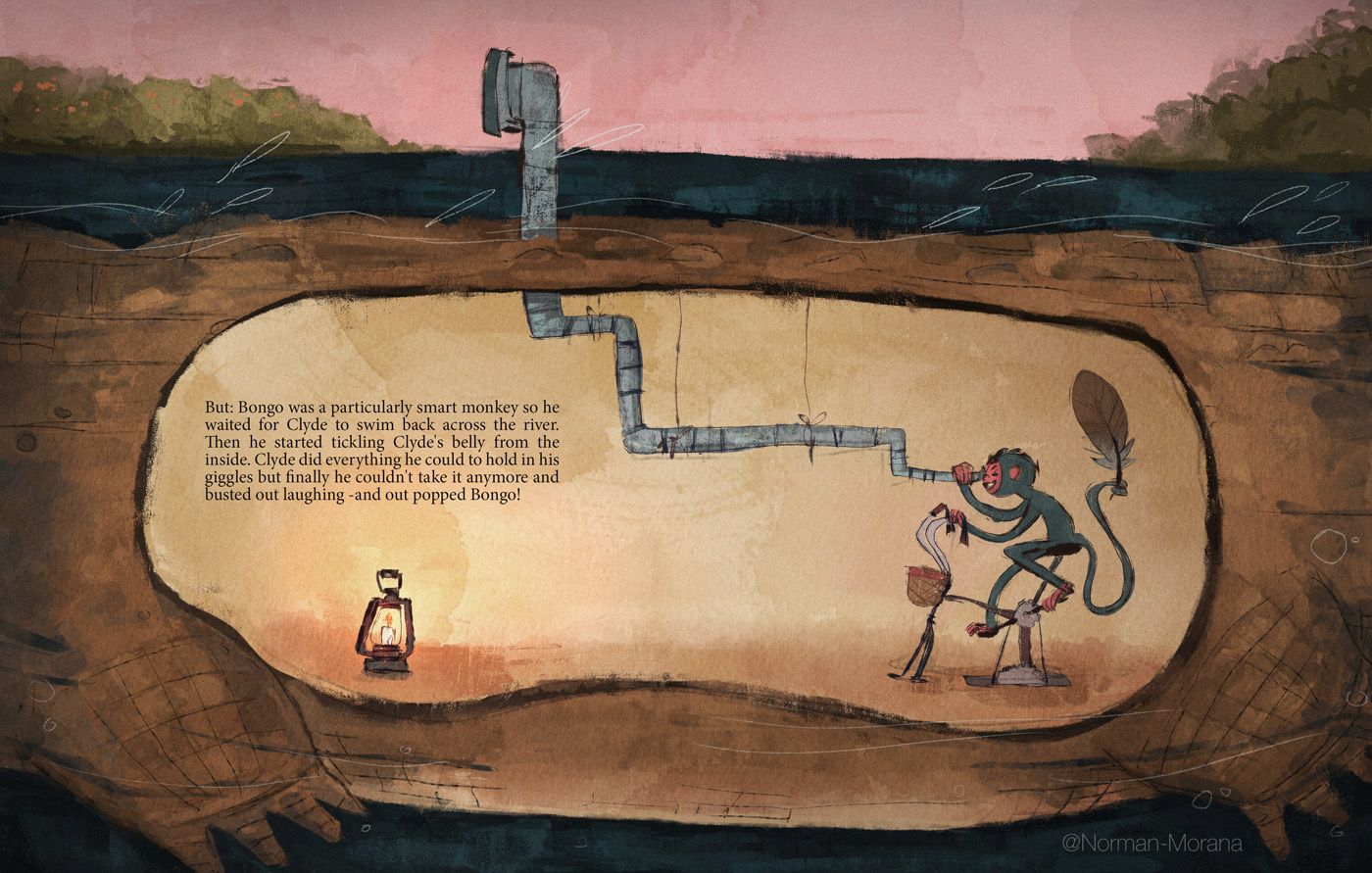
Edited version.

-
@Norman-Morana oh yeah that helps! I like that the monkey feels more like a focal point and the text reads better too!
Not sure if you wanted to make more edits, but one thought I had on your image was to make the eye of the periscope look to the right instead of the left? Right now the monkey and periscope lead my eye off the page to the left, but if it was turned right at the top I wonder if it would lead me back over to the monkey again? Especially if they was a curved tree or something to help lead your eye there.
And you could try moving the text a little bit to the right or centering it a little more? It's a tad tight on the left side.
Really fun and creative image as always though! I think you had the best idea of the bunch

Check out my art and tutorials :)
Instagram: www.instagram.com/carliannecreates/
Youtube:
https://youtube.com/c/CarlianneCreatesShop: www.carliannecreates.com
-
@Norman-Morana Moving the lamp and putting the read in shadow makes good logical sense, and it does read a lot better, but I still wonder if the whole thing is still skewed a bit towards the middle range or loses some of its simplicity by making half of the inside darker than the other half. I keep squinting at it and can't quite decide, so take this with a grain of salt.
@carlianne Interesting idea! I realized after reading your comment that I had been imagining this image the whole time as the right hand page of a long, horizontal spread. But I wonder if it makes logical sense that the monkey would be back, since by the drops of water, anatomy--and I just noticed the tiny spots of orange!--the gator is heading to the left. I wonder what would happen if the periscope were simply turned a bit towards the viewer? You could reflect an orange tree in the view finder.
I agree about the text. Now that the lantern is closer to the monkey, the text could be moved down and more towards the center.
I love, love, love the Rube Goldberg-i-ness of this illustration! It puts me in that whole Edward Gorey, Anita Lobel, 1960s frame of mind, and it reminds me a bit of Lee's work as well. I think a real child would be charmed by it.
And good for you for reworking your image, and so quickly! I am really enjoying your work on the forums!
-
@Norman-Morana I love your work; you have a lovely painterly style. I like your reworks and I agree with the advice from Carlianne about the periscope, it makes for a nice circular movement, although Laura makes a good point about the drops. I also think it’s a good idea to shift the text. Really lovely colour palette by the way

-
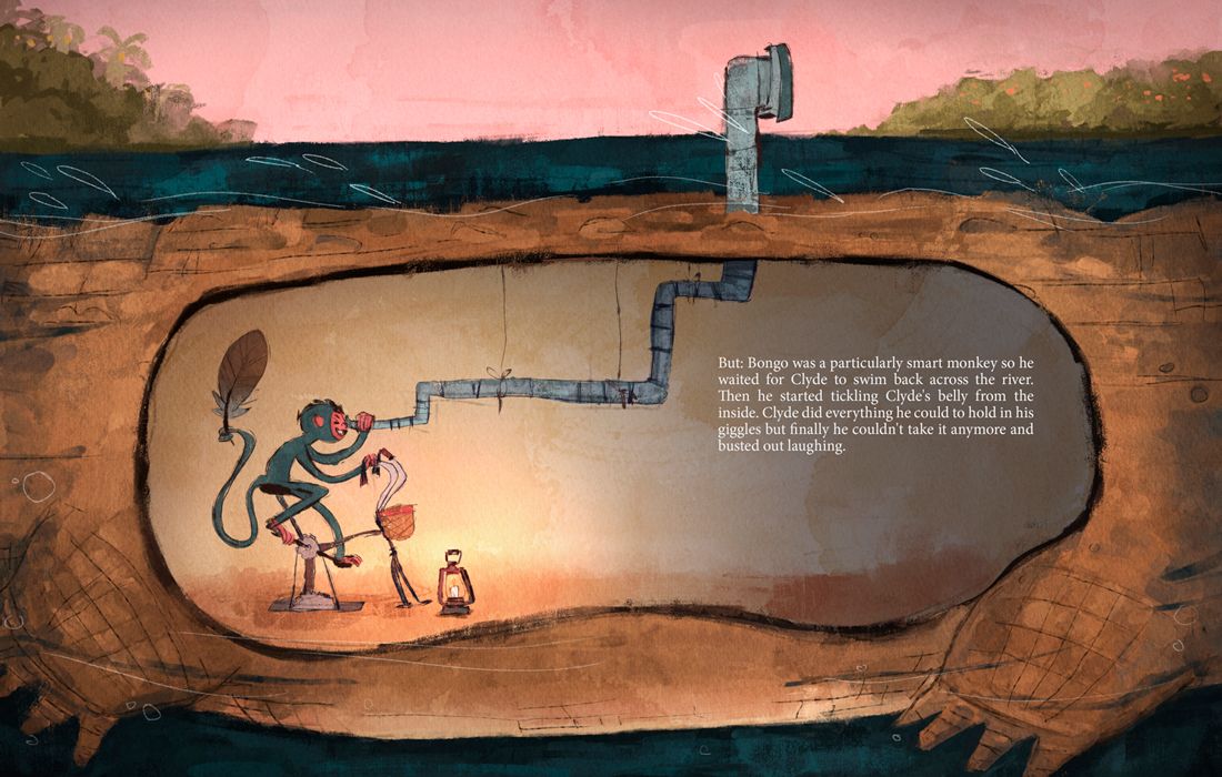
I love this image so much. I think the idea of having it as a spread with the periscope looking out over the spread is pretty cool. Seeing as people read left to right (in our part of the planet anyway), maybe horizontally flip it? Carlianee’s idea of flipping the way the periscope is looking if it’s just a single page is good too.
The lamp light is wonderful.
Is this is watercolor or digital or a mix ? Really lovely. -
Thank you, @carlianne @LauraA @Rachel-Horne I appreciate you all taking the time to provide feedback! The suggestions all kind of played off each other, hope it's cool I tagged everyone in this one post, plus I wanted to easily share the exploration.
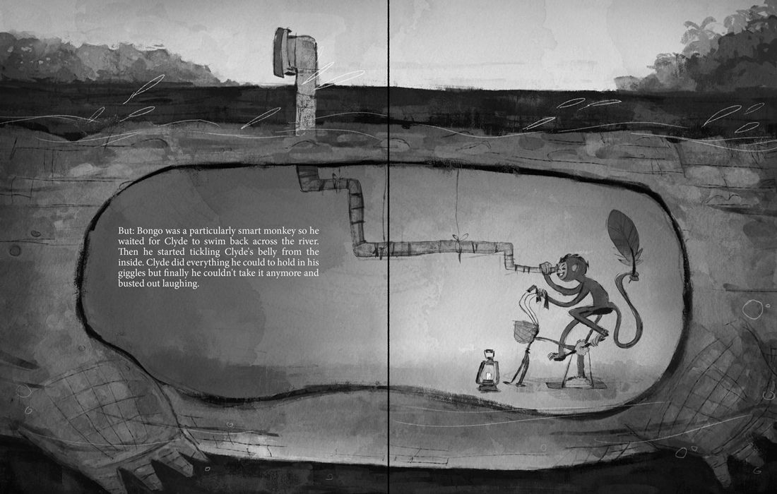
I see how having the periscope looking to the right makes sense. The monkey is traveling to the left and it scoping out the oranges there. But it seems like maybe thats not as noticeable on a first read. This illustration was set up as a full spread. My thinking was the reader would turn the page, and look from left to right. And I show where the spine is in the gray scale image.
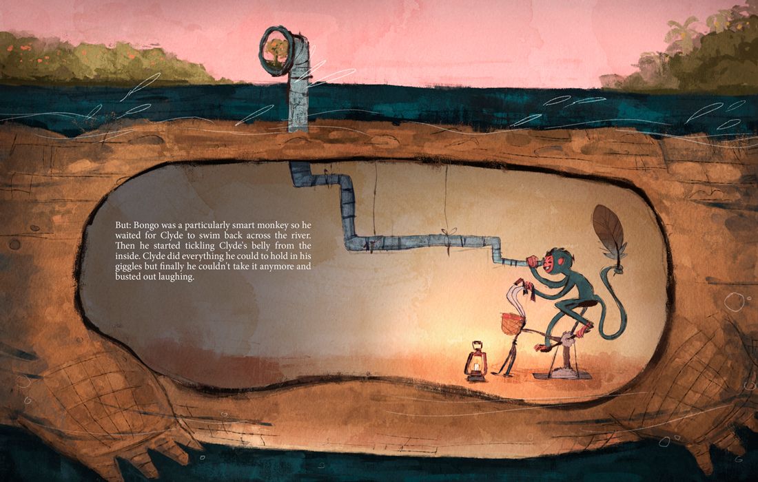
I explored two options for the periscope. In both I added some tree variety to the right, and I moved the text over a bit to the right. I'm trying not to get too close to the gutter. That's also why the periscope is designed the way it is, plus it seems silly. On option 2 I tried out having the periscope turned towards the viewer. I think it could work, I might have to make it draw less attention though. I'm leaning more towards the simplicity of option 1 and I hope it makes the viewer look in the background to try and see what the monkey is looking for.
I also tried out a flipped one just to see. When I look at that one it leads my eye off the page a little too quickly.
Option 1.

Option 2.
Flip Option.
Grayscale + Spine.
That's where I'm at with it right now, I'm going to sleep on it for a minute. I do have less experience with an actual illustrated page set up. I've really only done standalone images. If there's something I could be on the look out for, maybe not on this piece but on future ones, I'm all for hearing it
Thank you all again for offering feedback and the kind and encouraging words! It gave me some great ideas to explore
-
Hi @Coley thank you! I did try out a flipped version. definitely worth a shot, but I think the way I composed it made it not work. You can see it in my comment
And this piece is all digital. I do have some watercolor textures set to overlay that I made and scanned into the computer though. Maybe that counts as mixed?
-
@Norman-Morana I was wondering that afterwards, ie the watercolor texture. It's awesome. Did you do the thing where you change the channel or whatever lol. Sorry, I am just trying to remember the steps I saw Will use in his digital watercolor course. There was some complicated pathway about channels and selecting things and then it gave the ability to color it. Maybe I should just go and rewatch that part of that course LoL

Btw I agree flipping it leads eye out too quickly. I like the slight rotation on the periscope, it definitely stops the eye From travelling out of the illustration! -
@Norman-Morana The June live critique was yesterday?
-
Hi @dafoota, Also completely missed the critique arena!
Did anyone by any chance take a screenshot of the sweet 16 board and honorable mentions?
-
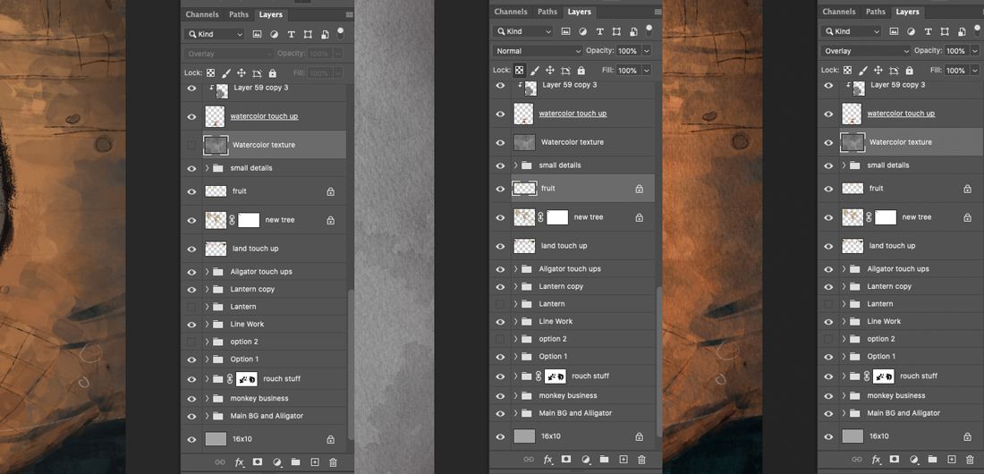
@Coley I haven't seen Will's watercolor class but it sounds like you're talking about blend modes. Sorry if this is old hat. Thought I'd show a couple quick screenshots. That box that says "Normal" is where you can find blend modes and I just show what it looks like off, normal mode, and set to overlay. And when I am painting this, I have the watercolor texture on from the start.
-
@dafoota @Jeremy-Ross Sorry to hear. I haven't checked if the stream is up on svs' site, but last I checked you could view it on their facebook page in full. Hope that helps!
-
This post is deleted! -
@Norman-Morana thank you. I enjoy your piece and even more you tenacity to go back and bend it to your will. Great stuff!
-
Very helpful @Norman-Morana! Much appreciated!
-
I love the extra storytelling of seeing the orange tree in the periscope!
I don't mind it flipped as it leads me to the text and feels natural with reading left to right, but i thin either way is fine. Looks great!
-
@Norman-Morana that's what Lee does fir textures I think? Will does something else that is a lot more complicated lol. I'll probably stick with Lee's version
-
Yes, nice job putting in the effort to take in the feedback & rework the illustration.
I'd like to see more evidence that the alligator is a machine. That was something that wasn't very clear--for sure--to me.
I really like your drawing style, color scheme, and textures!
-
@Norman-Morana Your original piece is so good. I do like it flipped too but it is also perfect the way it is to me. I don't mind the lantern on the other side of the the belly away from the little monkey - i feel like it works better compositionally over there and the textures you have going on around it in the original are awesome..also it seems to be illuminating the text to me. I remember Will and Lee really liking the piece.
-
Thank you! @Kevin-Longueil yeah this illustration is in kind of a tough place right now. Everything is subjective at this point and it’s difficult to know what to settle on, haha.