Wizard of Oz: THUMBNAILS - Your Feedback is greatly appreciated!
-
Hello Everyone,
After a day of sketching these 4 are the ones that I think work the best. I`m not sure which one would be better, a more zoomed out scene with the characters more spread out, or the closeup version with the city in the background.
Appreciate your help!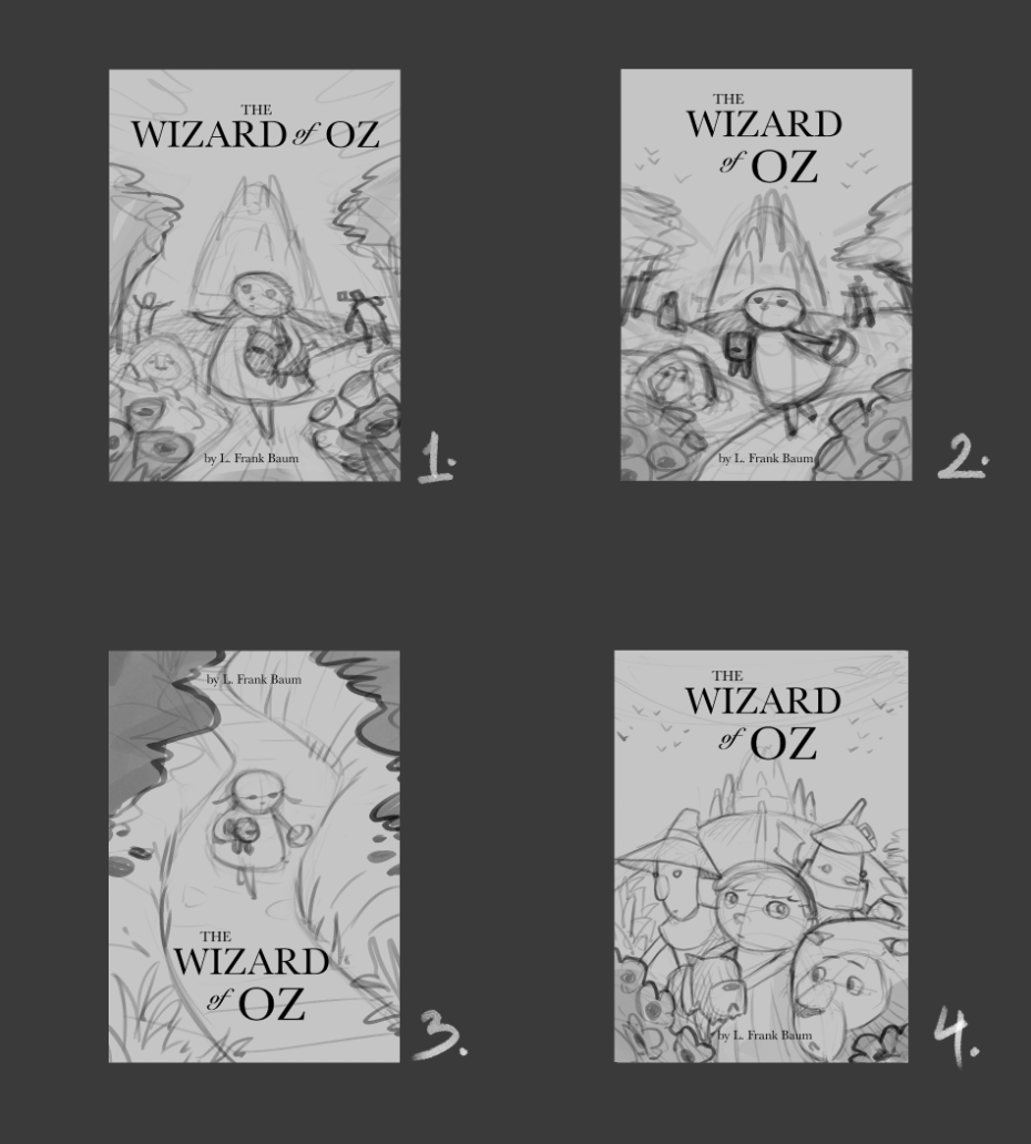
Later...
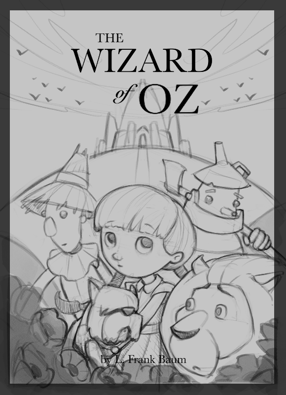
I started to clean up nr. 4, it was definitely the most effective of them all.
I will leave it as it is for a couple of hours and start working on something else, and later, with a fresh perspective I will start to paint.
Cant wait to share the process with all of you, Thank you!
C.S.Zoltan
Portfolio: www.behance.net/cszoltan
Instagram: www.instagram.com/c.s.zoltan -
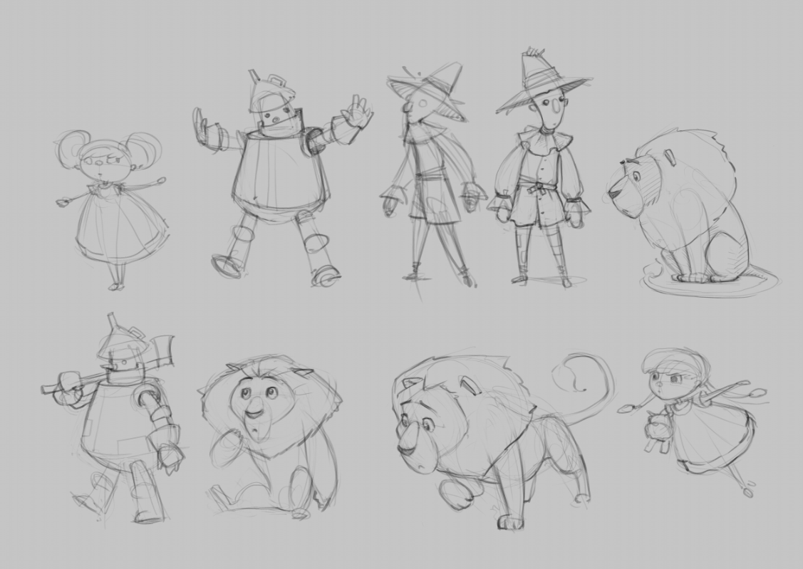
These are really cute! Just my thoughts, not that they’re correct necessarily, in the first one Dorothy seems maybe too centered? The next two are nice but maybe at the moment. It a lot of detail but maybe you add that later. I really like the fourth best with the characters. Your characters are really appealing !
-
@cszoltan Personally, I'm really gravitating towards number 4. I like to see these characters close up. The character designs are really strong and super cute!
-
Digging #4. Though something that Lee white said in his book cover class was to have the characters facing toward the inside of the book (right for most). This encourages the reader to go deeper into the book. He said editors note this as well.
Great character design and composition!
-
@cszoltan wow! These are so good!! I’m loving 2 and 4. I like all the character designs too.
-
@cszoltan my husband says 4. I always like to ask him because he’s not an illustrator so he sees it all differently.
-
@cszoltan 4 is very appealing to me
-
@cszoltan Love your drawings! 3 for me - the book is dark and quite violent ...not a fun romp at all in my opinion - 3 has a sense of tension to it that seems appropriate. They are all excellent though!
-
@cszoltan
Hi! Your characters are super hugy adorable - another not real word but (shrug) it works. Because your characters are fab I like 4 but I like how 3 is a more unexpected perspective. My only possible addition for number 3 is maybe have a character -scarecrow popping out of a bush in the back grass or have a green glow silhouette/shadow coming from the bottom towards her. Some element that says Oz more.")
-
great character designs, love your cowardly lion. Maybe more full figure thumbnails? i do like 4 but it feels crowded.
-
I like 2 with Dorothy in a fun gesture and the other characters visible but not prominent. I think having a central composition for a cover works.
-
I like a mix of 1 and 2. I like Dorothy's movement in 2 and the single line title in 1 (else everything looks too columned).
Your character designs are super! I hope it comes across in this composition -
I'm really liking 3 and 4. 3 because the composition draws me in and makes me want to know more but I don't think It's immediately obvious that it's Wizard of Oz. Not that that's a bad thing. Just an observation. 4 I like because you know the story immediately and it;s a good intro to the characters. The composition works well too.
-
Wow so many great comments, Thank you everyone!!!
I started to clean up nr. 4, it was definitely the most effective of them all.
I will leave it as it is for a couple of hours and start working on something else, and later, with a fresh perspective I will start to paint.
Cant wait to share the process with all of you, Thank you!