WIP magazine cover, critiques requested ;) - final updated July 29
-
Hi, Everyone.
I have 2 rough drafts for a children's magazine cover. Requirement from the publisher, if translated, is "Cherish ( protect/care) your child's growth". It's a December issue, so winter scene would be great, but there should not be Christmas elements such as stockings.
I don't want the characters to be too specific, such as dad/mom/grandparents, so I am using imaginative creature as a metaphor.
Main questions here --
- Do you think they both deliver a sense of "protect/care"?
- Do they both look fun to kids 2-6? any suggestion to make them more fun?
- Any suggestions compositional wise? (I'll shade them later though as they're rough sketches now)
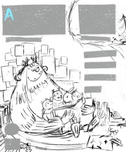
A - Reading books in cave. Background is kids' doodles that Yeti keeps.
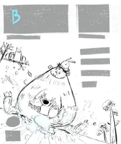
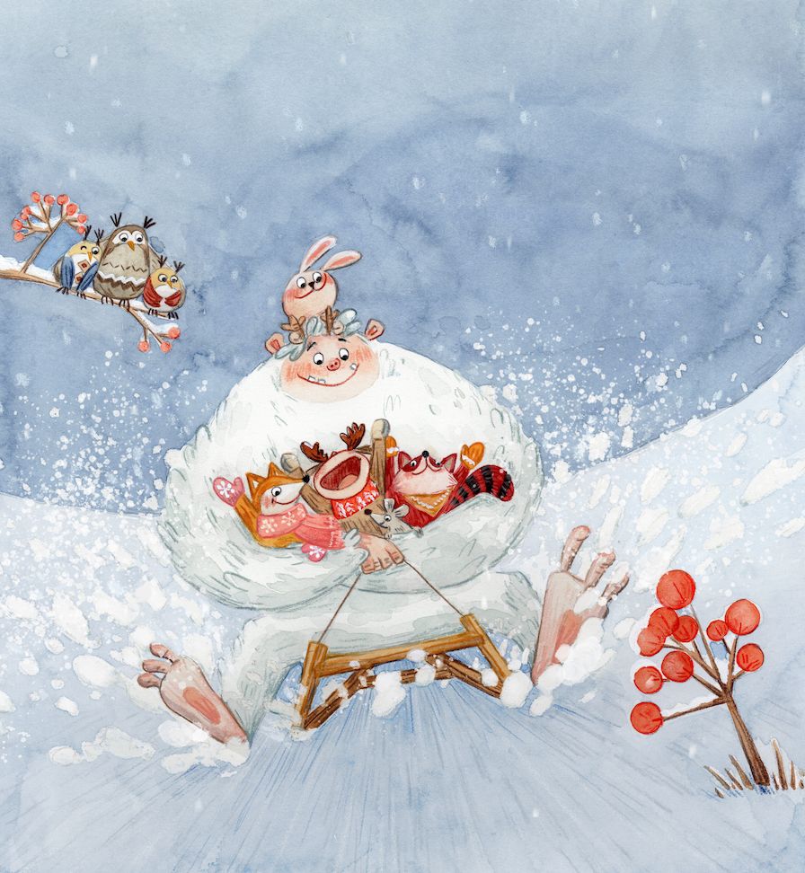
B- Snow sledding with Yeti.
Thank you very much!
-
These are looking great!
Do you think they both deliver a sense of "protect/care"?
I think A definitely does, though I'd consider curving the big creatures gesture into the scene a little more, instead of being so relaxed. Being in a cozy cave in winter and the overall gesture of the big creature in relation to the smaller characters hit your keywords very well.
I'm not really feeling B as is. I think it's an interesting concept, but the gesture and angle of the big monster and it's expression is deadening the fun and impact of the scene. Maybe if the legs were angled up a little and the sled is was catching air? Maybe if the smaller animals were all on the big monster's back, and the monster was in a more active position? Maybe if the smaller characters were held higher, against his chest?
Do they both look fun to kids 2-6? any suggestion to make them more fun?
Yes. I think they're both fun for this age group, and they both have a lot of potential for fun secondary details as you progress the piece.
Any suggestions compositional wise? (I'll shade them later though as they're rough sketches now)
I'd consider flipping B so it's angled the opposite way.
-
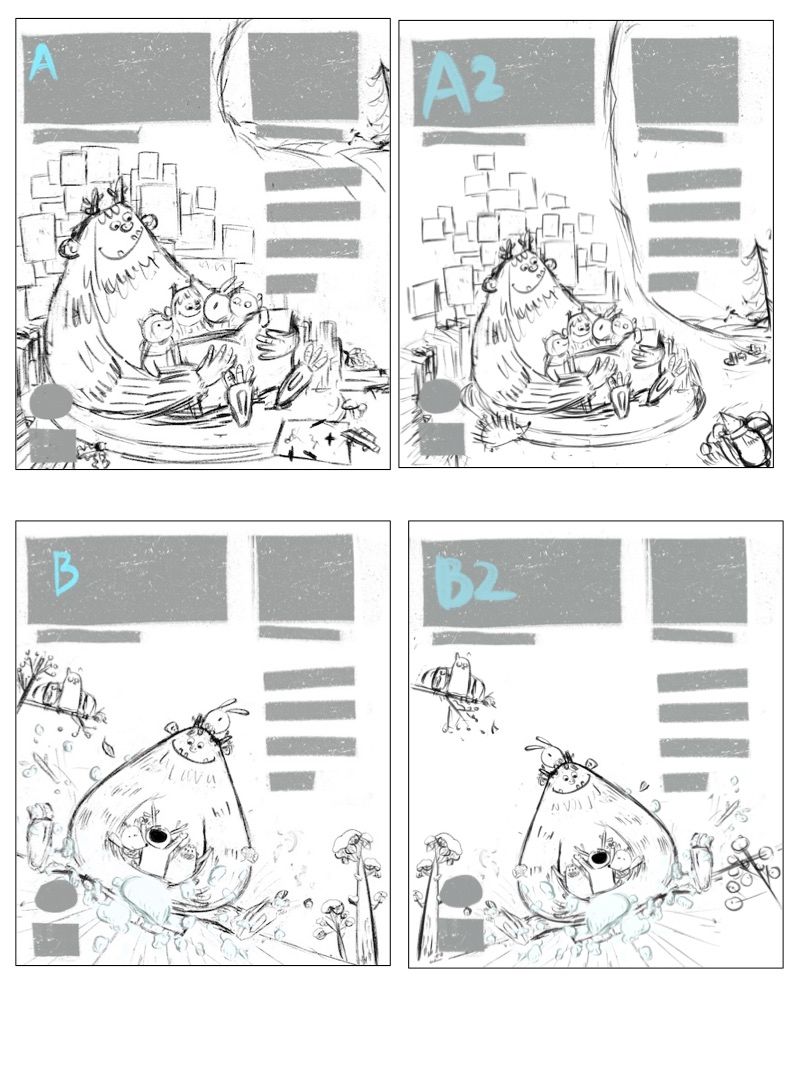
@TessaW Thanks so much! You are definitely right. I feel the weight of Yeti instead of fun in B too. I just flipped B, made it B2. Also made figures in A less crowded with a bigger cave entrance, see A2.
I'll also make legs in B up a bit more soon. Now one more question I have for everyone is A or A2, B or B2, which is better?
-
@idid I think for the purpouse of the cover 1 might be best suited especially with the suggestions above.
Still i really like the idea and the drawing of the second one. The big problem tho is that it doesn't really feel like they are moving. Things that could help are:
Changing his expression to look foward and be a little excited as the kids.
Raising his legs.
Hunching over and holding the children higher up to his chest. It feels much more dangerous than reading a book, so i feel like he would be extra careful in keeping them safe.
Maybe raising the horizon line in an atempt to make it feel like they are sliding down a hill insted of just going on a flat surface.
Also it feels a little off balance faivoring the left, try tilting it a little less. That would also fix the horizon line going straight into the corner of the page.
Hope it helps, keep up the amazing work
")
-
@Luca-Salvatore
Thank you for such detailed suggestions!Good catch with the horizon line and raising Yeti's arms a bit. I probably did not study snow sledding scenes well before making this illustration.
I will make change in the next few days and hopefully the Yeti would not look as stubborn as it is now.
Much appreciated!
-
Thank you so much everyone your critique!
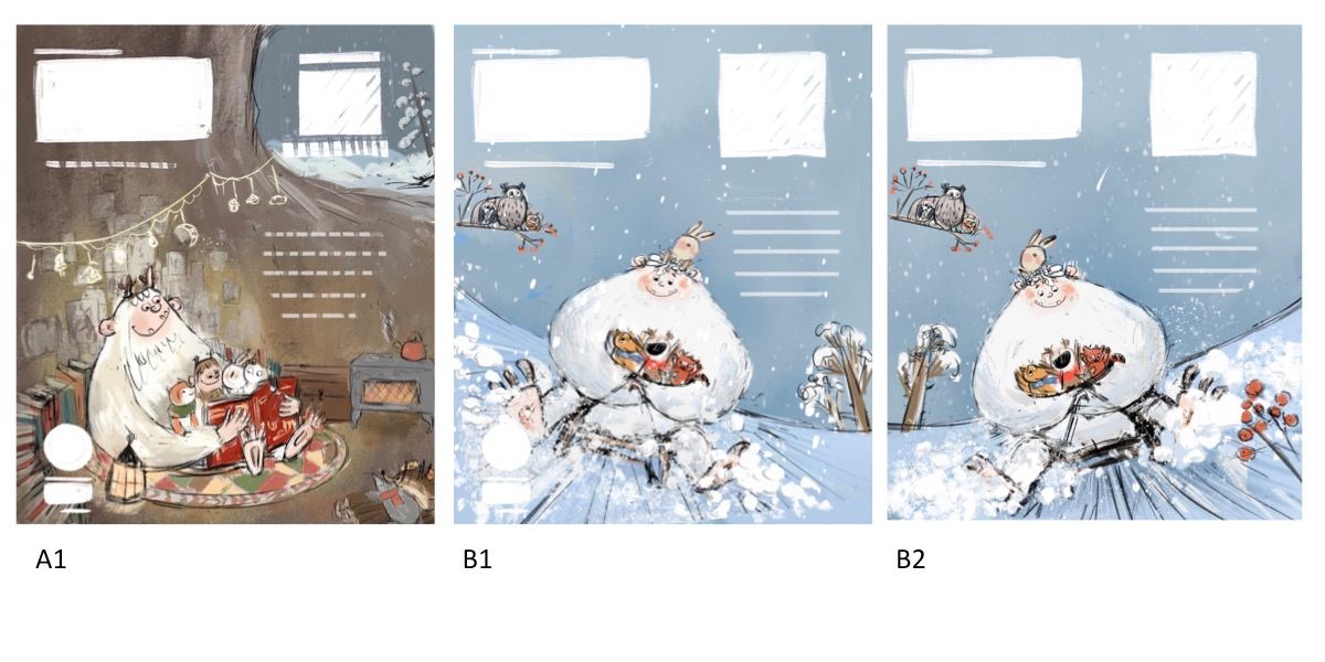
I have made a few changes to both drafts, and colored them a bit to see if the ideas work. I also flipped the snow sled image, to make them B1 and B2.
- What do you think of both illos? Any composition issue? or color wise?
- B1 or B2? I am having a really hard time to decide ... I think working with this draft for too long time somehow made me not able to think straight ...
Your insights are much appreciated! !
-
@idid I definitely think that the concept of A nails the "protect/care" angle more so than B. I also like the depth and warm foreground / cool background of A...Basically, I'm really feeling A. The only thing I would change (and this is a personal preference) is the color of the cave. I would use less browns and maybe more reds and oranges to make it feel warmer and contrast with the cool snowy background. Great work on this. Please post the final work if you can!
-
@idid cool! Which magazine was this for?
Portfolio: nyrrylcadiz.com
Instagram: https://www.instagram.com/nyrryl_cadiz/
YouTube: https://www.youtube.com/channel/UCbJCF1Im8ZO7hpGWTKOJMuA -
@idid I think these are wonderful. It seems like a great idea to give two options if you can. Curving the ground on B makes it so much stronger, and the second option on that one has a really nice composition. I think some things that would help on that one would be to soften the other straight lines. Can all the plants be gently curving as well? The only problem I have with B2 aside from that is that the snow is in front of the sled, and it would be coming off the runners toward the back and edges.
-
@j-sienkowski Thank you for this great suggestion! I'll try to play with background temperature a bit, to see if it gets a bit warmer.
Sure I'll post the finished illustration. Whichever one the publisher selects.
-
@carolinebautista Ah, so helpful! Let me try if soften the straight line helps, and also add more warm colors ! Maybe I am making the colors too cool unintentionally --- It has been really warm recently ...
stay cool !
-
@Nyrryl-Cadiz It is for a literature digest magazine by POPLAR Publishing Co. They are mainly in Asia market, mostly Japan / China / Taiwan , etc.

-
Hi Idid, I think that A is much stronger, the composition is perfect for all the text and "labels" that have to go on a magazine cover. The idea that you can see outside is interesting, but wouldn't it be much better to have a simple cave background as well, just so that the text can read more easily.
Cant wait to see your progress!C.S.Zoltan
Portfolio: www.behance.net/cszoltan
Instagram: www.instagram.com/c.s.zoltan -
@idid I really like A. I think the colors are very good. I don't think you need to warm them up any. They definitely feel warm in comparison to the outside and the kid's outfits and colors contrast very nicely. I think if you warmed it up they might get lost. The cooler scenes are nice in their colors but it is not reading "yeti" to me. It just looks like a large circular critter. But A definitely reads protection and care. I love it. I really like the character design and the watercolor effect of your medium.
-
@cszoltan and @chrisaakins Thank you! I like A better, too! I made a few changes after your suggestions and sent it to editors, they eventually chose B2. They liked all of them and B2 has a bright color that kids will love. So I am ready to illustrate on paper now! Can't wait
I'll share a finished piece once it is approved.
Many thanks to all of you!

-
@idid Cant wait to see the final cover Idid!
-
Hi again everyone, I really appreciate all your critiques/suggestions! I have finalized the cover illustration and attached it here (it is a bit tilted and logo/texts on the cover will compensate for that). The editor also prefers a really whiter background so I changed the level of background digitally.
I learned a lot from this experience, and .... also realized there's so much to improve in my illustration as color palette, way of rendering, etc. .... so more critiques are definitely needed in the future
Thank you again!
-
@idid looks great! All your characters are so cute. Is that traditionally done to start with?
-
@holleywilliamson Thank you! they are traditionally done
background level has been changed digitally -
It turned out beautifully!
Website: www.tessawrathall.com
Instagram: www.instagram.com/tessawrathall_art/