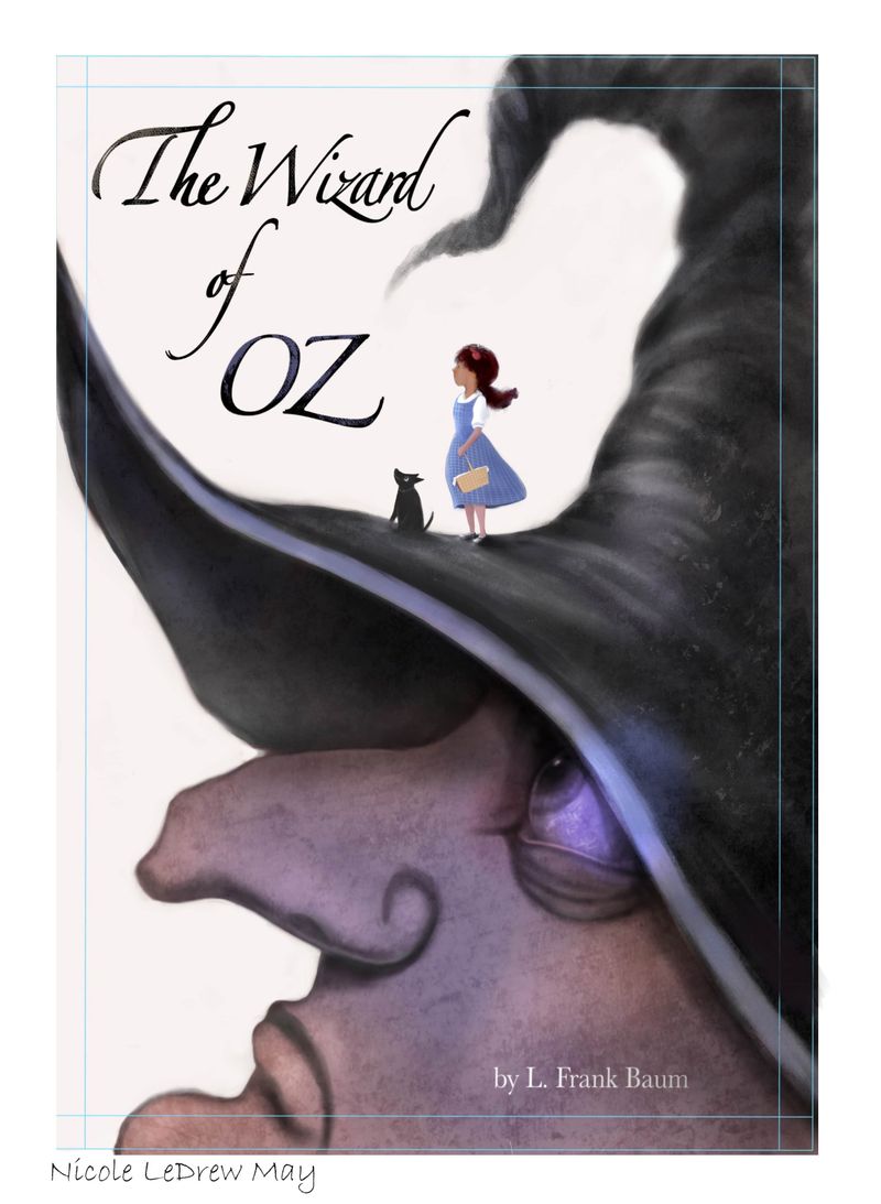
Seeking last minute thoughts on my Oz piece and maybe a hug
-
Hi @Coley
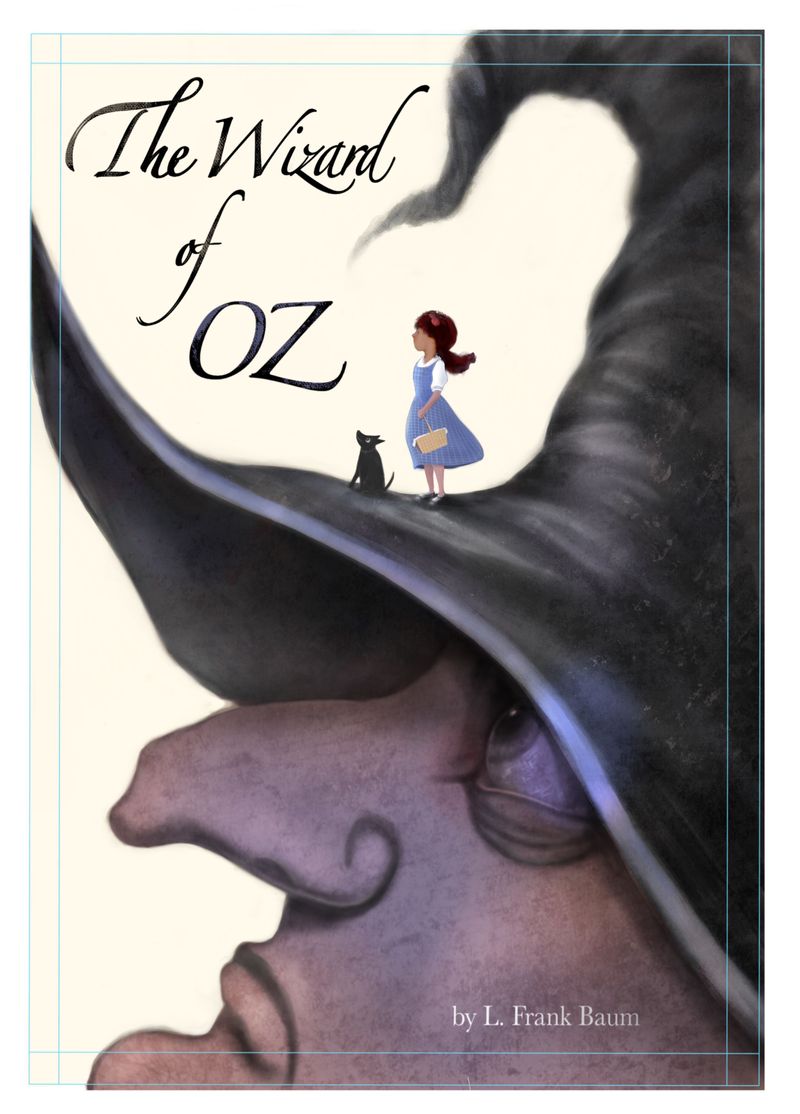
First, I like the more relaxed hand. Second, I think the title placement is good, the overall styling is maybe not my favorite, but I think it does work fine and would be ok to leave as is.
The biggest critique I have is that the silhouette of Toto and Dorothy is maybe a bit too soft, especially in relation to the title. I'd consider firming up the silhouette of them facing the text and maybe adding subtle texture to the title, though I'm not sure on that.
Overall though, this is a really cool and unique approach to the book. It's fun seeing the pairing of the more rendered style with a more graphic treatment!
Balancing family, work, and art is really tough- even more so during the pandemic! I'm sorry you're feeling down. Hopefully as things settle and some unkowns are cleared up, you can work out a balance that feels manageable and fulfilling. Hugs to you!
 I wish you well, and will be here on the forums to lend a listening ear if you ever need to vent! I think a lot of us can relate to the feelings you're experiencing.
 -
It looks beautiful, love the composition. Good luck with finding time with art, it is a struggle!
-
@gavpartridge hahaha, that made me smile lol.
-
Thanks @TessaW and @holleywilliamson .
@TessaW i will try firming up edges on Dorothy and Toto and see what it looks like, thanks. The witch’s hat was too soft and needed a few hard edges, I added them in in photoshop but I guess now I have to do similar with those characters. What you’re saying makes sense, thank you
 . You always give great feedback!
I went back into procreate to work on the hand because I couldn’t get photoshop to agree with me. So this is back a few steps in terms of witch’s hat etc, so take this only for the arm and hand and basket, I just tried having her hold it in a different position and was wondering if people thought this looked ok or natural? I, just sort of Messing around now . It was easier to find reference for the arm in this position. I tried photographing myself in the other original position for reference but didn’t get the angles right.
-
Hugs. I'm sorry you're having to put art on the back burner for now. That's hard. I hope you're able to find room for it in your life.
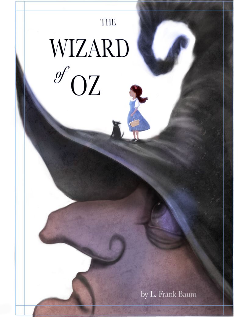
I really like this piece, version 2 especially. Concept and execution are both strong in my opinion. If you adjust the leading on the title that might help. You can also make the font larger if you need to fill more space. But don't worry too much about the graphic design elements. This is an illustration contest so I'm guessing the art is what really counts.
-
I love this piece. Really well done. I love love compose images which characters small - sometimes it can be challenge, for me ithelps focus on the shape, and silhouette, and worry less about "oh, that is an arm".
If you want to play around a bit more with the piece, it might be worth invest a bit of time on the edge control of the witch character. Another thing you might be try is testing out adding different color in the background, and/or play around with the typography (font/color, etc.) of the title.
A big hug. I am here to listen. I hope you do keep making art on the side, even it is just 5 mins a day, or an hour a week. I see how your art grows over the last few months that we hang out on this forum.
-
@Coley I love it. it's so unique
-
@Coley Ah I really love your cover - both work well for me. To be honest, I didn't really notice the hand thing - they both look fine to me, I think sometimes we can spend too long looking and it's hard to tell. The composition's lovely though. I suppose working on the lettering could be an option but this looks ok to me.
Sorry about your new situation. I know how you feel, I've had to to do this a few times over the past couple of years and it was difficult in lots of ways and although I couldn't do as much art, when I did have time I was probably much more productive. Don't give up, your work is really lovely and you're so far on the road! In view of your current situation this image seems even more poignant. Sending you lots of virtual hugs xxx -
Wow, that's a great silhouette you've created with the witch and the characters! The hand didn't bother me, either. In fact, I rather liked it up! If I were you, I'd spend what time I had left on this working on either the title or perhaps a soft background.
I think there's a little bit too much spacing between the words, and I agree that they are a little sharp. I discovered a little trick with PS type layers. You can select them, create a mask, and color it in with some brushy texture! That might make for a softer font. (You may have to rasterize it first--I don't remember.)
By soft background, I don't mean a landscape or anything complicated, just a little wash.
I'm very sorry for the job that will take you away from your art. I can very much understand why that is discouraging. We artists rightly hold tightly to our creativity and having to put it on the back burner must feel like a big defeat. I'm hoping you'll have some compensation or clarity in the long run that will have made it worth it, and most of all that you eventually will find a different job that allows you to draw, or some energy to draw anyway!
I big virtual hug from me!
-
Virtual hug!! Have you considered removing the curly end from the hat? I would keep the piece pointing toward the title, but remove the curly U shape below, which is pointing away from the title and kind of competing with it.
-
@Coley This looks great! I really like your style and as others have mentioned, the silhouette is really striking. Re: the lettering, it works compositionally, but I personally tend to gravitate to titles with lettering that's more hand drawn, or fonts that feel hand drawn. If you have time and the interest, it might be interesting to explore options with the lettering. re: having to get a day job, I totally empathize. That's a whole separate thread (sigh). Sending big hugs to you and know you're not alone.
-
Thanks so much for the hugs everyone . They were extra-necessary this morning as I found out an art grant I had applied for was turned down,...... when it rains, it pours as they say! lol. Oh my. Will try to shift focus to what I am truly grateful for . This thread has helped a lot! It made me feel that there were people that understand. Truly grateful for this community!
I have taken a lot of advice and employed it, great thought on turning the witch’s hat curl @deborah-Haagenson , I think it looks more tornado like too....it might be a wee bit close to the title but I’ll think on it.
@Johanna-Kim , I like more handwritten titles too, I redid it with a font from procreate but will see what’s in photoshop. And @LauraA I tried a light texture on the font, and a light wash on the bg. I haven’t added any variation or texture to the bg so will think on that. It might detract too much if I did that but I think the white background might have been too stark.
Thanks also @Rachel-Horne , @xin-li , @amiklo , @Nyrryl-Cadiz , your comments were very helpful ! And all hugs duly noted and accepted

Any other thoughts and critique appreciated.
-
@Coley I love the changes you made! I think it looks great!!
-
@Coley I'm just here for the hug. I'm new to the SVS world, but I love your artwork and am giving you a hug with my mind.
-
@Coley This feels odd to say, but I'm so sorry about the job! Your Oz piece is absolutely wonderful and proves one thing: you are a true artist, and will always remain one even if you have less time to put in the craft. And I know your time will come when you can invest more time into it again, sometime in the future! Do what you gotta do fro you and your family - as long as art is in you, it will never truly go away.
-
@Coley - just wanted to say congrats on the job and sorry. We got some bad news recently too. it has me reeling. the time to make art is so limited everything feels like a threat. Hugs to you. I'm sorry about the grant too. Sometimes we have to take time to live life to the fullest (even if that means focusing on a struggle) and wait for the time we can put all that into our art.
-
@Coley Love this! Dorothy looks great! I think either arm position works and she has the right amount of detail for her size relative to the cover. This font and spacing looks better to me too. The first version seemed to have too much leading.
Sorry to hear about your job situation. That sounds like a frustrating setback
 Be kind to yourself and just do what you are able to without getting burned out!
 -
@Coley Beautiful cover illustration! Sending you a virtual hug
 Times are tough right now!
 -
@Coley that font looks much better! It goes with the illustration much more and looks like less of an afterthought. The concept is really clever too.
A lot of artists have a non art related day job. Some find it zaps their creativity if the day job is creative and its better to do something completely different. Think of it like a writer, your experiences outside of art contribute to your idea generation
-
Thanks for the inspiring and heartfelt posts peeps

I’m feeling better this evening .... I was thinking about the job ( I feel like a bit of an idiot for complaining in some ways because so many people are unemployed!)....
But I can eventually work a little less than full time at this, once training is done, and I loved the book cover project a LOT, and I was about to send out postcards but now thinking about it, I might steer towards book cover work for a bit as it’s a shorter term project......so this thread and this month project may lead to something, or at least an attempt lol, thanks everyone
I think I’m done but won’t post till I stare at it more lol. I added a wee bit of harness and also some more light to the eyeball to focus attention there as well as hopefully on Dorothy.
Thanks again, sooo appreciative of the comments, they were really helpful on many levels.