Society of Visual Storytelling

    SVSLearn Forums

    • Register
    • Login
    • Search
    • Recent
    • Tags
    • Popular
    • Users
    • Groups
    • Search

    Dragonfly WIP (#2 updated)

    Artwork
    28
    39
    1860
    Loading More Posts
    • Oldest to Newest
    • Newest to Oldest
    • Most Votes
    Reply
    • Reply as topic
    Log in to reply
    This topic has been deleted. Only users with topic management privileges can see it.
    • xin li
      xin li last edited by

      No.3 is a really fun concept :-). I read "friendship" immediately. Great work.

      Web: www.lixin.no
      IG: www.instagram.com/lixin.illustration/

      1 Reply Last reply Reply Quote 0
      • carriecopadraws
        carriecopadraws SVS OG @Gary Wilkinson last edited by

        @Gary-Wilkinson I like #3, it has a cute story with a lot of visual appeal.

        Carrie Copa
        https://carriecopadraws.com/

        1 Reply Last reply Reply Quote 0
        • braden H
          braden H last edited by

          #3 is pretty cool. I've gotta put my vote in for #2 though since it's so... unique (strange in a good way 🙂 )

          1 Reply Last reply Reply Quote 0
          • theprairiefox
            theprairiefox last edited by

            I would agree that #2 and #3 are the most promising. I know that the judges like having a funny hook in the picture. I think either of these would fit that bill.

            -The Prairie Fox
            https://www.instagram.com/theprairiefox
            https://www.theprairiefox.com

            1 Reply Last reply Reply Quote 0
            • Graham Williams
              Graham Williams @Gary Wilkinson last edited by

              @Gary-Wilkinson number 3 is very good and very creative!

              1 Reply Last reply Reply Quote 0
              • Kevin Longueil
                Kevin Longueil SVS OG @Gary Wilkinson last edited by

                @Gary-Wilkinson Number one grabs my eye the most. I think it is the cleanest composition, quickest read, and most appealing. Three would be my second pick but one really stands out for me... i think the joy of it may be a big part of its appeal.

                Portfolio: kevinlongueil.com
                https://www.instagram.com/kevinlongueil/

                1 Reply Last reply Reply Quote 0
                • Jade Vaughan
                  Jade Vaughan last edited by

                  @Gary-Wilkinson #3 is really charming concept though I wonder if something about it could match the dynamism of #1. #2 hilariously reminds me of something in the invader zim universe. #4 I like the idea of a costume but I feel the family portrait overshadows that focus. Not sure this helps but do whichever feels strongest in your minds eye 🙂

                  Instagram: www.instagram.com/jadepagecraft/
                  Portfolio: www.jadesv.myportfolio.com

                  1 Reply Last reply Reply Quote 0
                  • Coley
                    Coley last edited by

                    Number three! So fun!

                    https://www.instagram.com/nicoleledrewmay/

                    1 Reply Last reply Reply Quote 0
                    • K
                      Kat SVS OG last edited by

                      1 and 3 are my faves, but I love 3 the most. So sweet!

                      1 Reply Last reply Reply Quote 0
                      • frankiiij
                        frankiiij last edited by

                        #1 is just so lovely. Even if you don’t use that one for the arena. Just print frame and put it up just like that. I think it is dope.

                        Much love and God bless!

                        1 Reply Last reply Reply Quote 0
                        • Gary Wilkinson
                          Gary Wilkinson last edited by

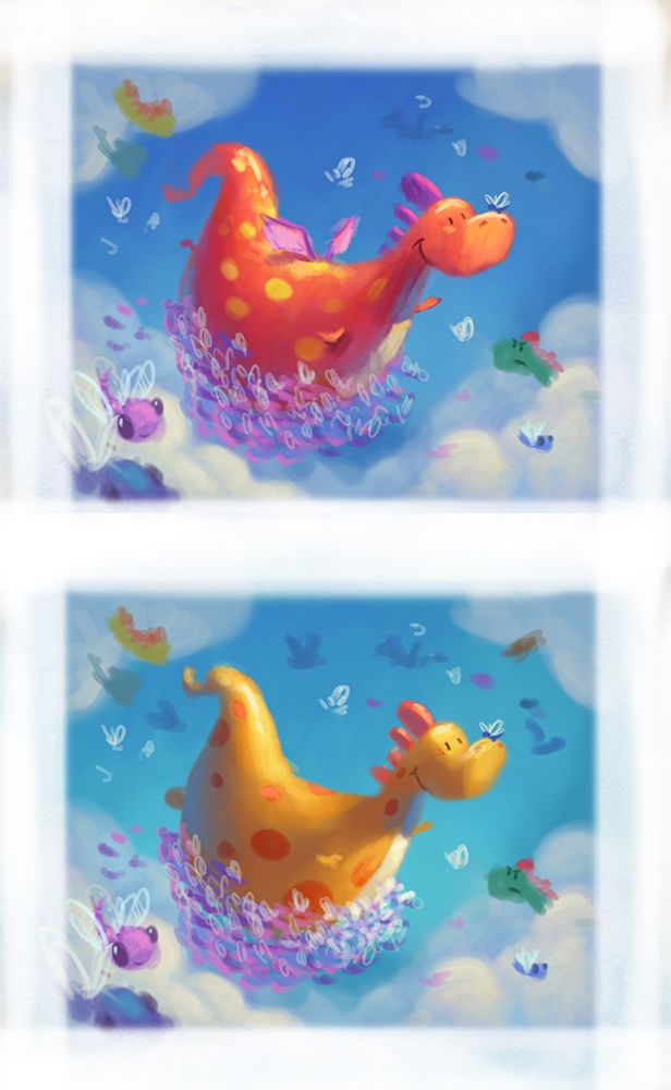
                          Thank you for all the comments and advice. No. 3 seems to be a popular choice and I quite like the cheeriness of the scene so i'll try work on that one. Did a couple of color studies that I think might work well, I think ill have quite the task illustrating the dragonflies but if I add some near the foreground it should read better.

                          Also thinking to add some dragons in the background with a look of confusion and anger at the happy dragon.

                          firefly2.jpg

                          www.garywilkinsonart.com
                          www.instagram.com/gwillustration/
                          www.twitter.com/GWillustration

                          A Nyrryl  Cadiz hakepe Heather Boyd Jade Vaughan 7 Replies Last reply Reply Quote 11
                          • A
                            aprilshin @Gary Wilkinson last edited by

                            @Gary-Wilkinson Oh my gosh, I love this idea so much!! It is so sweet and so adorbs!! Love the colors/lighting you chose, too. ❤

                            1 Reply Last reply Reply Quote 1
                            • Nyrryl  Cadiz
                              Nyrryl Cadiz SVS OG @Gary Wilkinson last edited by

                              @Gary-Wilkinson beautiful! i love the red one.

                              Portfolio: nyrrylcadiz.com
                              Instagram: https://www.instagram.com/nyrryl_cadiz/
                              YouTube: https://www.youtube.com/channel/UCbJCF1Im8ZO7hpGWTKOJMuA

                              1 Reply Last reply Reply Quote 1
                              • hakepe
                                hakepe @Gary Wilkinson last edited by hakepe

                                @Gary-Wilkinson I like the colors in the first one because it really makes the character pop.

                                Illustrator & Visual Artist
                                https://hakepe.myportfolio.com/

                                1 Reply Last reply Reply Quote 1
                                • Heather Boyd
                                  Heather Boyd @Gary Wilkinson last edited by Heather Boyd

                                  @Gary-Wilkinson I like the red because I feel it is more dynamic while I like the lightness/weight (as the colour makes the dragon appear to be able to flutter on air better) of the yellow one -so now I can't decide. Oh bother. lols

                                  Instagram: www.instagram.com/heatherboyd.illustration/
                                  Website: https://heatherboydillustration.ca
                                  Shop: https://www.inprnt.com/search/products?q=HeatherBoydIllustration
                                  Ko-Fi: https://ko-fi.com/heatherboydillustration

                                  Be blessed,

                                  1 Reply Last reply Reply Quote 1
                                  • JoshuaDages
                                    JoshuaDages last edited by

                                    What a great concept! I really like the yellow one. Seems to contrast a little better with the blue sky to me. Also love the idea of the angry dragon in the background!

                                    Joshua Dages
                                    https://www.instagram.com/joshuadagesart/
                                    https://joshuadages.com/
                                    https://www.etsy.com/shop/JoshuaDagesArt

                                    1 Reply Last reply Reply Quote 1
                                    • Jade Vaughan
                                      Jade Vaughan @Gary Wilkinson last edited by

                                      @Gary-Wilkinson so so cute!! Love the yellow one. I think it gives a nice contrast to the sky and doesn't blend with the purple of the dragonflies.

                                      Instagram: www.instagram.com/jadepagecraft/
                                      Portfolio: www.jadesv.myportfolio.com

                                      1 Reply Last reply Reply Quote 1
                                      • Eric Droke
                                        Eric Droke last edited by

                                        @Gary-Wilkinson, this is such a sweet concept! LOVE the dragon being carried by the dragonflies. I think i like the yellow one best. Not sure about having other dragons poking heads out of the clouds, though. Makes me ask, "If that dragon needs to be carried in order to fly, how did those other dragons get up there?" I think you'll be fine to just keep it simple and have just the one dragon. Keep up the great work, bro!

                                        1 Reply Last reply Reply Quote 0
                                        • Graham Williams
                                          Graham Williams @Gary Wilkinson last edited by

                                          @Gary-Wilkinson I like yellow best. It has more of that rubber ducky kids toy feeling. I hope you forget to enter the contest. This one doesn’t have to be submitted until September 😃

                                          1 Reply Last reply Reply Quote 0
                                          • alicia
                                            alicia last edited by

                                            This is so adorable! I love it! I agree that the yellow looks best. I really pops against the blue background better. Fabulous job!

                                            1 Reply Last reply Reply Quote 0
                                            • First post
                                              Last post