Dragonfly WIP looking for feedback
-
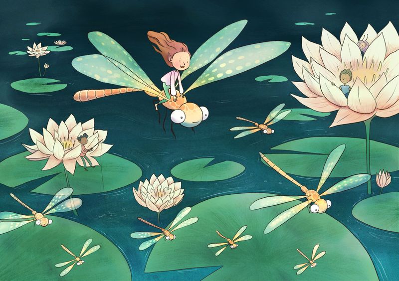
Here's the latest version! I'm at the stage where I'm not sure if it's finished or not. What do you guys think? Are there any adjustments I could make to improve it?
-
@Annabishop Beautiful piece! I love how her hair is flowing in the breeze! If it were me, I’d go through and add shadow and highlights just to give the painting a bit more dimension. Great job!
-
@Annabishop hey its a beatiful piece!! Ready to go!
If you ask for adjusments...I think the image is already working but..mmm maybe you can add a little more light on the big flower to generate some contrast, but as I said is already working, good job!
-
@alicia Thank you! I think you're right, I'll have a go at adding some more shadows and highlights.
-
@Jordi-Ventura Thank you! I will have a go at adding some more highlights to the flower. I was a bit worried it would compete with the focal point if it had too much contrast but I'll try it out and see what it looks like.

-
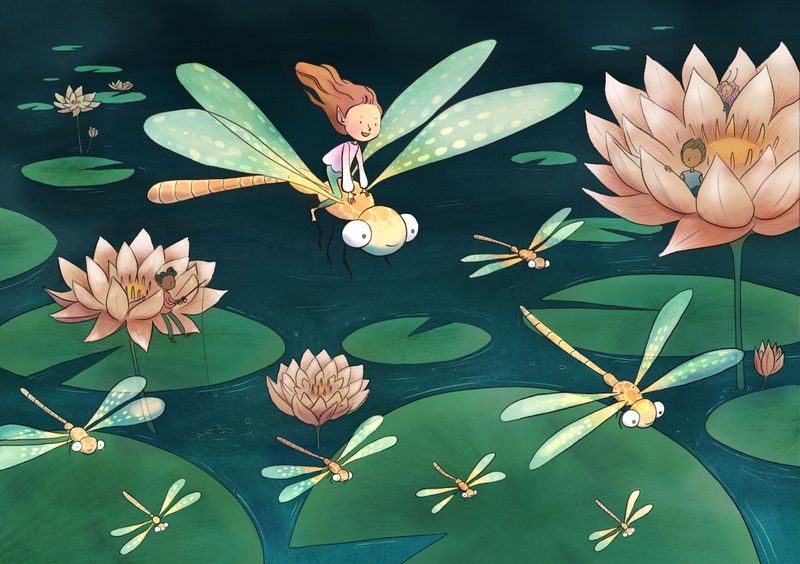
Hi! I'm new to SVS forums so I hope this is okay. I like a lot of things about your piece especially the world you've created here. I wonder if you could strengthen the focal point by darkening the flowers etc? As is, the three flowers, the girl on the dragonfly, and even the large lily pad on the bottom almost read as on the same plane? Good job and good luck!
-
Thank you @Joanne-Roberts, @alicia, and @Jordi-Ventura for the feedback! Is this working better?
-
@Annabishop hmmm honestly Anna I like more the last version.
It feels your darken more the image and burn it a little bit, the last version everything feels more organic, I dont know how to explain it!
Just my honest opinion! Anyways as I told you is a very good image you will be selected for sure ;)!
I did some paintover of I was pointing on my last coment, you already had a good mood on that image so if you want to improve it, its about adding little details here and there, working with adding some shadows or lights but being carefull to dont break all the value armony that you already have ( becouse its working! )

-
@Jordi-Ventura I totally agree with everything Jordi said. Her paint over nails the types of shadows & highlights I had in mind.
-
@Jordi-Ventura Thank you so much for taking the time to do a paint-over and give detailed feedback! Now that I look at the old version and new version side by side I totally see what you mean about it looking burnt and less organic. I was trying add more depth by darkening the background like @Joanne-Roberts suggested but I think I overdid it. I will have another go with the shadows!
-
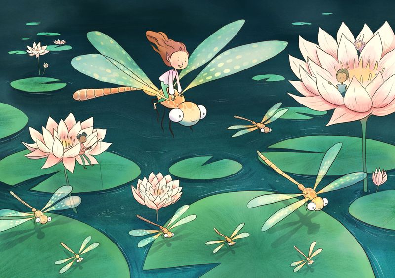
updated version, feeling a bit happier with it now... I think

-
@Annabishop Beautiful! Looks much better!
-
@Annabishop It looks awesome! I really like the overall composition of the piece. The dragonflies are really cute as well
")
-
@Annabishop This is beautiful! Great work!

-
-
@Annabishop Hey Anna, I really love your illustration! The only thing that I would add is that your main character has the same value as the Lilly pads on the surface of the water, if you look from a distance, they kind of all blend together in to a pattern. Maybe if you tried to blend in the background with the waters color a bit, or try some kind of atmospheric perspective to make the centerpiece pop.
C.S.Zoltan
Portfolio: www.behance.net/cszoltan
Instagram: www.instagram.com/c.s.zoltan -
@cszoltan I’ve already submitted it, but thank you anyway