Society of Visual Storytelling

    SVSLearn Forums

    • Register
    • Login
    • Search
    • Recent
    • Tags
    • Popular
    • Users
    • Groups
    • Search

    Just felt like sharing!

    Artwork
    art illustration feedback illustrator portfolio
    3
    8
    1061
    Loading More Posts
    • Oldest to Newest
    • Newest to Oldest
    • Most Votes
    Reply
    • Reply as topic
    Log in to reply
    This topic has been deleted. Only users with topic management privileges can see it.
    • ChrisConnor
      ChrisConnor last edited by

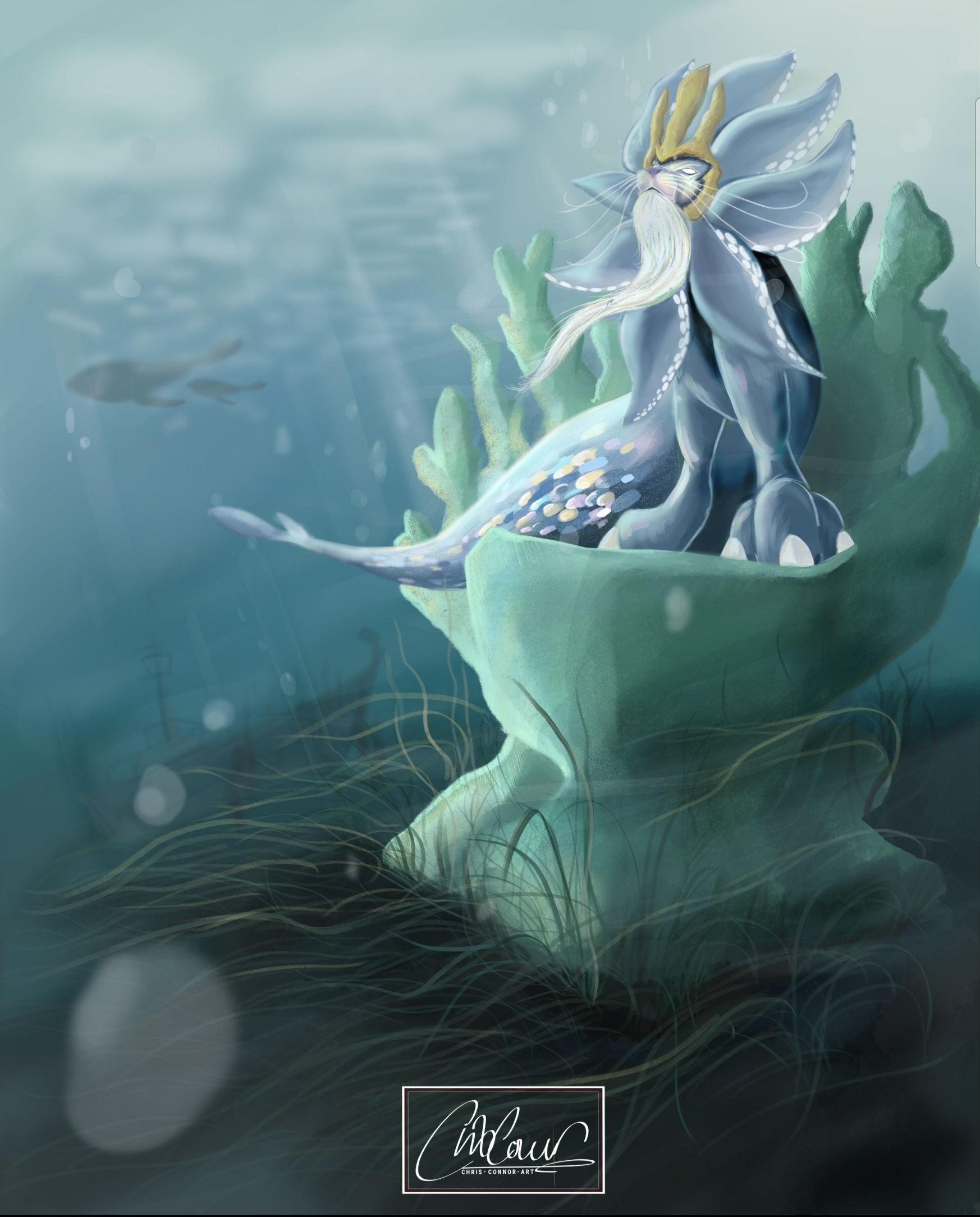
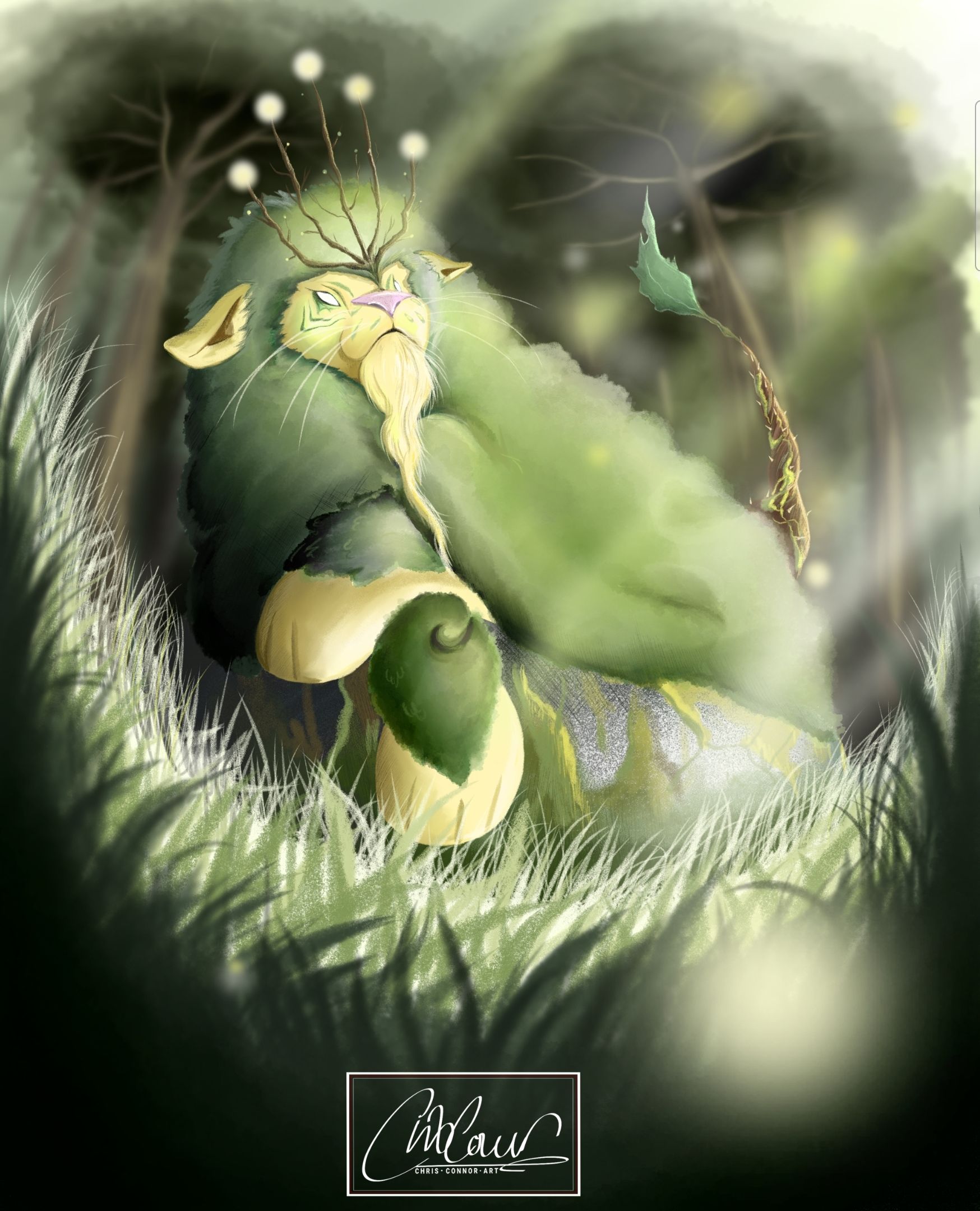
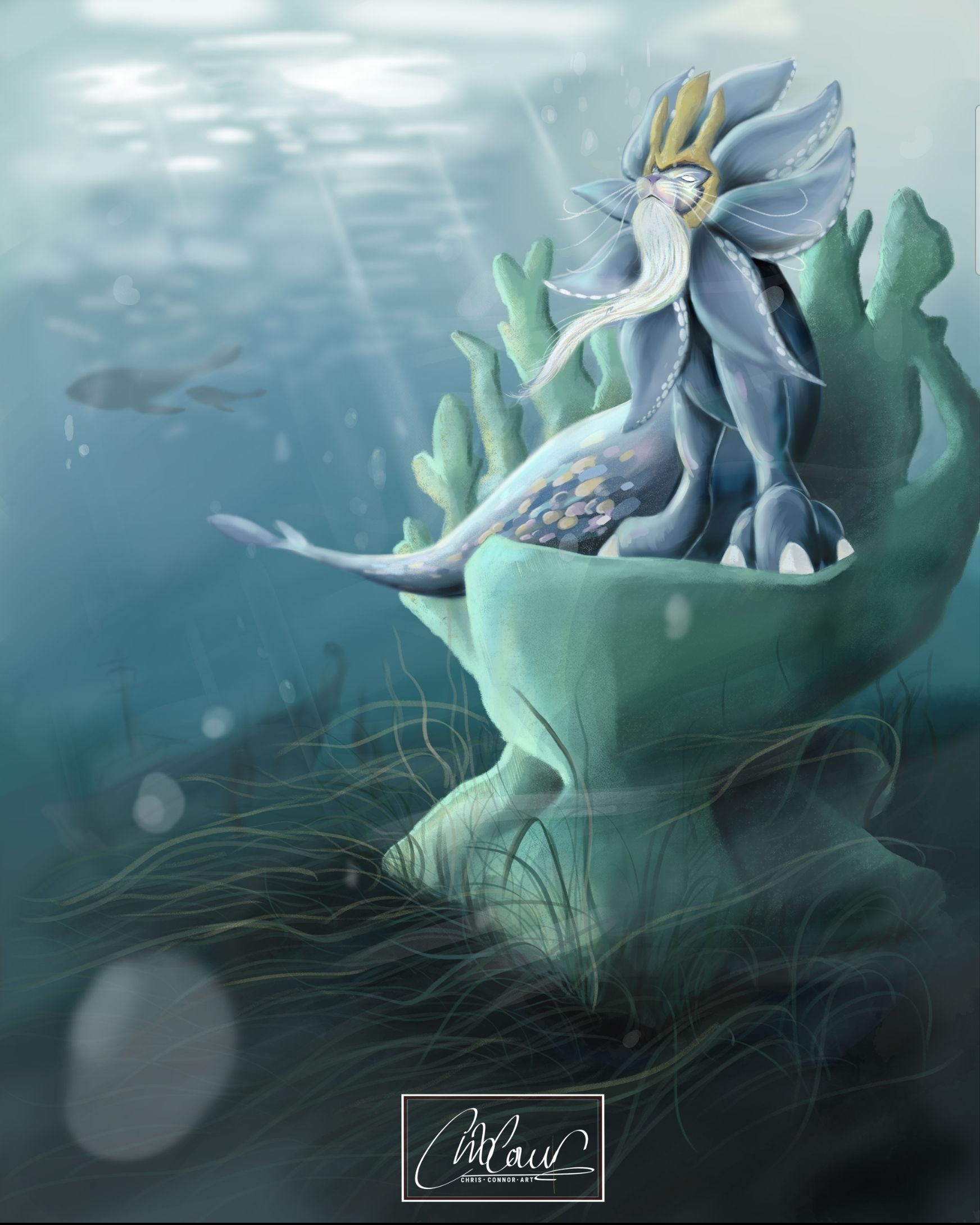
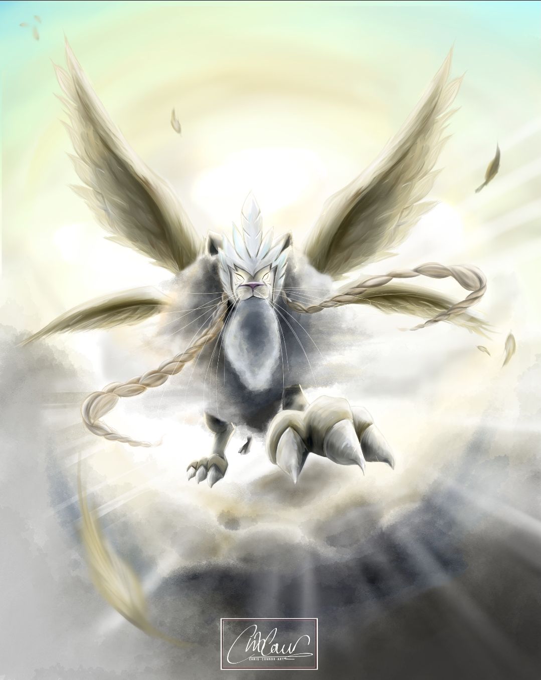
      Hey everyone, I've been working on some new illustrations for a small series I'm making with the theme of lions but with a twist. Each image is a lion that belongs to one of the elements. So far I've finished earth and water with fire and air left to do.
      I've mainly been focusing on composition, lighting and focus points in mind. After receiving some amazing advice from other members of this forum on previously posted work, it's really upped my game and I wanted to share some new images.
      Hope you like. Feel free to leave constructive feedback if you see somewhere to improve 🙂

      SmartSelect_20210324-191149_Gallery.jpg SmartSelect_20210324-191134_Gallery.jpg

      Jeremy Ross 1 Reply Last reply Reply Quote 14
      • Jeremy Ross
        Jeremy Ross @ChrisConnor last edited by

        Very cool @ChrisConnor!

        https://www.instagram.com/jeremyrayross
        https://www.jeremyrayross.com/
        https://twitter.com/jeremyrayross
        https://jeremyrayross.substack.com/

        ChrisConnor 1 Reply Last reply Reply Quote 1
        • ChrisConnor
          ChrisConnor @Jeremy Ross last edited by

          @Jeremy-Ross Thank you so much 🙂

          1 Reply Last reply Reply Quote 0
          • APHOTICMOTH
            APHOTICMOTH Moderator last edited by

            Creative, can't wait to see more of this series.

            The first piece is pretty flat, in terms of tone. You have 2 little spots with really dark shadow, but not much for shadow anywhere else. Shadows add depth.

            Your second piece handles the tone better, it could use a little help in that area too, but it is better than the first piece.

            All my links: https://APHOTICMOTH.carrd.co/

            ChrisConnor 2 Replies Last reply Reply Quote 0
            • ChrisConnor
              ChrisConnor @APHOTICMOTH last edited by ChrisConnor

              This post is deleted!
              1 Reply Last reply Reply Quote 0
              • ChrisConnor
                ChrisConnor @APHOTICMOTH last edited by

                @CLCanadyArts thanks for your feedback. Yes I see what you mean. I've also noticed that uploading to this has made all the colours flatter. I've just looked at the original file in the software and it's more vibrant for sure. As for the tone and shadows, I've taken this on board. I've attached a new upload edits!

                SmartSelect_20210325-173417_Gallery.jpg

                1 Reply Last reply Reply Quote 1
                • ChrisConnor
                  ChrisConnor last edited by

                  Hi guys, not sure if you are seeing this but here's the next one in the series.
                  'You're Highness'.
                  Screenshot_20210407-134936_Gallery.jpg

                  ChrisConnor 1 Reply Last reply Reply Quote 3
                  • ChrisConnor
                    ChrisConnor @ChrisConnor last edited by

                    I'm also aware there is a rogue whisker so ignore please 😅🤦🏼‍♂️

                    1 Reply Last reply Reply Quote 0
                    • First post
                      Last post